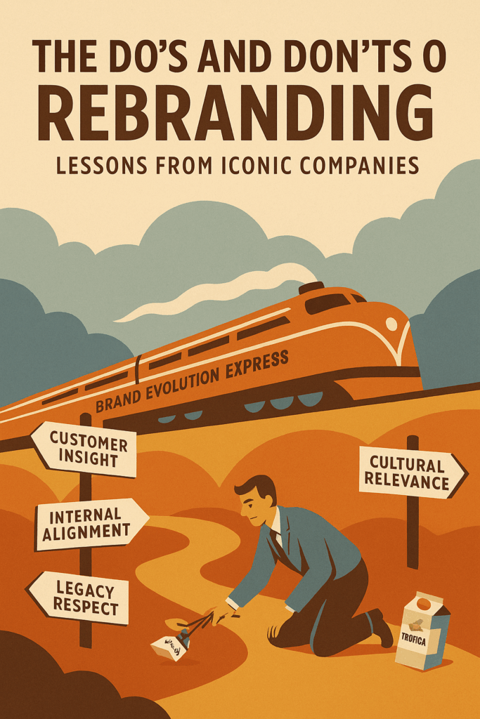


You’re planning a rebrand—but here’s the harsh truth: most rebrands fall flat.
Not because the idea isn’t smart, but because the strategy behind it isn’t sharp enough to cut through the noise.
It doesn’t matter if your brand is legacy or startup—without a rebranding strategy that aligns purpose with performance, even the boldest redesigns can backfire.
Want proof? Just ask companies like Tropicana or Gap—where cosmetic changes cost millions and alienated loyal fans.
But now flip the script—look at Airbnb, Old Spice, or Dunkin’. These aren’t just rebranding examples; they’re masterclasses in brand evolution that sparked renewed relevance, market share, and cultural impact.
I’m Viktor. I’ve spent the last 13+ years helping brands build award-winning campaigns, secure over $500 million in funding, and craft strategies that don’t just look good—they win. As a brand strategist and pitch architect, I’ll show you exactly how to rebrand without losing your essence, customers, or competitive edge.
This guide breaks down what works (and what wrecks) rebranding, backed by real-world rebranding case studies and frameworks used by the most iconic brands in the world.
Whether you’re launching a new brand identity or undergoing a strategic transformation, this is your blueprint for getting it right.
Ready to rebrand with precision, power, and purpose? Let’s get into it.
The Rebranding Blueprint: Purpose, Risk & Reward
What Is Rebranding and Why Do Companies Undertake It?
Rebranding is a strategic redefinition of how a brand presents itself to the world.
While a brand refresh may involve updating fonts, tweaking the color palette, or adjusting a tagline, rebranding goes deeper. It can involve everything from a new brand name and visual identity to a complete repositioning in the market.
Many iconic rebranding case studies show how powerful this transformation can be.
Take Airbnb, for example. What started as a couch-surfing tool underwent a complete rebranding in the 2010s—introducing a new logo, updated mission, and a user experience designed around a “sense of belonging.”
This was far more than aesthetic. It was a deliberate shift aimed at appealing to a broader, more global audience.
So why do brands take the leap?
Here are key triggers that often signal the need for a major rebranding effort:
Mergers and acquisitions: Two brands becoming one often require a unified identity.
Declining relevance: When a brand feels stuck in the 1990s or early 2000s, it risks losing market share.
Changing consumer preferences: New generations demand new narratives, new values, and new brand positioning.
Expansion beyond core offerings: Think Dunkin’ Donuts simplifying to Dunkin’—a modern, on-the-go brand offering more than just donuts.
Each of these scenarios requires more than a fresh coat of paint. They demand a strategic rebranding process that aligns the business’s internal truth with external expectations.
Strategic Rebranding vs. Cosmetic Redesign
A strategic rebrand is rooted in business transformation. It considers the company’s evolution, the market landscape, and future growth ambitions.
A cosmetic redesign, by contrast, is surface-level—it might modernize the logo or swap the serif font for a sans-serif, but it rarely addresses core business challenges.
Let’s look at a cautionary tale: Gap’s failed rebranding in 2010.
The retailer introduced a new logo without a clear story or strategy behind it. Consumers rejected the change almost immediately, forcing the company to revert within a week. Why? Because the brand’s deeper positioning—the reason people connected with it—wasn’t part of the rebranding process.
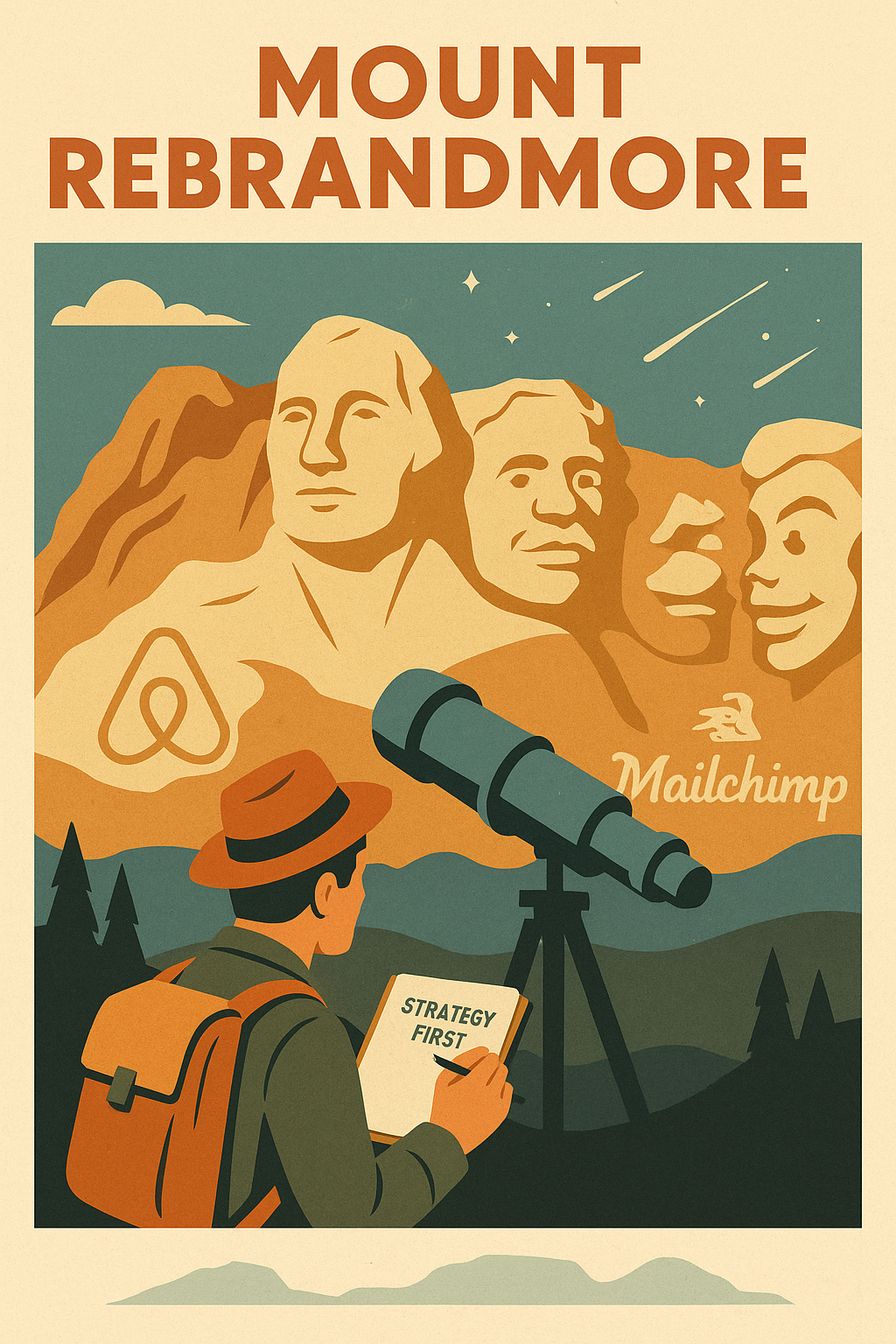
Now compare that to Mailchimp, which introduced a new logo and wordmark as part of a broader transformation.
With a playful and quirky aesthetic, polished typography, and improved readability, Mailchimp wasn’t just changing how it looked. It was evolving into a full-fledged marketing platform. Their rebranding successfully shifted perception from “email tool” to “professional image for small businesses.”
Brand Alignment: The Key to Successful Rebranding
Every highly successful rebranding effort shares one thing: alignment.
The brand strategy, visual identity, and tone of voice must speak the same language. That’s how a brand becomes easily recognizable, consistent across touchpoints, and credible in its messaging.
Here’s how to avoid falling into the trap of “new logo, same old problems”:
Connect visuals to values: Airbnb’s “Bélo” logo (a heart + location pin) symbolized inclusivity and community—perfect for a brand shifting from budget stays to meaningful experiences.
Make it usable, not just beautiful: Typography and color choices must enhance readability and brand consistency across web, mobile, and print.
Respect legacy while evolving: The best rebrands—like Old Spice’s major rebrand—don’t erase the past; they reinterpret it for a modern audience. The “man your man could smell like” campaign introduced new product lines and scents while maintaining the brand’s heritage.
Rebranding as Both Risk and Opportunity
Let’s be clear: rebranding involves risk. It can confuse loyal customers, stretch internal teams thin, or backfire if disconnected from reality. But when done right, it opens the door to:
Increased brand awareness
Appealing to a younger demographic
Stronger positioning in competitive markets
Expansion into new categories and offerings beyond legacy products
In every branding case study that ends in success—Airbnb, Mailchimp, Dunkin’, and Old Spice—rebranding was strategic. It wasn’t just about being new. It was about being true, timely, and transformative.
The Do’s of Rebranding: Strategies for Success
To avoid the pitfalls of poorly executed redesigns and create a truly successful rebranding, follow these essential strategies used by iconic brands that got it right.
Do Start with “Why” (The Simon Sinek Principle)
Every successful brand transformation begins with clarity of purpose.
As Simon Sinek argues in Start With Why, people don’t buy what you do—they buy why you do it.
Case Study: Apple
Apple didn’t dominate the tech world because it had the most features. It became a cultural phenomenon because it anchored its rebranding strategy in a belief: “Think Different.” Apple’s core purpose has always revolved around challenging the status quo and empowering creativity through intuitive design.
That emotional foundation continues to drive both customer loyalty and internal innovation. When your rebranding effort is rooted in a compelling brand purpose, everything from your new brand name to your visual identity gains credibility and resonance.
Do Conduct Deep Brand and Audience Audits
A powerful rebrand starts with understanding where your brand stands—and where your audience wants you to go. This means digging into:
Stakeholder interviews (executives, employees, customers)
Brand equity analysis
Perception gap studies
Audience segmentation and future behavior insights
You’re not just designing a new logo; you’re repositioning based on real insights, not assumptions.
Learn how these brands took this seriously:
Before undergoing a significant rebranding, Airbnb studied its users’ behavior, needs, and motivations. This research led to a new brand centered on a sense of belonging, which influenced everything—from their logo redesign to UX language.
The result? A rebranding success that transformed a niche lodging service into a global lifestyle platform.
Do Align Visual Identity with Brand Strategy
The right color palette, typography, and logo readability signal what kind of brand you are before a word is read or a product is touched.
Case Study: Mailchimp
Mailchimp’s rebranding is a masterclass in aligning design with strategic direction.
Formerly known for quirky, almost indie-style branding, the company underwent a major rebrand in the late 2010s.
The updated new logo and wordmark, paired with a vibrant pink and orange color scheme, retained the brand’s playful tone while introducing a more polished and professional image. Their visuals became more intuitive and consistent, enhancing user experience while reflecting the company’s evolution into a full-scale marketing platform.
This wasn’t a random redesign—it was a strategic rebranding aimed at expanding audience reach while preserving brand equity.
You might like: The Power of Brand Archetypes: Choosing the Right Personality for Your Business
Do Craft a Story People Want to Share
A successful rebranding example isn’t just noticed—it’s talked about. Jonah Berger’s Contagious offers the STEPPS framework—Social Currency, Triggers, Emotion, Public, Practical Value, and Stories—as key to viral traction.
Case Study: Old Spice
Old Spice underwent a significant rebranding in the 2010s that didn’t just refresh its old logo—it redefined masculinity in advertising. With the now-famous “The Man Your Man Could Smell Like” campaign, featuring the charismatic Spice Guy (Isaiah Mustafa), Old Spice became a pop culture icon. The campaign had:
Emotion: Humor and surprise.
Public: A distinct look that made it instantly recognizable.
Social Currency: People wanted to be the one who introduced others to the ad.
Millions of views online proved this wasn’t just a good ad—it was a branding case study in virality.
When your rebranding includes a compelling story, it naturally extends your marketing efforts.
Do Execute with Consistency and Clarity
Rebranding without consistency is like renovating one room in a collapsing building.
The new brand identity must be echoed across every touchpoint—from your website to your packaging, advertising, social media, employee behavior, and even store layouts.
Case Study: Dunkin’
When Dunkin’ Donuts rebranded to simply Dunkin’, it wasn’t just a cosmetic shift. The name change, simplified name and logo, and visual redesign with its legacy pink and orange color scheme all signaled its move beyond just donuts.
Dunkin’ repositioned itself as a modern, fast, on-the-go brand for coffee, breakfast, and mobile ordering. The rebranding coincided with updated menus, store designs, and a digital-first strategy.
This wasn’t just a branding case study—it was a transformation of the customer experience at every level.
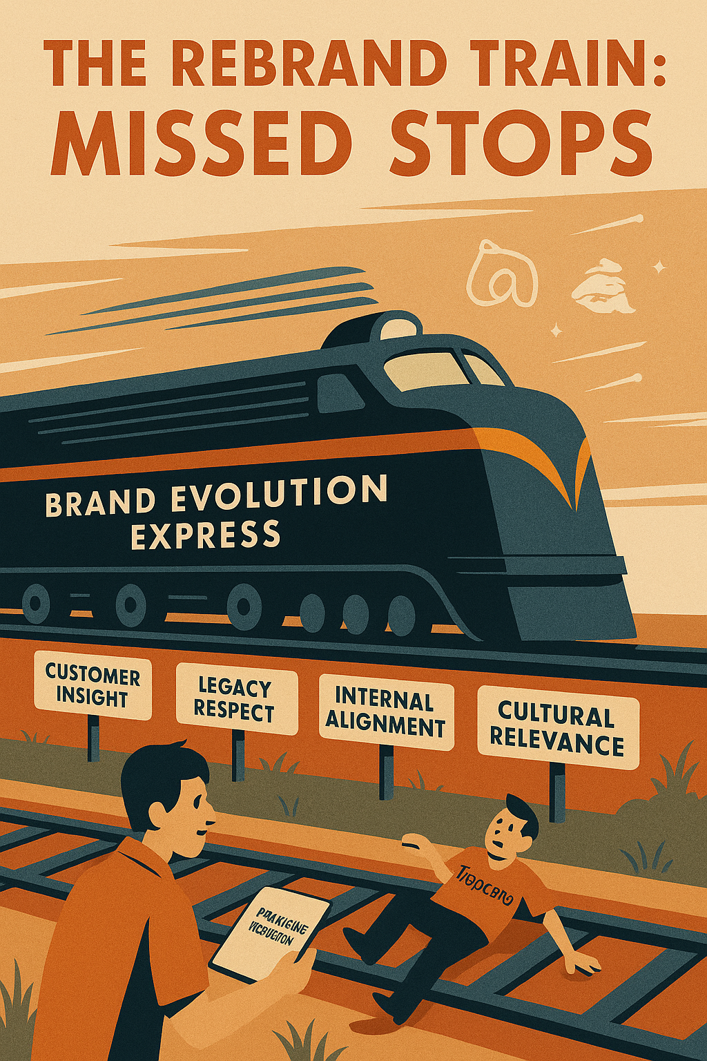
The Don’ts of Rebranding: Mistakes That Derail the Process
Rebranding can propel a business forward—but only when it’s done with purpose, precision, and perspective.
When it’s not? The fallout can range from minor confusion to full-blown backlash, revenue loss, and broken trust.
Here are the critical missteps to avoid, with rebranding case studies that show how quickly even beloved brands can falter.
Don’t Rebrand Without a Compelling Reason
If your rebranding effort isn’t grounded in a meaningful strategic shift, don’t do it. Change for the sake of change doesn’t excite audiences—it alienates them.
Case Study: Gap’s Logo Backlash
In 2010, Gap unveiled a new logo without any clear reason or context.
There was no messaging evolution, no new brand strategy, no shift in positioning—just a surprise redesign.
Within 48 hours, the public reaction was overwhelmingly negative.
Loyal customers and design professionals criticized the visual identity as generic, unnecessary, and tone-deaf. The company reversed course within a week, reinstating the old logo.
This is a textbook branding case study in how not to rebrand. Without a compelling rationale, even the most recognizable companies risk looking lost rather than refreshed. If your rebranding examples don’t come with a solid “why,” hit pause.
Don’t Alienate Loyal Customers
While attracting new markets is often a goal of rebranding, it shouldn’t come at the cost of alienating those who’ve already bought into your brand image. Successful brands evolve without erasing their DNA.
Your heritage in the process matters. Nostalgic branding often holds emotional weight, and disrupting it too suddenly can fracture trust and dilute brand equity.
Learn how these brands succeeded by honoring their roots:
Old Spice went through a major transformation but retained its iconic name and core masculinity themes.
Mailchimp, even as it pursued a more professional image, kept its quirky character and chimp mascot.
Smart rebranding doesn’t burn the past—it builds on it.
Don’t Skip Internal Brand Alignment
Rebranding is more than a design sprint—it’s a company-wide transformation. If your internal teams don’t understand, believe in, or embody the new identity, the execution will collapse at every customer touchpoint.
Your employees are your first brand ambassadors. If they’re not aligned, customers will feel the disconnect.
Train teams on the new brand values, tone, and behaviors.
Align internal communications with the external marketing campaign.
Build advocacy from within—because consistency starts inside the organization.
When internal buy-in is missing, even the most beautiful visuals and intuitive navigation won’t deliver lasting impact.
Don’t Confuse Visual Change with Strategic Change
Your visual identity—the logo, typography, color palette—is just one part of your brand ecosystem. A shiny redesign without messaging evolution or market repositioning is like updating the curtains in a crumbling house.
Case Study: Tropicana’s $35 Million Packaging Flop
In 2009, Tropicana introduced a complete redesign of its juice packaging. Gone was the iconic orange-with-a-straw image, replaced with a clean, minimalist design. The problem? There was no strategic rebranding underneath the visual change. No updated messaging, no redefined value proposition. Consumers didn’t recognize the product and sales dropped by 20% in two months—costing the brand $35 million.
Design without depth won’t sustain. The best rebranding examples—like Airbnb’s new identity, which used the combination of a heart and location pin to symbolize belonging—tie every design decision to a deeper narrative.

Rebranding Case Studies: What We Can Learn
Some of the most iconic brands in the world didn’t just rebrand for relevance—they did so with strategy. These rebranding case studies reveal how a clear purpose, a cohesive identity, and an emotional connection can transform a business from stagnant to standout. Learn how these brands executed highly successful rebranding strategies that drove measurable impact.
Airbnb’s Rebrand: From Couch-Surfing to Belonging
Rebranding was strategic for Airbnb—not just a new look, but a redefinition of their mission. Initially known as a platform for budget-friendly lodging, the brand needed to grow beyond the perception of couch-surfing.
Their 2014 complete rebranding introduced the now-famous “Bélo” symbol—an abstract heart mixed with a location pin, meant to express belonging anywhere. This visual identity marked a significant change: the brand evolved from transactional bookings to emotional experiences.
Key outcomes:
Broadened appeal to a diverse user base
Enhanced trust through a cleaner, more intuitive UX
Established itself as a global lifestyle brand, not just a tech startup
This branding case study shows how thoughtful storytelling and design can align to reflect a deeper purpose, transforming public perception at scale.
Old Spice: The Viral Resurrection of a Legacy Brand
Once seen as your grandfather’s aftershave, Old Spice underwent a significant rebranding that turned a fading legacy product into a pop culture powerhouse.
In the early 2010s, the brand launched the “Smell Like a Man, Man” campaign featuring Isaiah Mustafa, known widely now as the “Spice Guy.” The campaign combined absurd humor, direct address, and rapid visual transitions to captivate a younger male audience.
What worked:
Targeted a new demographic while respecting the old name and masculine heritage
Generated millions of views online and massive social media engagement
Resulted in a significant increase in market share and revived shelf presence
Old Spice’s rebranding success proves that bold storytelling and emotional connection can rewrite a brand’s relevance—even decades after its peak.
Dunkin’s Simplification Strategy: More Than Just Donuts
In 2018, Dunkin’ Donuts rebranded to simply Dunkin’. While the name and visual identity were simplified, the strategic intent behind the rebrand was layered and forward-looking.
Here’s what made it work:
The change reflected the brand’s evolution from a donut shop to a fast, beverage-first, on-the-go brand
Maintained the signature pink and orange color scheme, ensuring brand continuity
Enabled expansion into diversified offerings beyond donuts—cold brews, breakfast wraps, digital ordering, and more
This rebranding example aligned with shifting consumer behavior, especially among younger, mobile-centric audiences. It modernized the brand without discarding the emotional equity built since the 1990s and early 2000s.
Mailchimp: Playful Meets Professional
Mailchimp’s rebranding is a standout in the tech-meets-design space. The company, originally known for its quirky tone and chimp mascot, faced a challenge: how to mature the brand without losing its charm.
The solution?
Introduced a new logo and wordmark with bolder, more refined typography
Integrated vibrant illustrations and a fresh yellow and pink-orange aesthetic
Evolved tone of voice to balance creativity with credibility, signaling a move from email-only tools to a full-fledged marketing platform
Outcome:
Created a professional image for Mailchimp while keeping its brand DNA intact
Improved readability and brand consistency across digital assets
Delivered users with a more engaging, polished experience that felt both human and capable
Mailchimp’s case underscores the importance of evolving your identity as your new brand offerings and positioning expand—but doing so in a way that feels authentic, not abrupt.
Takeaways from Iconic Rebranding Examples
| Brand | Old Identity | New Identity | Strategic Shift | Key Result |
|---|---|---|---|---|
| Airbnb | Couch-surfing booking tool | Global lifestyle community | Emphasized belonging & trust | Expanded user base + cultural cachet |
| Old Spice | Outdated legacy product | Bold, youth-driven pop culture icon | Connected with a younger audience | Market share and engagement surge |
| Dunkin’ | Coffee + donuts | Streamlined, lifestyle convenience brand | Reflected fast-paced, mobile-friendly offerings | Relevance to a broader, modern market |
| Mailchimp | Quirky email tool | Professional yet playful marketing platform | Maturation of brand with product evolution | Greater brand consistency and credibility |
These rebranding case studies aren’t just examples of aesthetic updates—they’re successful rebranding strategies that reshaped consumer perceptions, unlocked new markets, and strengthened brand longevity. They prove that when a rebrand is aimed at the right audience, backed by a clear strategy, and executed holistically, the results can be transformative.
Want to replicate this level of clarity and impact in your next rebrand? Then let’s talk strategy, not just design.
Final Lessons: What Every Brand Should Remember
Great rebranding is not about “looking better,” it’s about being better aligned with the future of your business and the evolving needs of your audience.
Whether you’re studying a rebranding case study or preparing for your own shift, these final principles will keep your strategy grounded and your execution sharp.
Rebranding Is a Long-Term Investment, Not a Quick Fix
Too many companies approach rebranding like a campaign: something with a launch date, a press release, and a short-term buzz target.
But the truth is, rebranding is a long-term investment that requires strategic foresight, organizational commitment, and patience.
As Clayton Christensen outlines in The Innovator’s Solution, sustainable innovation—and by extension, successful rebranding—must address what he calls the “job to be done.” That is, what job is your customer hiring your brand to perform in their life?
A new brand name, logo, or positioning that doesn’t realign with that job will fail, no matter how sleek the redesign. It’s not just about how your brand looks, but why it exists and what need it solves better than anyone else.
Successful brands like Airbnb, Mailchimp, and Dunkin’ didn’t just shift how they spoke—they evolved what they meant to customers:
Airbnb evolved from “cheap travel” to delivering a sense of belonging
Mailchimp shifted from quirky tools to being a credible partner in growth
Dunkin’ modernized its identity to reflect on-the-go convenience, not just breakfast food
Each of these rebranding case studies illustrates a strategy that extended well beyond the launch phase. These rebranding efforts were embedded into marketing, product development, and company culture—because real change isn’t just seen, it’s felt over time.
Differentiation Without Dilution
One of the biggest risks in rebranding is losing what made the brand meaningful in the first place. But powerful rebranding doesn’t erase the past—it builds upon it.
As explained in Blue Ocean Strategy by Kim and Mauborgne, the key is to move beyond the bloody waters of competition and into a blue ocean of new demand. That doesn’t mean abandoning what works—it means creating uncontested value that makes competition irrelevant.
This requires a delicate balance:
Keep your brand essence intact (the core values and emotional truths that customers connect with)
Expand into new spaces with a refined voice, new services, or fresh design systems
Avoid dilution by anchoring every change in strategy—not just aesthetics
Take Old Spice as an example: It rebranded for relevance while retaining its masculine heritage. Or look at Mailchimp, which introduced a more professional image without sacrificing its playful tone. These rebranding examples prove that you can modernize and grow without losing yourself.
Rebranding Takeaways to Guide Every Brand
Rebranding must solve a real problem—not just respond to a trend.
Maintain what’s meaningful while introducing what’s modern.
Design for long-term relevance, not short-term reaction.
Position around purpose, not just products.
Build a new brand identity that’s internally embraced and externally understood.
When rebranding was strategic, as it was for Airbnb, Old Spice, and Dunkin’, the result wasn’t just a stronger logo—it was a stronger business.
Conclusion: Build a Brand That Evolves with Purpose
Rebranding is not just a business decision—it’s an act of bravery. It requires clarity about who you are, courage to change what no longer serves you, and a deep commitment to the people who matter most: your customers.
The most successful rebranding case studies—from Airbnb to Mailchimp to Dunkin’—weren’t just visual upgrades. They were holistic, strategic shifts. These brands didn’t rebrand because they needed a fresher logo or a trendier font. They rebranded because they had evolved, and their identity needed to catch up with their ambition.
Airbnb’s rebrand wasn’t about design—it was about creating a global language of belonging.
Dunkin’ simplified its name and identity to better reflect a fast-paced, beverage-first lifestyle, not just donuts.
Mailchimp’s redesign brought forward a more mature, professional identity—while keeping the brand’s soul intact.
These rebranding examples show what happens when a company leads with purpose. They didn’t abandon their roots. They refined them. They didn’t just update their look. They updated their meaning.
So whether you’re preparing for a light redesign or a complete strategic repositioning, remember:
Start with your why—your reason for existing beyond products or profits.
Keep the customer at the core—their needs, values, and evolving expectations are your north star.
Execute with both heart and mind—blend data with emotion, insight with intuition, and strategy with creativity.
Your brand is a living entity. It’s meant to grow, evolve, and adapt to change. But evolution without purpose is noise. With purpose, it becomes your competitive edge.
If you’re inspired by these branding case studies, and you’re ready to create your own, now is t