In aerospace, logos are rarely discussed. Which is usually a good sign.
When they are discussed, it’s often because an image feels off — a logo that looks fine in isolation, but questionable once placed on a fuselage, a technical document, or a vector-based schematic where precision suddenly matters more than personality.
Aerospace logos don’t exist to stand out. They exist to convey reliability.
They show up as images on aircraft, vectors in certification files, illustrations in investor decks, and scaled-down graphics in digital systems long before anyone debates brand tone or logo ideas. By the time those conversations happen, the aerospace logo has already done its quiet work — either reinforcing trust, or introducing doubt.
Many aerospace brands struggle not because they lack engineering excellence, but because of common aerospace branding mistakes that undermine trust before a single meeting takes place.
This article explores aerospace logo design the way the industry itself does: cautiously, practically, and with a long memory. We’ll look at famous logos, recurring design patterns, and aerospace logo ideas that work not because they’re stunning, but because they’re dependable.
Aerospace Logo Design — Executive Summary
- Strong aerospace logos prioritize trust over expression
- Most aerospace logo design relies on typography, not icons
- Visual similarity across aerospace logos is intentional
- Poor logo choices quietly increase perceived risk
- In 2026, image systems and vectors matter more than standalone marks
What Is an Aerospace Logo?
An aerospace logo is a graphic identifier used by companies operating in aviation, space, and aerospace manufacturing.
Unlike consumer branding, aerospace logo design is not about emotional connection or rapid recognition on social media posts. It is about signaling engineering credibility, operational maturity, and readiness to operate in regulated environments.
A great aerospace logo must function as:
- A clean vector
- A precise image
- A recognisable mark across documents, hardware, and digital systems
If it fails in any of these contexts, the logo isn’t wrong — it’s incomplete.
What Makes the Perfect Aerospace Logo Design?
The idea of a perfect aerospace logo is misleading. What matters more is fitness for purpose.
Across decades of aerospace branding, certain design principles repeat:
- Clear fonts and disciplined layout
- Minimal reliance on illustration
- Geometric shapes over expressive forms
- Conservative logo colors chosen for legibility, not trend appeal
- Compatibility with long-term brand systems and logo files
In aerospace, logos only function properly when they are part of a larger identity system built on brand identity consistency in aerospace, rather than isolated visual assets.
The strongest aerospace marks consistently follow a small set of practical aerospace logo design principles shaped by regulation, procurement processes, and long-term operational use.
Aerospace Logo Ideas from Famous Logos
These aerospace logos aren’t included because they’re visually exciting. They’re included because they survived.
These logos are best understood not as inspiration, but as reference systems used by established aerospace and defense brands operating at global scale.
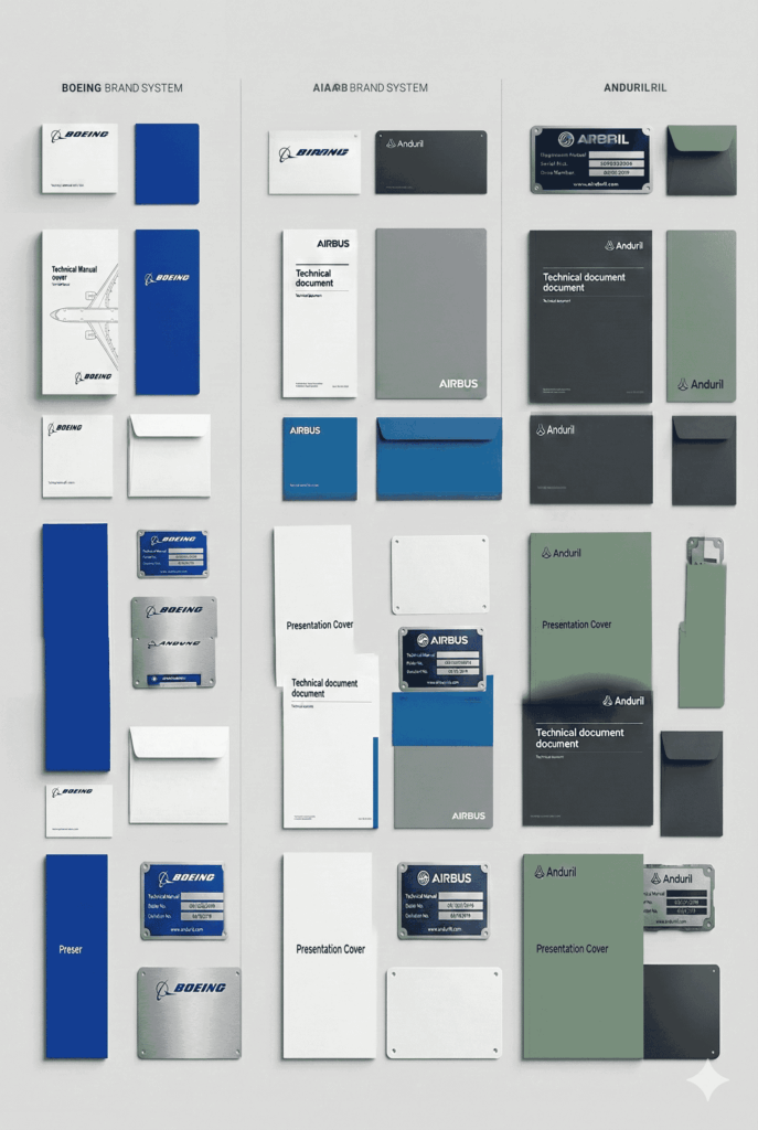
Airbus
A restrained wordmark paired with a minimal graphic element. Airbus’s logo design works because it scales effortlessly — from aircraft livery to vector-based technical documentation — without ever demanding attention. It feels inevitable, which in aerospace is usually the goal.

Why it matters:
Typographic clarity + system consistency beats symbolism.
Anduril Industries (Autonomous Aerospace Systems)
Anduril’s logo deliberately rejects traditional aerospace restraint in favor of a sharper, software-native identity. This works because credibility is carried by execution speed, government adoption, and visible deployment — not by heritage signals.
Why it matters:
Anduril shows that aerospace branding can bend the rules only when the company is willing to carry the credibility burden elsewhere.

Anduril’s visual language works largely because it carefully navigates color psychology in defense branding, balancing modernity with institutional risk tolerance.
Boeing
Despite recent turbulence, the Boeing logo remains structurally sound. The typography is disciplined, recognisable, and designed to function across image-heavy and documentation-heavy environments alike.
Why it matters:
In aerospace, logos often outlast reputational cycles.
Lockheed Martin (Aerospace Division)
A pure wordmark with controlled spacing and no decorative elements. There’s no attempt at visual storytelling — only authority through restraint.
Why it matters:
When engineering credibility is the brand, illustration becomes unnecessary.
Northrop Grumman
Clean typography, balanced proportions, and a subtle nod to motion in its graphic treatment. The logo feels engineered rather than designed — which is precisely why it works.

Why it matters:
Aerospace logos often succeed by not feeling designed at all.
Rolls-Royce Aerospace
An example of how heritage can be preserved without nostalgia. The logo relies on typography and proportion rather than graphic embellishment, allowing it to remain credible across generations of technology.
Why it matters:
Longevity is a design constraint, not a side effect.
Safran
A strong example of modern aerospace logo design done quietly. The mark feels contemporary without chasing trends, and functional without appearing cold.

Why it matters:
Modernisation in aerospace happens through refinement, not reinvention.
Thales (Aerospace Systems)
A disciplined wordmark paired with a restrained graphic element. Thales manages complexity without visual clutter — a common challenge in aerospace branding.

Why it matters:
Complex portfolios require visual discipline, not more symbols.
Honeywell Aerospace
A sub-brand that benefits from corporate consistency while maintaining clarity within a highly technical domain. The logo system works because it integrates cleanly into a larger brand architecture.

Why it matters:
Aerospace logos rarely exist alone — they live inside systems.
GE Aerospace
Built on a historic corporate mark, adapted carefully for aerospace applications. The logo balances legacy with technical relevance without attempting reinvention.

Why it matters:
Not every aerospace logo needs to start from scratch.
NASA
Frequently referenced, often misunderstood. NASA’s logos succeed because they balance abstraction, geometry, and strict usage rules — not because they’re expressive or illustrative.

Why it matters:
Even iconic aerospace logos rely on systems, not just shapes.
Aerospace Logo Design vs Other Industries
| Industry | Logo Goal | Risk Tolerance | Design Style |
|---|---|---|---|
| Aerospace | Trust & reliability | Very low | Restrained, typographic |
| Defense | Authority & security | Extremely low | Institutional |
| Startups | Differentiation | High | Experimental |
| Consumer brands | Emotion | Medium–High | Expressive |
Aerospace logos aren’t conservative by habit.
They’re conservative because failure is expensive. This restraint reflects broader aerospace brand positioning strategies, where predictability and credibility consistently outweigh visual differentiation
Design Elements That Define Aerospace Logos
Across thousands of aerospace images — whether custom-built or pulled from internal libraries — certain design elements appear consistently:
- Typography over icons
- Abstract or geometric shapes rather than literal aircraft imagery
- Limited logo colors selected for clarity and contrast
- Systems thinking that extends beyond a single logo image
In practice, these elements are often evaluated through a formal aerospace brand audit, which tests whether a logo system holds up across real-world applications.
When an Aerospace Logo Is Working (And When It’s Not)
An aerospace logo is working if:
- It scales cleanly as a vector and image
- It remains legible in dense documentation
- It conveys competence without explanation
- It integrates smoothly into larger brand systems
An aerospace logo is failing if:
- It depends on trendy illustration styles
- It could have been generated by a free aerospace logo maker
- It relies on artificial symbolism to feel meaningful
- It feels interchangeable with DIY or template-driven logos
Most failures aren’t dramatic.
They simply erode confidence over time. When logos are redesigned without this systemic understanding, they frequently fall into aerospace rebranding pitfalls that erode credibility instead of restoring it.
Common Aerospace Logo Design Mistakes
1. Treating Logo Makers as Strategy
Tools like logo makers, free logomakers, or platforms such as BrandCrowd logo maker and 99designs can generate quick visuals — but speed is not the same as suitability. Aerospace branding rarely benefits from shortcuts.
2. Chasing Logo Ideas Without Context
Browsing logo ideas or aerospace logo ideas can be useful. Choosing the right logo requires understanding constraints, competitors, and long-term use cases.
3. Overthinking Creativity
Aerospace brands don’t need stunning aerospace visuals. They need clarity, consistency, and credibility.
Many of these issues stem from repeating visual branding mistakes aerospace firms make, particularly when borrowing conventions from less regulated industries.
Aerospace Logo Design Checklist
Works as a vector and raster image
Uses fonts appropriate for technical contexts
Avoids literal icons unless justified
Applies consistent logo colors
Integrates into documentation and digital systems
Supports long-term brand consistency
If this checklist feels restrictive, that’s normal.
That’s the category.
Create Your Aerospace Logo: What’s Changing in 2026
Aerospace logo design is quietly evolving:
- Less emphasis on standalone logos
- More focus on systems, layout, and typography
- Reduced reliance on symbolic illustration
- Greater attention to how logos behave across platforms
The goal is no longer to create the perfect logo in isolation.
It’s to create a professional, adaptable identity that holds up everywhere.
Frequently Asked Questions
Is there such a thing as a free aerospace logo that works?
Rarely. Free aerospace logos or generator-based designs often lack the precision and adaptability required for real-world aerospace use.
Should I use a logo maker to create my aerospace logo?
Logo makers can help explore directions, but choosing the right logo usually requires custom thinking and experienced designers.
Do aerospace logos need icons or symbols?
Not necessarily. Many great aerospace logos rely purely on typography and layout.
What colors work best for aerospace logos?
Muted, high-contrast colors that support legibility and consistency tend to work best.
Who This Aerospace Logo Guide Is For
This guide is useful if you are:
- Choosing the right aerospace logo
- Creating a custom aerospace logo
- Evaluating competitors’ branding
- Refining an existing identity system
If you’re looking to download a template and move on, this may feel slow.
If you’re making decisions, it should feel familiar.
As aerospace companies scale internationally, clearly defined aerospace brand guidelines become essential for maintaining consistency across regions, suppliers, and regulatory environments.
Final Thought
In aerospace, people remember what feels reliable.
A strong aerospace logo doesn’t try to stand out. It tries to stand up — across time, scrutiny, and changing contexts. And while no logo will carry a business on its own, the wrong one has a habit of raising doubts no one wants to explain.
If you’re focused on creating a logo you’ll love, you may be asking the wrong question.
The better one is whether it will still make sense years from now.
Ultimately, aerospace logos succeed when they align with broader trust signals in aerospace and defense that reassure stakeholders long before any technical claims are evaluated.
Authority Note
BBDirector specializes in branding for high-trust, high-stakes industries. Our work focuses on brand systems designed to survive scrutiny, scale, and long decision cycles.