Iconic Defense Logos (And What They Actually Get Right)
Studying iconic defense logos is less about inspiration and more about understanding how restraint, consistency, and governance operate over time. These logos are memorable because they are dependable, not expressive.
They survived board turnover, geopolitical shifts, mergers, audits, and decades of technical evolution.
What follows is not an aesthetic review, but an operational one—focused on why these marks continue to function inside high-stakes systems.
1. Rheinmetall
Rheinmetall’s logo is unapologetically industrial. The wordmark is heavy, geometric, and uncompromising, reflecting a brand rooted in land systems, armaments, and defense manufacturing.
What makes it effective is consistency. The logo behaves predictably across vehicles, documentation, and corporate materials without attempting to soften or humanize its role.
Why it matters:
In defense manufacturing, clarity and weight often signal credibility better than refinement.

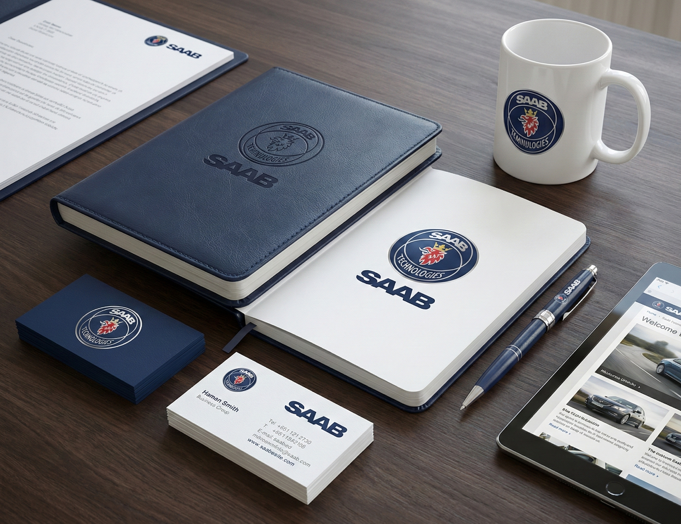
2. Saab (Defense Division)
Saab’s defense branding reflects Scandinavian design discipline applied to a military-industrial context. The logo is minimal, functional, and optimized for technical environments rather than promotional ones.
Its visual quietness allows Saab’s products, programs, and partnerships to take precedence. This reinforces an often-overlooked principle: in defense branding, the logo should rarely be the most interesting element on the page. That logic mirrors audits discussed in Brand Audit Checklist
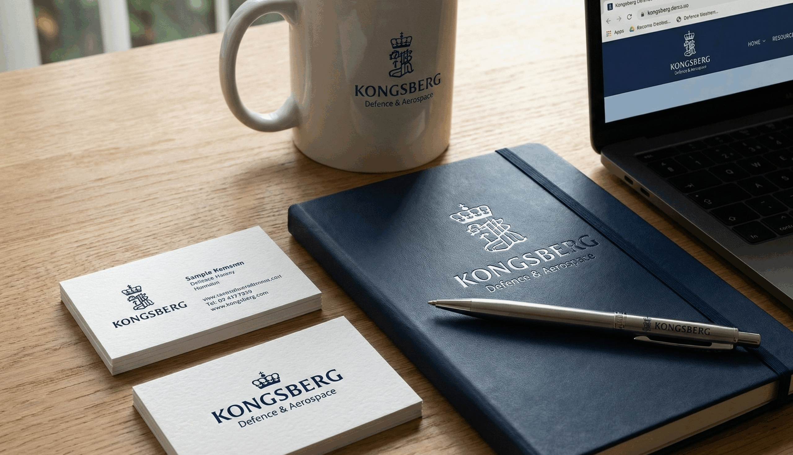
3. Kongsberg Defence & Aerospace (Defense Systems)
Kongsberg’s defense identity prioritizes legibility and modularity. The wordmark integrates cleanly into a broader corporate system while remaining neutral enough for multinational defense programs.
Its effectiveness lies in how easily it coexists with partner brands and government marks.
Why it matters:
Defense logos must often subordinate themselves to larger systems without losing authority.
4. Leonardo (Defense & Security Division)
Leonardo’s defense branding avoids national symbolism or militaristic cues. Typography carries the identity, supported by calm spacing and disciplined proportions.
The logo functions across land, naval, cyber, and electronics programs without requiring adaptation.
Why it matters:
In diversified defense portfolios, neutrality enables scale.
![]()
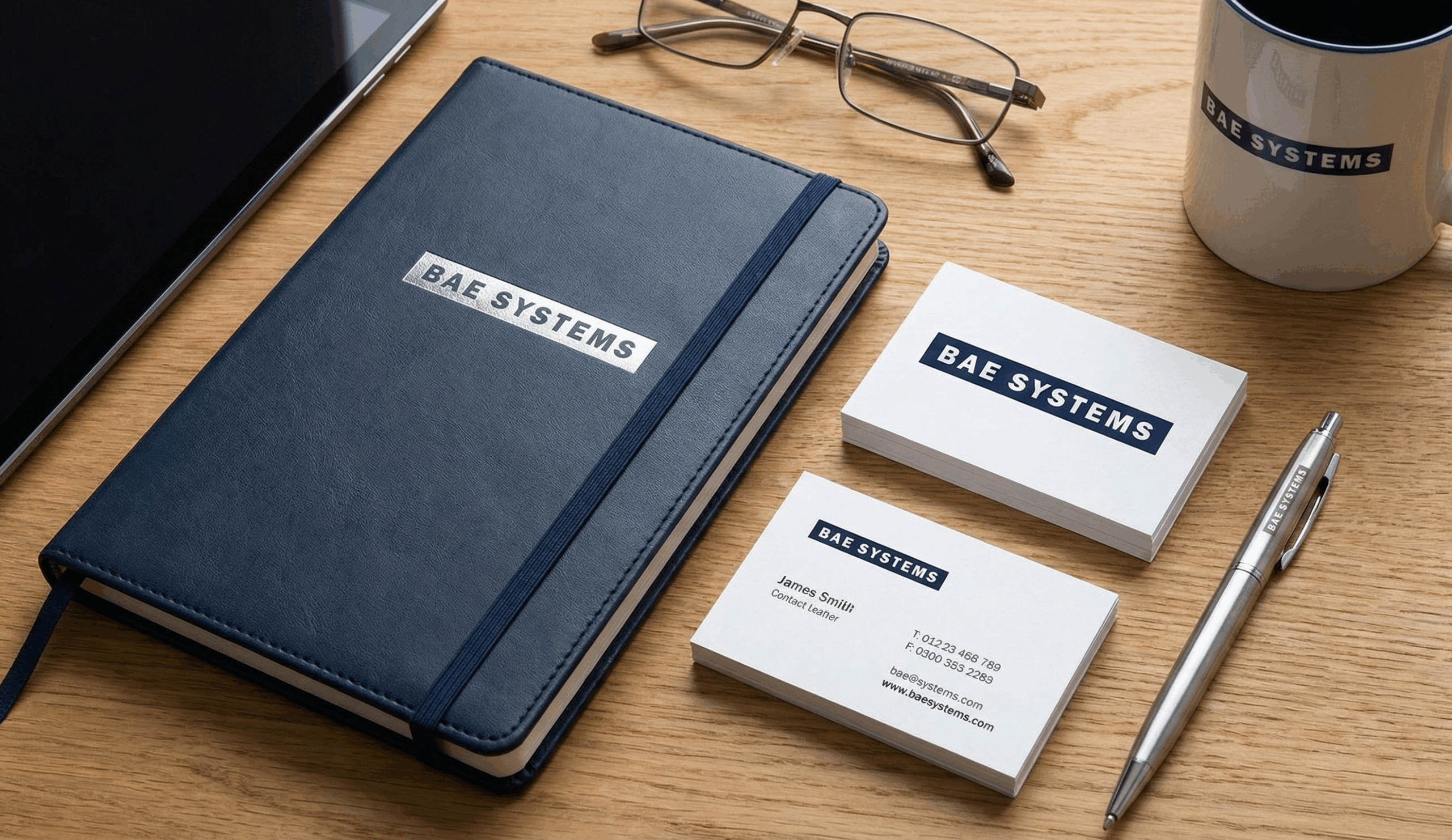
5. BAE Systems
BAE Systems demonstrates how a defense logo can be authoritative without relying on any iconography at all. The logotype is compact, proportionally disciplined, and visually neutral—allowing it to coexist comfortably with government insignia, partner logos, and classified markings.
This neutrality is not accidental. In multinational defense environments, visual dominance can be a liability. BAE’s logo reflects the principle that credibility often comes from not standing out, echoing strategies discussed in Brand Identity tips for Defense teams
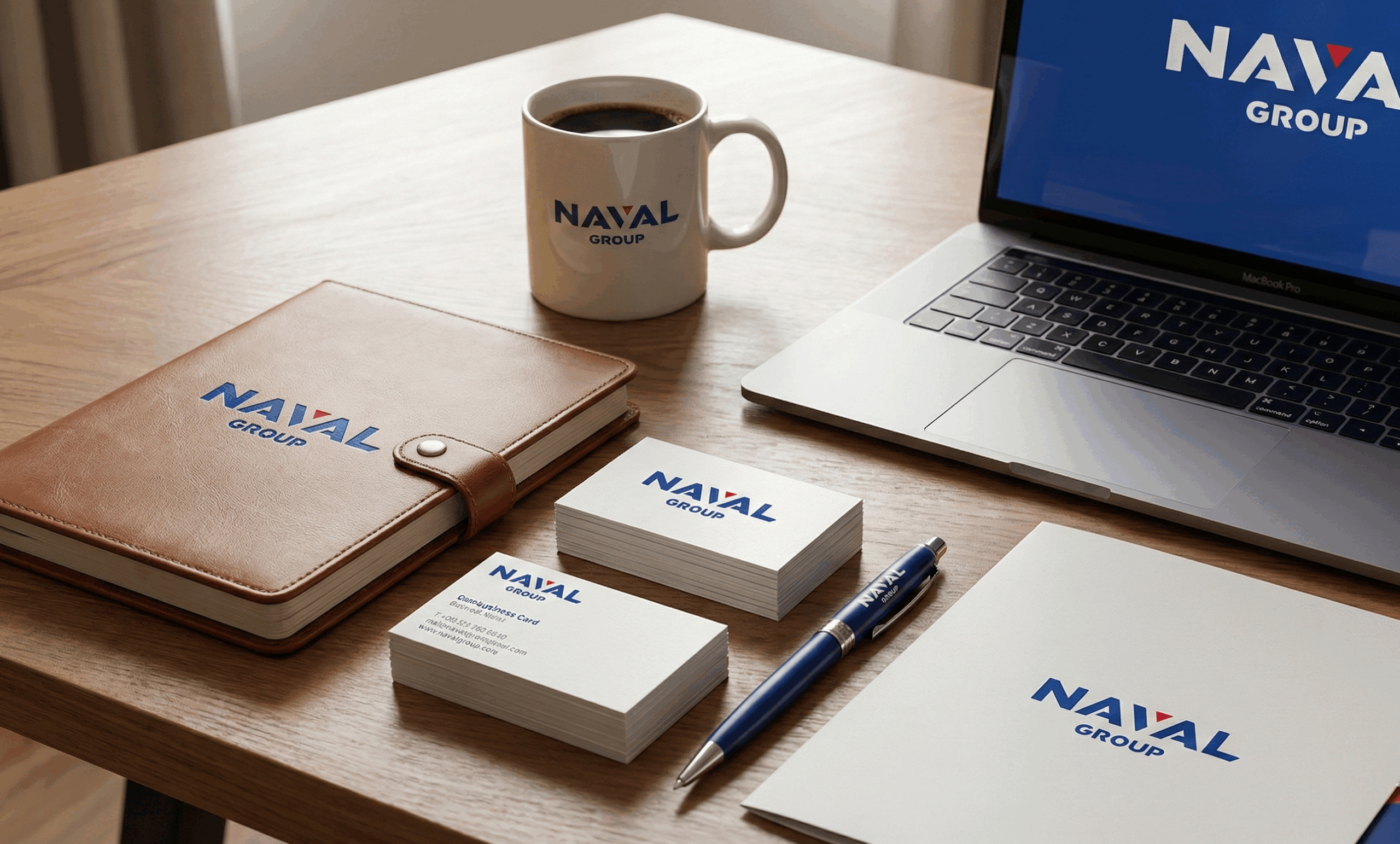
6. Naval Group
Naval Group’s identity balances institutional authority with modern restraint. The typography is stable, and the graphic system supports long-life platforms where branding must endure decades of service.
There is no visual attempt to dramatize naval power.
Why it matters:
In naval defense, permanence outweighs presence.
7. General Dynamics
General Dynamics’ logo is almost aggressively neutral. There is no icon, no motion cue, no symbolic shorthand. The logotype communicates only one thing: institutional presence.
This refusal to “explain” the brand visually is precisely why the logo holds up. In defense contexts, explanation introduces interpretation risk. General Dynamics avoids that entirely, aligning with critiques outlined in Visual Branding Mistakes

8. Palantir (Defense & Security Context)
While not a traditional defense contractor, Palantir’s logo is notable for its extreme restraint. The mark is intentionally minimal, allowing the brand’s credibility to be carried by deployment and outcomes rather than symbolism.
This approach works because the company accepts scrutiny elsewhere.
Why it matters:
When a brand invites scrutiny through performance, the logo can afford to stay quiet.
![]()