Why the Logo Matters in Fintech (and When It Gets Noticed)
In the fintech industry, the logo is rarely discussed when everything is functioning smoothly. It becomes visible when something doesn’t align: a partner questions credibility, a regulator reviews documentation, or a financial institution hesitates during onboarding. In those moments, the fintech logo is no longer decoration—it is evidence.
That is why fintech logo design operates differently from most brand categories. A logo here is often the first signal of seriousness, stability, and intent. It must support brand strategy, fit complex brand identities, and hold together across the entire digital experience, from apps and dashboards to contracts and investor materials.
This article examines logos for fintech through a pragmatic lens: how they work, why certain logos endure, and what best practices actually matter when designing a fintech logo meant to survive scrutiny.
Executive Summary (TL;DR)
- A fintech logo builds credibility before a product is fully understood.
- The best fintech logos prioritize clarity, restraint, and system compatibility.
- Well-designed fintech logos succeed by reducing meaning, not adding it.
- Many fintech companies underestimate how early logo decisions affect trust.
- Effective fintech logo design supports long-term brand identities, not trends.
What Is a Fintech Logo?
A fintech logo is a core component of brand identity design for companies operating in financial services and digital finance. Unlike lifestyle or consumer brands, the logo must function inside regulated, audited, and highly standardized environments.
A fintech logo appears as a company logo in legal documents, as a vector asset across platforms, and as part of a broader digital experience that includes web design, product UI, and reporting systems. It must communicate reliability without overstatement and remain legible across contexts.
Generic logo design advice fails here because fintech logos are not primarily expressive. They are operational tools within a brand strategy that prioritizes trust, continuity, and clarity.
What Makes a Strong Fintech Logo Design (Best Practices)
A strong fintech logo is not defined by creativity alone. It is defined by fit.
The logo must work across jurisdictions, integrate into brand identities without friction, and scale with the company’s growth. In practice, “perfect” fintech logo design usually means appropriate, not distinctive.
Best practices emphasize:
- Structural simplicity
- Visual neutrality
- High reproducibility across platforms
The logo should communicate your brand’s stability more than its ambition. In fintech, effective logos are designed to endure long decision cycles rather than capture short-term attention.
Famous and Successful Fintech Logos
These examples represent best logos in fintech not because they are expressive, but because they are resilient. Each demonstrates how logo design can support trust, scale, and brand value in the world of fintech.
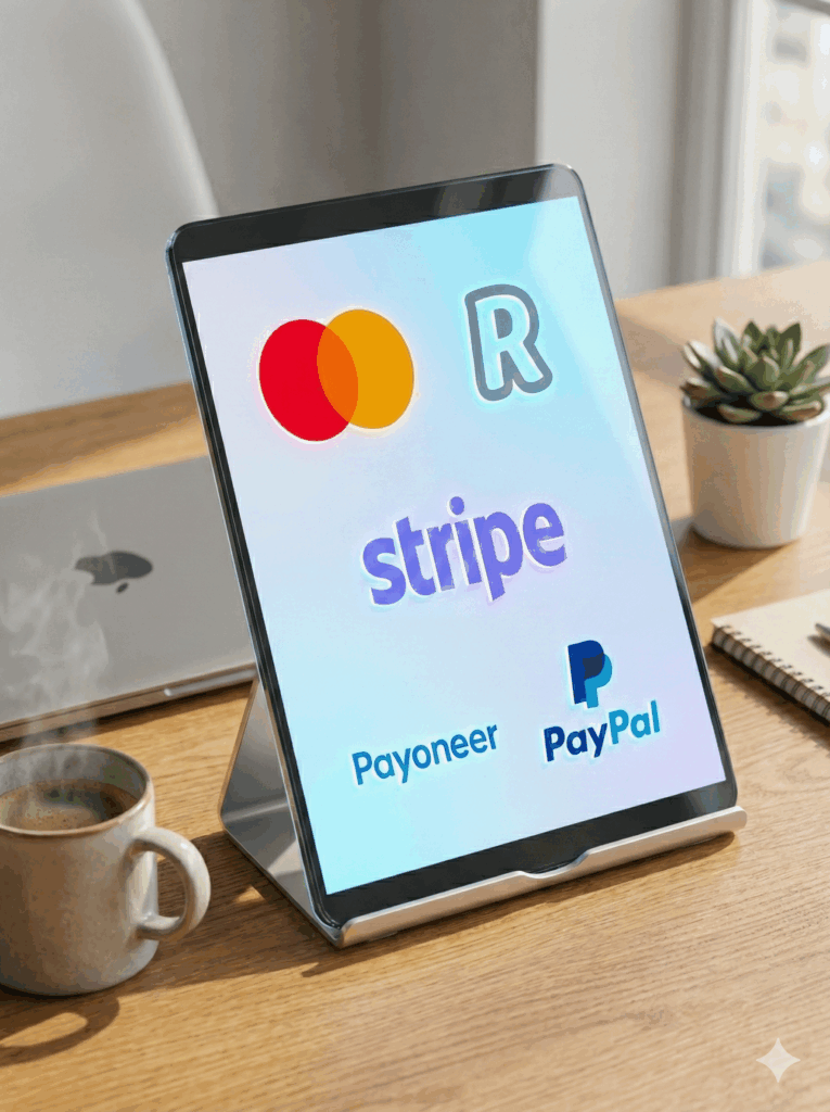
Stripe — Infrastructure-First Logo Design
Stripe’s fintech logo is iconic because it was designed for the digital experience of developers, operators, and financial teams—not for marketing campaigns.
The logo avoids symbolism entirely. Instead, it behaves like a stable label inside complex systems, which aligns precisely with Stripe’s role in the fintech industry.

Why it belongs on this list:
- The logo is typographic, neutral, and non-referential
- It integrates seamlessly into dashboards, APIs, and web design
- It does not imply promises beyond what the product delivers
- The logo works equally well in documentation, product UI, and investor material
- It scales globally without cultural or regulatory reinterpretation
Stripe’s logo design shows how restraint can become a competitive advantage for fintech companies operating at infrastructure level.
PayPal — Maturity Through Logo Simplification
PayPal’s fintech logo is iconic because it reflects a conscious transition from fintech startup to financial institution.
Earlier versions leaned into expressiveness. The current logo redesign removed that emphasis in favor of clarity, legibility, and neutrality—mirroring PayPal’s expanded regulatory and operational responsibility.

Why it belongs on this list:
- The logo change aligned with PayPal’s increased role in financial services
- Typography became clearer and more authoritative
- Visual noise was reduced to improve cross-platform consistency
- The logo holds up in compliance-heavy environments
- It reinforces trust without signaling disruption
PayPal demonstrates that effective fintech logo design often involves subtraction, not reinvention.
Payoneer — Operational Clarity Over Brand Theater
Payoneer’s logo rarely appears in “best logos” lists, which is precisely why it deserves inclusion here. It is designed to operate quietly inside complex financial workflows.
The logo communicates reliability and competence without relying on symbolic storytelling.

Why it belongs on this list:
- The rebranded logo prioritizes legibility across systems and geographies
- It avoids trendy design elements that would date quickly
- The mark integrates cleanly into enterprise platforms
- It supports consistent brand identities across regions
- It signals professionalism rather than aspiration
Payoneer’s logo is a strong fintech logo because it never competes with the transaction itself.
Mastercard — Logo as System, Not Symbol
Mastercard’s logo is one of the clearest examples of a logo that functions as infrastructure. While often described in symbolic terms, its real strength is structural.
The overlapping circles are simple enough to be endlessly adapted without breaking recognition.

Why it belongs on this list:
- The logo is geometrically stable and highly adaptable
- It works in color, monochrome, motion, and reduction
- The logo design supports a modular brand system
- It integrates across physical, digital, and regulatory touchpoints
- It has evolved without losing core recognition
- Aligns with The Power of Omnichannel Branding: Creating a Seamless Customer Experience
Mastercard proves that a fintech logo can be both recognizable and operationally invisible.
Revolut — Controlled Expression in a Consumer Fintech Brand
Revolut represents a more expressive edge of fintech logo design, but its inclusion is based on discipline, not style.
While closer to consumer branding, Revolut’s logo remains typographic, adaptable, and system-aware—key requirements for a trustworthy fintech logo.

Why it belongs on this list:
- The logo communicates accessibility without sacrificing seriousness
- Typography remains clean and highly legible
- The logo stands consistently across app, web, and marketing
- Logo changes have been incremental, not disruptive
- It balances fintech brand personality with operational credibility
Revolut shows that fintech logos can lean expressive if the system underneath remains stable and reinforces brand value quietly (more explored in Brand Equity 101: How to Build and Maintain a Valuable Brand)
Side-by-Side Comparison: Five Fintech Logos That Endure
| Brand | Logo Type | Expressiveness | System Compatibility | Maturity Level |
|---|---|---|---|---|
| Stripe | Wordmark | Very Low | Extremely High | Infrastructure |
| PayPal | Wordmark | Low | High | Regulated |
| Payoneer | Wordmark | Very Low | High | Regulated |
| Mastercard | Symbol + Wordmark | Low | Extremely High | Infrastructure |
| Revolut | Wordmark | Medium | Medium–High | Consumer Fintech |
Key observation:
The more infrastructure-like the fintech firm becomes, the less expressive the logo needs to be—and the more important system compatibility becomes.
Fintech Logos Compared to Other Industries
| Industry | Primary Logo Goal | Risk Tolerance | Typical Design Approach |
|---|---|---|---|
| Fintech | Trust and continuity | Low | Minimal, system-led |
| Consumer Tech | Differentiation | Medium | Expressive, icon-based |
| Healthcare | Credibility | Very low | Conservative |
| Media | Attention | High | Illustrative |
This comparison explains why logos for fintech rarely follow general design trends.
Design Elements That Define Trustworthy Fintech Logos
Typography
Typography carries most of the brand message. Clean, engineered typefaces reduce ambiguity and improve legibility.
Icons and Symbols
Icons are often avoided. Literal imagery introduces semantic risk and limits future flexibility.
Color and Layout
Color is controlled. Layout discipline ensures the logo stands consistently across platforms.
System Behavior
Logos are adaptable assets. The logo should work well as a vector, image, and embedded UI element across the digital experience.
When a Fintech Logo Is Effective (And When It’s Not)
- If the logo integrates into compliance materials without revision, it’s effective.
- If the logo needs explanation, it may not be.
- If internal teams modify it, the logo design is under strain.
- If the logo looks great but fails in documentation, it’s not working.
This logic applies regardless of design trends.
Common Fintech Logo Design Mistakes
- Over-symbolizing trust or security
- Designing for pitch decks instead of long-term systems
- Using logo makers or template tools that lack vector robustness
- Ignoring how logo design costs multiply during redesigns
These pitfalls reduce brand value over time.
The strongest fintech logos are not memorable because they are bold.
They endure because they remain appropriate as scrutiny increases.
Fintech Logo Design Checklist
- Does the logo ensure clarity in regulated environments?
- Is the logo easy to reproduce and adaptable across platforms?
- Does the logo support consistent design across brand identities?
- Would the logo still feel appropriate after a logo change or IPO?
Quiet Design Trends Shaping Fintech Logos
What’s fading:
- Decorative symbols
- Overly expressive illustration
What’s gaining weight:
- Simple logo systems
- Neutral typography
- Logos that support long-term brand identities
Design ensures clarity by prioritizing systems over novelty.
Final Thought
In fintech, the logo isn’t there to impress. It is there to hold. A professional fintech logo must survive audits, platform shifts, regulation, and growth without losing coherence. The most effective fintech logos are quiet not because they lack ambition, but because they understand their role.
A well-designed fintech logo builds credibility over time. It supports the brand without overshadowing the system. In an industry defined by trust, that restraint is not a limitation—it is the design approach that lasts.
BBDirector specializes in branding for high-trust, high-stakes industries. Our work focuses on brand systems designed to survive scrutiny, scale, and long decision cycles.
FAQ
Because the logo is often the first signal of trust in financial services.
Logo design costs vary widely depending on complexity, system scope, and regulatory needs.
Frequent logo change can undermine trust. Stability matters.
Yes, but inspiration should never override context.


