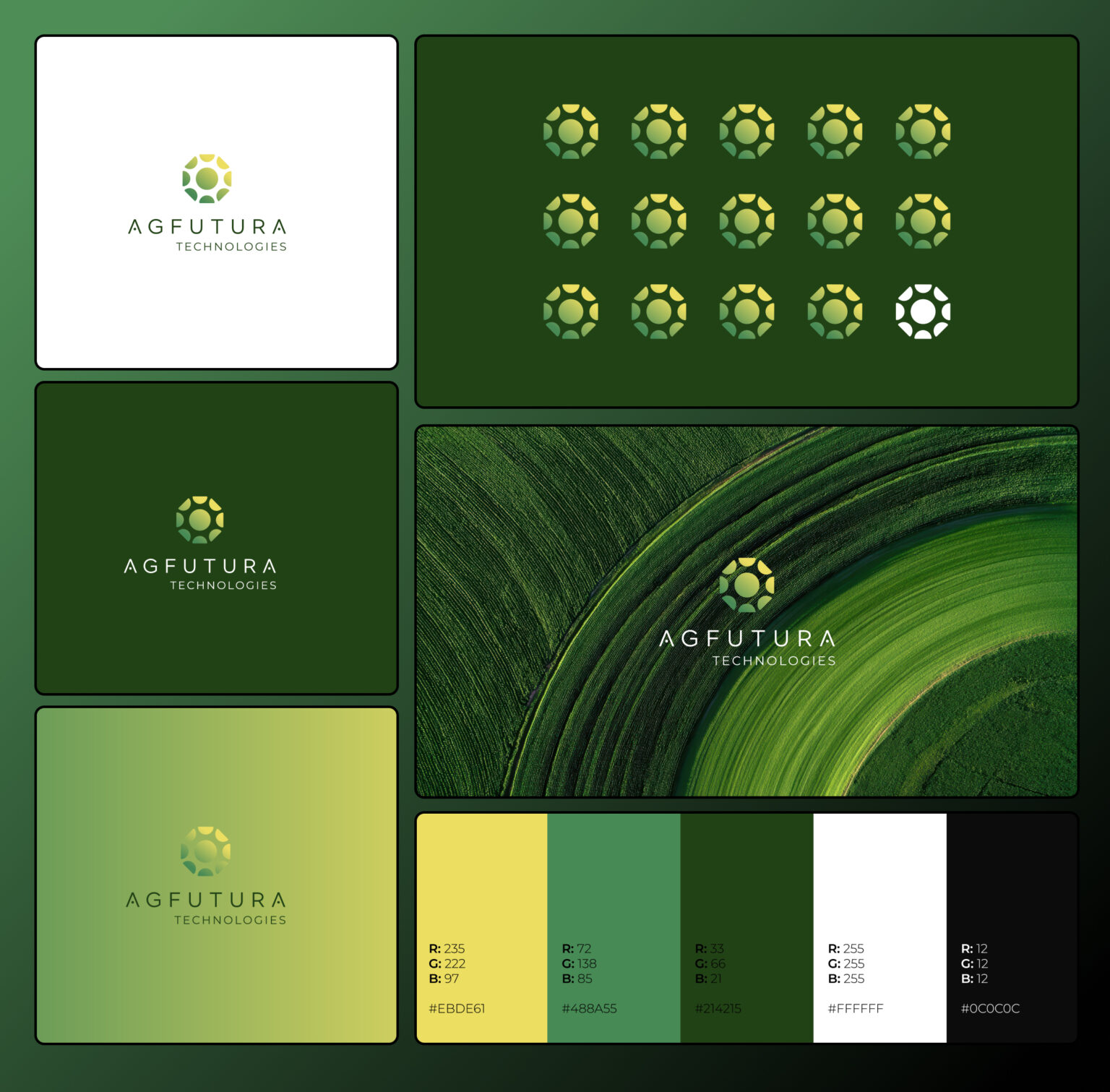


Agritech companies often sit in one of the most difficult branding spaces because they need to communicate agriculture, technology, sustainability, field implementation, institutional credibility, and business value at the same time. A company in this space cannot rely only on a green color palette, a leaf icon, and a few nice field images, because the audience usually needs to understand much more than “this brand is connected to agriculture.”
The real challenge is that agritech brands need to feel grounded in the real world while also appearing modern, scalable, and technically capable. They need to make sense to farmers and field operators, but they also need to look credible in front of investors, EU project partners, public institutions, research organizations, engineering teams, and commercial partners.
That is why agritech brand identity should be treated as a strategic system, not just a logo design project.
For AGFUTURA Technologies, the goal was to create a complete visual identity that could communicate the company’s role across agriculture, engineering, digital systems, sustainability, business development, policy, and innovation ecosystems. The brand needed to feel agricultural, but not rustic. It needed to feel technological, but not cold. It needed to feel institutional, but not boring. Most importantly, it needed to be flexible enough to work across websites, reports, presentations, signage, stationery, merchandise, field applications, event booths, and digital product touchpoints.
This case study covers how we developed the AGFUTURA Technologies brand identity from the logo system to the website direction, and why that matters for agritech companies that want to build trust in complex B2B and innovation-driven markets.
The Branding Challenge: Explaining a Multidisciplinary Agritech Company
AGFUTURA Technologies is not a simple agriculture company, and it is also not a narrow technology startup. The company works across multiple connected areas, including agriculture, engineering, digital systems, sustainability, business development, policy, research, implementation, and EU project ecosystems.
That kind of multidisciplinary work is valuable, but it is also difficult to communicate clearly. When a company operates across many areas, the brand can easily become fragmented. One touchpoint may feel agricultural, another may feel institutional, another may feel technical, and another may feel like a generic sustainability brand. Over time, this makes the company harder to understand and harder to remember.
The goal was to avoid that.
The AGFUTURA identity needed to bring the company’s different areas of work into one clear brand system. It needed to communicate growth, systems, collaboration, field implementation, and applied innovation without becoming overloaded with symbols or visual clichés.
For agritech brands, this is a common problem. The company may work across many valuable areas, but the market still needs a simple way to understand what the brand stands for. A strong identity should not reduce the business into something smaller than it is, but it should give the complexity a clear visual structure.
That became the foundation of the AGFUTURA brand identity.
The Strategic Direction: Agricultural, Advanced, and Implementation-Focused
The central strategic idea behind the AGFUTURA identity was to make the brand feel like an applied innovation company working in agriculture and connected systems. This is an important distinction because the brand should not look like a traditional farm business, a generic green startup, or a cold technology platform.
The visual direction needed to balance several qualities at once.
It needed to feel connected to agriculture through color, growth symbolism, field imagery, and natural references. At the same time, it needed to feel modern and structured through geometry, typography, modularity, and clean digital applications. The brand also needed to feel credible enough for institutional and B2B environments, because agritech companies often operate in serious contexts where trust, professionalism, and clarity matter.
This is where many agriculture technology brands struggle. They either lean too far into nature and become visually indistinguishable from organic food brands, or they lean too far into technology and lose the connection to agriculture, field conditions, and real-world implementation.
For AGFUTURA, the direction was built around a middle ground: a brand identity that feels agricultural and advanced, natural and structured, practical and future-facing.
That balance shaped the logo, color palette, typography, website design, brand book, and application system.
Logo Design: A Modular Growth Symbol for Agritech Innovation
The AGFUTURA Technologies logo was designed to communicate more than agriculture alone. The mark combines a circular growth symbol with modular geometric forms, creating a visual language that suggests ecosystems, movement, collaboration, systems thinking, and innovation.
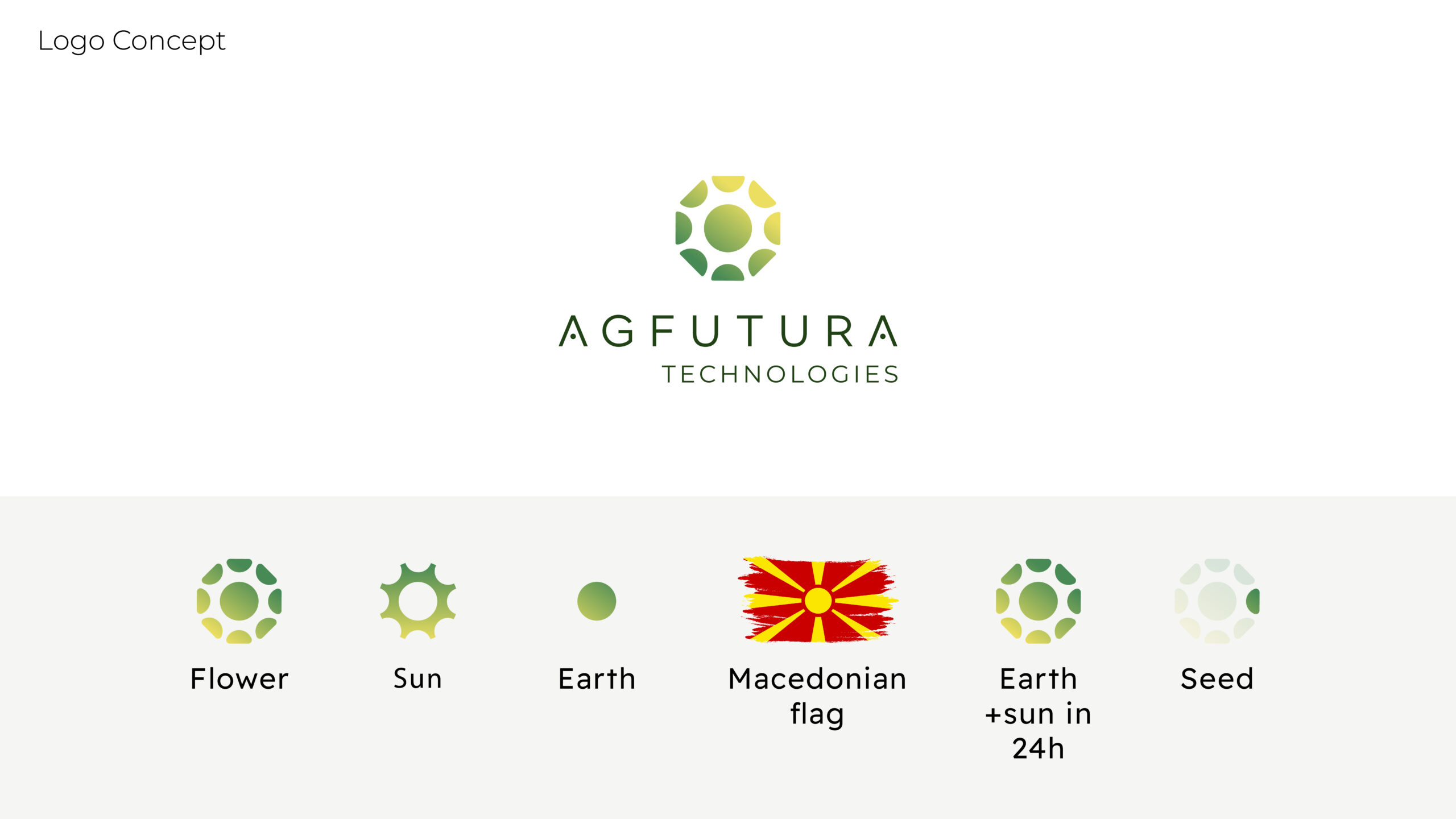
The circular structure gives the logo a sense of continuity and connection. This is important for a company working across agriculture, sustainability, digital systems, and implementation, because the value of the business sits in how different disciplines connect. Agriculture is not treated as a static field or a single product category. It is presented as a living system supported by technology, knowledge, and collaboration.
The internal modular forms suggest growth, leaves, fields, and connected parts without becoming too literal. This helps the mark avoid the common agritech logo problem where the entire identity depends on a generic leaf. A leaf can be appropriate in agriculture branding, but when the company does more complex work, the symbol needs to carry more meaning.
The wordmark uses a clean geometric style that gives the brand a more modern and credible technology presence. This is important because the symbol brings in growth and nature, while the typography adds professionalism, clarity, and structure. Together, the mark and wordmark create a balance between agriculture and technology.
The result is a logo that can work across multiple contexts: website headers, reports, field signage, presentation decks, social media, event booths, merchandise, business cards, and mobile interfaces.
For agritech logo design, that kind of flexibility matters because the logo rarely lives in only one place. It needs to perform across physical, digital, institutional, and commercial environments.
Color Palette: Green Is Not Enough by Itself
Green is an obvious color choice for agritech, agriculture, sustainability, and environmental brands, but green alone is not a strategy. The question is not whether an agritech brand should use green. The better question is what kind of green best represents the company’s position in the market.
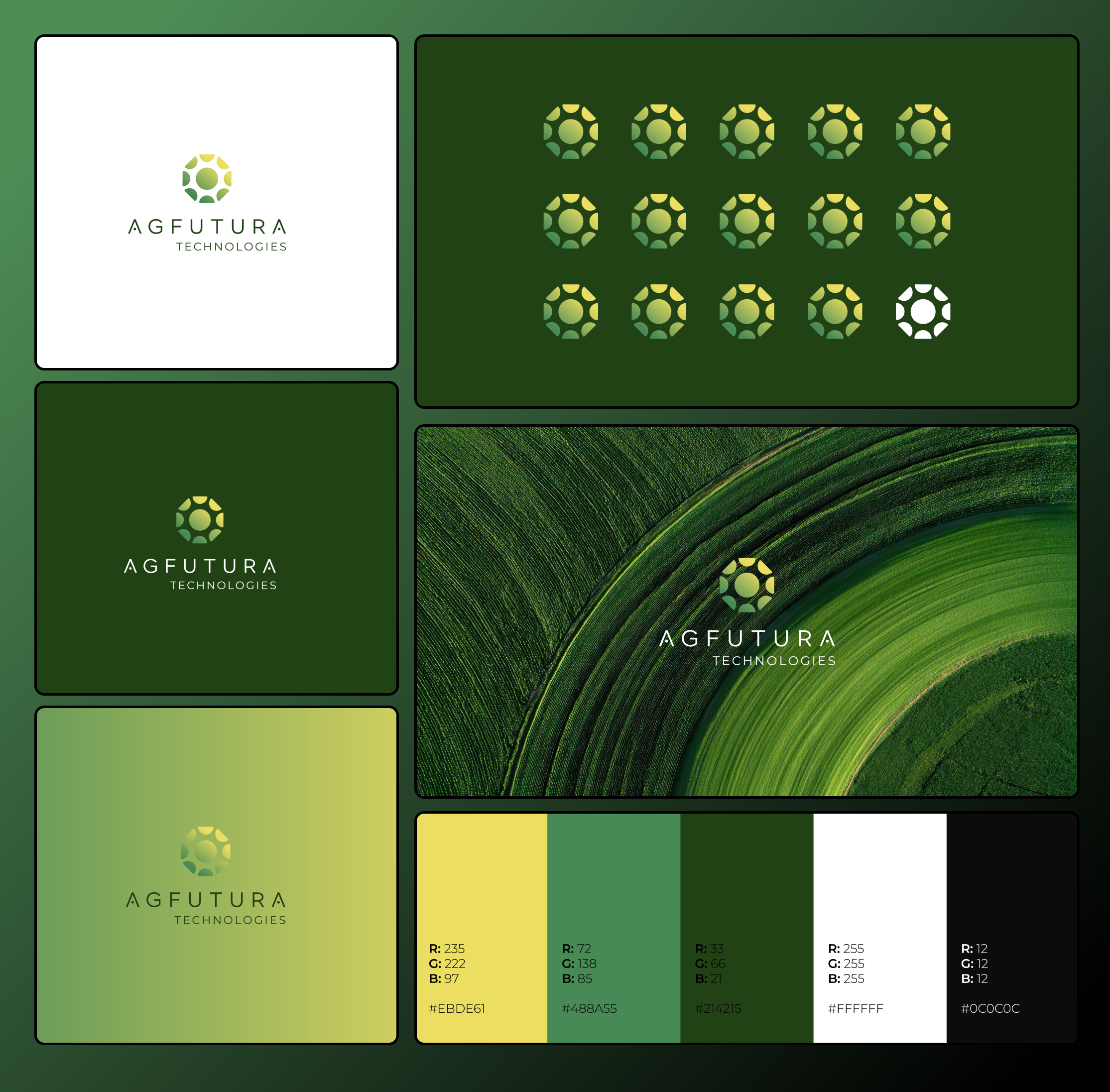
For AGFUTURA Technologies, the color system uses deep forest green, growth green, harvest yellow, light sage, soft gray, and white. Together, these colors create a brand palette that feels fresh, credible, agricultural, and future-focused.
The deep green gives the identity stability, seriousness, and a clear connection to agriculture and the environment. The brighter growth green adds energy and signals innovation, motion, and progress. The harvest yellow introduces sunlight, optimism, and forward movement, which helps the brand avoid feeling too corporate or heavy. Light sage and soft gray support the system by creating calm backgrounds that feel clean and professional across print and digital applications.
The green-to-yellow gradient is especially important because it gives the identity a sense of energy and transition. It reflects growth, sunlight, and movement from idea to implementation. In the context of agritech brand development, this kind of color system helps the brand feel more dynamic than a flat green identity while still staying grounded in agriculture and sustainability.
The palette was designed to work across logo applications, website layouts, reports, brochures, signage, event materials, merchandise, and digital interfaces. This gives the brand consistency while allowing enough flexibility for different types of communication.
Typography: Clarity for a Complex Agritech Brand
Typography plays a bigger role in agritech branding than many companies realize. When a company works across technical, institutional, and field-related environments, the type system has to support clarity, professionalism, and usability.
For AGFUTURA Technologies, the typography direction was designed to feel clean, structured, and readable. The brand needs to explain complex work across agriculture, engineering, digital systems, policy, sustainability, and EU project ecosystems, so the typography cannot be decorative for its own sake. It needs to help the user understand information quickly.
The type system supports hierarchy across website pages, reports, presentations, brochures, signage, and digital product interfaces. Large headlines can communicate strategic messages clearly, while body copy and captions remain readable in more detailed contexts such as reports, project summaries, and institutional documents.
This is important because agritech companies often have to communicate with different types of audiences. A farmer, a researcher, a public institution, a technology partner, and a business development team may all interact with the same brand, but they will not all read it in the same way. A strong typography system helps the brand remain clear across those different contexts.
In the AGFUTURA identity, typography is part of the communication system.
Brand Guidelines: Turning the Logo Into a Complete Visual System
A logo alone is not enough for a company like AGFUTURA Technologies. The identity needed to become a working brand system that could scale across many touchpoints and remain consistent over time.
The brand book covers the core elements of the visual identity, including logo usage, clear space, minimum size, light and dark background applications, icon-only usage, color palette, typography, stationery, print collateral, merchandise, signage, website applications, event booth design, and mobile interface examples.
The purpose of the brand guidelines is not to make the identity feel rigid. The purpose is to make it usable.
For agritech companies, this is especially important because the brand may appear in many practical environments: project proposals, EU documents, field signage, reports, research materials, partner decks, conference booths, mobile tools, dashboards, websites, social media, and business development presentations. Without a clear brand system, those touchpoints can quickly become inconsistent.
The AGFUTURA brand book shows how the identity behaves in real contexts. It demonstrates how the logo appears on business cards, letterheads, envelopes, report covers, presentation folders, notebooks, apparel, caps, tote bags, water bottles, mugs, lanyards, packaging, signage, event booths, website screens, and mobile dashboards.
This matters because potential partners do not experience a brand only through one logo file. They experience the brand through every document, presentation, screen, sign, and touchpoint they encounter.
The guidelines make sure that every touchpoint feels connected to the same company.
Website Design: Making the Agritech Brand Easier to Understand
The website direction extends the identity into a full digital experience. For AGFUTURA Technologies, the website needed to do more than look modern. It needed to explain a complex company clearly.
The homepage centers around the strategic message:
Bringing ideas to market.
This line works because it captures AGFUTURA’s role across the full innovation journey. The company is not only involved in early ideas, research, or strategy. It supports movement from concept through validation, piloting, commercialization, and adoption.
The website hero also communicates the company’s combined expertise across business, engineering, digital, and policy. This helps position AGFUTURA as a multidisciplinary partner rather than a narrow agriculture service provider.
The website also includes strong proof points, such as 40+ projects, 150+ European partners, and a regional focus across the Western Balkans and Europe. These metrics are important because agritech and innovation companies need to show credibility quickly. Visitors need to understand that the company has real activity, real partnerships, and real implementation experience behind the brand.
The navigation structure supports a broader content system, including About Us, What We Do, Products, Thematic Areas, Projects, News and Insights, and Contact. This gives the company room to explain different parts of its work without overloading the homepage.
From a brand development perspective, the website is where the AGFUTURA identity becomes operational. The logo, color palette, typography, field imagery, content structure, and messaging all work together to make the company easier to understand and easier to trust.
That is the real job of an agritech website.
It should not simply decorate the company. It should organize the company.
Brand Applications: Showing the Identity in the Real World
The AGFUTURA brand system was designed to work across real-world applications, not just digital mockups. This is important because agritech companies often need to operate across physical environments, events, documents, field settings, and digital platforms at the same time.
The brand applications include headquarters signage, field signage, event booth materials, website mockups, mobile dashboard examples, stationery, reports, brochures, presentation folders, notebooks, apparel, caps, tote bags, water bottles, mugs, lanyards, visitor badges, and packaging.
Each application plays a different role in the brand system.



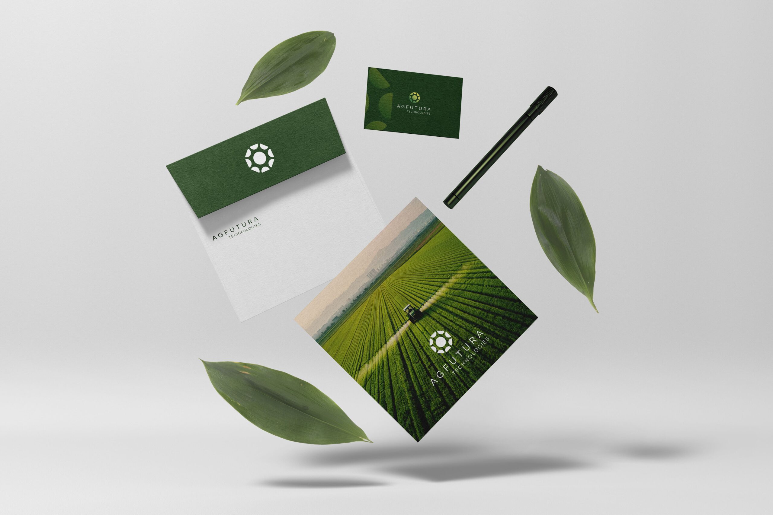
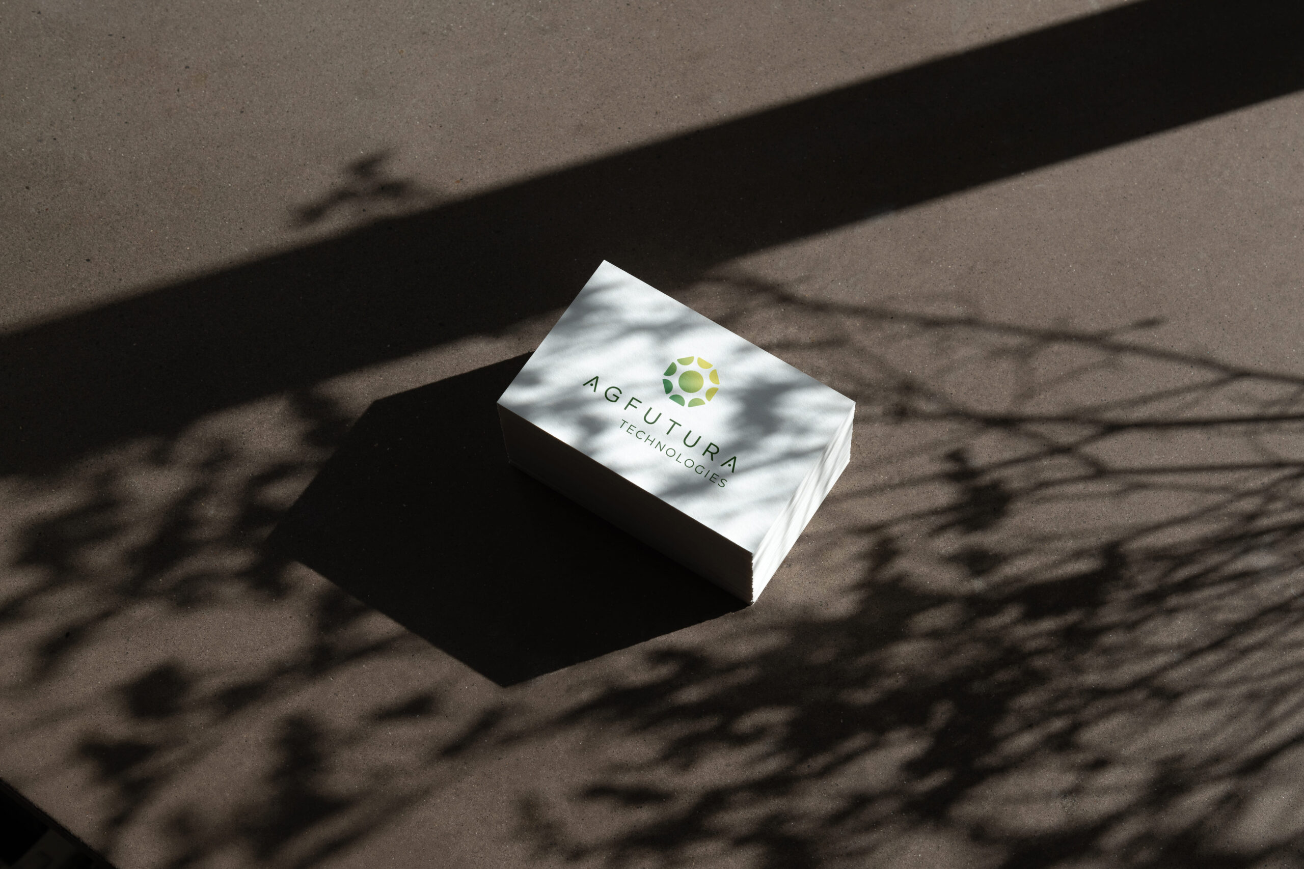
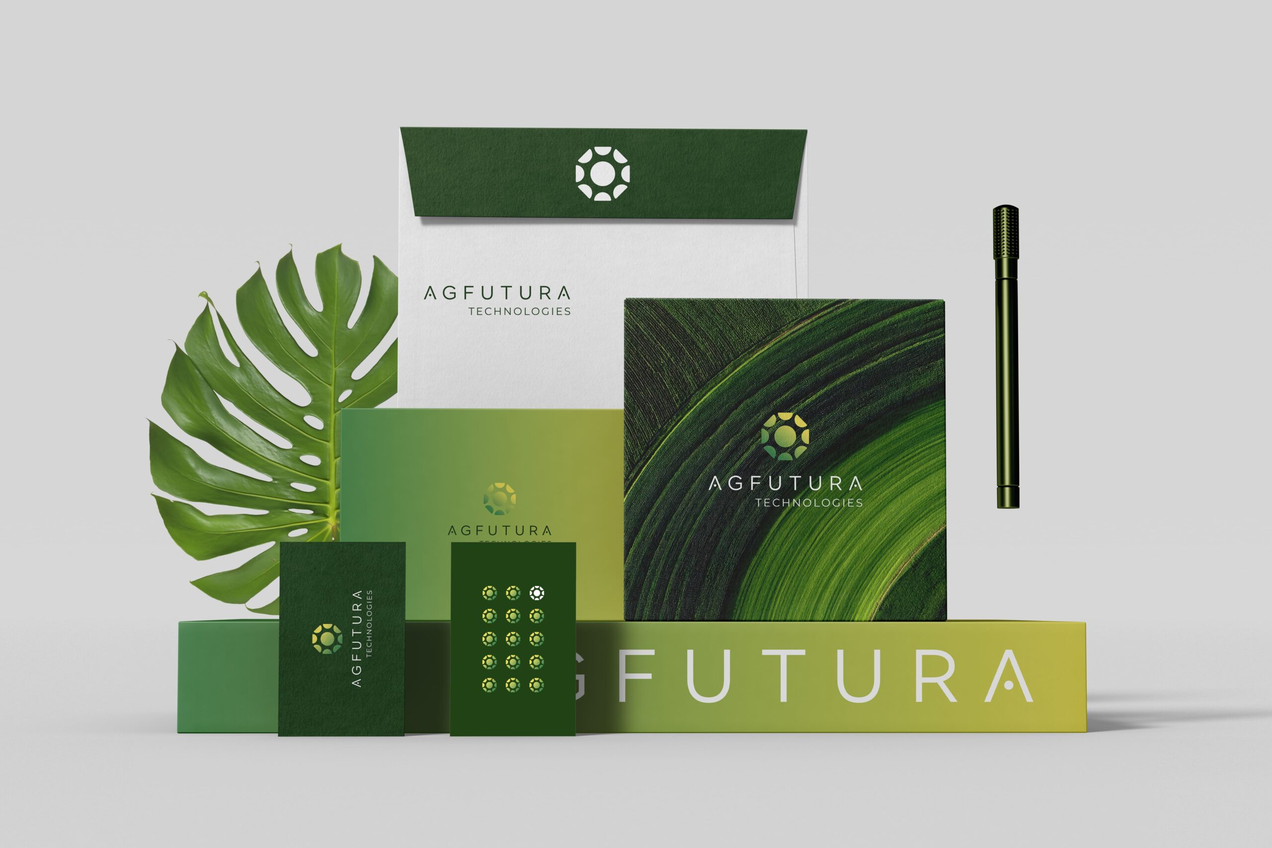
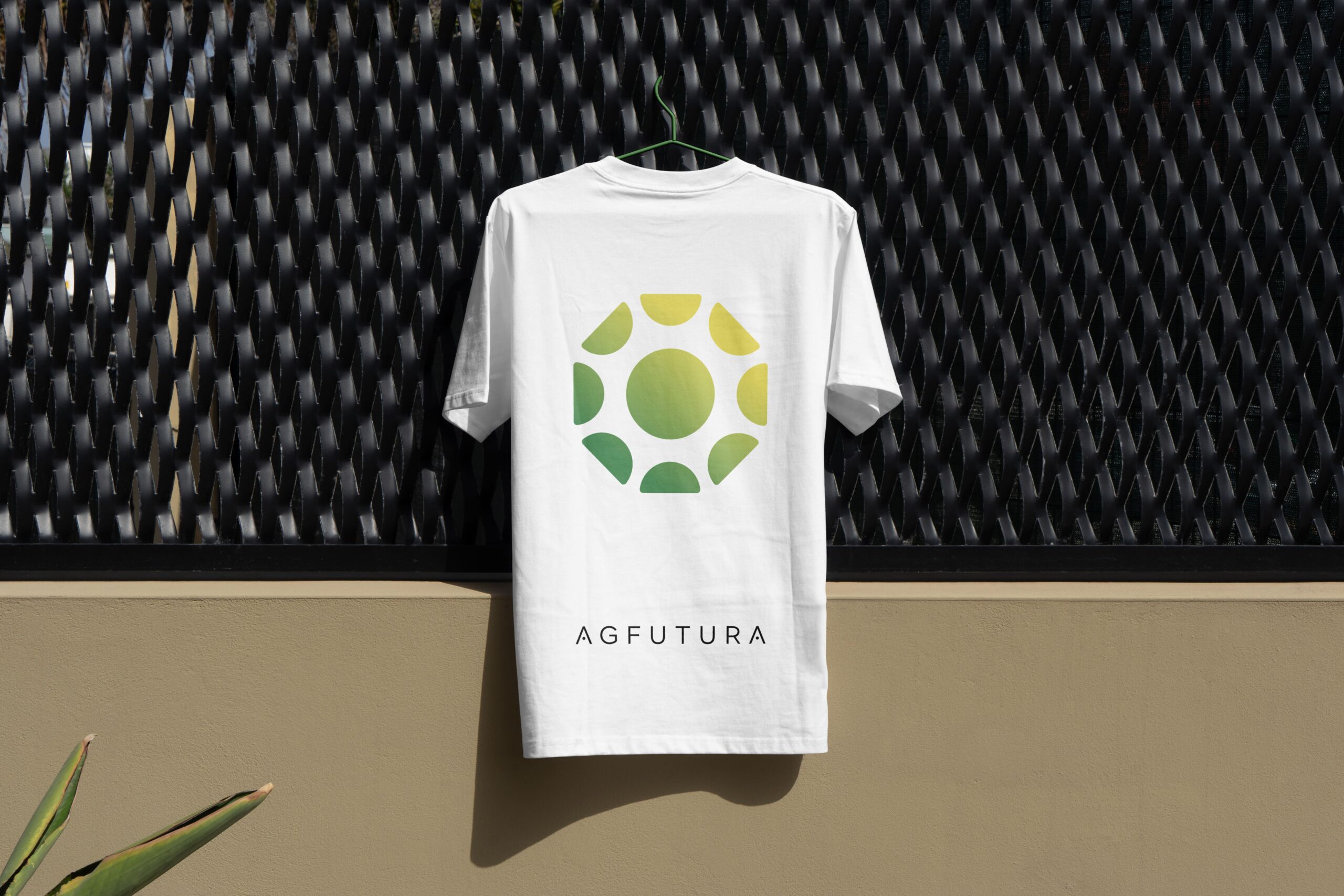

Headquarters signage gives the company a more established and professional presence. Field signage connects the identity to agriculture and implementation. Event booth design helps the brand appear credible in conferences, expos, and partner environments. Stationery and print collateral support institutional and business communication. Merchandise helps the brand feel tangible and recognizable. Website and mobile examples show how the identity performs in digital settings.
This is where a complete agritech brand identity becomes more powerful than a logo alone.
A logo might create recognition, but the brand system creates consistency. Consistency creates trust. Trust supports business development, partnerships, investor conversations, and customer confidence.
For a company working across complex sectors, that consistency matters.
Why Agritech Companies Need Complete Brand Systems
Agritech companies are often complex by nature. They may combine science, field work, technology, sustainability, commercial strategy, research, hardware, software, policy, and partnerships. This complexity can be a strength, but only if the brand makes it understandable.
A weak brand identity can make an advanced company look smaller, less credible, or less focused than it really is. A generic logo can make the company blend into every other green innovation brand. A disconnected website can make the business feel fragmented. Inconsistent collateral can weaken trust before a serious conversation even starts.
A complete brand system solves those problems by creating alignment across every touchpoint.
For agritech companies, strong brand development helps communicate:
What the company does.
Why the work matters.
Who the company serves.
What kind of innovation it represents.
Why partners should trust it.
How the brand behaves across physical and digital environments.
This is why agritech branding should not be treated as surface-level design. It is part of how the company explains itself to the market.
A strong visual identity makes complex work easier to understand. A strong website makes the business easier to navigate. A strong brand book keeps the identity consistent as the company grows.
Together, those elements help the company show up with more confidence.
The Final Result: A Clear Agritech Brand Identity System
The final AGFUTURA Technologies identity brings together logo design, visual identity, brand guidelines, website direction, print collateral, digital applications, signage, merchandise, and real-world brand mockups into one cohesive system.
The brand feels agricultural without becoming rustic. It feels technological without becoming cold. It feels credible enough for institutional and B2B environments, while still remaining connected to field implementation, growth, sustainability, and practical innovation.
The logo establishes the visual foundation. The color palette creates recognition and energy. The typography brings clarity and professionalism. The brand guidelines turn the identity into a scalable system. The website explains the company’s role more clearly. The applications show how the brand can live across real touchpoints.
For AGFUTURA Technologies, the brand identity is not only about looking better. It is about making the company easier to understand, easier to trust, and easier to scale across different audiences and environments.
That is what good agritech brand development should do.
It should help a complex company become clearer without making it smaller.
Building Agritech Brands That Are Easier to Understand and Trust
Agritech companies often do serious work in markets where trust matters. They need to communicate with technical teams, field operators, public institutions, research partners, investors, commercial clients, and project ecosystems. That means the brand identity has to work harder than it does in simpler categories.
At BBDirector, we develop brand identities, logo systems, brand guidelines, websites, pitch materials, and visual storytelling systems for companies working across technology, agriculture, sustainability, innovation, and complex B2B markets.
For companies like AGFUTURA Technologies, the goal is not just to create attractive visuals. The goal is to turn complex work into a clear brand system that people can understand, trust, and remember.
If your agritech company has outgrown its current logo, website, presentation style, or visual identity, the issue may not only be design. It may be a brand clarity problem.
A strong identity system will not do the whole job alone, but it should make every next conversation easier.
That is the point of good brand development.