


1. Helvetica Neue — The Functional Flight Commander
Helvetica Neue is the aerospace industry’s “safe mode.” It’s clean, readable, and compliant—a visual standard in technical documentation and navigation systems.
Why it works: It’s neutral, adaptable, and delivers precision in any environment. Perfect for functional communications.
Why it fails: Overuse leads to invisibility. Everyone from airlines to auditors uses it.
Fix: Pair Helvetica Neue with a strong logo symbol or modern geometric design element to add differentiation.
(See: [Visual Branding: How to Design a Cohesive Brand Identity Across All Platforms])
2. Eurostile — The Retro-Futuristic Wing
Eurostile screams “space age”—the font that once sold humanity on the Jetsons’ future. Its squared-off strokes evoke structure and stability.
Why it works: Eurostile communicates the engineering discipline that aerospace buyers respect.
Why it fails: It can feel stuck in a Cold War-era optimism.
Use it like a vintage aircraft: with reverence and purpose. Great for heritage rebrands or storytelling campaigns that tap into nostalgia.
(See also: [Brand Evolution: How to Keep Your Business Relevant Over Time]
3. Futura — The Geometric Genius
Futura is geometry turned into elegance—each stroke feels engineered with intent.
Why it works: The geometric balance exudes precision and timeless confidence.
Why it fails: Overuse creates sterility; it lacks emotional resonance alone.
Fix: Use Futura for headline typography and data visualization, but pair with a more human secondary typeface.
(See: [The Psychology of Branding: How to Create an Emotional Connection with Customers])
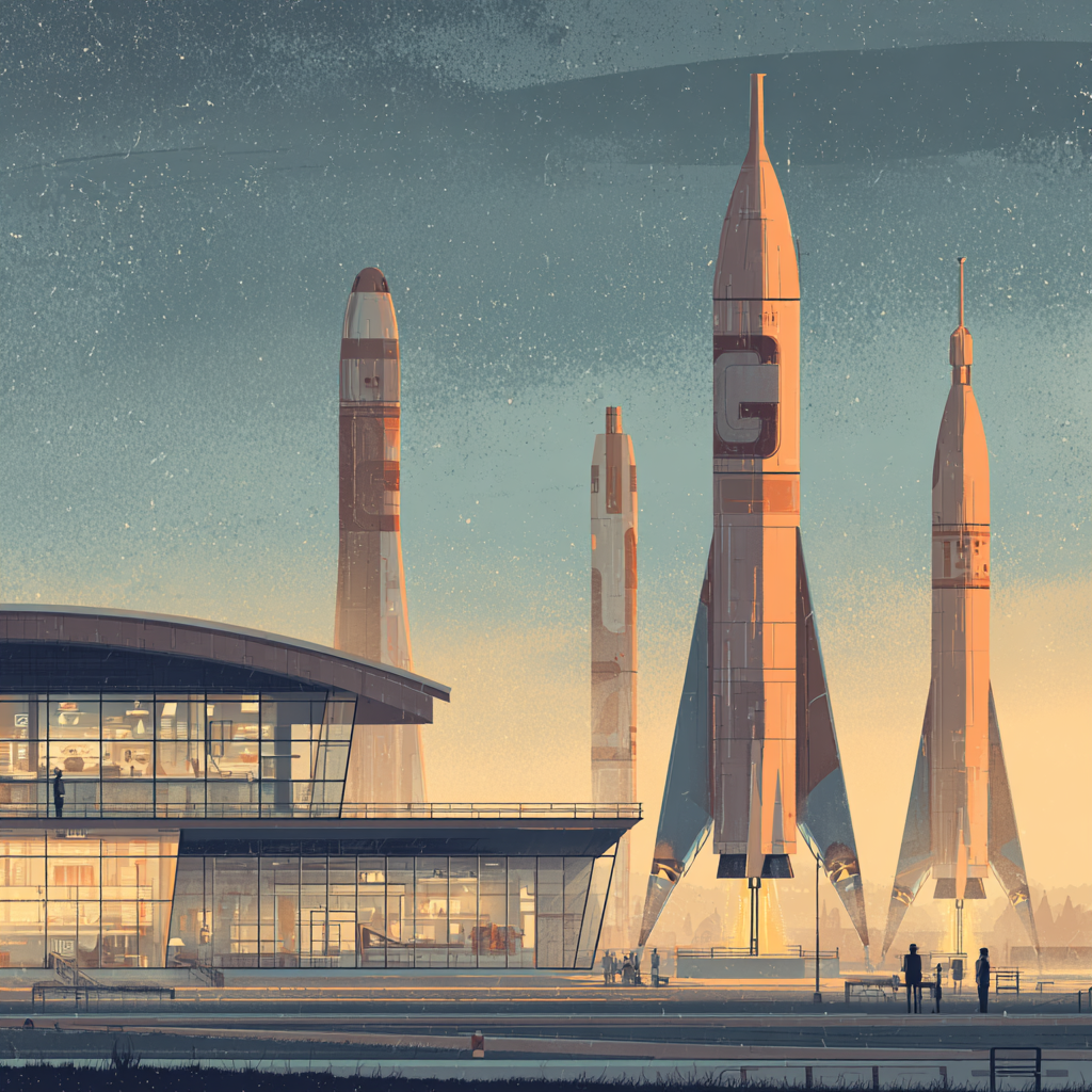
4. Gotham — The Institutional Innovator
Gotham has powered presidential campaigns and NASA’s outreach alike. It’s distinctive, bold, and democratic in tone—exactly what modern aerospace brands need to appear accessible yet powerful.
Why it works: Balances technical strength with human trust.
Why it fails: Risk of looking too corporate or “template” in rebrands.
Fix: Try Gotham Narrow for compact digital UIs, or Gotham Rounded for friendly digital experiences.
(See also: [Brand Positioning Techniques: How to Stand Out in a Saturated Market])
5. Univers — The Modular Technician
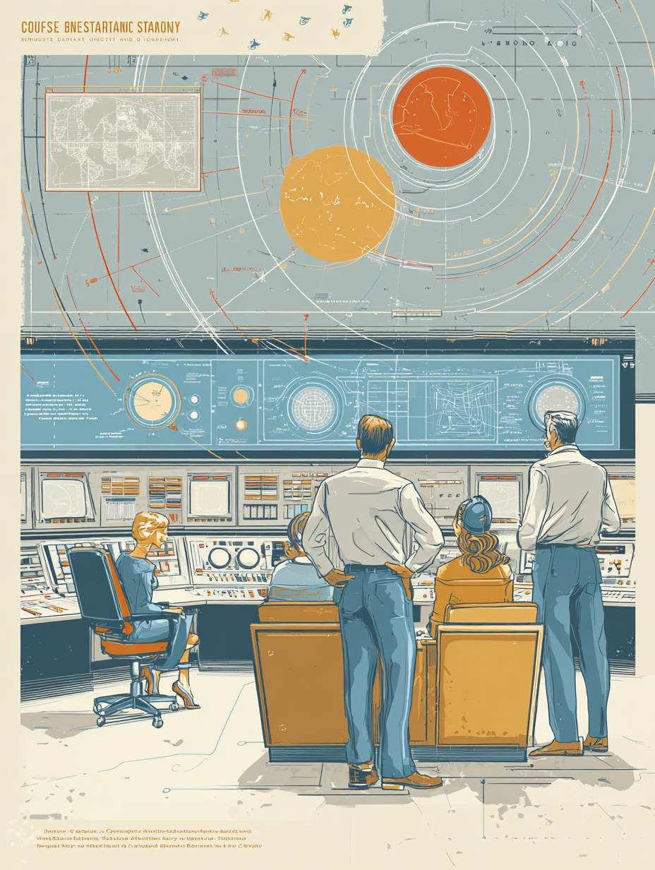
If Helvetica is the autopilot, Univers is the flight manual. It’s a modular, functional, and highly compliant font system designed for order and scalability.
Why it works: Ideal for cockpit screens, dashboards, and technical presentations.
Why it fails: Feels bureaucratic when used in consumer-facing messaging.
Fix: Keep Univers for engineering contexts; use softer sans-serifs elsewhere for brand storytelling.
6. DIN 1451 — The Industrial Minimalist
DIN 1451 was built for legibility in harsh environments—perfect for control panels, labeling, and UI interfaces.
Why it works: It screams precision and clarity, foundational to aerospace trust.
Why it fails: Its cold neutrality can hurt emotional storytelling.
Design Tip: Use DIN for functional labeling, data-heavy dashboards, or airplane schematics—but balance it with more elegant, human fonts in marketing
7. Avenir — The Visionary’s Typeface
Meaning “future,” Avenir fuses precision with warmth. It’s a favorite among designers seeking contemporary professionalism without sterility.
Why it works: Perfect balance between geometric structure and emotional approachability.
Why it fails: Too subtle for commanding branding moments.
Fix: Use Avenir Next for digital applications and investor decks—it’s suitable for aerospace startups defining their brand identity.
(See: [How Brand Clarity Accelerates Investor Confidence in Aerospace Startups])
8. Serif Fonts — The Heritage Pilots
Serif typefaces like Garamond, Freight, or Baskerville still have their flight path. They’re the fonts of legacy, academia, and authority.
Why it works: Great for white papers, thought leadership, and historic storytelling.
Why it fails: Feels outdated in logo designs or UI.
Fix: Limit serif use to print or internal documents. Pair with sans-serif systems for modern cohesion.
9. Custom Typefaces — The Identity Engine
When your technology is one of a kind, your font should be too. Custom typefaces project ownership, confidence, and permanence.
Why it works: Distinguishes your brand from competitors and embeds your philosophy into every letter.
Why it fails: Poor execution or illegibility kills usability.
Fix: Partner with a creative studio experienced in aerospace typography. Test a trial version across digital and print environments.
(See: [How to Create a Brand Style Guide (And Why You Need One)]
10. Comic Sans — The Fatal Crash
You knew this one was coming. Using Comic Sans anywhere in your aerospace presentation or investor briefing is a brand crisis in motion.
Why it fails: Undermines every ounce of engineering authority.
A 2021 MIT Media Lab study found people trust information 30% less when presented in Comic Sans.
Fix: Establish a font governance policy in your brand style guide. Audit every asset for consistency.
(See: [Brand Crisis Management: How to Rebuild Trust After a Reputation Hit])
Key Takeaways
Typography is the unsung co-pilot of your brand strategy. Fonts silently shape how government buyers, investors, and engineers perceive your competence.
- Helvetica and DIN communicate precision and functionality.
- Avenir and Gotham humanize your tech story.
- Futura and Eurostile connect you to aerospace heritage.
- Custom typefaces give you long-term differentiation.
- Consistency is compliance—your brand must look as reliable as it flies.