


If you think color psychology is just a Pinterest board for lifestyle brands, think again.
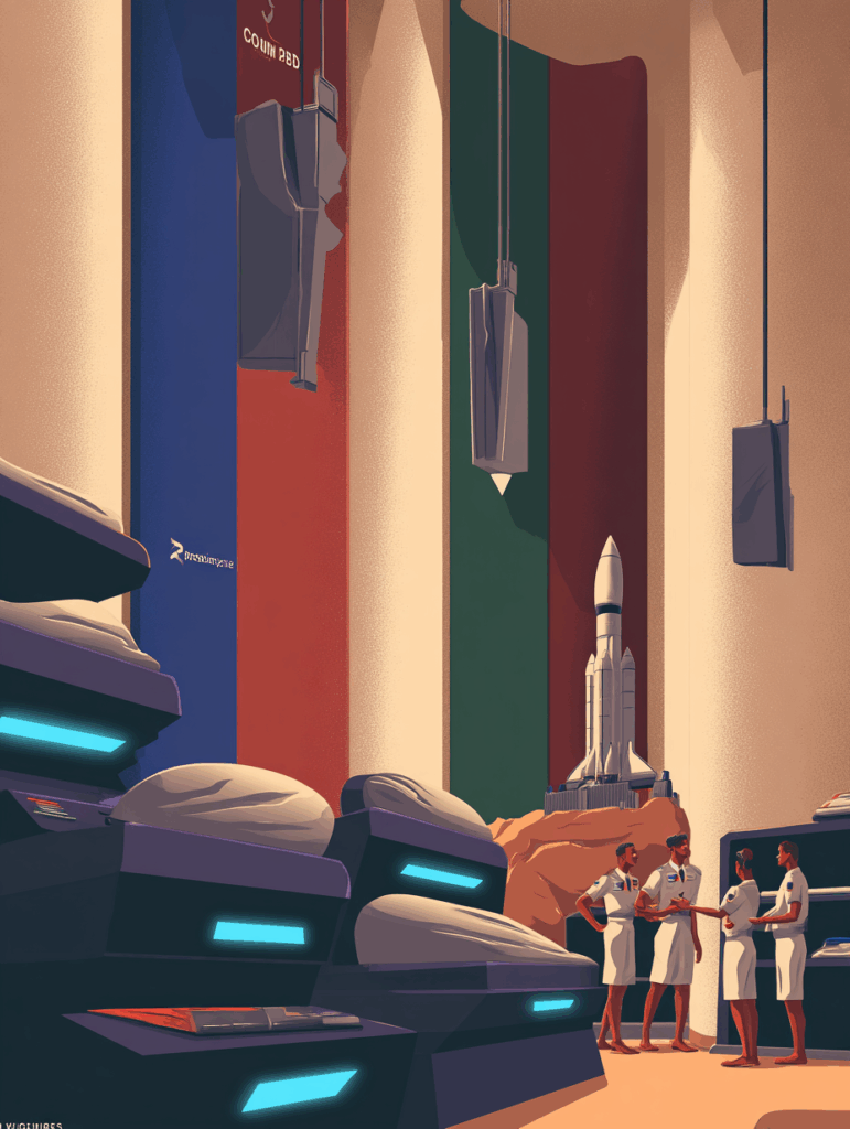
In the defense sector—where billion-dollar contracts hang in the balance—the power of color isn’t decorative. It’s decisive.
When you’re courting Pentagon buyers, foreign defense ministries, or skeptical aerospace investors, how your brand presents visually isn’t just “branding fluff.”
It’s a subtle, constant negotiation of trust, competence, and alignment with mission-critical values.
In other words, color psychology in branding plays a direct role in influencing procurement confidence and public trust.
Still think blue is just “a safe bet”? Consider this: Color can increase brand recognition by up to 80%, and 62–90% of a first impression is based on color alone. Your brand might be capable of launching a hypersonic weapon—but if it shows up in PowerPoint yellow, it’s getting ghosted in Phase 2 reviews.
TL;DR
Color psychology isn’t fluff; it’s frontline strategy. In defense branding, color choices aren’t aesthetic—they signal competence, alignment, and authority. Make the wrong move, and your brand gets dismissed before the specs get read.
1. The Role of Color in Brand Identity: First Looks, Lasting Trust
- Your brand color is the uniform your reputation wears.
- The right color signals operational discipline, alignment with mission scope, and visual cohesion.
- Raytheon’s crimson signals intensity and clarity. Palantir’s grayscale conveys analytical neutrality.
Fix: Audit your brand guidelines to ensure your color palette reflects your brand identity across decks, exhibits, sites, and social. See: Visual Branding: How to Design a Cohesive Brand Identity Across All Platforms
2. Psychology of Color in Branding: Why Blue Means “We Know What We’re Doing”
- Color psychology explains why blue dominates the defense sector: trust, intelligence, and competence.
- NASA, Lockheed Martin, and Boeing—all rely on the deep psychological comfort of blue.
- But this overuse can turn your brand invisible.
Action: Use color variants like slate, indigo, or teal to create distinction while retaining psychological benefits. Related: Typography and Color Psychology: How Design Impacts Your Brand Perception
3. Color Meanings & Brand Personality: What Does Your Palette Say?
- The colors used reflect brand personality as much as language and imagery.
- Green evokes “tactical readiness.” Dark gray? Stealth. Burgundy? Gravitas and aggression.
- Your brand archetype should guide this.
Reference: The Power of Brand Archetypes: Choosing the Right Personality for Your Business
Also see: How to Define Your Brand’s Core Values and Mission Statement
4. Choosing the Right Color for Your Brand: Avoiding the Default Blue Trap
- Blue = safe, but sameness is a liability in a saturated market.
- Anduril’s black-white branding conveys speed, precision, and controlled disruption—blue wouldn’t do that.
- Use color theory and contrast to differentiate in a sea of safety.
Fix: Run a competitor brand audit. Use a color matrix to identify gaps. Start here: Brand Positioning Techniques: How to Stand Out in a Saturated Market
5. Color Affects Brand Perception Across Cultures and Contexts
- Color perception varies globally. Red may signal urgency in the U.S., but hostility in the Middle East.
- Multinational defense brands need regional flexibility without fracturing brand consistency.
Action: Define a flexible brand style guide with alternate region-specific palettes. Related: Brand Consistency Across Divisions: Lessons from Lockheed and Raytheon
6. Using Color Psychology to Build Brand Recognition and Equity
- Your signature color becomes your shortcut to trust.
- DARPA’s deep teal. Thales’ midnight blue. These are mnemonic tools that build brand equity.
Tip: Use the same exact color codes (Pantone/HEX) across print, web, and signage. Read: Brand Equity 101: How to Build and Maintain a Valuable Brand
Key Takeaways
- The psychology of color in branding is not a soft science—it’s a strategic lever.
- Color affects brand perception more than most realize, especially in risk-averse markets like aerospace and defense.
- The right brand color can increase visibility, elevate trust, and even nudge procurement outcomes.
- If your brand blends into the default palette, you’ve already lost half the room before the first slide.
FAQ
Color psychology is the study of how color influences perception and decision-making. In branding, it shapes trust, recognition, and emotional response to a company or product.
In defense, color is shorthand for attributes like security, intelligence, or innovation. Color psychology in branding helps position your brand in the mental category your audience already trusts.
Yes—especially in the early phases of vetting and RFPs. When capabilities are similar, brand perception—subtly influenced by color—can be a tie-breaker.
No. While blue conveys trust, overuse makes it hard to stand out. Consider alternate palettes that align with your archetype and mission. Related: Rebranding Done Right: When, Why, and How to Reinvent Your Brand
Start with a brand strategy workshop. Use research, color theory, and stakeholder interviews to narrow options. Then test with buyers via pitch decks and prototype mockups. See: Build a Comprehensive Brand Strategy: From Identity to Market Domination