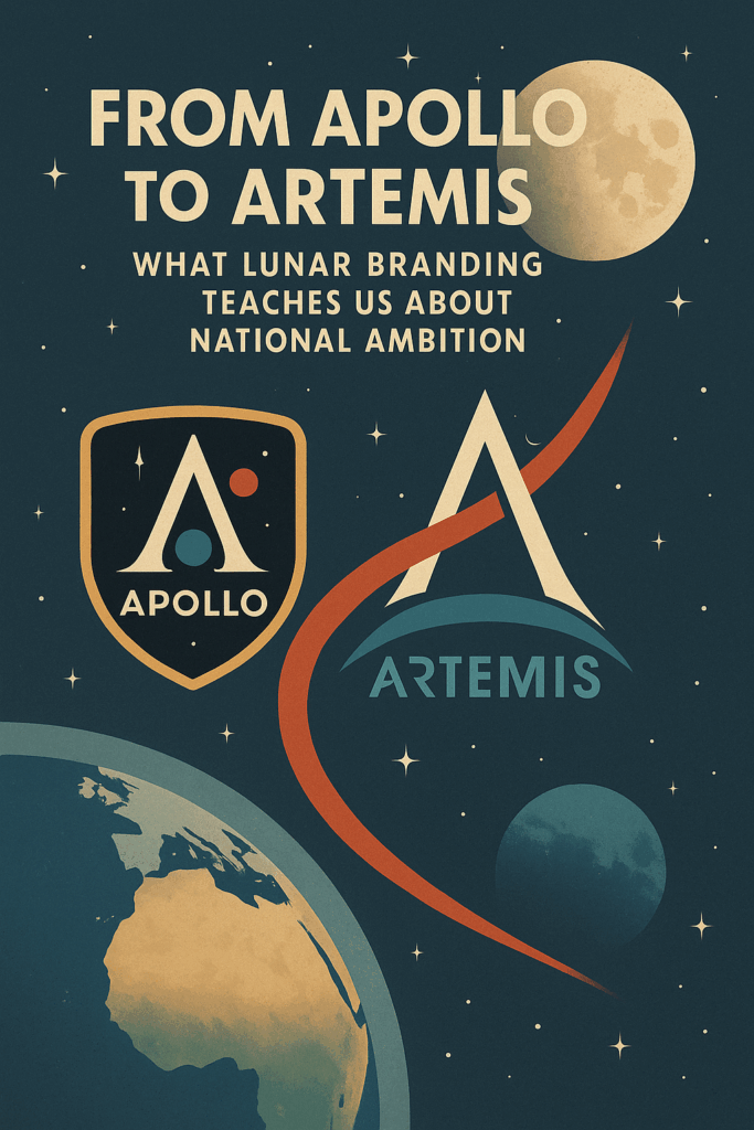


You’ve seen the Artemis logo—a stylized “A” cutting across a lunar arc—and maybe you’ve wondered: why does a moon mission need branding at all?
The answer’s simple—because branding shapes belief, and belief shapes budgets, policy, and purpose.
Just like a pitch deck can win or lose millions in seconds, a mission emblem can make or break public and political momentum.
The Apollo Program didn’t just land on the Moon—it marketed it as a symbol of American dominance. Artemis? It’s NASA’s signal that space exploration is back, inclusive, and more ambitious than ever.
I’m Viktor, a strategist who’s helped brands craft narratives that raise capital, capture imagination, and define futures.
This guide is going to break down how the United States went from planting flags to building orbiting gateways—and why the logos, mission patches, and messaging aren’t just design choices—they’re geopolitical declarations.
If you’re ready to see how lunar branding became a blueprint for national ambition, let’s dive in. This isn’t just about logos. It’s about legacy.
NASA and the Semiotics of Space Exploration
At first glance, NASA might seem like a purely scientific or aerospace organization—tasked with launching rockets, deploying lunar landers, and managing orbiting satellites.
But in reality, NASA is also one of the world’s most effective branding machines. From the Apollo program to today’s Artemis missions, this space agency has mastered the art of symbolism, storytelling, and strategic communication.
Its logos, mission patches, and orbital infrastructure aren’t just visuals—they’re cultural signals that signify ambition, legacy, and leadership.
The Dual Identity: Space Agency and Brand
NASA doesn’t just launch spacecraft—it launches narratives. Every lunar mission, every trajectory from Earth, every rendering of NASA’s Gateway in orbit around the Moon carries with it a carefully constructed message.
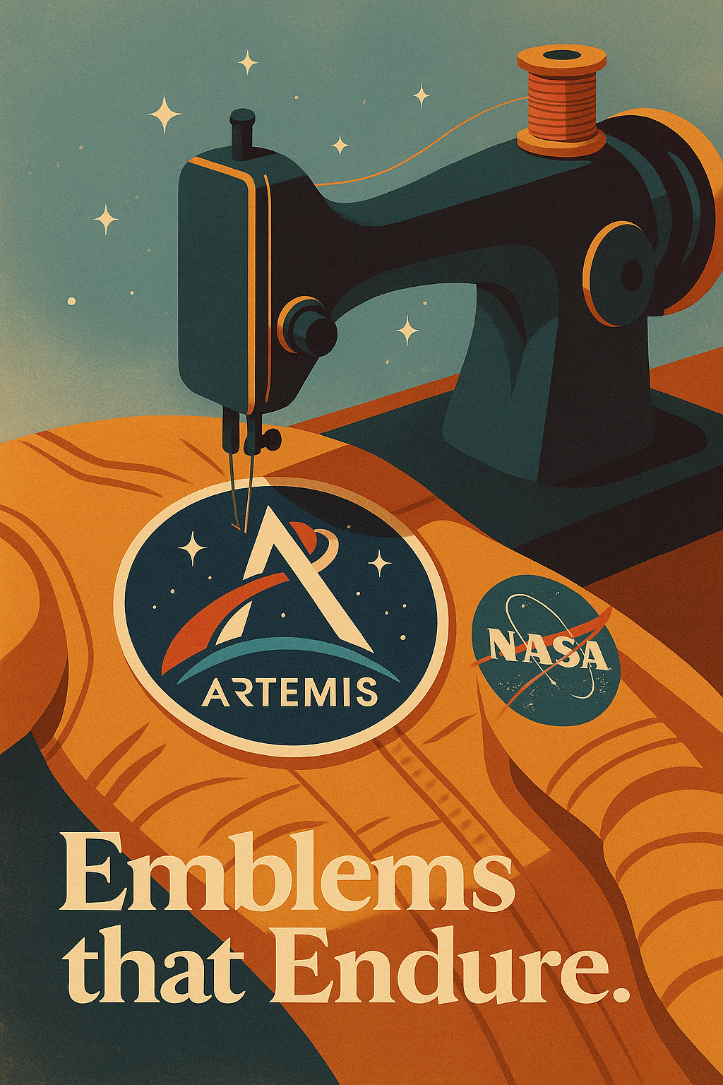
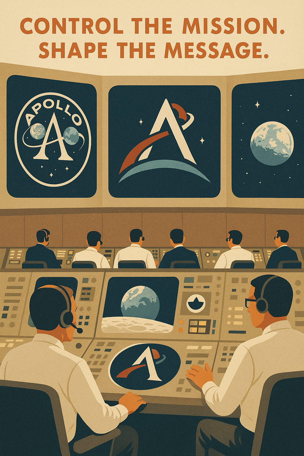
It’s why NASA employees proudly wear mission patches on their sleeves. These emblems are not mere decorations; they’re mnemonic devices that cement a mission’s intent into the public psyche.
Think about the original Apollo program emblem: an eagle landing on the Moon with an olive branch in its talons. That image didn’t just commemorate a successful lunar landing.
It declared peaceful dominance—America’s ability to project power beyond the Earth, without firing a single shot.
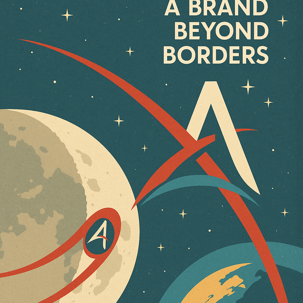
Today, the logo for Artemis, with its stylized “A” cutting through a red arc symbolizing the path from Earth to the Moon and beyond the Moon, draws direct inspiration from the Apollo program while introducing a new vision—one that includes the first woman and first person of color stepping onto the surface of the Moon.
Branding the Mission: Logos, Emblems, and Emotion
Logos are engineered for meaning.
The Artemis program logo, revealed with precise timing, aligns with NASA’s broader plan to deploy a small space station—the Lunar Gateway—and enable sustained missions to the Moon.
This isn’t about a single lunar landing. It’s about establishing a space station in orbit around the Moon as a permanent fixture—a geopolitical stake planted in the vacuum of space.
These branding choices are not coincidental. They’re calculated. NASA understands that the emblem of a mission is what makes it memorable. That’s why visuals like the Orion spacecraft silhouetted against Earth’s curvature or the original Earthrise photo from Apollo 8 still move people today.
These images symbolize more than science—they represent unity, exploration, and a sense of planetary identity.
The Emotional Orbit: Why Visuals Matter
Space visuals hit different. When people see a rocket escape low Earth orbit, watch astronauts float above the Moon’s lunar south pole, or witness renderings of humans returning back to Earth, they’re not just observing—they’re participating.
They feel the stakes. They sense the scale. This emotional resonance is why branding matters more in aerospace than almost anywhere else.
NASA’s semiotics turns abstract scientific milestones into national ambition.
By stylizing the journey from the Earth to the Moon, and casting Artemis as the twin sister of Apollo, the agency isn’t just branding a mission—it’s branding a philosophy: that the U.S. leads not just on Earth, but in orbit, on the Moon, and as a stepping stone for Mars.
Apollo: Cold War Symbolism in a Mission Patch
To understand the Apollo program, you have to understand its context—not just technological, but geopolitical.
The late 1960s weren’t just the golden age of aerospace innovation—they were the height of Cold War rivalry.
When NASA launched its lunar mission to land on the Moon, it was racing for dominance, credibility, and ideological victory. The Moon became the ultimate battleground of symbols—and the Apollo program logo and mission patch became its flag.
Design Breakdown: Earth, Moon, and Myth
The program logo and mission patch encapsulated a mythic scale. It connected Earth to Moon, wrapped in a narrative arc of exploration and destiny.
The emblem didn’t just brand a mission—it branded a movement. It was minimalist yet meaningful. Every line, every curve had narrative weight.
And it worked. The iconography of Apollo has endured for decades. It appears on T-shirts, textbooks, and films—not just as a logo, but as a cultural artifact. It inspired a generation of scientists, engineers, and dreamers. The Moon landing was the physical achievement; the Apollo brand was the ideological victory.
Ideology in Orbit: Branding a Superpower
Apollo’s success was in what it represented.
The U.S. had not only put the first humans on the Moon, but had done so with a narrative that made it feel like a shared victory for humanity—even though it was very much a nationalistic feat.
In reality, the Moon had become a silent platform for ideological confrontation. The U.S. flag was planted, but the image that stuck was Earthrise—a reminder that while this was a triumph for one nation, it symbolized something far greater.
The Apollo emblem mirrored that duality: power wrapped in peace, dominance cloaked in diplomacy.
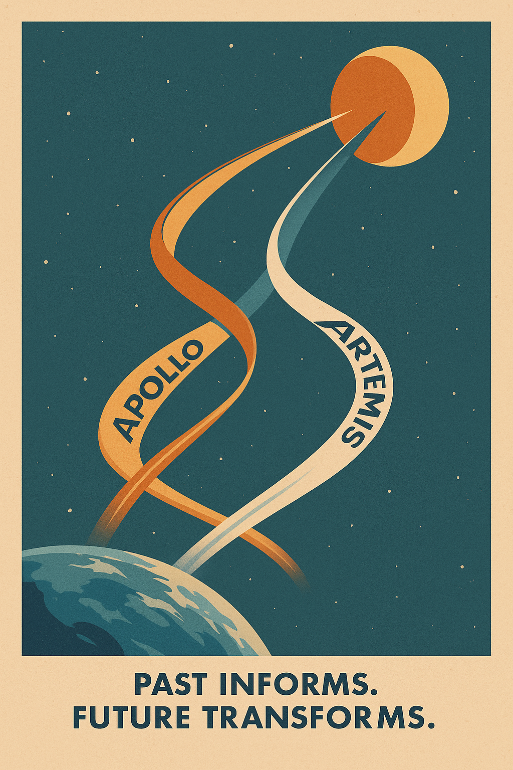
As NASA now returns to the Moon through the Artemis program, it’s no coincidence that the new logo draws inspiration from the Apollo program. Just as Artemis is the mythological twin sister of Apollo, the branding aims to resemble the logo of its predecessor—while updating it for a more inclusive, global mission. The lessons of Project Apollo are not just historical; they’re strategic.
Artemis: A New Brand for a New Era
If Apollo was about winning the race, Artemis is about redefining the journey. As NASA reenters the lunar arena, it’s doing so with a new mission, a new message, and a bold new brand.
The Artemis program is not merely a technical continuation of the Apollo era—it’s a cultural and symbolic reset. This is NASA’s strategic rebranding of space exploration for a more inclusive, cooperative, and future-focused world.
The Mythology of Meaning: The Twin Sister of Apollo
The name Artemis wasn’t chosen randomly. In mythology, Artemis is the goddess of the Moon, the twin sister of Apollo, and a protector of the vulnerable. By naming its newest lunar mission after her, NASA is making a pointed statement: this era of exploration will be different.
It’s not about Cold War victory—it’s about humanity, representation, and sustainability.
Deconstructing the Logo for Artemis
When the logo for Artemis was revealed, it came loaded with semiotic intent. Every line, curve, and color was engineered to signify a leap into a new era.
The stylized “A” reflects both the letterform of “Artemis” and an arrow shooting upward, pointing toward the Moon and beyond.
The red arc slicing across the letter represents the trajectory from Earth to the Moon—a literal and symbolic path of return.
The blue crescent suggests Earth’s presence and support, grounding the mission in our shared planetary identity.
The white stylization evokes the Moon’s surface, tying the logo to its celestial target.
Together, these elements resemble the logo of Apollo while clearly signaling evolution. It’s a design that draws inspiration from the Apollo program but introduces modernity, diversity, and vision.
Infrastructure in Orbit: Branding Through Technology
The Artemis brand is embedded in NASA’s infrastructure.
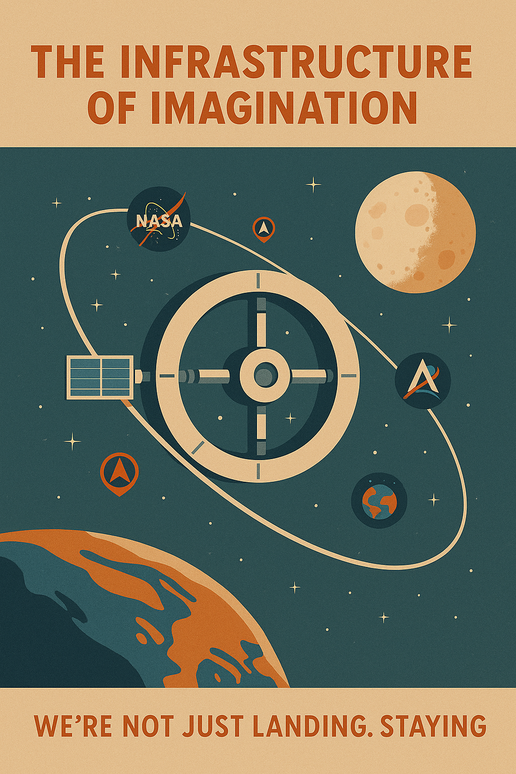
As part of the program, NASA plans to deploy a small space station—the Lunar Gateway—in orbit around the Moon.
This space station in orbit will serve as a launch point for deeper space missions and a destination and a stepping stone for reaching Mars.
By incorporating assets like the Orion spacecraft and the Lunar Gateway into its brand narrative, NASA is extending Artemis beyond a singular event.
The inclusion of these elements in promotional materials, animations, and even public-facing visual identities shows a maturity in NASA’s branding strategy. It’s no longer about singular hero moments—it’s about systems, permanence, and pathways to the future.
Rebranding Lunar Exploration in the 21st Century
NASA previously solicited global partnerships, private sector contributions, and international cooperation for Artemis.
That collaboration is now baked into the brand. Unlike the nationalist overtones of Apollo, Artemis is positioned as a global human achievement—one that will send humans on the Moon again, but with new values, broader inclusion, and a clearer trajectory: way to Mars.
The Emblem as Mission: Designing for Meaning
In the high-stakes world of aerospace and lunar missions, symbols matter. They don’t just represent the mission—they are the mission.
Whether it’s the Apollo program emblem or the logo for Artemis, these designs act as visual anchors for public memory, political messaging, and strategic storytelling. In NASA’s ecosystem, an emblem isn’t just a badge—it’s a brief that blends mythology, national ambition, technological aspiration, and global relevance.
The Semiotic Weight of Emblems
NASA understands the psychology of symbolism. Every lunar mission comes with an emblem because humans need more than facts and figures—we need meaning. These mission patches serve as emotional and intellectual distillations of billion-dollar undertakings. They signify purpose. They humanize complexity.
A Logo Is Never Just a Logo
As branding strategist Rory Sutherland notes in Alchemy, not all value is rational—sometimes it’s symbolic. NASA’s emblems exemplify this principle.
They transform the abstract (like a space station in orbit around the Moon) into something culturally tangible. They turn engineering into mythology.
The Artemis program logo—its upward arc, modern typography, and lunar crescent—doesn’t simply denote a mission; it embodies a new mindset. Where Apollo was a race to plant a flag, Artemis is a vision to deploy a small space station, establish permanence, and prepare for the next phase of interplanetary life. The logo reflects that. It’s aspirational, not adversarial. It invites participation.
Design, Myth, and Narrative Converge
The Apollo emblem was literal: an eagle, Earth, and Moon. It spoke of national triumph. The Artemis logo is layered: it’s mythic (named after the goddess of the Moon), functional (representing the trajectory from Earth), and forward-looking (pointing way to Mars). This is design as strategy—a convergence of identity, mission objective, and myth-making.
This shift reflects a larger branding evolution within NASA. It’s no longer about simply getting to space—it’s about why we go, who we bring, and what we leave behind. The emblem, in this case, becomes a capsule for narrative continuity across decades.
Artemis vs. Apollo: A Shift in Signaling
So what does the change from the Apollo program logo and mission patch to the Artemis logo actually signify? It’s the difference between conquest and construction. Between moment and movement. Apollo was a flag in the dust. Artemis is an outpost in orbit.
Where Apollo drew a line in the Cold War sand, Artemis sketches a path through cislunar space. From low Earth orbit to a space station in orbit around the Moon. From landing on the Moon to building on it. From the “first men” to the first woman, with a timeline pointed at the Moon by 2024 and a vision that stretches far beyond it.
The emblems aren’t just historical markers. They are cultural tools. They help NASA control the narrative—and the perception—of American leadership in space.
Orbit, Gateway, and the Art of Infrastructure Branding
When most people think of a lunar mission, they picture astronauts planting flags and walking across the dusty surface of the Moon. But Artemis changes the narrative. It isn’t just about where NASA plans to land on the Moon—it’s about what they intend to build in orbit around it. At the heart of this vision lies the Lunar Gateway, the Orion spacecraft, and a broader infrastructure strategy that redefines what national presence in space actually looks like.
Beyond Landing: The Branding of Infrastructure
With Artemis, NASA has shifted from momentary conquest to lasting construction.
It signifies permanence, resilience, and long-term leadership. Unlike Apollo’s brief visits, Artemis aims to deploy a modular hub in cislunar space—one that serves as a stepping stone to Mars and a base for future missions beyond the Moon.
Just as the International Space Station once symbolized peaceful cooperation in low Earth orbit, the Gateway now marks America’s commitment to deep space. And critically, it does so visibly.
Visual Storytelling in Orbit
Renderings of the Orion spacecraft docking with the Gateway are frequently used in public-facing materials.
These visuals reinforce the message: Artemis is a revolution in how space presence is maintained.
Every diagram, every animation of orbit-to-surface transitions, supports a larger brand promise. This mission isn’t just about reaching a destination. It’s about controlling the infrastructure that makes sustained presence possible. That’s a powerful message in the era of multipolar space ambitions.
Permanent Presence, Visualized
The concept of a small space station in orbit carries symbolic weight. It changes the narrative from one of flags and footprints to one of hubs and highways. With Artemis, NASA is branding not just a mission, but a permanent trajectory from Earth to the Moon—and eventually, way to Mars. The Lunar Gateway becomes the literal and figurative bridge to the next frontier.
This rebranding extends the value of Artemis far beyond its mission patches or logos. It emblematizes capability—flexibility, modularity, and foresight. And just like the Apollo emblem once embodied ambition in the Cold War, today’s infrastructure branding signals a nation positioning itself as the architect of humanity’s extraterrestrial future.

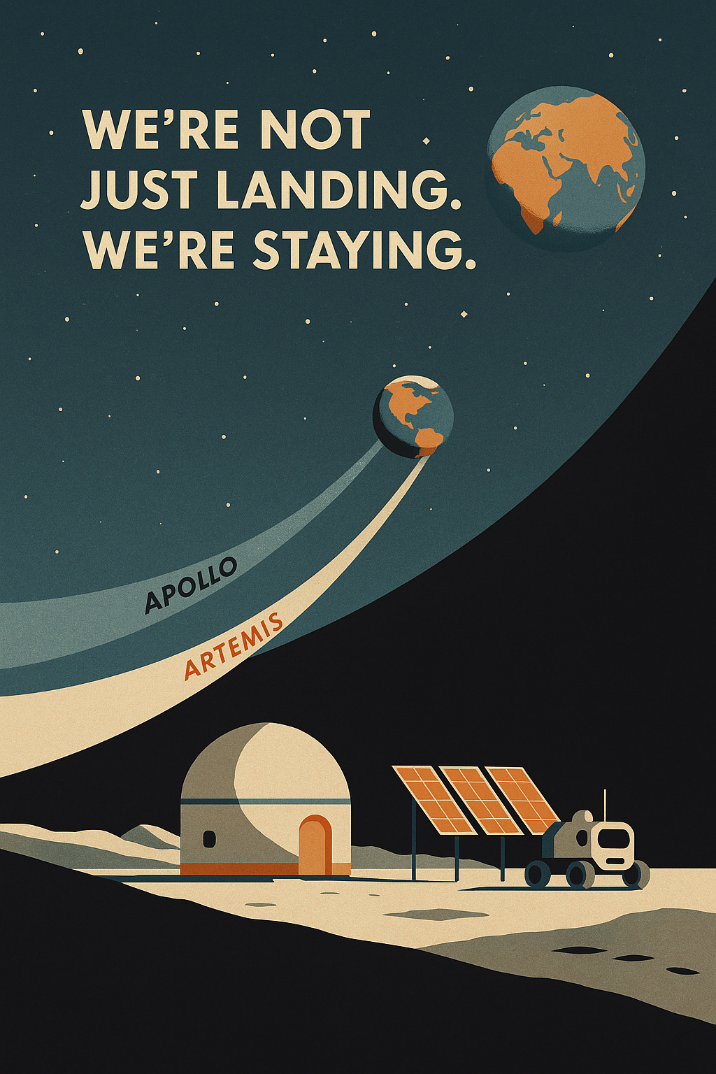
From “Land on the Moon” to “Base on the Moon”
The phrase “land on the Moon” once symbolized the pinnacle of human achievement. With Apollo, it was about flags, footprints, and a fleeting moment that echoed through Cold War history. But Artemis flips the script. Now, NASA’s objective isn’t just to land on the Moon—it’s to stay there. It’s not about winning a race. It’s about building a new category: permanent presence.
This isn’t just a tactical shift. It’s a branding masterstroke.
The New Lunar Land: Infrastructure as Strategy
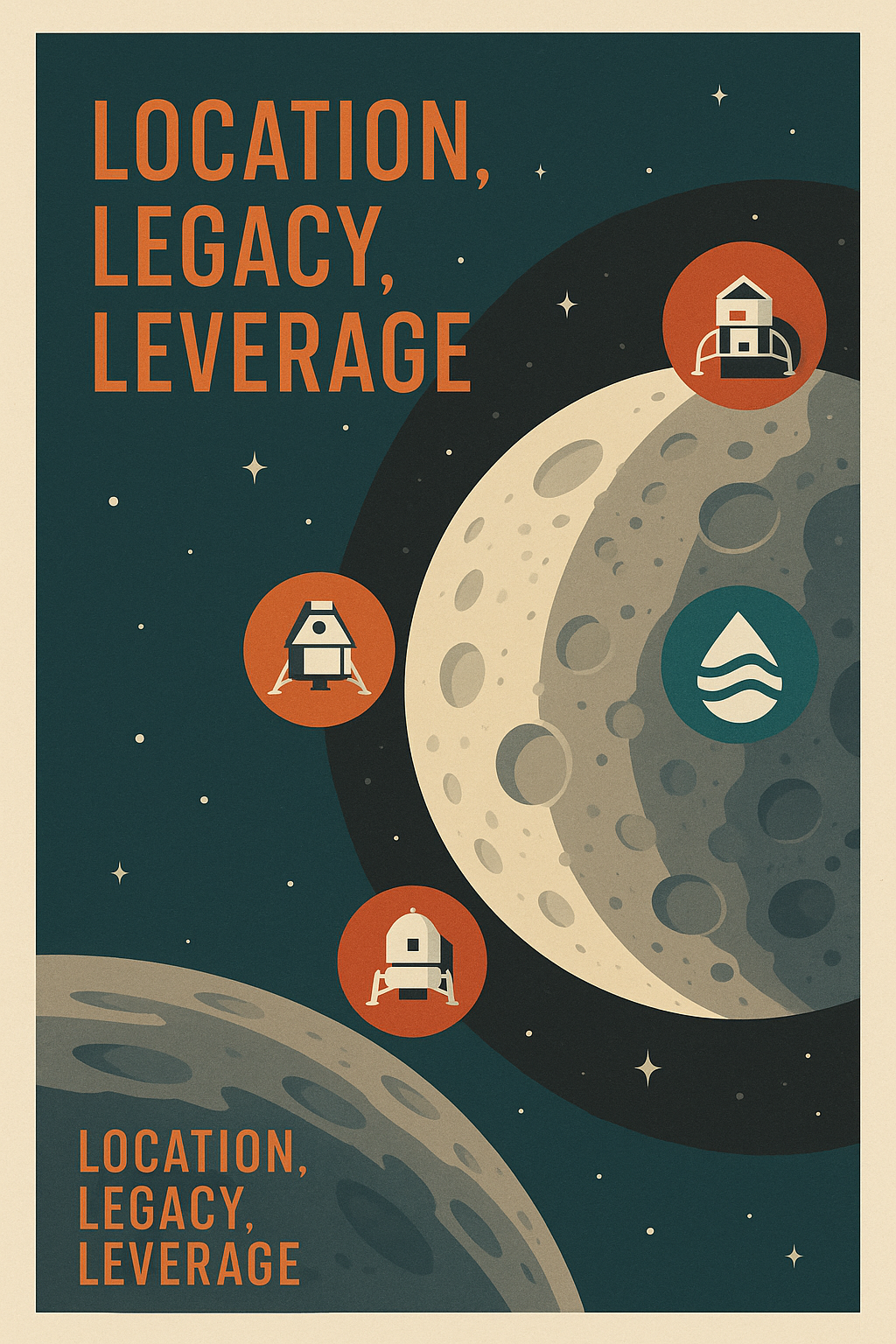
Enter the lunar lander, no longer just a descent vehicle but a tool of territorial permanence. With Artemis, each landing is designed not for glory, but for groundwork. The mission aims to establish a series of sustainable assets—including lunar habitats, mobile rovers, and power systems—that can evolve into a base on the Moon. The Moon is no longer a destination. It’s a destination and a stepping stone—one that points clearly toward Mars.
And where will NASA plant its flag this time? Not in the Moon’s equatorial zone like Apollo—but at the lunar south pole. This is a calculated branding decision. The south pole is thought to harbor water ice—an essential resource for long-term survival and fuel production. In branding terms, it’s the difference between visiting a place and investing in it. It’s about owning the high ground in a new extraterrestrial economy.
Flags Are Easy. Bases Are Strategy.
By moving from short-term landings to long-term infrastructure, NASA is shifting its narrative from episodic success to enduring leadership.
This aligns with the core principles in Peter Thiel’s Zero to One: don’t compete in existing markets—create a new one.
This is also a clear application of Blue Ocean Strategy. Instead of battling over legacy space race narratives (a red ocean of nationalism and competition), Artemis sails into a new, uncharted market: orbital permanence and lunar logistics. NASA is branding not just the Moon’s surface—but the pipeline that connects Earth, orbit, and beyond the Moon.
Soft Power on a Hard Surface
A base on the Moon does more than expand scientific frontiers—it expands influence. In geopolitical terms, it’s a soft power move on a hard surface. Visibility is key. Every lunar relay, every orbital asset, every piece of infrastructure becomes a node in a network of influence. The lunar south pole becomes a branded beacon—of capability, of continuity, of control.
The Moon is no longer a dead rock. It’s branded real estate. And whoever builds the first base defines the rules of engagement for space in the 21st century.
Branding Beyond Borders: Artemis as Global PR
While Apollo was a distinctly American achievement—emblematic of Cold War triumph—NASA’s Artemis program is intentionally multinational.
It isn’t just about reclaiming leadership in space—it’s about redefining it. Artemis represents a strategic shift from space race to space diplomacy, from national pride to missions from humanity’s perspective. It’s branding on a planetary scale.
From National Glory to Global Story
Artemis isn’t pitched as “America’s return to the Moon.” It’s sold as “humanity’s return.” And that phrasing is no accident. It broadens buy-in. It attracts international funding, partnerships, and political goodwill.
This is how NASA positions itself not just as a space agency, but as a coalition leader for the future of space exploration.
Through partnerships with the European Space Agency (ESA), JAXA (Japan), and CSA (Canada), NASA embeds brand unity into its infrastructure. The space station in orbit around the Moon—the Lunar Gateway—will have modules and technologies contributed by these nations. This isn’t outsourcing—it’s branding shared ownership.
Moon to Mars: A Campaign, Not Just a Timeline
“Moon to Mars” isn’t just a project scope. It’s a campaign slogan—a rallying cry that transcends borders. In branding terms, it’s the bridge between nostalgia and aspiration. The Moon links us to the legacy of Apollo. Mars points to the unknown frontier. Together, they position Artemis as both historical continuation and future vision.
This campaign format lets NASA signify progress in stages. Each launch, orbit, and landing becomes a milestone in a much larger public narrative. That’s how you sustain attention across decades—not just with rockets, but with meaning.
Emotional Branding for Every Stakeholder
NASA’s Artemis brand is engineered to resonate on multiple levels:
Public: Artemis is mythic, inclusive, and emotionally charged. It invites everyone to see themselves in the mission.
Scientific: It promotes sustainable infrastructure, deeper planetary research, and international collaboration.
Political: It reinforces soft power and diplomatic leadership while creating economic opportunities in aerospace industries.
This emotional branding strategy echoes the work of great marketers—making a technical mission feel like a shared human destiny. Artemis is no longer just NASA’s. It belongs to all of us.
By building a brand that transcends national borders, Artemis secures not just funding, but faith. And in space exploration, that’s the real fuel.
National Ambition Through Logos and Language
From Apollo to Artemis, NASA has mastered the art of encoding national vision into emblems, slogans, and mission names that resonate far beyond the technical community.
These aren’t just branding elements—they are cultural touchstones and political tools.
From “We Can” to “We Must”
The Apollo program was born in the crucible of the Cold War. Its emblem—the eagle carrying an olive branch—signified peace through strength. Its tagline, though unwritten, was clear: “We can land on the Moon.” It was a declaration of possibility, backed by urgency.
Artemis, by contrast, isn’t about proving capability—it’s about demonstrating responsibility. The mission language has shifted from triumph to stewardship: “We must return to the Moon,” not as tourists, but as tenants—sustainably, inclusively, and permanently. Where Apollo says, “Look what we achieved,” Artemis says, “This is the path forward.” It’s about legacy-building, not legacy-proving.
This transition mirrors the shift from short-term conquest to long-term infrastructure. From planting a flag to deploying a small space station in orbit around the Moon. From singular moments to generational movements.
Branding as Political Signaling
NASA’s branding is never apolitical. Every mission patch, every logo for Artemis, carries political signaling. It tells Congress, international allies, and the general public what to expect—and why it matters.
By positioning Artemis not just as another lunar mission, but as a “path to Mars,” NASA signals intergenerational investment. The brand commits to continuity across presidencies, economies, and shifting global dynamics. It’s not just about the surface of the Moon—it’s about building the pipeline from Earth to the Moon and beyond.
This is where design, language, and policy intersect. NASA’s Artemis logo becomes both a call to action and a contract with the future.
Continuity with Agility: The NASA Brand
Few organizations have maintained brand strength like NASA. Its identity is built on dual principles: continuity (an enduring vision for human spaceflight) and agility (adapting to new political, technological, and cultural realities).
The transition from the Apollo program emblem to the Artemis logo is a case study in brand evolution. Both resemble the logo of their time, both speak to national identity—but only Artemis speaks to the collective future. It is as much about infrastructure as it is about inspiration.
In this way, the NASA brand does what every great national symbol should: it connects generations, invites global participation, and signifies more than just missions. It stands for meaning.
Lessons for Brands Here on Earth
NASA might operate in the vacuum of space, but its branding offers Earth-bound businesses a masterclass in narrative economics, semiotic precision, and long-term strategic vision. Whether you’re running a tech startup, launching a new consumer product, or managing a global enterprise, the way NASA signifies its missions offers deep insight into how brands can position themselves for both cultural relevance and competitive advantage.
1. Myth + Modernity: Build Legacy with Vision
The Apollo program drew on ancient mythology to signify American exceptionalism in the Cold War era. With Artemis—named after the twin sister of Apollo—NASA modernizes that myth to reflect current values: diversity, continuity, and progress. This blend of ancient symbolism and futuristic ambition makes the brand both timeless and timely.
Lesson: Fuse your brand’s origin story with a forward-facing vision. Mythical frameworks give meaning. Modern relevance gives motion.
2. Visual Continuity: Design is Strategy
From the Apollo program emblem to the logo for Artemis, NASA has maintained a visual lineage that balances legacy with innovation. Each emblem isn’t just decoration—it’s documentation. It connects missions across decades, creating a shared symbolic language for all stakeholders, from NASA employees to global citizens.
Lesson: Design isn’t just aesthetics—it’s strategic continuity. Your logo, typeface, and color palette should be able to evolve without losing coherence. Visual memory fuels brand loyalty.
3. Inclusivity as a Competitive Advantage
Artemis proudly foregrounds the first woman and the first person of color to land on the Moon. That’s not just a progressive milestone—it’s positioning. NASA is branding inclusion as innovation and reengineering its cultural appeal for a broader, younger, global audience.
Lesson: Inclusivity isn’t a side note. It’s a growth engine. Let your brand reflect the world you want to lead—not just the market you want to serve.
4. Strategic Narrative: From Orbit to Ownership
With Artemis, NASA shifts from episodic storytelling (land on the Moon) to architectural storytelling (deploy a small space station, build infrastructure in orbit around the moon). This isn’t just a mission—it’s a strategic system with multiple nodes of engagement: the Orion spacecraft, the Lunar Gateway, the path to Mars.
Lesson: Don’t sell a product. Tell a system. The best brands create narrative ecosystems that evolve, expand, and inspire sustained attention.
5. Space Branding Reflects Earth Realities
NASA’s lunar mission branding is a mirror for earthly concerns: climate, equity, cooperation, and innovation. The agency’s ability to make orbit, space stations, and abstract infrastructure emotionally engaging is a high-stakes branding achievement.
Lesson: Even in technical or niche industries, emotion drives connection. Use narrative to translate your complexity into clarity, and your clarity into conviction.
6. Mental Models in Action
NASA deploys multiple cognitive frameworks that brands should study:
Signaling: Artemis signals moral and strategic leadership.
Critical Mass: International partners and public support create inertia.
Narrative Economics: The Artemis story drives both funding and fascination.
Lesson: Embed mental models in your strategic thinking. Great branding isn’t just storytelling—it’s structured thinking wrapped in a story.
Branding Our Way to the Stars
The Artemis program is a masterclass in strategic branding. Every emblem, every logo for Artemis, every mission patch and campaign slogan is designed to signify more than just technical milestones. They communicate intent, assert continuity, and unify identity—across generations, across nations, and across the vastness of space.
This isn’t about aesthetics. It’s about alignment.
From the Apollo program, which achieved a Cold War-era miracle, to Artemis’s inclusive return to the surface of the Moon, NASA has used symbolism not just to inspire, but to persuade. The modern space agency doesn’t just launch rockets—it launches narratives.
Today’s lunar branding tells a story that goes far beyond planting flags. It’s about establishing presence: orbit around the Moon, deploying a small space station in orbit, and laying the groundwork for the path to Mars. Artemis signals that humanity is not simply visiting space—we are starting to belong there.
And that’s the final insight: the true power of aerospace branding isn’t just to show what we’ve done—it’s to shape what we believe we can do next.