


You’ve got a branding challenge that’s bigger than just colors, logos, or taglines—it’s about cutting through noise and making the world feel something.
But here’s the catch: most brands today play it safe.
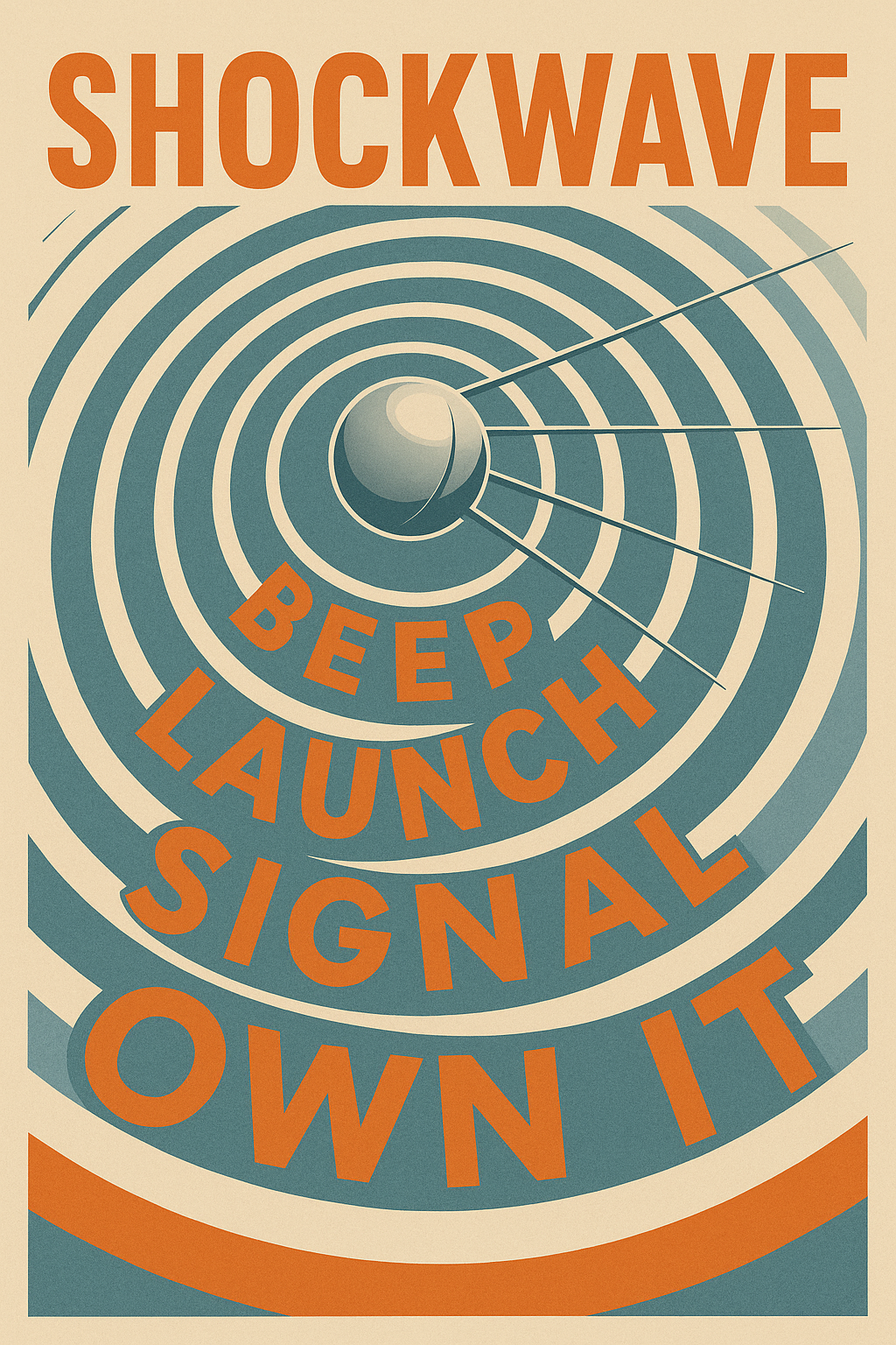
They wait for the right moment, over-engineer every message, and in doing so, miss their chance to lead. Sputnik didn’t wait.
In 1957, a silver sphere the size of a beach ball rocketed into Earth’s orbit—and with it, the Soviet Union launched more than a satellite.
They launched a narrative. A shockwave. A brand. One that bypassed logic and hit straight at global perception. The world didn’t need a press release. The beep was enough.
The truth? If your brand doesn’t spark emotional gravity like that—if it doesn’t own the moment and the meaning—it won’t last. I’m Viktor, a strategist with over a decade in building market-defining brands and business plans that have helped secure over half a billion in funding. This article isn’t just a Cold War history lesson—it’s a masterclass in bold brand strategy.
We’re going to unpack how Sputnik became one of the most iconic—and unintentional—branding moves in history, and how you can use those same strategic signals to craft a brand that’s impossible to ignore. Ready to launch? Let’s go.
“The Right Brand Identity Can Add Zeros to Your Revenue.
The Satellite That Launched a Global Narrative
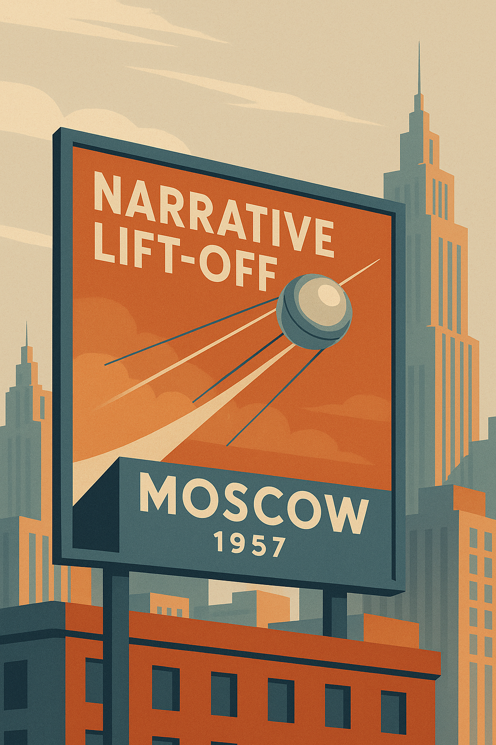
On October 4, 1957, a polished metal sphere no bigger than a yoga ball streaked into orbit and began broadcasting a rhythmic “beep… beep… beep.” That sound didn’t just come from a satellite—it came from Moscow, and it struck deep into the hearts of Americans.
This was Sputnik I, the first artificial satellite to orbit Earth, and the beginning of the Sputnik program—a Russian branding masterstroke disguised as a scientific achievement.
Though the word “brand” rarely enters Cold War textbooks, Sputnik was precisely that: a brand experience. And it launched with precision.
A Shockwave in the Sky
The world was entrenched in Cold War paranoia, a geopolitical standoff between the United States and the Soviet Union. But until that moment, dominance was mostly measured in troop counts, nuclear stockpiles, and rhetoric. Sputnik changed the battlefield—it moved the conflict into space, and into culture.
Within hours of the launch, global media scrambled to cover the event. Headlines like “Russians Put Satellite in Orbit” and “Space Age Begins” swept across front pages from New York to Tokyo. Radio stations played the eerie “beep-beep” over airwaves as proof that the USSR was now above them—literally and psychologically.
The brand impact was immediate. The Soviet Union was no longer just a communist state—it was a visionary design force, capable of beating the West in the race to space. Sputnik I wasn’t just a satellite. It was a Russian brand signal launched with the clarity of a missile.
Design as Signal
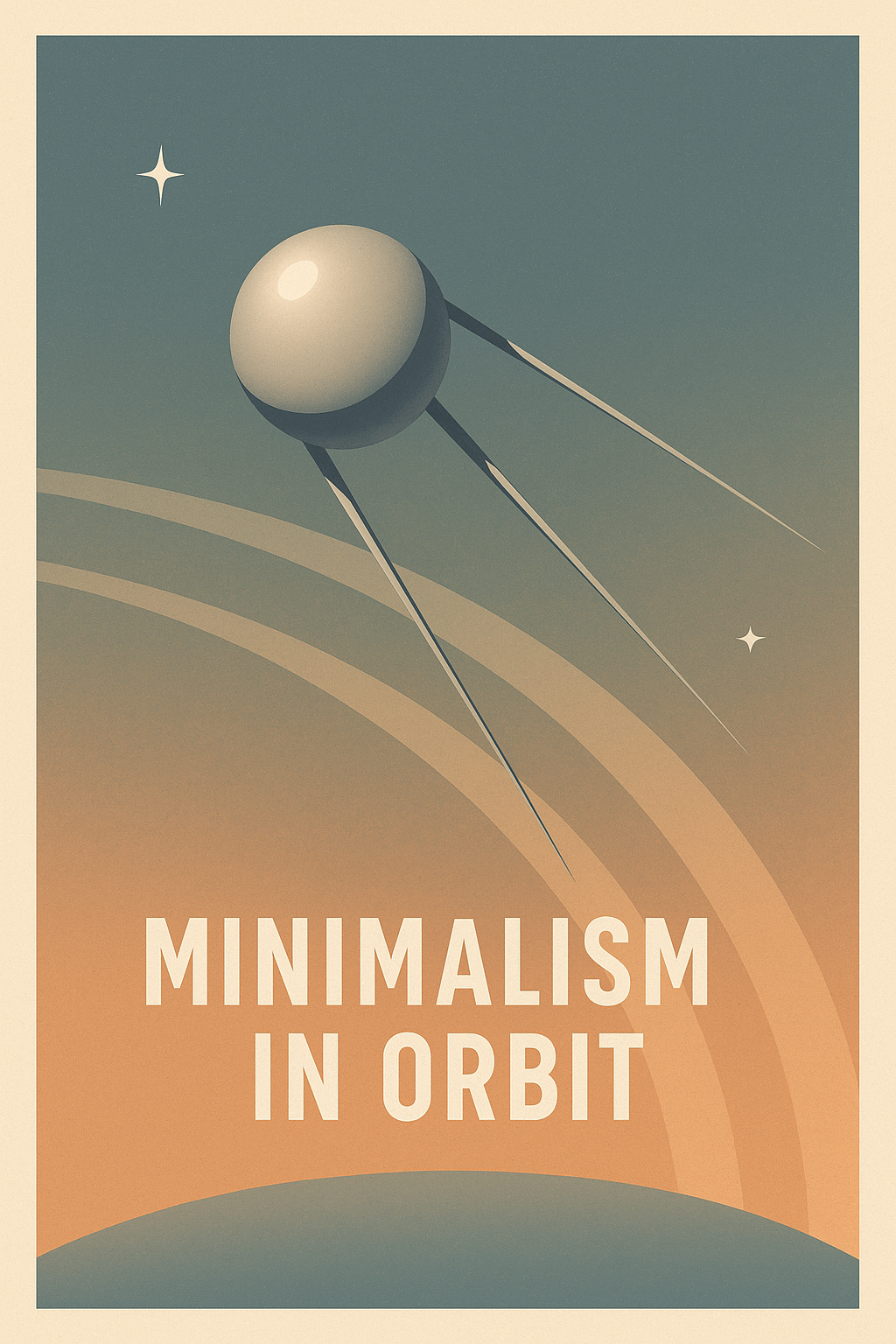
Sputnik’s design was minimal, elegant, and terrifying. Four simple antennae extended from a smooth metal sphere, reflecting sunlight as it orbited. This wasn’t by accident—it was intentional, symbolic russian design. It looked like the future. It looked like power. And it sounded like inevitability.
While American satellites like Vanguard were still theoretical or plagued by failure, Sputnik simply worked. It didn’t need to say anything. Its existence was a declaration: the Russians had focus, the right target, and execution.
More Than Technology: A Cultural Weapon
For the Soviet Union, this was never just about science. It was about perception. In the late 1950s, perception was power. The Sputnik brand was engineered not just to orbit Earth but to dominate the narrative. It spawned panic, yes—but it also inspired awe. It reframed Russia not as a backward totalitarian state, but as a space-faring superpower.
It’s no coincidence that Sputnik II followed just a month later, further cementing Soviet space dominance and keeping the russians in the headlines. Each launch added gravity to the brand—each satellite a lesson in how to own a global conversation without saying a word.

Russia’s Strategic Use of Design in the Sputnik Program
At a glance, Sputnik I might have seemed simple—just a shiny metal sphere with four antennae. But this wasn’t a fluke of engineering—it was calculated, deliberate, and deeply strategic.
The russian design of Sputnik was about perception and crafting a brand image that transcended language and ideology.
Minimalism as a Message
The Sputnik design was minimalist, yes—but it wasn’t minimal in impact. In fact, its simplicity made it iconic. With no visible seams, no rivets, no moving parts, it looked almost alien in its perfection. Against the backdrop of bulky, complicated American prototypes, Sputnik’s smooth silver finish appeared not just advanced—it appeared inevitable.
This was the Soviet lesson in industrial design: use form to create fear, fascination, and credibility. While Western engineers obsessed over complexity, Russia’s Sputnik program opted for elegance—and in doing so, created a symbol that resonated with the entire world.
The Shape of the Future
The Soviet Union was branding itself not just as a military power but as a technological visionary. The shape and surface of Sputnik were chosen to evoke futurism. Sleek. Spherical. Silver. These weren’t just stylistic choices—they were space branding moves.
A silver sphere orbiting Earth reflected sunlight like a space station, glittering in the night sky for all to see. Its shine was seen as a promise—and a threat.
The world was looking up, and what they saw wasn’t just a satellite—it was a new kind of brand identity. One that blurred the line between engineering and ideology.
Contrasting the West
In contrast, early American satellite efforts like Vanguard were riddled with launch failures, bulky designs, and poor public presentation. They looked—and often functioned—like fragile science projects. Sputnik, on the other hand, felt complete. Silent. Confident. Dominant.
The Russians understood that visual coherence translates to perceived competence.
Their satellite didn’t need to speak—it needed only to exist. And in doing so, it whispered volumes about Soviet capability, vision, and control. It was a Russian design strategy that turned hardware into psychological warfare.
Branding Without a Logo
It’s tempting to think of branding as a modern corporate tactic. But Sputnik proves otherwise. With no nameplate, no voice, no slogan—just design—Sputnik became one of the most recognizable and emotionally charged brands of the 20th century.
This wasn’t a one-off. The same design language echoed in future sputniks and later Soviet space icons. It was about consistency. About creating a narrative through design. And above all, it was about making sure that when the world looked to the stars, what they saw was unmistakably Russian.
Positioning and Perception
In the world of modern marketing, brand positioning is everything. But long before Apple mastered product mystique or Tesla turned innovation into identity, the Soviet Union showed the world what brand power really looked like—with a 184-pound satellite named Sputnik.
This wasn’t just a technological victory. It was a masterclass in how to transform a geopolitical act into a cultural narrative, where Sputnik became more than a satellite—it became a symbol. A myth. A russian brand moment that reshaped global perception.
Media as a Weapon of Influence
The USSR understood the power of narrative—and they knew the Sputnik launch wasn’t enough on its own. What mattered was what the world thought it meant. Within hours of its successful orbit, Soviet media began seeding headlines through state-controlled outlets and international channels, broadcasting the “Sputnik shock” with carefully crafted ambiguity.
The messaging walked a line between triumph and threat. “Sputnik circles the globe every 96 minutes” wasn’t just a fact—it was a signal. A new rhythm of dominance. A new timeline that the West didn’t control.
Meanwhile, American media did half the work for them. U.S. newspapers amplified the fear, politicians issued reactive statements, and citizens began scanning the skies. Russia, without dropping a single bomb, had hijacked the global information cycle.
From Scarcity to Status
One of the greatest brand lessons from the Sputnik program was how to leverage scarcity. There were no detailed blueprints. No extensive press briefings. No flashy launch videos. In fact, the Soviets shared very little—and that was intentional.
This scarcity of information created mystique, and mystique is branding gold.
It allowed the world to fill in the blanks, often overestimating Soviet capability. In branding terms, this is positioning through psychological asymmetry—owning the high ground without giving away the map.
Scarcity created desire, but also fear. And that emotion gave Sputnik its stickiness. The West couldn’t stop talking about it. It wasn’t just a satellite anymore—it was a new axis of global relevance.
The Birth of Russia’s Space Identity
With Sputnik, the Soviet Union launched a new national identity. One not of industrial grayness or cold militarism, but of cosmic ambition. Of progress. Of design-minded futurism.
Where Western brands were rooted in capitalism and competition, the russian brand strategy was built on ideology and impact. The USSR positioned itself as the world’s first space power, using that narrative to leapfrog perception gaps in every other area—from economy to culture to science.
Exporting the Myth
Sputnik became a cultural export. It showed up in children’s books, on postage stamps, in art, music, and later even fashion. It inspired films, literature, and decades of space obsession. The sputnik brand, without ever being “branded,” had reached global iconicity.
That’s the ultimate branding victory: when the product becomes the story, and the story becomes the symbol.
The Cold War Marketing Duel: Sputnik vs NASA
If Sputnik was the opening shot in the Space Race, then the creation of NASA was America’s rapid response—a rebranding emergency in the face of global perception collapse.
The Soviet Union had seized the high ground not just in orbit, but in narrative control, and the United States knew it needed more than rockets—it needed a brand.
What unfolded next was not just a scientific competition—it was a full-blown Cold War marketing duel. On one side, the russians had Sputnik, sleek and silent. On the other, the U.S. began crafting a brand identity of its own, centered around freedom, innovation, and a bold vision for the future.
NASA: The American Rebrand
Just one year after Sputnik’s launch, in 1958, the U.S. formed the National Aeronautics and Space Administration (NASA). This was no ordinary government agency—it was a strategic response to a russian design success that had rattled the global psyche.
NASA was positioned as more than a research body. It became a symbol of American potential, a counter-brand to Soviet secrecy. Where the Soviet Union used mystique, the U.S. used media. Where the Sputnik program used silence, NASA used storytelling.
Documentaries, school programs, press conferences, and science fairs flooded American culture. Astronauts became celebrities. Science became patriotic. The NASA brand wasn’t just about catching up—it was about reclaiming the narrative.
Kennedy’s Speech: The Counter-Branding Moment
Then came the defining brand pivot: John F. Kennedy’s 1962 speech at Rice University. His words—“We choose to go to the Moon… not because it is easy, but because it is hard”—were not just political rhetoric. They were counter-branding genius.
Kennedy reframed the space race as a moral crusade, turning technological catch-up into a mission of courage, freedom, and human spirit. In branding terms, it was the classic underdog story with a visionary twist. The U.S. wasn’t just reacting to Sputnik; it was aiming higher, louder, and more emotionally.
Narratives in Orbit
At its core, the space race was a battle of competing narratives:
The Soviet story was one of dominance, mystery, and control—broadcast through the cold logic of orbital physics and the chilling regularity of Sputnik’s beeps.
The American story was one of aspiration, transparency, and choice—driven by speeches, documentaries, and images of astronauts training in the desert.
Both nations used design, symbolism, and propaganda not just to fuel their programs, but to win hearts and minds at home and abroad.
The Brand Battle That Redefined History
By the late 1960s, the U.S. had effectively turned the tide. The Apollo 11 moon landing was the ultimate brand win—televised live, with an American flag planted on lunar soil. Yet it’s crucial to recognize that without Sputnik’s shock, none of this storytelling infrastructure would’ve been built.
Sputnik forced the U.S. to evolve not only its space capabilities, but its understanding of how powerful branding could be. In that sense, the russian satellite did more than start the space race. It ignited a branding revolution that changed how governments communicate, inspire, and compete.

Why Sputnik’s Simplicity Worked
In the modern world of branding, complexity often masquerades as credibility. But Sputnik taught us a different design lesson—that simplicity, done right, doesn’t weaken a message. It amplifies it. When the russian satellite soared silently across the sky, its impact wasn’t just technical—it was deeply psychological.
The brilliance of the Sputnik design wasn’t in what it did. It was in how it looked, how it sounded, and how it made people feel.
Contrast Theory in Action
As outlined in The Great Mental Models Vol. 4: Economics and Art, one of the most powerful psychological triggers in perception is contrast. When something drastically deviates from expectations, it arrests attention. That’s exactly what Sputnik did.
In a world that expected clunky rockets and televised countdowns, Sputnik’s silent orbit felt surreal. Its smooth, spherical design—without logos, lights, or decoration—was a stark contrast to the noisy, angular machines dominating American media. It didn’t look like technology. It looked like the future. And that’s why the world couldn’t stop watching.
This principle is at the core of brand psychology: when something doesn’t fit the mold, it becomes more memorable. The Sputnik brand didn’t follow the rules—and that’s why it reshaped them.
Rory Sutherland on the Power of the Unexpected
In Alchemy, Rory Sutherland argues that “logic is often the enemy of effective design.” That consumers (and citizens) aren’t rational creatures—they’re emotional. They’re influenced not by the utility of a product, but by how it breaks patterns and hacks attention.
Sputnik’s simplicity was irrational—and that’s why it worked. It defied the Western expectation that space innovation had to be complex. It looked like something out of science fiction: minimalist, metallic, mysterious. The absence of visible mechanics created an illusion of higher intelligence, even superiority.
In branding, this is known as premium through absence. Think of the Apple iPhone’s single-button interface, or luxury packaging that reveals little. Simplicity is not the absence of complexity—it’s the compression of meaning. And Sputnik nailed it.
The Power of Being First
Branding pioneer Al Ries once said, “It’s better to be first than it is to be better.” Sputnik wasn’t just a russian satellite—it was the first artificial satellite ever. And that “first” status gave it category ownership in the public imagination.
Once a brand is first in a category, every competitor becomes a comparison. Sputnik owned the “space” in “space”—in both the literal sky and the figurative mind.
This is one of the timeless brand lessons: when you’re first, you don’t just lead—you define. And when your design supports that leadership with visual and emotional clarity, you build a brand that lasts generations.
Simplicity as Sophistication
In retrospect, Sputnik’s simplicity was a strategic decision and it embodied the idea that design is a signal.
The USSR didn’t need to say they were ahead. They showed it—by doing more with less. That’s the essence of a world-class design strategy. And it’s one of the reasons why, even today, Sputnik remains one of the most enduring and powerful brands of the 20th century.

Brand Legacy and Cultural Memory: Sputnik’s Enduring Influence
Some brands are built. Others are launched—like a signal into the stratosphere. Sputnik was the latter. And decades after its historic 1957 debut, the Sputnik brand remains one of the most powerful in global memory.
It didn’t have a logo. It wasn’t advertised. It didn’t sell a product. But it entered the global consciousness with such force that it transcended its own function and became something greater: a symbol. A legacy. A russian cultural artifact turned universal metaphor.
From Satellite to Symbol
The iconography of Sputnik—that spherical body with four antennae—has become visual shorthand for space itself. You’ll find it in everything from tech company logos to fashion designs to digital art. In film, television, and gaming, Sputnik’s silhouette evokes nostalgia, mystery, and scientific ambition. It is, quite literally, the shape of the future.
Why? Because Sputnik doesn’t just represent a moment in space culture—it represents a shift. It’s the historical line between Earth-bound dreams and orbital reality. Between industrial ambition and cosmic identity.
It’s also a case study in historical branding. Without a marketing team, without a slogan, Sputnik achieved what modern campaigns spend millions chasing: icon status.
The Myth of Russian Innovation
The legacy of Sputnik is deeply embedded in Russia’s technological self-image. From space programs to nuclear energy to AI and cyber warfare, “sputnik” is invoked as a badge of ingenuity and first-mover dominance. It has become a blueprint for national pride and branding around progress, resilience, and futurism.
Just as Silicon Valley venerates Steve Jobs and Tesla, Russia venerates Sputnik—the moment it declared itself a leader not just in war, but in wonder.
The Sputnik Effect: From Vaccines to Media
In recent years, the Sputnik name has been intentionally revived to re-anchor Russian innovation in public consciousness. The Sputnik V COVID-19 vaccine, for example, wasn’t just a health initiative—it was a branding decision.
By choosing the “Sputnik” name, Russia instantly framed the vaccine as a technological first, evoking the original 1957 launch and tapping into that cultural heritage of urgency, leadership, and scientific pride. It wasn’t just about medicine—it was about narrative ownership.
Similarly, Sputnik News, a state-sponsored media outlet, leverages the brand’s Cold War resonance. In doing so, it signals a continuation of the russian information strategy: being first, being loud, and reshaping global narratives from a distinctly Russian perspective.
These examples reveal the timeless power of the Sputnik brand: it’s flexible, adaptable, and emotionally charged. It functions as both heritage and strategy.
A Brand that Defied Gravity
Few historical events create lasting brand equity without commercial intent. Sputnik did. Its image and influence have outlived its orbit. It lives on not just in museums or textbooks, but in the way we talk about speed, surprise, and signal.
When we say a product or idea “launched like Sputnik,” we’re not talking about satellites—we’re talking about cultural impact. That’s legacy. That’s brand mastery. That’s what happens when design, message, and moment align with atomic precision.

What Modern Brands Can Learn from the Sputnik Strategy
If you strip away the geopolitics and rockets, the launch of Sputnik was a branding masterstroke—one that modern companies, startups, and visionary creators can still learn from. The Sputnik brand wasn’t built on ads or influencers. It was built on timing, symbolism, and shock value. It was a russian design story that hit the world like a siren from space—and it still echoes in marketing playbooks today.
Let’s break down the core strategic lessons from the Sputnik strategy and how they apply to brand building in today’s hyper-competitive, attention-fragmented world.
1. Own the Narrative Early: Speed = Perception Leadership
When Sputnik launched in 1957, it didn’t just mark a scientific breakthrough—it established perception dominance. The russians didn’t wait for approval, perfection, or feedback loops. They acted. And in doing so, they owned the story before anyone else could shape it.
Modern brand lesson: Don’t wait for perfect. Be first. Whether launching a product, dropping a campaign, or responding to cultural events—speed defines leadership. Whoever frames the narrative first sets the frame others must follow.
2. Simplicity = Sophistication: Design to Disrupt, Not Impress
The Sputnik design was a lesson in minimalist brilliance. No text. No brand name. No color. Just form—pure, spherical, and symbolic. And yet, that simplicity became its greatest strength.
Modern brand lesson: In an age of overstimulation, simple is memorable. Strip away noise. Let design signal clarity. Brands that embrace minimalism often project more confidence, more luxury, and more focus. Simplicity isn’t basic—it’s bold.
3. Symbolism Matters: Every Visual Cue Builds Brand Memory
Sputnik wasn’t adorned with slogans or propaganda. Its very shape and sound did the talking. That silver sphere, that constant beeping—they weren’t features; they were symbols. And they embedded themselves in collective memory.
Modern brand lesson: Every design choice speaks. Typography, color, packaging, UI—these are not aesthetics; they’re memory triggers. Build symbols that stick. Think Nike’s swoosh, Tesla’s “T,” or Apple’s bitten apple. The visual language is the brand.
4. Contextual Timing is Key: Leverage Cultural Shifts
The Sputnik launch didn’t happen in a vacuum—it happened at a tipping point in history. The Cold War was simmering, and the world was hungry for a signal of what came next. Russia delivered it with perfect timing.
Modern brand lesson: Timing is everything. Launch during conversation peaks. Enter when emotions are high. Whether it’s a social shift, cultural movement, or global disruption—brands that align with the zeitgeist gain disproportionate traction.
5. Leverage Fear and Curiosity: Emotion Drives Viral Reach
Let’s be honest: Sputnik’s “beep” scared the world. But it also fascinated. That balance—between anxiety and awe—is a core engine of virality. The unknown draws us in.
Modern brand lesson: Emotional tension captures attention. Whether it’s curiosity, fear, wonder, or urgency—tap into core human emotions. Facts don’t move markets—feelings do. Just like Sputnik, your brand should aim to disrupt the mood.
Last Words
If you want to build a brand that lasts, don’t just market a product—launch a moment. Whether you’re in defense tech, AI, consumer goods, or biotech, the Sputnik playbook still applies:
Be first.
Be clear.
Be bold.
Be unforgettable.
Remember: the world doesn’t remember who built the best—it remembers who launched first, loudest, and most beautifully.