How do you make an agritech company look credible before anyone reads the website, opens the pitch deck, books a call, or studies the product?
That is where the logo starts doing its quiet little job.
And in agritech, that job is harder than it looks.
Because agritech companies live between two very different worlds.
On one side, there is agriculture: land, crops, food systems, field work, farmers, biology, weather, soil, supply chains, sustainability, and real-world production.
On the other side, there is technology: data, digital platforms, sensors, robotics, automation, engineering, research, software, AI, dashboards, environmental intelligence, and scalable systems.
A strong agritech logo has to make those two worlds feel connected.
Not forced together.
Not “we added a leaf to a tech logo and now it’s agriculture.”
Not “we made it green and called it sustainability.”
A serious agritech logo needs to show that the company understands the field, but also has the capability to move it forward.
That balance matters.
Because before people understand your full business, they judge your signals.
Your logo is one of the first.
The Logo Is Often the First Trust Signal
A logo is not the whole brand.
But it is one of the fastest ways people decide what kind of company they are dealing with.
This is especially important in agritech because the audience is usually mixed.
An agritech company may need to build trust with farmers, investors, public institutions, EU project partners, universities, engineers, food producers, sustainability teams, technology vendors, researchers, and government bodies.
That is not one simple audience.
A farmer may look for practicality.
An investor may look for scalability.
A public institution may look for credibility.
A project partner may look for seriousness.
A technology partner may look for capability.
A research partner may look for legitimacy.
The logo cannot explain all of that.
But it can create the right first impression.
It can signal:
This company is modern.
This company is serious.
This company understands agriculture.
This company is not just another generic tech startup.
This company can operate in professional, institutional, and field environments.
That is why agritech logo design should never be treated as a small visual task.
It is part of how the company earns trust before the conversation begins.
The Main Problem With Agritech Logos
The biggest problem with many agritech logos is that they stop at the obvious.
A leaf.
A seed.
A sun.
A field line.
A green gradient.
Maybe a little data node somewhere, just so everyone knows technology was invited to the meeting.
These symbols are not automatically bad.
The problem is when they are used without a deeper idea.
Because a generic leaf does not explain what kind of agritech company you are.
It does not show whether you work in precision farming, field robotics, farm management software, food systems, digital agriculture, soil intelligence, sustainability, climate data, agricultural finance, EU innovation projects, or applied field implementation.
Those are different businesses.
They should not all look the same.
A strong agritech logo should not simply say:
“We are connected to agriculture.”
It should say something more specific:
“We help agriculture become more intelligent.”
“We turn field data into better decisions.”
“We connect research with real-world implementation.”
“We build technology that works in agricultural environments.”
“We help food systems become more resilient.”
“We bring innovation into the field, not just into presentations.”
That is the difference between a logo that fills space and a logo that carries meaning.
What an Agritech Logo Should Communicate
A good agritech logo usually needs to communicate five things.
1. Agriculture
The logo should make sense in the agriculture, food, land, sustainability, or environmental space.
That does not mean it needs to show a literal plant.
Agriculture can be communicated through color, shape, rhythm, circular forms, growth patterns, land geometry, field grids, organic movement, or natural references.
The point is category connection.
People should not look at the logo and wonder whether the company sells accounting software, cloud security, or protein bars.
Unless the protein bars are made from regenerative blockchain soil data, in which case good luck to everyone involved.
The logo needs to belong to the agricultural world in some way.
2. Technology
Agritech is not traditional farming branding.
The technology side matters.
The logo should feel modern enough to support digital platforms, software interfaces, dashboards, reports, websites, apps, presentations, and investor materials.
This is where structure matters.
Geometric forms, clean typography, modular symbols, precise spacing, and digital-friendly marks can help the brand feel more advanced.
But the logo should not become so technical that it loses the agricultural connection.
That is the balance.
Agricultural, but not rustic.
Technological, but not cold.
3. Credibility
Agritech companies often work in serious environments.
They may be involved in public funding, EU projects, field trials, institutional partnerships, research programs, government initiatives, food systems, environmental projects, or investor conversations.
So the logo needs to feel credible.
Not childish.
Not generic.
Not trendy for the sake of being trendy.
Not like a logo bought from a “100 eco logos bundle” for $12.
A credible agritech logo should feel like it can sit comfortably on a website, project proposal, technical report, pitch deck, conference banner, or partner document.
That is where many agritech identities fail.
They look fine on social media but weak in serious contexts.
And serious contexts are where a lot of agritech opportunities happen.
4. Practicality
Agritech is connected to the real world.
Fields. Farms. Equipment. Food production. Climate. Supply chains. Field teams. Local communities. Public systems. Real consequences.
So the logo should not feel like technology floating above reality.
It needs some groundedness.
That may come through natural colors, stable typography, circular systems, practical geometry, or a visual language that feels less “startup hype” and more “real implementation.”
A good agritech logo should feel like it can survive outside a pitch deck.
Because the work itself has to.
5. Scalability
A logo is not designed for one perfect mockup.
It has to work everywhere.
For agritech companies, that can include:
Website headers.
Mobile apps.
Dashboards.
EU project documents.
Research reports.
Field signage.
Conference booths.
Social media.
Presentations.
Partner pages.
Data platforms.
Packaging.
Training materials.
Vehicles.
Equipment.
This means the logo must be clear, flexible, and usable.
It should work in full color and one color.
Large and small.
On light and dark backgrounds.
As a full lockup and as a symbol.
A logo that only works when it is huge, centered, and surrounded by dramatic shadows is not a logo system.
It is a poster trying to avoid responsibility.
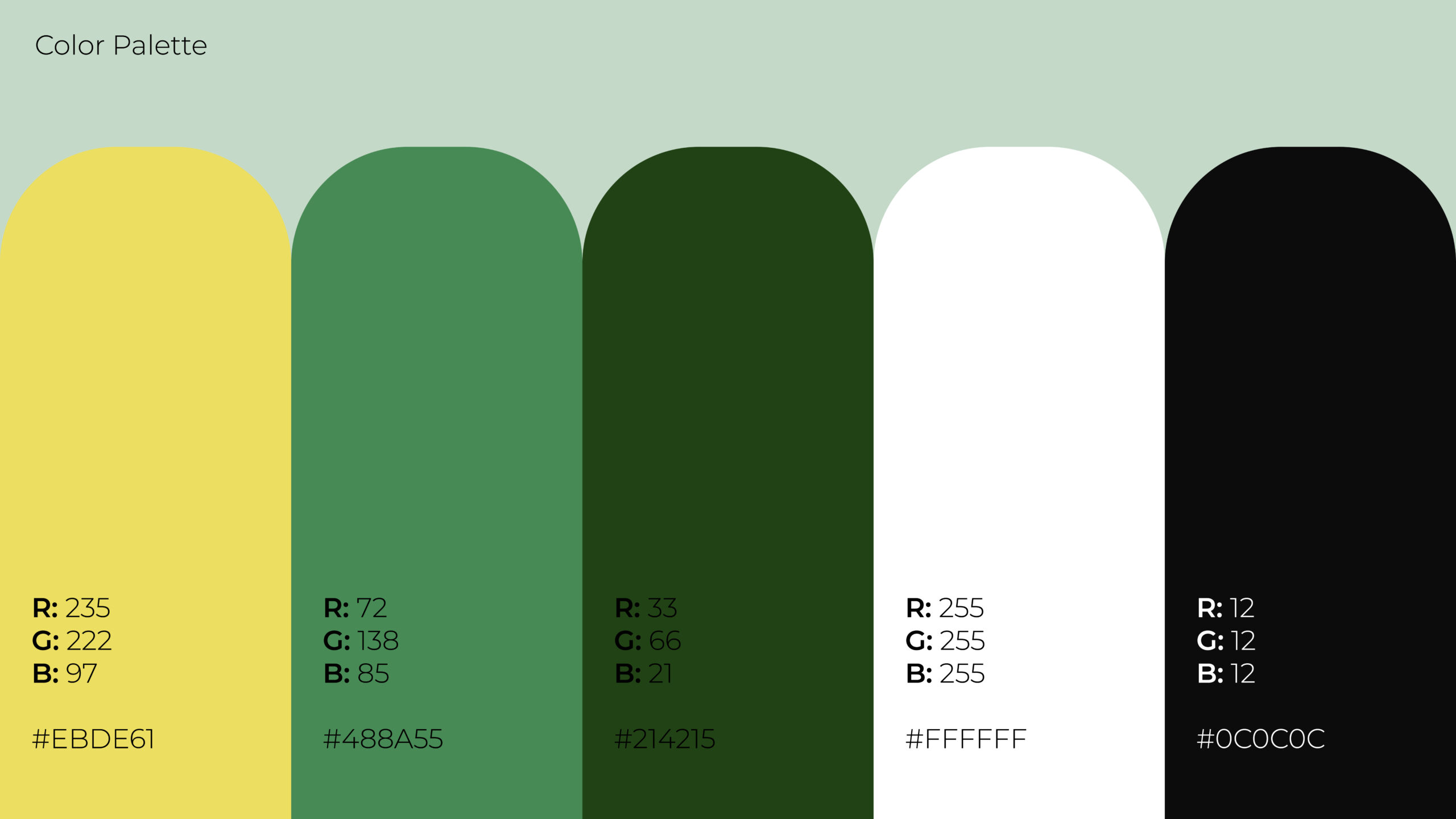
Why “Green” Is Not a Strategy
Green is the most common color in agriculture and sustainability branding.
That makes sense.
Green signals nature, growth, farming, environment, health, sustainability, and land.
But green alone is not enough.
The real question is:
What kind of green?
A deep forest green can feel stable, mature, and environmental.
A bright lime green can feel energetic, digital, and startup-like.
A soft sage green can feel calm, natural, and premium.
A yellow-green gradient can suggest sunlight, growth, energy, and motion.
A green paired with charcoal can feel technical and credible.
A green paired with blue can feel more data-driven and environmental.
Color choices should reflect the type of agritech company, not just the category.
For an advanced agriculture technology company, the palette should show more than “we are eco-friendly.”
It should support the company’s position.
Is the brand about precision?
Growth?
Field implementation?
Digital systems?
Climate resilience?
Food innovation?
Research credibility?
Industrial agriculture?
Sustainability?
The color system should help answer that.
The Best Agritech Logos Balance Opposites
Agritech logo design is difficult because the category itself is built on tension.
Agriculture is ancient.
Technology is modern.
Agriculture is physical.
Technology is often digital.
Agriculture is seasonal, biological, and local.
Technology is scalable, structured, and system-driven.
Agriculture deals with soil, weather, machinery, crops, animals, people, and unpredictable conditions.
Technology deals with data, interfaces, automation, sensors, algorithms, and infrastructure.
A strong agritech logo needs to respect both sides.
If the logo leans too far into agriculture, the company may look traditional, small, or local.
If it leans too far into technology, the company may look disconnected from the real world it claims to serve.
The sweet spot is the bridge.
A logo that feels connected to land and growth, but also to intelligence, systems, and progress.
That is what agritech branding should aim for.
Not just “natural.”
Not just “techy.”
Both.
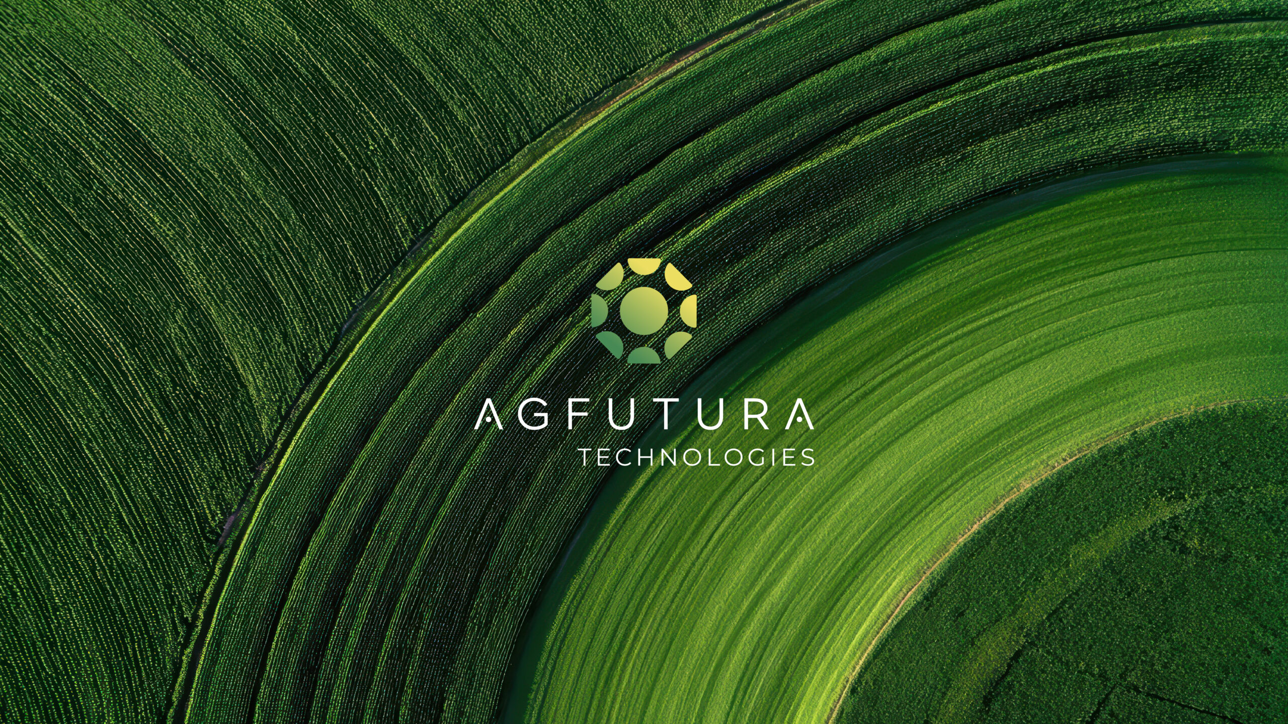
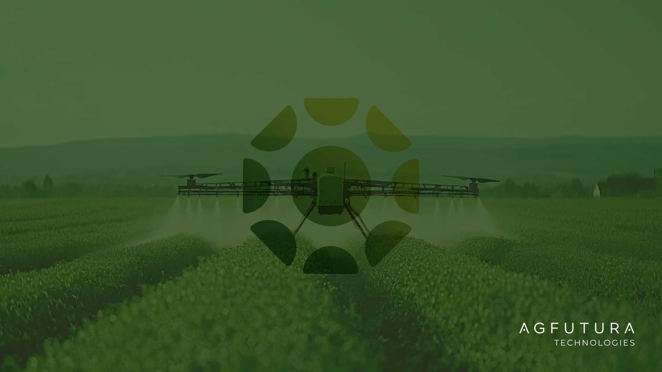
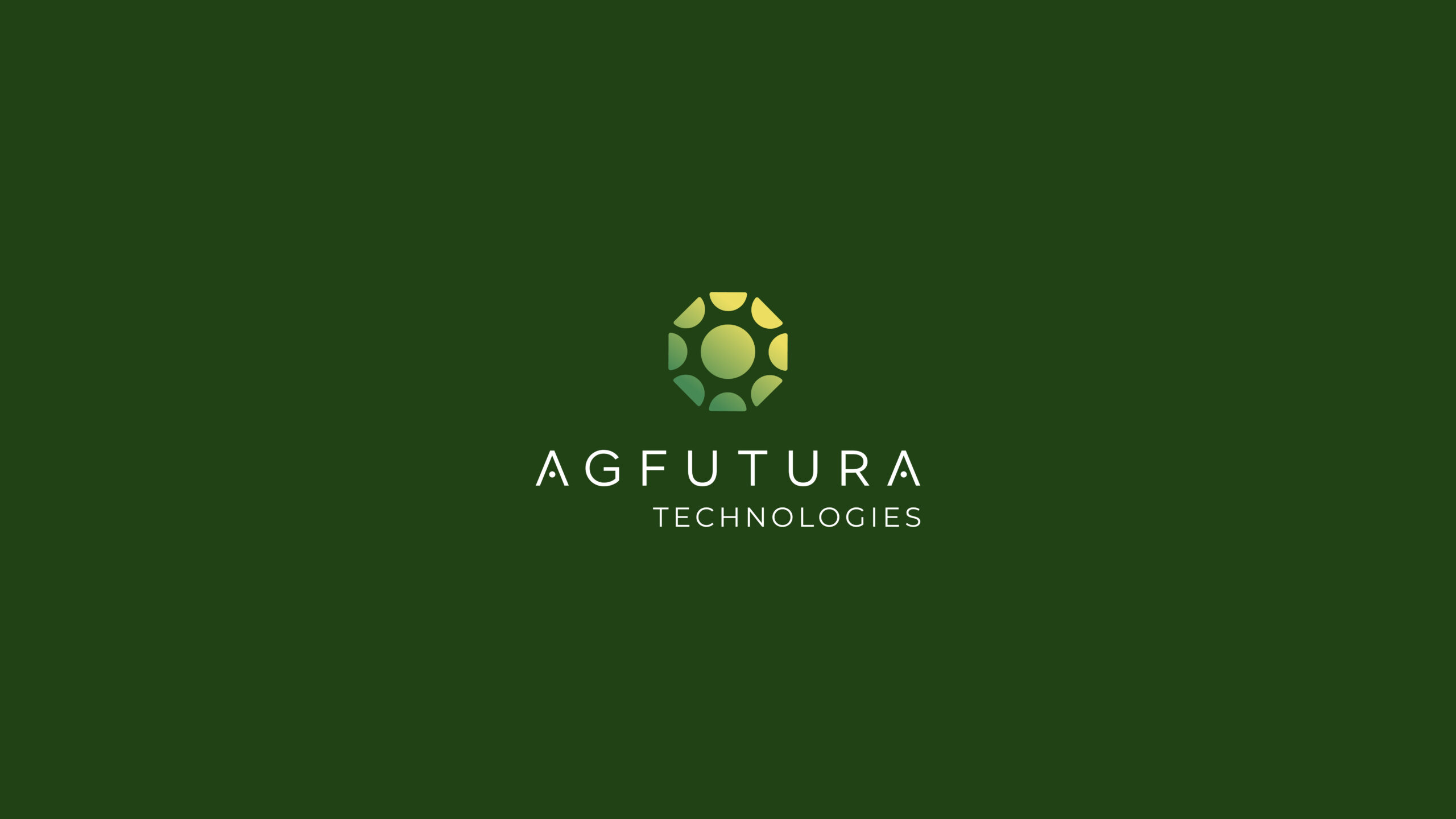
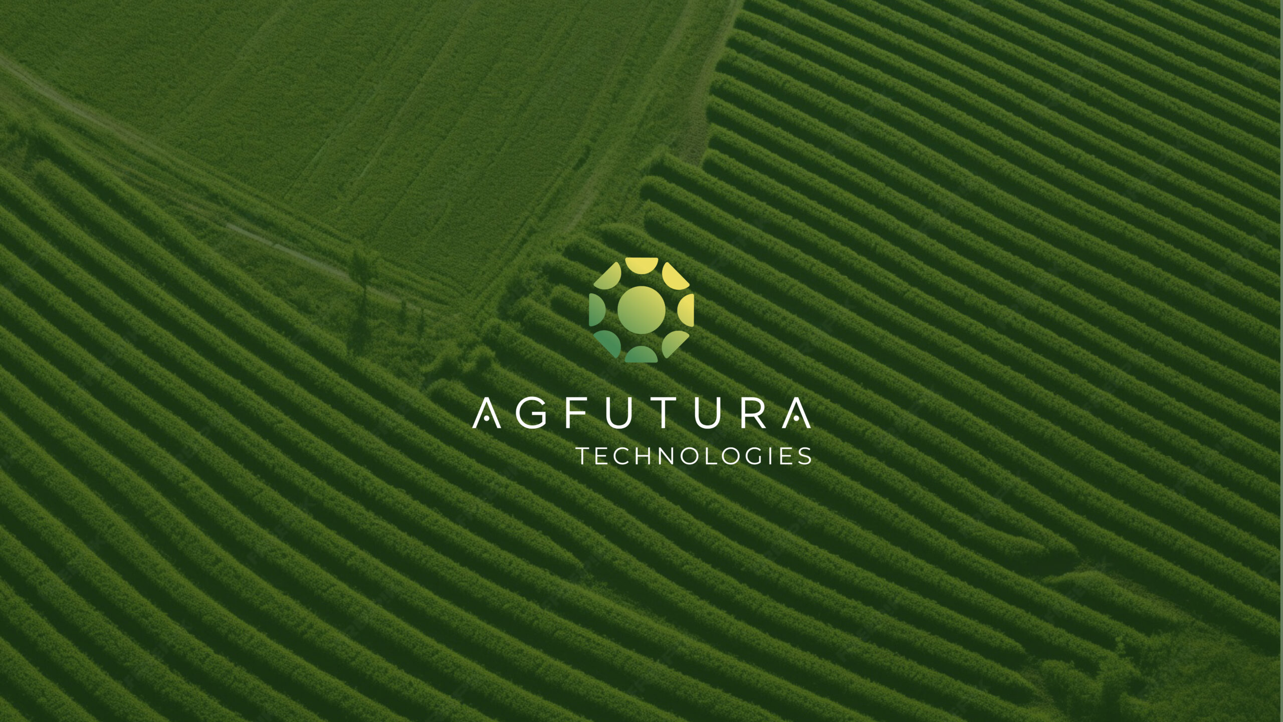
Example: AGFUTURA Technologies Logo Design
For AGFUTURA Technologies, the logo had to represent a company working across agriculture, engineering, digital systems, sustainability, business development, policy, and EU project ecosystems.
This was not a simple farming brand.
It was also not a pure SaaS company.
The identity needed to sit between agriculture and applied innovation.
So the mark could not rely on a generic leaf.
It needed to feel connected to growth, but also to systems.
It needed to feel natural, but also structured.
It needed to work for digital platforms, institutional materials, reports, presentations, and a larger website system.
The final logo combines a circular growth symbol with modular geometric forms.
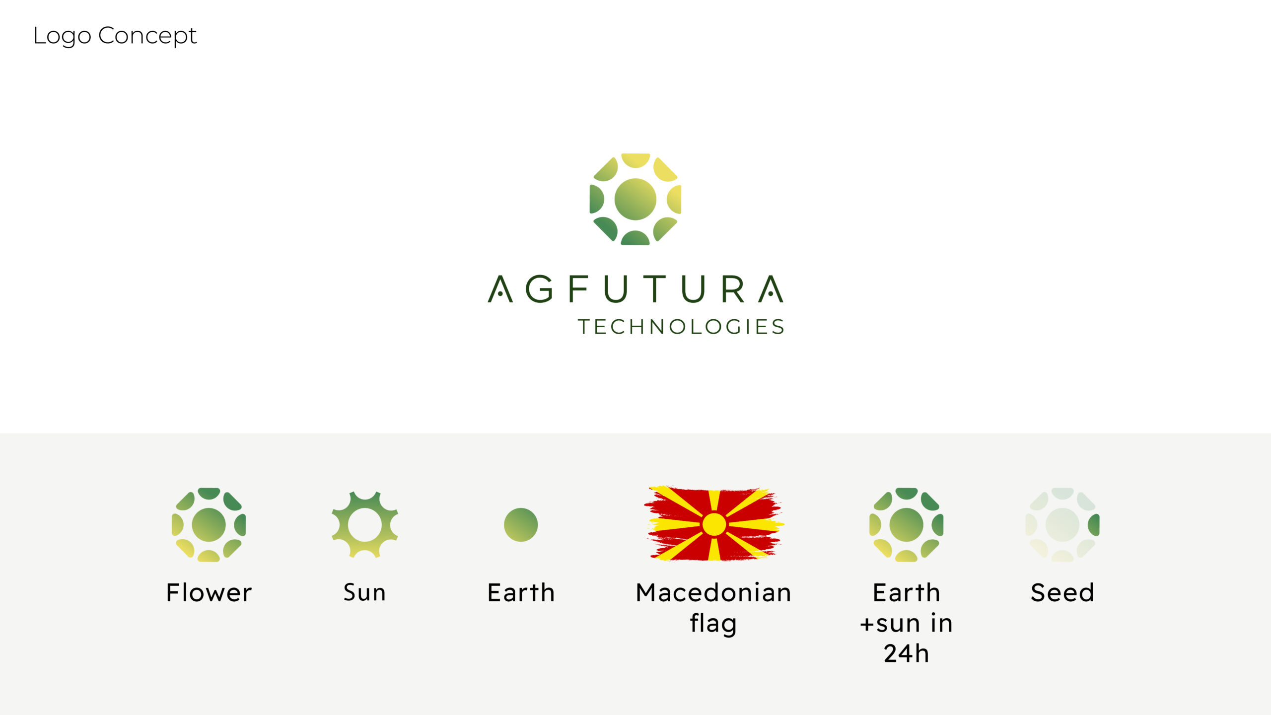
The circular structure suggests ecosystems, movement, continuity, and collaboration.
The internal forms suggest growth, fields, leaves, systems, and technology without becoming too literal.
The green-to-yellow gradient connects the identity to nature, food systems, sunlight, energy, and forward movement.
The clean geometric wordmark gives the brand a more modern and credible technology presence.
The goal was not to make AGFUTURA look like “an agriculture company.”
The goal was to make it look like an applied innovation company working in agriculture and connected systems.
That distinction matters.
Because when a company does complex work, the logo should not make it look smaller than it is.
A Good Agritech Logo Should Show the Company’s Role
The strongest agritech logos do not only show the industry.
They show the company’s role inside the industry.
A precision agriculture company should feel accurate, data-driven, and controlled.
A robotics company should feel engineered, modular, and reliable.
A sustainability company should feel responsible, regenerative, and transparent.
A farm software company should feel practical, clear, and usable.
A research and innovation company should feel credible, structured, and forward-moving.
An applied innovation company should feel like it can move ideas into implementation.
That is why agritech logo design should start with strategy.
Not because every logo needs a 90-page explanation.
Please no.
But because the logo should be based on a real business idea, not just a visual cliché.
The question is not:
“How do we make this look agricultural?”
The better question is:
“What should people understand about this company before they read anything?”
That is the job of the mark.
What Potential Clients Should Look For in an Agritech Logo
If you are leading or building an agritech company, your logo should help answer a few important questions.
Does it make the company look credible?
Does it feel modern enough for technology and digital platforms?
Does it still feel connected to agriculture or the field?
Does it avoid generic eco-brand clichés?
Does it work in serious institutional contexts?
Does it scale across website, reports, decks, dashboards, and field materials?
Does it show what makes the company different?
Does it support the company’s future, not just where it is today?
That last question is important.
Agritech companies often evolve quickly.
They add new services, projects, partnerships, markets, technology layers, and business models.
A logo should not trap the company in a narrow category too early.
It should create room to grow.
That does not mean the logo should become vague.
It means the symbol should be specific enough to mean something, but flexible enough to support the company as it expands.
Your Logo Can Either Build Trust or Create Friction
A weak agritech logo may not destroy a company.
But it can create friction.
It can make the business look less serious than it is.
It can make advanced technology feel generic.
It can make institutional partners hesitate.
It can make the company blend into every other green startup.
It can make the website feel weaker.
It can make the pitch deck less convincing.
It can make a serious company look like it has not fully grown into its own identity.
On the other hand, a strong agritech logo creates alignment.
It gives the brand a clear visual anchor.
It supports the website.
It strengthens presentations.
It improves recognition.
It creates consistency across touchpoints.
It helps the company show up with more confidence.
That is why logo design matters.
Not because people will sit for 20 minutes analyzing the symbol like it is a museum piece.
They will not.
But they will feel whether the brand looks right.
And in business, that feeling matters.
Agritech Logo Design Is Really About Trust
At the end of the day, agritech logo design is about trust.
Trust that the company understands agriculture.
Trust that the technology is serious.
Trust that the brand can operate in professional contexts.
Trust that the company is not generic.
Trust that the identity can scale with the business.
That is why the logo should not be an afterthought.
Especially for agritech companies working across complex sectors, technical solutions, public-private partnerships, sustainability, research, and implementation.
The logo does not need to explain everything.
But it should open the right door.
It should make the company feel credible enough to explore, clear enough to understand, and distinct enough to remember.
That is what we aimed for with AGFUTURA Technologies.
A logo that feels agricultural and advanced.
Natural and structured.
Practical and future-facing.
Because agritech brands are not just selling technology.
They are often selling confidence in a better way to grow, manage, measure, produce, or implement something in the real world.
And that kind of confidence starts earlier than most people think.
Sometimes, it starts with the mark.
Need an Agritech Logo That Makes Your Company Look as Serious as the Work You Do?
At BBDirector, we create logo designs, brand identities, website systems, and strategic visual assets for companies working across agriculture, technology, sustainability, innovation, and complex B2B markets.
If your agritech logo feels too generic, too rustic, too cold, too small, or disconnected from the actual value of your company, the issue is not just visual.
It is strategic.
Your identity should help people understand what you do, why it matters, and why they should trust you.
A strong logo will not do the whole job alone.
But it should make every next step easier.
That is the point.