Some companies are easy to explain.
A burger place sells burgers.
A gym sells sweat with better lighting.
A SaaS company sells dashboards that may or may not emotionally damage the operations team.
AGFUTURA was different.
AGFUTURA operates across agriculture, food systems, environmental services, vocational education, robotics, connectivity, digitalisation, business innovation, engineering, field implementation, and EU project ecosystems.
In other words, not exactly the kind of company you can explain with one stock photo of a happy farmer holding a tablet in a wheat field.
The challenge was not simply to design a nice-looking agritech website.
The challenge was to create a digital system that could help people understand what AGFUTURA actually does, why the company matters, and how its work moves ideas from concept to practical implementation.
That is where the website strategy started.
Not with decoration.
Not with trendy gradients.
Not with “let’s make it green because agriculture.”
The real task was clarity.
The Problem: Multidisciplinary Companies Are Easy to Undersell
AGFUTURA is not just an agriculture consultancy. It is not just a project development company. It is not just a digital agriculture business. It is not just an innovation partner.
It sits between disciplines.
That is powerful, but it is also dangerous from a communication standpoint.
The more a company does, the easier it becomes for its website to feel fragmented. One section talks about agriculture. Another talks about robotics. Another talks about business innovation. Another talks about education. Another talks about EU projects. Before you know it, the website starts feeling like five different companies sharing one navigation bar.
That was the thing we wanted to avoid.
The new website had to communicate AGFUTURA as one connected organization, not a collection of unrelated activities.
So the core strategic question became: How do we make a multidisciplinary innovation company feel like one operational system?
The answer was to build the website around a simple narrative: AGFUTURA brings ideas to market.
That line became the center of gravity.
It captures the company’s role across research, engineering, validation, field implementation, business development, and adoption. It also avoids the usual innovation language trap where everything sounds impressive but nothing sounds usable.
Because innovation only matters when it works in practice.
The Strategic Direction: Applied Innovation, Built for the Field
The website direction was built around the idea of applied innovation.
Not abstract innovation.
Not conference-stage innovation.
Not “we have a framework and a PDF” innovation.
Applied innovation means the work survives contact with the real world.
For AGFUTURA, that real world includes farmers, agronomists, EU partners, project consortia, universities, public institutions, field teams, technology providers, and business development partners.
That is a wide audience mix.
So the website needed to work for multiple reader types:
- institutional partners who need credibility
- EU project partners who need capability and structure
- agri-food businesses who need practical implementation
- public institutions who need trust and seriousness
- researchers who need technical depth
- farmers and field operators who need clarity
- collaborators who need to understand where they fit
This is where many B2B and agritech websites struggle.
They either become too academic and unreadable, or they become too commercial and lose credibility.
We wanted AGFUTURA to sit in the right middle ground: credible enough for institutions, clear enough for business, practical enough for the field.
That was the design and messaging balance.
The Visual Language: Calm, Structured, and Field-Connected
The design direction uses a controlled green palette, strong dark sections, field imagery, card-based layouts, rounded interface elements, and clean typography.
The result feels agricultural without becoming rustic.
There is no fake “farm charm.”
No overused leaf icons trying to carry the entire brand identity on their tiny chlorophyll backs.
Instead, the interface feels modern, structured, and grounded.
The visual system combines:
- soft agritech green backgrounds
- dark contrast sections for authority
- clean content cards
- field and implementation imagery
- rounded containers
- minimal iconography
- structured navigation
- large strategic headlines
- clear project modules
- proof-driven metrics
This gives the website a calm but confident presence.
It feels like a company that works in agriculture, but also understands systems, engineering, technology, research, and institutional collaboration.
That was important.
The brand could not feel like a farm website.
It had to feel like an applied innovation company.
The Homepage: Explaining the Whole Business Without Overloading the User
The homepage is structured to answer the reader’s questions in the right order.
First: What does AGFUTURA do?
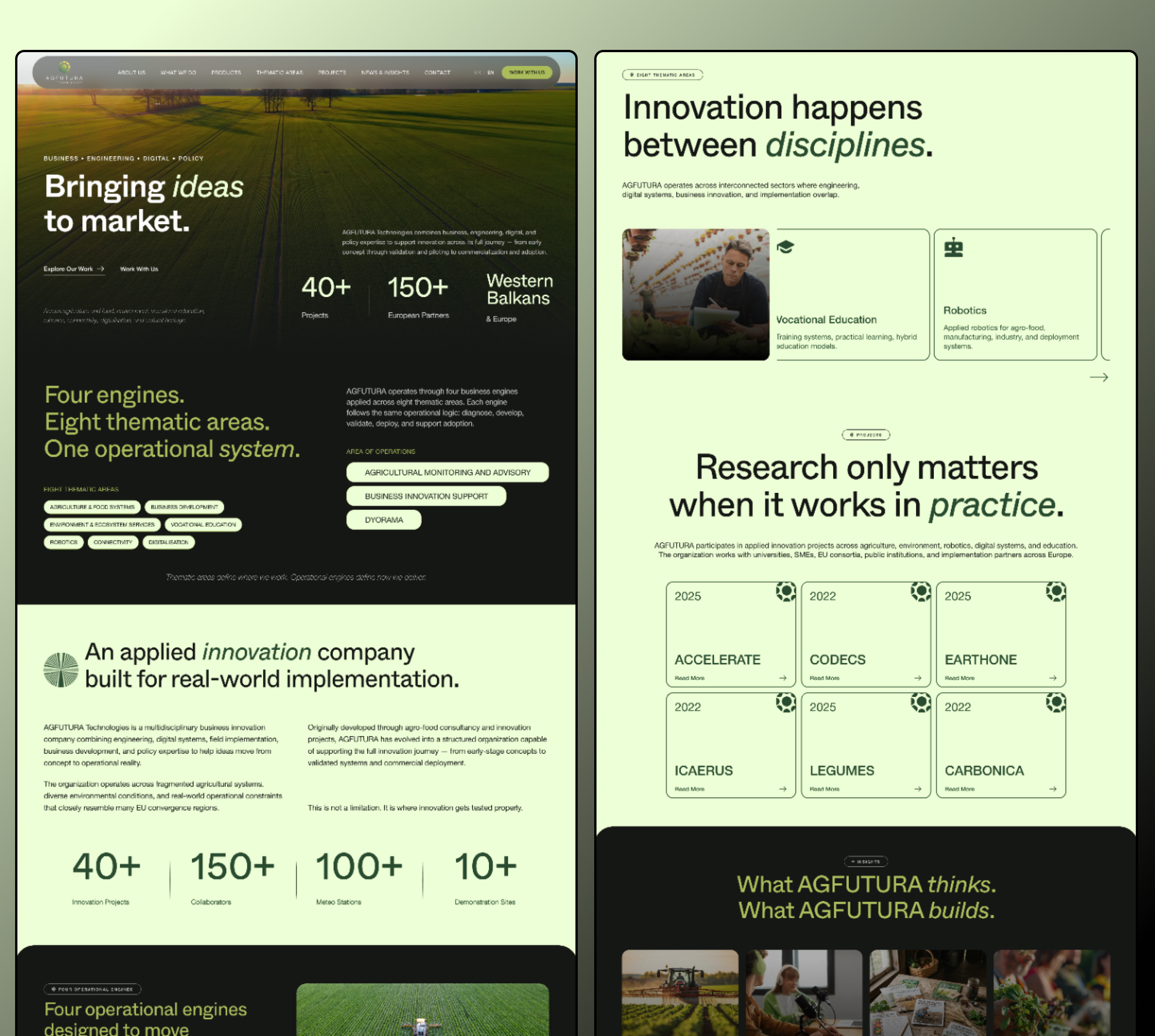
The hero section answers this with the core message: Bringing ideas to market.
That immediately positions AGFUTURA as a bridge between concept and implementation.
Then the page expands the idea: Four engines. Eight thematic areas. One operational system.
This line does a lot of heavy lifting.
It tells the reader that AGFUTURA’s work may be broad, but it is not random. There is an operating structure underneath it.
That matters because companies like AGFUTURA often suffer from what I call “expertise sprawl.”
They have too much expertise for a simple brochure-style website. So instead of organizing the complexity, many sites just list everything.
And listing everything is not strategy. It is inventory.
The homepage avoids that by grouping AGFUTURA’s work into a system.
The user can quickly understand:
- what the company does
- where it operates
- what sectors it touches
- how its work is structured
- what proof exists
- what projects support the positioning
- what insights the company publishes
- how to engage further
That is the job of a good strategic website.
Not just to impress.
To orient.
Messaging System: Turning Complexity Into Useful Language
The website uses large, direct statements to simplify complex work without dumbing it down.
Examples include: Innovation happens between disciplines.
This line captures AGFUTURA’s interdisciplinary nature without needing a paragraph of explanation.
It tells the reader that the company’s value is not located inside one narrow service category. It is created at the intersection of agriculture, engineering, digital systems, business innovation, education, and implementation.
Another key line: Research only matters when it works in practice.
That line is especially important for a company working in innovation ecosystems.
A lot of organizations talk about research. Fewer can explain how research becomes field-tested, operationally useful, commercially relevant, and ready for adoption.
This line positions AGFUTURA as practical, not just theoretical.
That was the messaging goal across the website: make the company sound intelligent, but never trapped inside institutional fog.
Because let’s be honest, many innovation websites sound like they were written by a committee that lost a fight with a grant application.
This site needed to avoid that.
Content Architecture: Four Engines, Eight Thematic Areas, Clear Navigation
The website is designed around clear content architecture.
Instead of forcing every AGFUTURA activity into one flat list, the structure separates the company’s work into thematic areas and operational engines.
The thematic areas help explain where AGFUTURA works.
These include areas such as:
- agriculture and food systems
- environment and ecosystem services
- business development
- vocational education
- robotics
- connectivity
- digitalisation
- cultural heritage
The operational engines explain how AGFUTURA delivers.
This distinction is important.
Many websites mix “what we do,” “where we work,” “who we serve,” and “how we deliver” into the same section. The result is usually confusion wearing a nice font.
For AGFUTURA, the structure needed to separate those layers.
The user should be able to understand: Where does AGFUTURA operate?
and also: How does AGFUTURA move innovation forward?
That is why the website is built with modular sections, project cards, thematic blocks, and repeated content patterns.
The design is not just visual.
It is organizational.
Project Cards: Making Credibility Easy to Scan
AGFUTURA’s project portfolio is a major trust signal.
Projects like ACCELERATE, CODECS, EARTONE, ICAERUS, LEGUMES, and CARBONICA are presented as clean project cards with simple hierarchy.
The goal was to make project credibility easy to scan.
Not every visitor will read every project page. Most people first need to see that the company is active, credible, and connected to serious initiatives.
The project card system helps with that.
Each card can work as a small proof point. Together, the cards create a sense of momentum.
The layout also makes the website easier to scale. As AGFUTURA adds more projects, new cards can be added without breaking the design system.
That is one of the quiet jobs of good website design: it should not collapse the moment the client adds more content.
A good B2B website is not a poster. It is a working system.
Metrics and Proof: Making Scale Visible
The website also uses proof metrics to make AGFUTURA’s scale more visible.
Numbers like:
- 40+ innovation projects
- 150+ collaborators or European partners
- 100+ meteo stations
- 10+ demonstration sites
These are not decorative statistics.
They are trust anchors.
For a company operating across innovation, agriculture, engineering, and implementation, proof matters. Visitors need to understand that the company has real activity behind the positioning.
The metrics section gives the reader a fast way to understand scale.
It says: this is not just theory. There is operational weight here.
That kind of proof is especially important for companies working with institutional partners, EU projects, and applied field systems.
Design System: Built for Growth, Not Just Launch
The AGFUTURA website was designed as a scalable system.
That means the visual language can support:
- homepage storytelling
- service pages
- thematic area pages
- project pages
- insight articles
- partner pages
- case studies
- news updates
- landing pages
- future content modules
This matters because AGFUTURA is not a static company.
It works across multiple sectors, projects, partnerships, and innovation cycles. The website needs to grow with that.
So the design uses repeatable components:
- hero sections
- thematic cards
- project cards
- metrics blocks
- dark editorial sections
- image-led content modules
- navigation pills
- category tags
- insight grids
- call-to-action sections
The outcome is a site that can keep expanding without looking patched together.
That is the difference between designing a page and designing a digital identity system.
One looks nice today.
The other still works after the company adds 30 more projects, 12 more partners, and a new operational vertical because someone had another idea over coffee.
Why This Website Matters for Agritech and Innovation Brands
Agritech companies often sit in a difficult communication space.
They need to speak to people in the field and people in institutions. They need to sound practical and technical. They need to communicate innovation without sounding vague. They need to show credibility without drowning the user in jargon.
That is not easy.
A website in this space has to do more than look clean.
It has to explain:
- what the company does
- why the work matters
- how the company creates value
- where the company operates
- what proof exists
- who the company helps
- how the user can engage
The AGFUTURA website was designed around exactly that problem.
It turns a complex organization into a readable digital system.
Not by simplifying the company into something smaller, but by giving the complexity a structure.
That is the real win.
The BBDirector Approach
At BBDirector, we do not see websites as isolated design projects.
A website is usually the most visible expression of a company’s strategy.
It is where positioning, messaging, identity, proof, user experience, business development, and content architecture all have to work together.
For AGFUTURA, the work was not just about making agriculture look modern.
It was about helping a multidisciplinary company become easier to understand, easier to trust, and easier to navigate.
That required:
- strategic positioning
- messaging hierarchy
- content architecture
- brand-aligned visual direction
- UI structure
- project organization
- proof-based storytelling
- scalable design components
- a clear bridge between innovation and implementation
That is the kind of website work we care about.
Not design for decoration.
Design for clarity, trust, and business usefulness.
Final Result: A Website That Makes Innovation Feel Operational
The final AGFUTURA website presents the company as an applied innovation partner built for real-world implementation.
It communicates the company’s work across agriculture, digital systems, business innovation, education, robotics, environmental systems, and field deployment in a way that feels structured and understandable.
The site gives AGFUTURA a stronger digital foundation for:
- explaining what it does
- presenting projects
- attracting collaborators
- building institutional trust
- supporting business development
- publishing insights
- scaling future content
Most importantly, it helps the brand avoid the trap that complex companies often fall into: sounding smaller than they really are.
AGFUTURA does serious, multidisciplinary work.
The website needed to make that visible.
And that is exactly what the design system was built to do.
Need a Website That Explains a Complex Company Clearly?
If your company works across technical, scientific, industrial, agricultural, or innovation-heavy sectors, your website cannot just look good.
It needs to make people understand you faster.
At BBDirector, we help complex companies turn their expertise into clear positioning, strong visual systems, useful websites, and brand assets that support real business conversations.
If your current website makes people work too hard to understand what you do, it is probably costing you trust before the first call even happens.
Let’s fix that.
Work with BBDirector to turn complexity into a website people understand, trust, and remember.