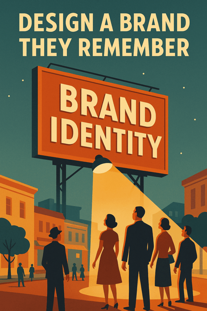


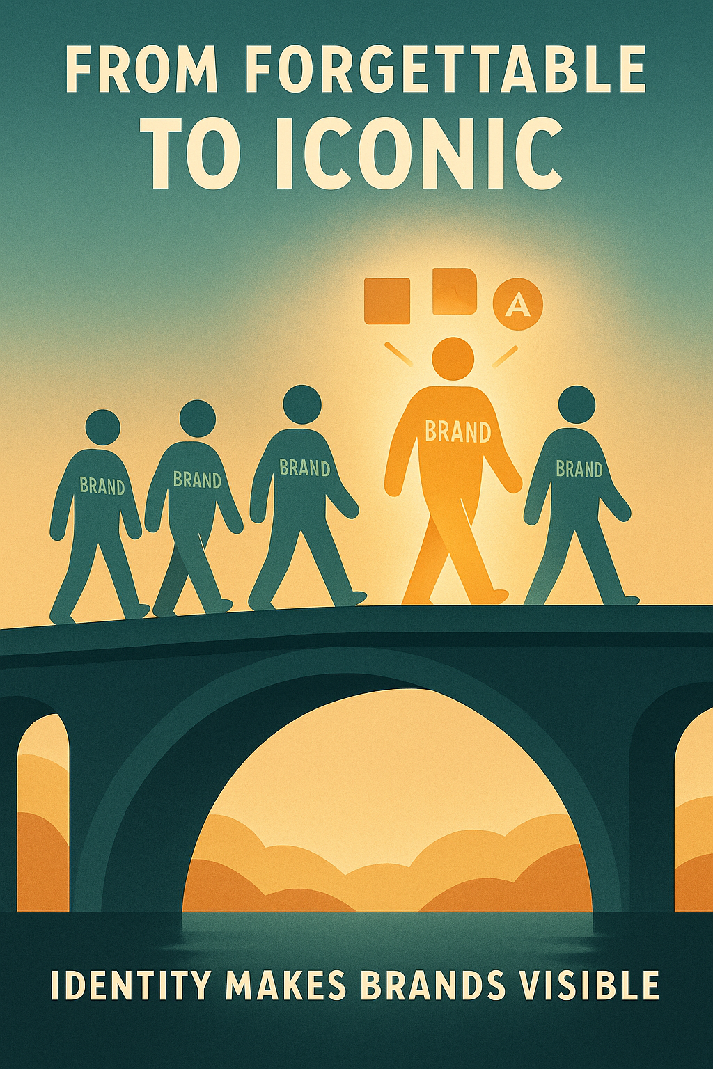
You’ve got a standout brand, product, or service—but here’s the problem: people aren’t remembering it, connecting with it, or trusting it.
And it’s not because your offer isn’t solid—it’s because your visual identity is working against you.
In a world where attention spans are short and options are endless, even the most brilliant business idea will get overlooked if the visuals don’t click.
The reality?
People judge your brand in seconds—based on how it looks, feels, and behaves across platforms.
If your visual brand identity is inconsistent, generic, or forgettable, that first impression won’t convert to a lasting connection. But a cohesive visual identity—one that communicates your brand’s personality, reflects your values, and aligns with what your audience wants to feel—can be the difference between being ignored and becoming iconic.
I’m Viktor, a strategist who’s helped top-tier brands shape visual branding that moves markets. Over the past 13 years, I’ve worked with everyone from global startups to legacy giants, building visual systems that don’t just look great—they get remembered, shared, and acted on.
In this guide, I’m going to walk you through how to create a strong visual identity that works across every platform you use, from your website to your socials to your packaging and beyond.
Here’s what you’ll walk away with:
A crystal-clear understanding of what a visual brand identity is (and isn’t),
The essential graphic design elements that make up a good visual identity,
The strategies to keep it consistent, scalable, and effective across all channels.
Because whether you’re launching a brand, refreshing one, or scaling something huge—visual identity isn’t a “nice-to-have.” It’s the face of your strategy.
It’s how your brand is perceived. And if you get it right, it becomes the fastest path to brand recognition, loyalty, and long-term differentiation.
Let’s get to work.
What Is a Visual Brand Identity?
So, what exactly is a visual brand identity—and why does it matter so much?
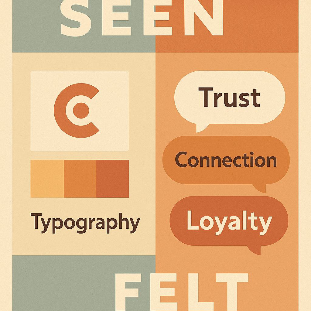
Put simply, your visual identity is the collection of design elements that create the look and feel of your brand. It’s the visual representation of your brand’s personality and values, translated into color, type, layout, and imagery. It’s how your brand looks, talks, and presents itself to the world—and it’s often the first thing people notice before they ever read a word about what your product or service actually does.
When done right, your visual brand identity does more than just look “on-brand.” It becomes a powerful tool to differentiate your brand, create a memorable presence, and build a strong brand image that works consistently across platforms—from a pitch deck or packaging to your brand on social media.
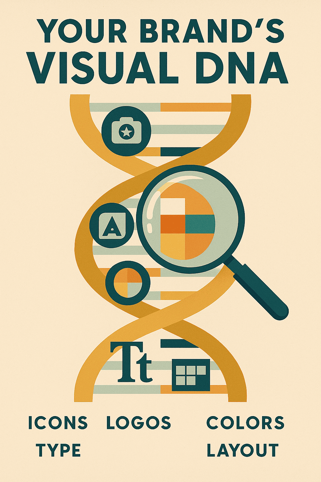
Key Components of a Visual Identity System
Here are the core visual assets that make up your brand’s visual identity:
Logo
The cornerstone of your visual identity, your logo design needs to be simple, scalable, and memorable. Whether it’s a wordmark, icon, or combination mark, it should reflect your brand name, mission, and positioning—and work seamlessly across digital and physical formats.Color Palette
Your brand colors evoke emotion and signal meaning. From luxury black-and-gold to vibrant neon tones, your palette helps define the feel of your brand. A strong color system includes primary, secondary, and neutral tones that work well together across backgrounds, media, and use cases.Typography (Brand Fonts)
Fonts communicate tone just as much as words do. Are you bold and modern, elegant and refined, or utilitarian and tech-focused? Your brand font choices should reflect your brand personality and offer a visual hierarchy—headlines, body copy, and accent fonts that all align.Imagery and Photography Style
The style of visuals you use—whether it’s raw, documentary-style photography or polished studio shots—should tell a cohesive story. Think in terms of light, composition, filters, and how your images represent your brand. This also includes illustrations, 3D graphics, or motion design if they’re part of your visual design language.Brand Iconography
Icons are more than just visual flourishes—they’re functional elements that guide users and build recognition. A cohesive icon set helps users navigate and interact with your brand’s identity across apps, websites, and products.Layout and Design Principles
Your visual identity doesn’t live in isolation. It’s how the elements work together to create an intuitive, polished experience. This includes spacing, grid systems, alignment, margins, and balance. A strong layout ensures your content is not only beautiful but easy to consume.
Pro Tip: These elements must be documented in a clear and accessible brand style guide—a template-driven playbook that ensures your visual identity stays consistent as your brand scales.
Identity vs. Brand Identity vs. Visual Identity
Let’s clear up a common point of confusion:
Identity is the overarching concept of who your brand is—its values, mission, purpose, and positioning in the market.
Brand identity includes both tangible and intangible elements. This covers everything from your tone of voice and messaging to your customer experience, visual identity, and even internal culture.
Visual identity is the tangible, visible layer of your brand identity. It’s what people see—your design, colors, logo, fonts, and style. It’s how your brand expresses itself in a way people can instantly recognize.
So when people say “your brand doesn’t feel cohesive,” what they often mean is that your visual identity is misaligned—with your strategy, with your message, or with your target audience.
Your visual identity for your brand is how the world sees you. It identifies your brand, tells a story at a glance, and sets the tone for every interaction that follows.
A unique visual identity isn’t about chasing trends. It’s about creating a visual identity that’s rooted in clarity, connection, and consistency. When these design elements like logos, fonts, and imagery are thoughtfully designed and intentionally aligned, your brand looks, feels, and performs like a category leader.
Ready to build a visual system that not only looks great but makes your audience feel something? Let’s go deeper.
Why Visual Brand Identity Matters
Your audience will see your brand before they ever hear it. Before they understand your message, try your product, or explore your story, they will judge your brand visually. This becomes even more important in regulated industries like medical devices, where visual credibility can influence whether clinicians, procurement teams, and institutional buyers trust the company enough to move forward.
In those first few milliseconds, the design decisions you’ve made—color, shape, typography, layout—trigger unconscious judgments that shape how your brand is perceived.
This is where the power of visual identity comes into play.
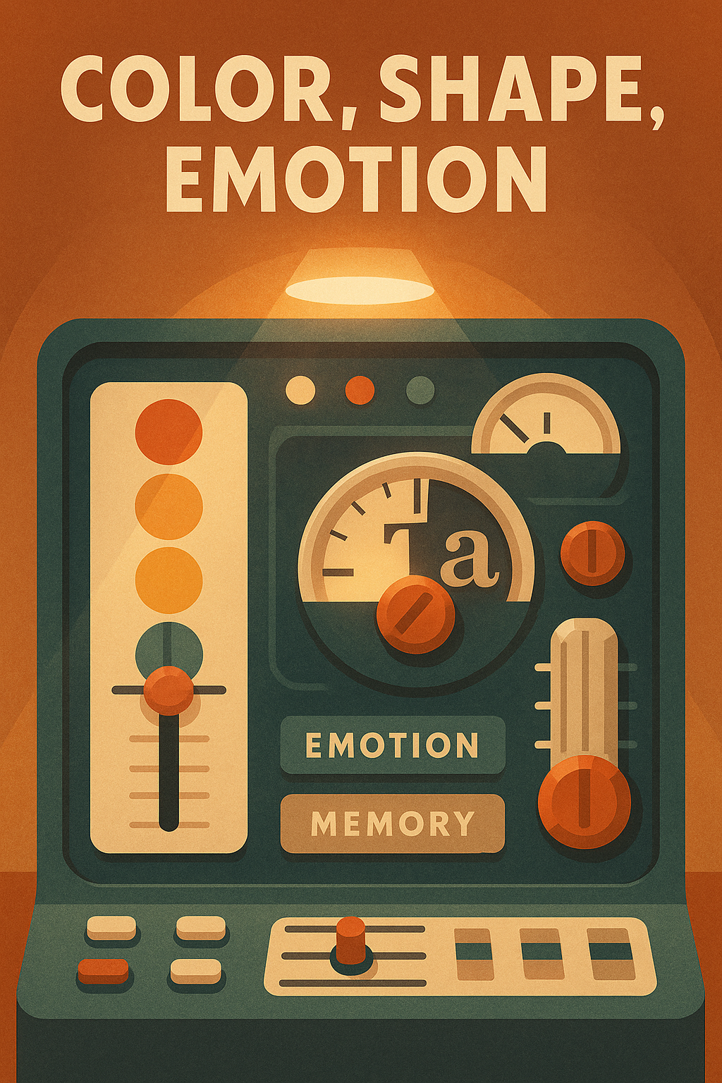
The Psychology Behind Visual Design
Every color, line, and curve in your graphic design communicates something. It’s not just about beauty—it’s about perception and emotion. Color alone increases brand recognition by up to 80%. Why? Because visual stimuli activate emotional responses that anchor memory and influence decision-making.
Let’s break down three of the most potent psychological design triggers:
Color: Blue often signals trust (think: PayPal, Facebook); red evokes urgency and passion (Coca-Cola, Netflix); green conveys wellness or sustainability (Whole Foods, Spotify). The right color palette doesn’t just “look good”—it supports your brand purpose and speaks directly to your target audience.
Shape & Typography: Rounded fonts and circular logos often feel friendly and inclusive, while sharp edges and bold lines signal authority or innovation. Your choice of typography and logo shapes contributes significantly to how your visual identity is perceived.
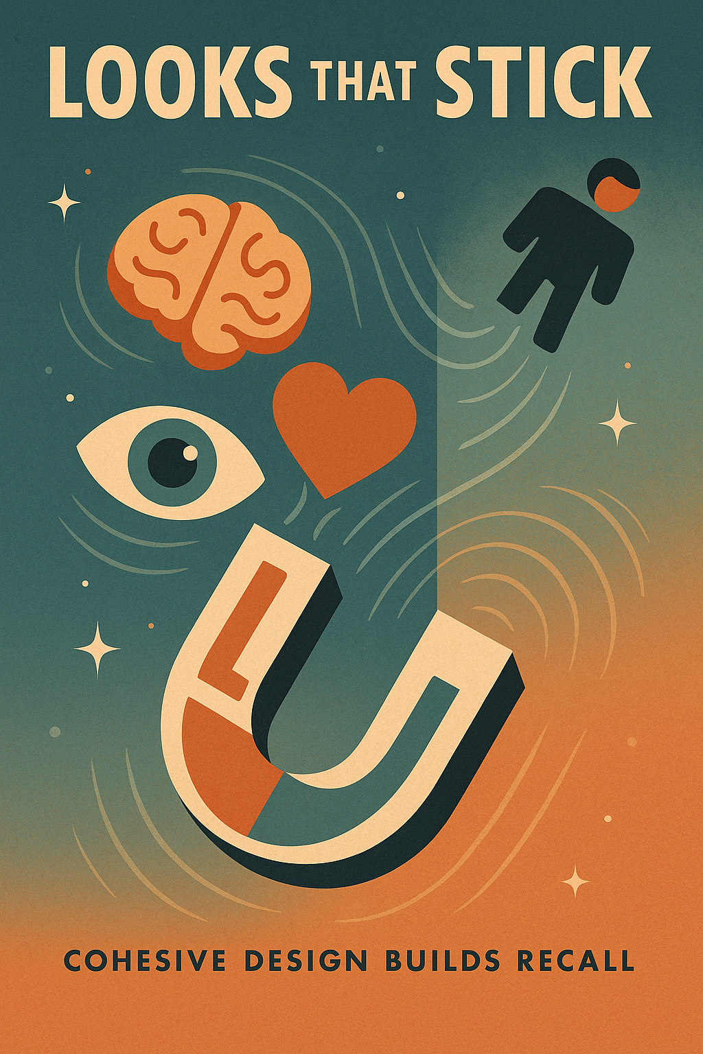
Emotion & Memory: People are more likely to remember visuals that trigger an emotional reaction. A strong visual identity makes people feel something—and when people feel, they remember.
A good visual identity isn’t just decoration. It’s behavioral design with a strategic purpose.
Brand Case Studies: Who’s Doing It Right?
Let’s take a look at a few iconic companies that have mastered the art of visual brand identity:
Apple: Clean, minimalist, and design-forward. Apple’s visual identity is rooted in simplicity, modernism, and whitespace. Their logo? A bite out of an apple—recognizable in any size, on any surface. Every product, store, and piece of content aligns with their brand purpose: innovation through elegance.
Nike: The iconic swoosh isn’t just a symbol—it’s movement, momentum, aspiration. Nike’s consistent use of black-and-white, bold typography, and empowering imagery cements their position as a performance-driven, lifestyle-forward brand. Their visuals reflect action and attitude.
Spotify: With a flexible yet recognizable visual design system, Spotify uses vibrant gradients, playful animation, and a distinct green logo to represent creativity, energy, and user empowerment. Their graphic design evolves with music culture while staying rooted in their core identity.
Each of these companies built a visual identity that mirrors their brand personality, aligns with their values, and delivers clarity across every customer interaction.
Core Elements of a Strong Visual Identity System
To create a strong visual identity, you need more than a good-looking logo or trendy font. A truly effective visual brand identity is built on a system—a collection of brand assets that work together to consistently reflect your brand personality, support your brand positioning, and create recognition across every touchpoint. Explore proven ways to develop a brand identity.
Let’s break down the essential elements that form the foundation of a strong visual identity system:
1. Logo Design That Reflects Your Brand
Your logo is the flagship of your visual identity—a small graphic with a massive job. It must represent your brand, signal your values, and remain recognizable across every context, from mobile apps to billboards.
Types of Logos:
Wordmark (Logotype): Text-based, using the brand name in a distinct typeface (e.g., Google, Coca-Cola).
Lettermark: Initials or abbreviations used as the primary logo (e.g., IBM, HBO).
Icon (Symbol or Brandmark): A standalone graphic or abstract mark (e.g., Apple, Twitter).
Combination Mark: A hybrid of icon + text (e.g., Adidas, Spotify).
Emblem: Text inside a symbol or badge (e.g., Starbucks, Harley-Davidson).
Tips for Designing a Timeless Logo:
Keep it simple: Complex visuals get lost in small formats.
Ensure scalability: Your logo should look sharp on everything from a favicon to a tradeshow banner.
Stick to one or two design options and refine them—avoid endless variations.
Design a logo that feels aligned with your brand purpose and audience—not just what’s trending.
A strong logo becomes the anchor for your overall visual identity, and the visual shorthand for how your brand is perceived.
2. Consistent Color Palette and Visual Cues
Your color palette is a powerful emotional and psychological trigger. Color can reinforce your brand positioning, differentiate you from competitors, and create immediate visual recognition.
Psychology of Color in Branding:
Blue: Trust, professionalism (LinkedIn, PayPal)
Red: Excitement, urgency, boldness (YouTube, Target)
Green: Health, sustainability, peace (Spotify, Whole Foods)
Black & White: Luxury, modernism, clarity (Chanel, Apple)
How to Choose the Right Brand Colors:
Align colors with your brand’s identity and message.
Choose primary and secondary color palettes to allow flexibility across platforms.
Use visual cues like highlights, overlays, and accent colors to guide behavior and enhance hierarchy.
A consistent color system helps ensure that your visual identity feels connected, no matter the medium.
3. Typography and Brand Fonts
Fonts are the unsung heroes of graphic design. They communicate tone, hierarchy, and professionalism without saying a word. Your brand fonts should support readability, accessibility, and most importantly—brand voice.
Key Considerations for Typography:
Web-safe vs. custom fonts: Web-safe fonts offer fast load speeds and cross-platform reliability; custom fonts provide unique differentiation.
Font hierarchy: Use distinct type styles for:
Headlines (Bold, strong, attention-grabbing)
Body copy (Clean, readable at all sizes)
Calls-to-action (Contrast or emphasis for conversion cues)
Typography that’s inconsistent or misaligned can fracture your brand image, while a well-defined font system reinforces a consistent visual identity.
4. Visual Language and Design Elements
Beyond logos and fonts, your brand’s visual identity depends on the language of design: spacing, shapes, textures, patterns, and layout grids. These often-overlooked elements bring cohesion and polish to your brand uses.
Design Details That Matter:
Shapes & Lines: Rounded shapes feel warm and inclusive; angular shapes feel bold and progressive.
Spacing & Layout: Negative space provides breathing room and increases focus.
Texture & Depth: Subtle shadows, gradients, or patterns can modernize flat visuals.
Your visual system should include rules around these design elements to maintain visual coherence across touchpoints—web design, product packaging, sales decks, and social media.
Want your brand to feel intentional, premium, or approachable? Your visual art direction sets the tone.
5. Brand Imagery and Visual Content Guidelines
Photography, illustration, and other visual media play a major role in how people emotionally connect with your brand. This is where your brand identity comes to life.
Define a Distinct Image Style:
Are your brand photos bright and minimal? Gritty and real? Stylized or documentary?
Choose a consistent image treatment—filters, lighting, composition—to maintain a unified brand image.
Content Guidelines Should Include:
User-generated content (UGC) dos and don’ts
Social media visual layouts (templates for stories, reels, posts)
Video overlays and motion graphics direction
Banner and display ad formats
By clearly defining your visual content guidelines, you protect the representation of the brand—especially as teams grow and content scales.
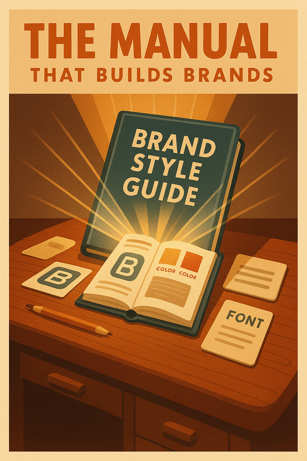
Creating a Brand Style Guide (Template & Best Practices)
A brand style guide isn’t a “nice to have”—it’s a non-negotiable if you want to build a consistent visual identity, scale your brand, and maintain trust across every touchpoint. Without a centralized, easy-to-follow document that defines how your visual identity should be expressed, even the best branding will erode over time through misalignment, guesswork, and inconsistency.
Whether you’re working with internal teams, freelance designers, agency partners, or global teams, a brand style guide ensures that everyone speaks the same visual language—and that your brand always shows up exactly the way it should.
Once the system is documented, choosing the right model for ongoing brand work becomes the next decision, because maintaining consistency across campaigns, sales assets, social content, and product materials requires the right support structure.
Think of it as the blueprint for your brand’s visual identity. It defines the rules, structure, and creative boundaries that make your branding repeatable without being boring, and recognizable without being rigid.
Why a Brand Style Guide Matters
Your brand identity doesn’t live in one place. It’s seen on your website, in your product UI, across your social content, inside email headers, within sales decks, and on packaging. And while your brand voice tells people who you are, your visual identity shows them.
A clear style guide:
Ensures consistent visual design across channels and campaigns
Empowers teams to produce on-brand assets without constant oversight
Protects your brand image from dilution
Accelerates production by reducing design guesswork
A style guide helps maintain the representation of the brand as it scales—without compromising creativity.
What to Include in Your Brand Style Guide
Below is a breakdown of the essential components to include when you create a strong visual identity system using a documented style guide:
1. Mission and Brand Purpose
Start with WHY (inspired by Simon Sinek). Your brand identity must be grounded in purpose. Articulate:
Why your brand exists
What you believe in
What brand voice you want your audience to hear and feel
This clarity sets the foundation for every graphic design decision that follows.
2. Logo Usage Rules
Approved versions of your logo (full color, monochrome, icon-only)
Clear space requirements and minimum sizing
Where and how to use the logo across different media (digital, print, merch)
Don’ts: distortions, color changes, poor contrast, unapproved placements
These rules help identity stay consistent and ensure the logo represents the brand accurately—at every size and in every setting.
3. Brand Colors & Hex Codes
Primary and secondary color palettes
RGB, HEX, CMYK breakdowns
Color usage hierarchy (primary for headers, secondary for highlights, etc.)
Color contrast guidelines for accessibility
Color is a visual identity multiplier. With this system in place, your brand always looks intentional, not improvised.
4. Typography Guidelines
Brand fonts and use cases (headlines, body copy, UI text, CTAs)
Font hierarchy: sizes, weights, and spacing
Web-safe alternatives to custom fonts
Examples of correct and incorrect font usage
Typography is where graphic design meets tone. These rules ensure you don’t dilute your brand identity through inconsistent or inappropriate font pairings.
5. Grid Systems & Layout Templates
Design grids for print, web, and mobile formats
Margins, padding, column structure
Content hierarchy principles (especially for web design and social assets)
Layouts help create balance, flow, and predictability across content types. They ensure your visual style stays cohesive even as content changes.
6. Imagery Guidelines: Do’s and Don’ts
Image tone, filters, lighting, and cropping
Approved stock libraries or preferred photo sources
What not to use: cliché stock photos, off-brand visuals
Guidelines for UGC, product photography, and video content
Imagery builds emotion and memory—this section helps differentiate your brand visually while staying true to your values.
7. Social Media Templates
Pre-designed templates for Stories, Reels, Feed posts, YouTube thumbnails
Logo placement, font size, caption hierarchy, and branding elements
Brand-safe animation or motion design directions
When everyone uses the same framework, your brand might show up differently across formats—but it still feels the same. That’s the power of visual consistency.
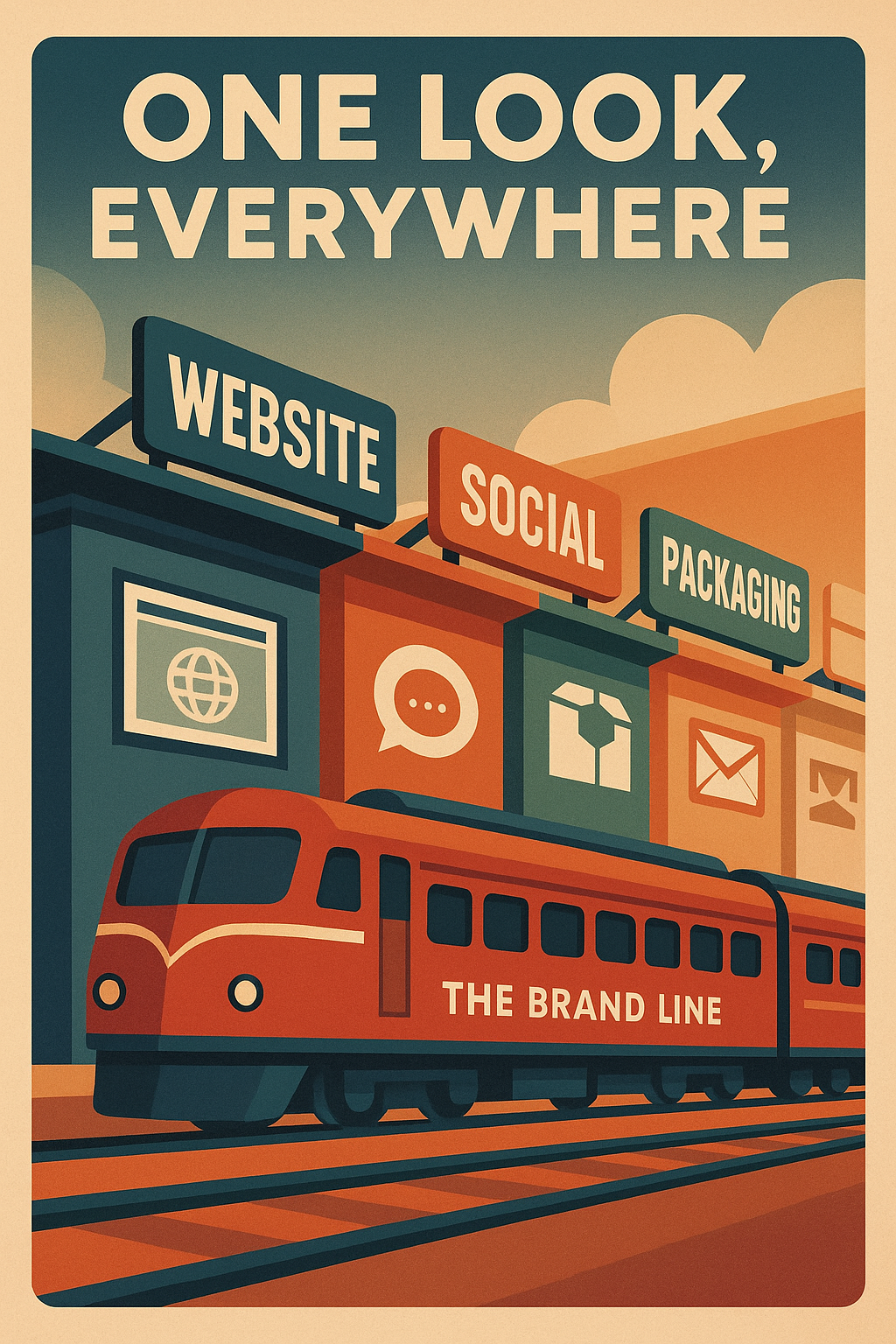
Visual Identity Across Platforms: Ensuring Cohesion Everywhere
Creating a visually compelling brand identity is only half the job—maintaining that identity across every platform is what builds brand recognition, trust, and long-term value. Your visual identity should feel seamless, whether someone is browsing your website, unboxing your product, viewing a pitch deck, or engaging with your brand on social media.
The goal? A consistent visual identity that reinforces your message and style, no matter where or how people experience your brand.
This is also how AI startups apply brand cohesion when they need their website, pitch deck, product UI, sales materials, and thought leadership to signal the same level of maturity to enterprise buyers.
Let’s break down how to ensure your visual brand identity performs cohesively across all key channels:
1. Website & Digital Experiences
Your website is often the first and most important touchpoint in your brand ecosystem. It’s your 24/7 storefront, sales rep, and brand ambassador rolled into one.
Align UX/UI Design with Brand Identity:
Your graphic design choices—from button styles to navigation layouts—should reflect the same visual language established in your brand guidelines.
Icons, animation, micro-interactions, and transitions should all follow your established visual identity standards.
Your logo, fonts, and color palette should show up exactly as they do in your printed or promotional materials, reinforcing the representation of the brand.
Web Accessibility Considerations:
Ensure sufficient contrast between text and background for readability.
Avoid overly small fonts or low-contrast CTAs that hinder usability.
Use semantic HTML, proper alt-text, and screen-reader-friendly design to extend your visual identity to all users inclusively.
Your site is where identity becomes the experience—and bad UX can damage even the best-designed brands.
2. Social Media & Content Marketing
In a content-driven world, your brand is only as memorable as its consistency across platforms like Instagram, LinkedIn, YouTube, and TikTok.
Creating Consistent Templates:
Design flexible but structured templates for stories, reels, carousels, and video thumbnails.
Apply your brand colors, logo, and fonts in a repeatable system—this helps users instantly recognize your content in a crowded feed.
Cohesion Across Formats:
Maintain visual alignment between static posts, short-form videos, and long captions.
Use consistent lower-thirds, overlays, animations, and image filters to ensure your visual identity helps reinforce your message and values.
Social platforms are where many users will first encounter your brand, so every swipe, click, and scroll should feel like an extension of your overall visual identity.
3. Print and Packaging Design
Even in a digital world, print still matters. In fact, physical materials can leave a lasting impression—if they’re on-brand.
Extending Your Brand to Physical Assets:
Use the same fonts, logos, and color palette from your style guide on all packaging, business cards, and print collateral.
Packaging should feel like a tactile embodiment of your visual identity—whether it’s minimalist, expressive, bold, or elegant.
Examples:
Business cards with foil accents that reflect a premium identity.
Brochures and event materials that align with your web design and digital branding.
Product packaging that brings together form and function while staying true to your graphic design standards.
Print is your brand in the real world. It’s where visual trends meet physical presence.
4. Email, Presentations, and Sales Materials
Your internal and outbound documents are just as important as your public-facing content. Inconsistent design in these areas erodes professionalism and weakens brand image.
Branded Templates for Communication:
Design master decks in PowerPoint, Keynote, or Google Slides with clear guidelines on fonts, logos, colors, and layouts.
Provide plug-and-play templates for sales teams, internal briefings, webinars, and investor updates.
Ensure your graphic design guidelines are followed from slide 1 to the closing CTA.
Email Design Standards:
Use branded headers, footers, buttons, and consistent font sizing.
Align email signatures, out-of-office messages, and campaign layouts with your visual identity.
Use banners, GIFs, and CTA blocks that match your brand’s personality and voice.
Whether you’re closing deals or nurturing leads, consistency in these documents communicates reliability, professionalism, and brand integrity.
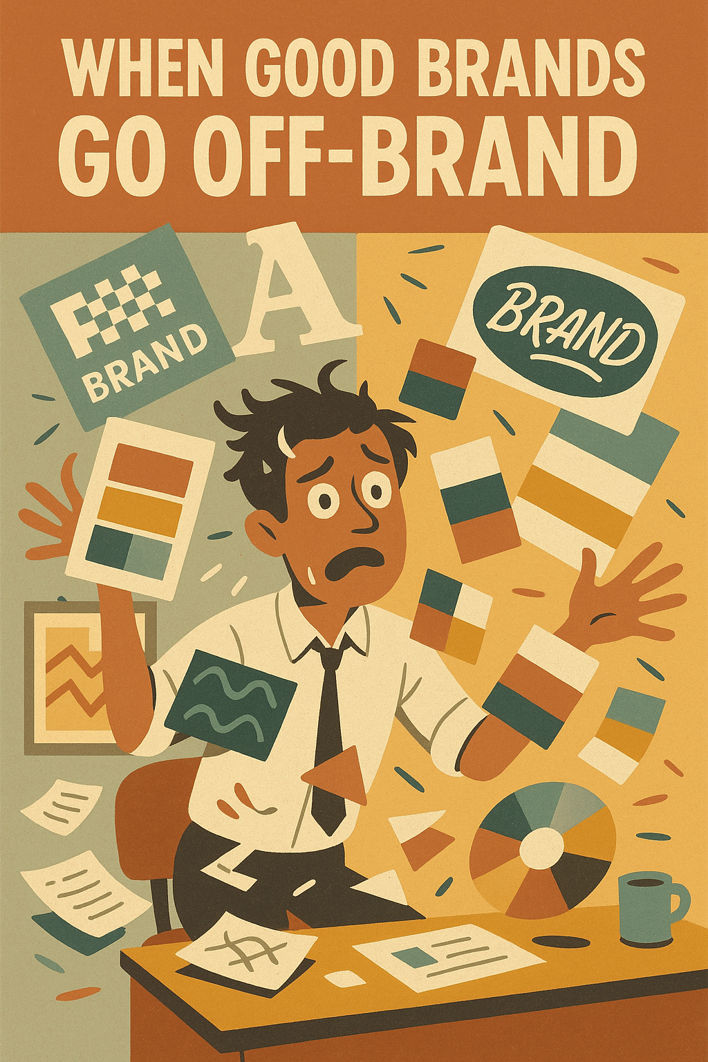
Common Mistakes in Visual Brand Design (And How to Avoid Them)
Even the most well-intentioned branding efforts can fall flat if they’re built on weak foundations or executed inconsistently. Whether you’re building a brand from scratch or refreshing an existing one, your visual identity must be purposeful, cohesive, and built to last. Otherwise, you risk confusing your audience, diluting your message, and undermining your credibility.
Here are the most common pitfalls in visual brand design—and how to avoid them if you want to create a strong visual identity that supports long-term growth.
1. Inconsistency Across Touchpoints
The mistake: Your brand looks one way on your website, another on your Instagram, and completely different in email campaigns or packaging. There’s no visual continuity.
Why it hurts: Inconsistency breaks trust. It creates friction, weakens your brand image, and causes confusion. People don’t know what to expect—and that unpredictability reduces your memorability.
How to fix it:
-
Develop and enforce a detailed brand style guide.
-
Use templates and design systems across platforms to promote a consistent visual identity.
-
Align your internal and external teams around shared graphic design standards.
Your identity is the visual expression of your brand. Without consistency, that expression loses meaning.
2. Designing Without a Clear Brand Strategy
The mistake: Jumping straight into designing a logo or picking fonts and colors without first defining who your brand is, what it stands for, and who it’s speaking to. Check out why typography and color psychology matters when building a brand ID.
Why it hurts: When there’s no underlying strategy, your design decisions are based on personal preference—not brand purpose or audience alignment. You’ll struggle to differentiate your brand or connect emotionally with your target market.
How to fix it:
-
Start with WHY—define your mission, values, and brand personality before touching any visual elements.
-
Use that strategy to guide all creative work, from graphic design to web content to messaging.
-
Revisit your brand identity regularly to ensure visual decisions reflect evolving goals.
A beautiful brand without a strategy is just decoration. Clarity creates power. Here’s a guide on
3. Prioritizing Trends Over Timelessness
The mistake: Chasing the latest visual trends—like overly minimal fonts, gradient overloads, or ultra-flat illustrations—without considering long-term relevance or brand fit.
Why it hurts: What’s trendy today might be outdated tomorrow. When your brand relies too heavily on fleeting styles, your identity can feel generic or disposable.
How to fix it:
Design for longevity, not virality. Timeless design doesn’t mean boring—it means rooted in brand positioning and enduring appeal.
Use trends as inspiration, not direction. Incorporate modern elements thoughtfully into a well-grounded system.
Focus on visual choices that represent your brand authentically and serve your users first.
If your identity only works in 2024, you’ll need to rebrand in 2025. That’s not smart branding—it’s expensive guesswork.
4. Poor Scalability or Legibility in Logo Design
The mistake: Designing a logo that looks stunning on a desktop, but breaks down in small sizes or loses meaning when scaled.
Why it hurts: A great logo is adaptable. If it’s too complex, too thin, or overly detailed, it won’t hold up on mobile, in print, or in dynamic digital environments. This weakens your core visual identity.
How to fix it:
Test your logo across real-world applications: favicons, app icons, business cards, signage, social avatars.
Ensure clear legibility in black and white and at reduced scale.
Use vector-based formats and create logo variants (full, stacked, icon-only) as part of your brand assets.
Your logo is not just a decoration—it’s the anchor of your brand’s visual system. Treat it accordingly.
5. Failing to Update Brand Visuals Over Time
The mistake: Sticking with outdated design choices that no longer reflect your brand identity, product evolution, or audience expectations.
Why it hurts: As your company evolves, so should your visual identity. Clinging to old designs can create a disconnect between how your brand is perceived and what it truly offers today.
How to fix it:
Audit your brand visuals annually to assess alignment with your current strategy and market position.
Refresh elements like color palettes, typefaces, or layout patterns without losing core recognizability.
When necessary, explore a full rebrand or brand evolution to realign with business goals.
Growth requires evolution. A static visual identity in a dynamic business environment is a liability, not a legacy.
How to Create a Unique and Memorable Visual Identity
In a world saturated with sameness, a unique visual identity is your unfair advantage. It’s what allows your brand to break away from industry noise, leave a lasting impression, and connect on an emotional level. But crafting a visual system that’s both memorable and strategic isn’t about randomly mixing colors, fonts, and shapes—it requires clarity, creativity, and competitive foresight.
So how do you create a strong visual identity that both reflects your values and positions you as the unmistakable choice in your category?
Let’s break it down.
Blend Innovation with Strategic Clarity (The Edison Model)
The best visual identities come from a place of disciplined creativity. Thomas Edison didn’t just invent lightbulbs—he engineered systems that solved real-world problems. That mindset applies to brand building too.
Innovation without clarity is noise. If your design is daring but disconnected from your brand identity, it will confuse rather than captivate.
Start with the fundamentals: What does your brand represent? What do you want your audience to feel, remember, or believe after seeing your logo or interacting with your content?
Then, explore visual directions that translate that strategy into sensory impact. Use graphic design as your tool—not just to decorate, but to communicate.
Edison’s legacy wasn’t in the spark—it was in the system. Your visual identity should be no different: inventive, intentional, and built to scale.
Apply Blue Ocean Strategy to Visual Branding
Most brands fight for attention in the same design waters—recycling visual trends, mimicking competitors, and blending into the background. To truly differentiate a brand, you need to sail into a blue ocean.
Blue Ocean Strategy teaches us to shift from competition to creation. When it comes to visual branding, that means:
Defining your own aesthetic rather than chasing category conventions.
Avoiding visual clichés common in your industry.
Expressing your brand voice through unexpected but authentic design choices.
Ask yourself: What visual decisions would make my brand instantly recognizable—without seeing the logo?
That’s the hallmark of a true strong visual identity: recognizable even in fragments.
Your design system shouldn’t compete with others—it should render them irrelevant.
Collaborate with Experts: Designers Who Think Like Strategists
You don’t have to do it all alone. In fact, you shouldn’t.
Building a high-performing visual identity requires collaboration between creative vision and strategic intent. This is where working with experienced graphic designers and brand strategists becomes a game-changer.
Look for designers who understand not just aesthetics, but brand architecture and consumer psychology.
Collaborate closely: share your mission, values, customer insights, and brand positioning. Let them translate that strategy into visual language.
Use creative sprints, moodboarding sessions, and iterative reviews to refine a design system that’s both distinct and aligned.
When creatives understand your “why,” they’re empowered to design beyond trends—and build a visual identity that becomes a strategic asset, not just a design deliverable.
Tools & Resources for Visual Brand Identity Design
In today’s fast-paced digital world, creating and maintaining a strong visual identity requires not only creativity and strategy but also the right set of tools and resources. These resources can streamline your design process, ensure consistent visual identity across platforms, and empower you to create a strong brand identity that resonates with your target audience. Below is an overview of essential tools and platforms that can help you build and manage your visual brand identity.
1. Design Tools for Crafting Your Visual Identity
Modern graphic design is driven by powerful software that enables creative professionals to push boundaries while maintaining consistency. Some of the leading design tools include:
Adobe Suite:
Adobe’s ecosystem—especially Photoshop, Illustrator, and InDesign—remains the industry standard for high-end graphic design and visual identity work. These tools offer extensive capabilities for creating logos, illustrations, layouts, and more.Figma:
Figma is a collaborative interface design tool ideal for teams working on UX/UI projects. Its real-time collaboration features make it easier to build cohesive design systems and ensure that every element of your brand identity aligns across digital platforms.Canva:
For those seeking a user-friendly solution, Canva provides intuitive design templates that help non-designers produce professional-grade visuals quickly. It’s particularly useful for creating social media graphics, presentations, and basic branding assets.Sketch:
Sketch is popular among digital designers for its vector editing capabilities and robust plugin ecosystem. It excels at creating detailed web and app designs that reflect your visual identity in every pixel.
2. Style Guide Generators
A well-documented style guide is essential to maintain consistent visual identity across all brand touchpoints. Several online platforms can help generate and manage your brand guidelines, including:
Frontify:
This platform allows you to create, manage, and share your brand style guide in a centralized digital space. It helps teams adhere to your brand identity standards by providing clear templates and guidelines for logos, colors, typography, and imagery.Bynder:
Bynder is another robust asset management tool that doubles as a brand portal, enabling you to manage visual assets, update brand guidelines, and ensure that your graphic design elements are used correctly across all channels.
3. Typography Pairing & Color Palette Tools
Typography and color are critical components of your visual identity. To create harmonious designs, consider using:
Typography Pairing Tools:
Tools like Google Fonts, FontJoy, or Typewolf help you explore and select font combinations that align with your brand identity. These resources allow you to experiment with different font pairings, ensuring that your headlines, body text, and CTAs maintain a clear hierarchy and cohesive brand voice.Color Palette Generators:
Resources such as Adobe Color, Coolors, or Paletton enable you to develop comprehensive color schemes. These tools provide RGB, HEX, and CMYK values that ensure your brand colors are applied consistently across both digital and print media. They also offer inspiration by exploring color trends that complement your visual identity.
4. AI Logo Design Tools – Pros & Cons
Artificial intelligence has entered the realm of logo design, offering quick and cost-effective options for startups and small businesses. Some popular AI logo makers include Looka, Tailor Brands, and LogoMakr.
Pros:
Speed & Affordability: Quickly generate multiple logo options without a huge upfront investment.
Ease of Use: Intuitive interfaces make it accessible even for non-designers.
Variety: AI tools often provide a broad range of design variations based on your inputs.
Cons:
Lack of Uniqueness: AI-generated logos might lack the distinctive touch that comes from custom, strategic design.
Limited Customization: You might find yourself constrained by the template options available.
Generic Outcomes: Without a deep understanding of your brand identity, the resulting logo may not fully differentiate your brand from competitors.
While AI logo design tools can serve as a starting point, partnering with a professional designer is advisable for a unique visual identity that truly reflects your brand’s core values.
5. Brand Audit and Asset Management Platforms
To keep your visual identity fresh, consistent, and scalable, regular audits and effective management of your design assets are crucial. Platforms that specialize in this area include:
Frontify & Bynder (Revisited):
Both tools not only help create style guides but also act as centralized hubs for your visual assets. They facilitate version control, ensure that updated brand guidelines are accessible to all team members, and support consistent use of your graphic design elements.Digital Asset Management (DAM) Systems:
Other DAM platforms like Widen or Brandfolder can help you store, organize, and distribute your brand assets efficiently. These systems ensure that every file—from high-resolution logos to digital templates—is maintained in its correct format and is easily accessible for use in various campaigns.
Time to Take Action: Build a Brand That Stands the Test of Time
A brand that doesn’t define its values and mission lacks direction. Don’t let your brand become one of the countless businesses that fade into irrelevance because they failed to establish a strong brand identity.
It’s time to take action and put your brand on the path to authenticity, consistency, and long-term success.
Here’s Your Next Step:
✔ Write down 3-5 core brand values that define your business’s purpose and identity.
✔ Draft a compelling mission statement in one or two sentences that communicates what your brand stands for.
✔ Start integrating these values into your business strategy—from your marketing to your company culture and customer experience.
Make Your Brand Values More Than Just Words
Apply them in daily decision-making.
Ensure they are reflected in your brand messaging, visual identity, and interactions. Find out how you can develop an effective brand messaging strategy.
Revisit and evolve your values over time to stay aligned with industry trends and consumer expectations.
Brands that succeed are brands that stand for something. Define what your brand stands for and start building a legacy today.
Designing a Cohesive Visual Identity That Resonates
Your visual identity is more than a surface-level aesthetic—it’s the visual manifestation of your brand’s soul. It shapes how your audience feels about your business, how they remember it, and ultimately, how they trust it. From your logo to your typography, from your color palette to your imagery, every element plays a role in building an identity that speaks clearly and confidently in every context.
Recap:
A strong visual identity is:
Consistent, so that every touchpoint reinforces your brand image;
Strategic, aligning with your brand purpose, values, and positioning;
Memorable, helping you differentiate your brand in a saturated marketplace;
And emotionally resonant, connecting with your audience on a deeper level.
When done right, your visual identity helps turn casual viewers into loyal customers—and loyal customers into brand advocates.
All Visual Elements Must Work Together
Great branding doesn’t happen by accident. It happens when all elements of your graphic design system—logos, fonts, colors, layouts, and imagery—are intentionally aligned to create a cohesive whole. This harmony is what gives your brand its voice, its look, and its lasting impact.
Your visual identity refers to how you look, but also to how you’re experienced. Every time your audience interacts with your brand, whether online or offline, your visuals should reinforce the same message: “This is who we are.”
Your identity isn’t just what you show—it’s how you make people feel. And consistency is what makes that emotional connection stick.
Final Tip: Start With Why—Then Design With Purpose
Before you touch a color swatch or sketch a logo, get clear on your “why.”
Why does your brand exist?
Who are you trying to reach?
What do you want them to believe, feel, and remember about you?
This clarity is the compass for every visual decision. From typography to tone, from templates to textures, when your graphic design flows from your purpose, it becomes more than visual—it becomes visceral.
So, define your brand identity with intention. Use design to represent your brand, not just decorate it. And ensure every element—from the boldest billboard to the smallest icon—works together to create a strong visual identity that truly resonates.