

What separates a good fintech website from one that actually helps people understand a financial product?
It’s a question I wanted to explore when developing FORMA, an independent financial technology brand and interactive website concept.
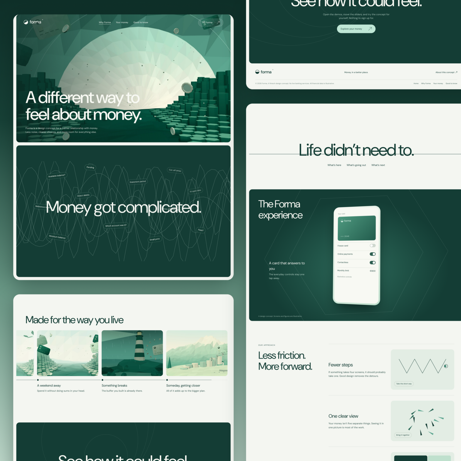
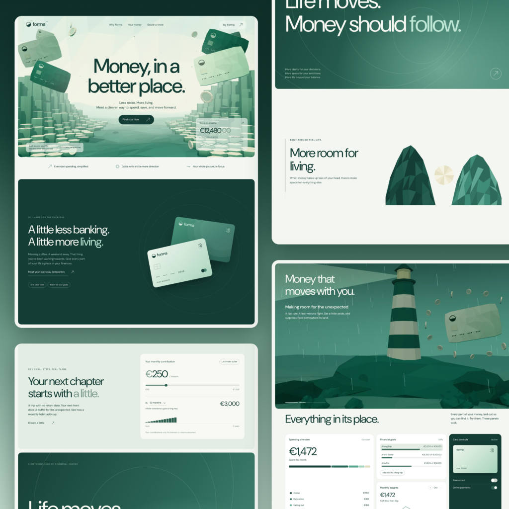
The project combines a complete visual identity, three-page website, interactive financial dashboards, payment card controls, savings planning tools, and motion design.
Rather than producing another attractive homepage or adapting a pre-built template, I wanted to demonstrate how the marketing website and financial product could become one connected experience.
The result is FORMA, a complete concept developed in 2026 and now available for acquisition.
Explore the interactive FORMA website
What Makes the Best Fintech Websites Work?
The best fintech websites need to achieve something that ordinary marketing websites don’t always have to consider.
They’re asking people to trust a company with their money, financial information, or business operations.
That creates a different set of expectations.
Visitors need to understand what the product does, who provides the underlying financial services, what it costs, and what happens when something goes wrong.
A beautiful interface can make a product more approachable, but it cannot replace clear information or credible trust signals.
For financial companies, the challenge is balancing three objectives:
- Clarity: Explain complex financial products in language people understand.
- Credibility: Provide accurate information about the company, its services, and how it handles customer money.
- Usability: Help visitors explore the product and confidently complete the next step.
These design principles apply to consumer banking applications, payment platforms, and B2B fintech products alike.
With FORMA, I wanted to explore how those objectives could influence the entire digital experience, rather than treating them as separate requirements.
Building the FORMA Fintech Brand
Traditional banking websites often rely on institutional imagery, dark blue color schemes, and conservative typography.
Those conventions are familiar, but they aren’t the only way to build trust.
For FORMA, I developed a visual identity using deep forest greens, softer mint tones, clean typography, rounded interface elements, and generous spacing.
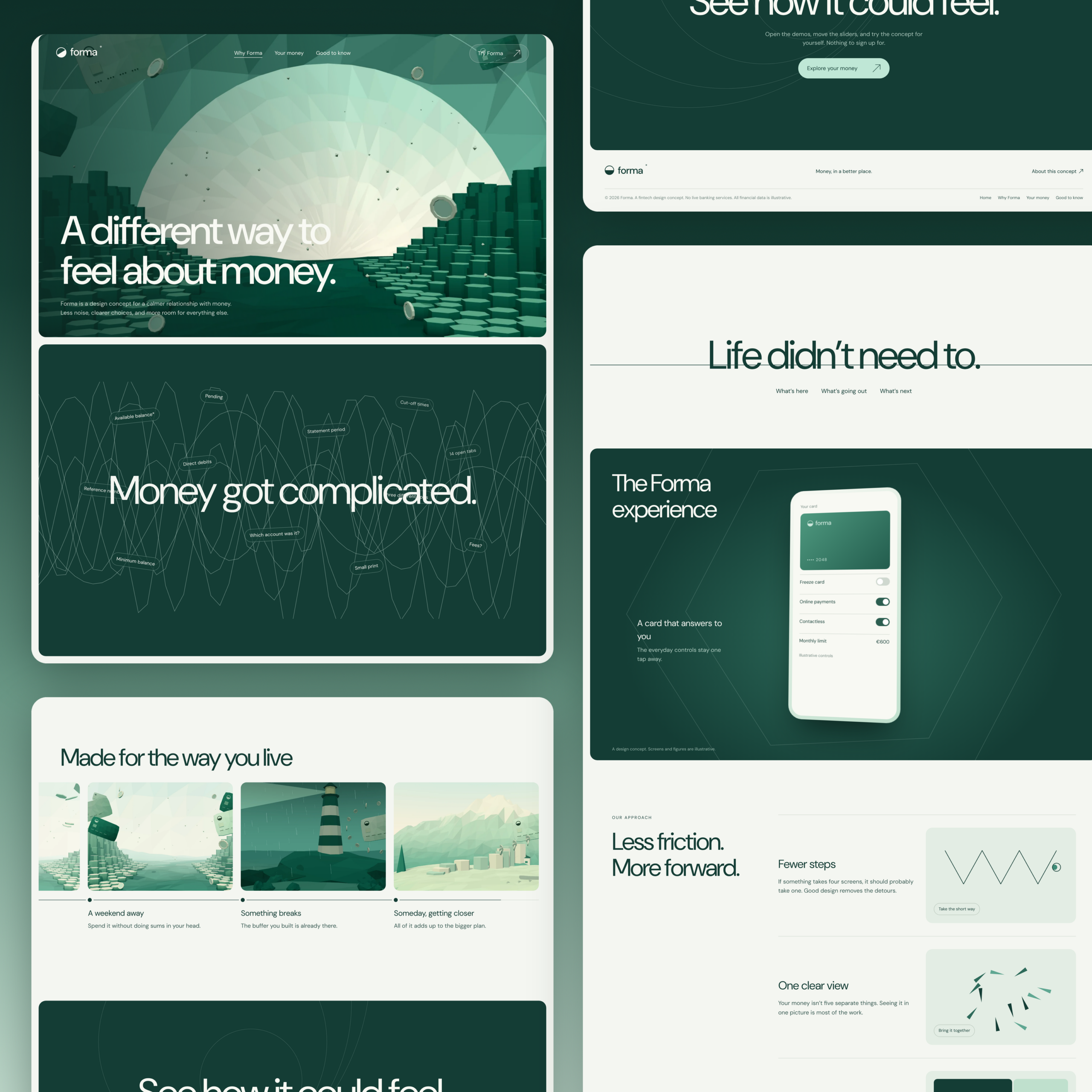
The color palette establishes a confident visual foundation while keeping the experience approachable.
I also wanted the identity to work across two environments.
The marketing website needed room for storytelling, large typography, dimensional elements, and animation.
The financial application needed a more structured layout that could accommodate balances, transaction histories, charts, and interactive controls.
This is where a consistent design system becomes important.
A company can have an attractive marketing website and still deliver a confusing product experience. The challenge is to maintain consistency without forcing every interface to behave like a promotional page.
FORMA uses a shared visual language across both.
Fintech Homepage Design: Starting With Everyday Life
Most financial websites introduce their features before explaining why people need them.
Accounts. Cards. Transfers. Payments. Savings.
But customers don’t necessarily think about money in those terms.
Someone saving for a holiday is thinking about the trip. Someone checking their balance before buying groceries wants to know what’s available. Someone planning for their first home wants to understand how long it might take.
That’s why FORMA’s homepage begins with a simple proposition:
Money, in a better place.
The page introduces familiar financial situations before moving into the product’s functionality.
Animated payment cards, interactive previews, and scroll-driven transitions connect the visual identity to the proposed financial experience.
The landing page design follows a progression: establish relevance, introduce the product, and demonstrate how it could work.
That approach also gives visitors a reason to continue exploring.
Instead of relying entirely on copywriting to explain the features, the website allows visitors to interact with selected examples.
Fintech UX Design: Connecting the Website to the Product
One of the more interesting decisions in developing FORMA was treating the marketing website and financial interfaces as parts of the same project.
These are frequently handled by different teams.
A branding agency develops the identity. A website team creates the marketing experience. Product teams design the application.
There’s nothing inherently wrong with that workflow, but it creates opportunities for inconsistencies.
The website might promise simplicity while the application presents users with dozens of equally important options.
With FORMA, I wanted the product demonstrations to support the promises introduced on the website.
The three-page structure follows that thinking.
Home introduces the concept through everyday financial situations.
Why Forma explains the problems the product intends to address, including disconnected financial information and unnecessary complexity.
Your Money demonstrates the financial interface through working interactive examples.
This helps reduce cognitive load by introducing functionality progressively rather than presenting every feature at once.
The objective is to guide users from understanding the brand to exploring the product.
Financial Dashboard Design: Information Before Decoration
Financial dashboards have a particular challenge.
Almost everything they contain could be considered important.
Balances, spending, savings, transaction histories, financial goals, notifications, and account details all compete for attention.
But an interface isn’t necessarily better because it shows more information.
For FORMA, I started with four questions:
- How much money is available?
- Where is it going?
- What’s happened recently?
- How close am I to my financial goals?
The dashboard establishes an overview before allowing visitors to explore individual details.
Users can switch between different spending periods and filter transactions by category.
The information hierarchy prioritizes what people need to understand first, while additional controls help them investigate further.
In a production digital banking application, this approach would require careful handling of different account states.
For example, an available balance might differ from the current balance because of pending transactions or restrictions.
Those distinctions must be communicated accurately, especially when people are about to move money.
The FORMA dashboard uses illustrative information, but its UI design demonstrates how these interactions could be organized.
Making Payment Cards Interactive
One of my favorite elements is the payment card experience.
I didn’t want another decorative card mockup surrounded by feature descriptions.
Instead, visitors can interact directly with the card.
The interface allows users to rotate it, switch between Mint and Forest finishes, freeze or unfreeze the sample card, toggle online and contactless payments, and adjust a monthly spending limit.
These interactions demonstrate something important about financial product design.
People need to understand the state of their financial controls.
Is the card active? Are online payments enabled? Has the spending limit changed?
The interface should provide an immediate, understandable answer.
In a real product, these controls would also need to communicate whether the underlying operation succeeded.
A toggle changing color doesn’t mean a payment system has successfully frozen a card.
That requires backend confirmation, appropriate authentication, and error handling.
FORMA demonstrates the intended interactions rather than actual banking services.
Savings Planning: Making Financial Goals Tangible
The savings planner explores another aspect of fintech design.
Long-term financial goals are often difficult to evaluate because the amounts and timelines feel abstract.
With FORMA, visitors can choose a financial objective, adjust the target amount, enter existing savings, and change monthly contributions.
The interface updates the estimated time required to reach the selected goal.
The calculations are illustrative and don’t assume interest or investment returns.
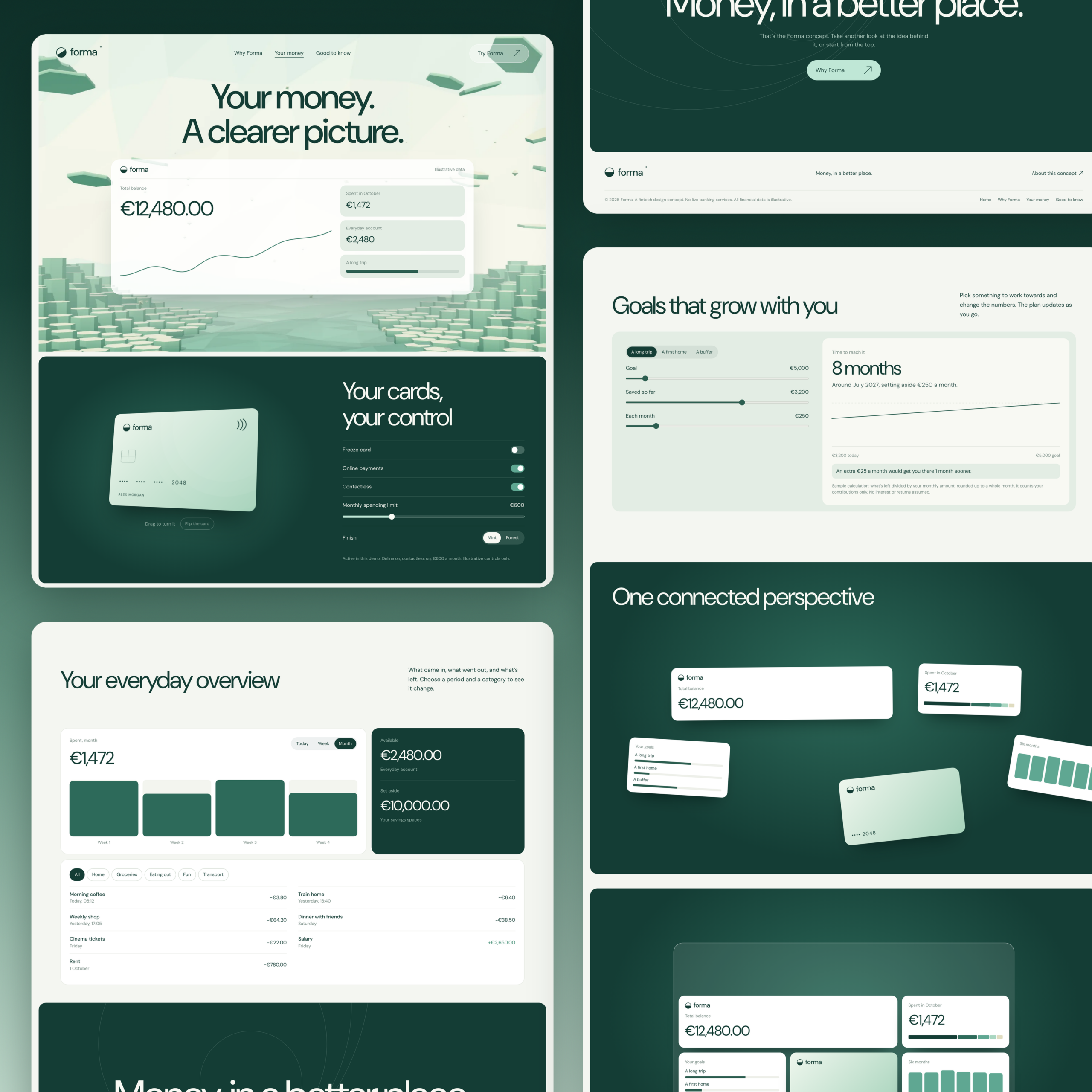
The objective was to make the relationship between contributions, time, and financial goals easier to understand.
In a production financial application, calculations would require clearly defined assumptions, appropriate disclosures, and user testing.
A financial calculator shouldn’t simply display a convincing number.
It should help people understand what that number means.
Motion, Conversion, and the Fintech Website Experience
Animation can improve how visitors experience a website, but it needs a reason to exist.
FORMA includes a dimensional hero environment, scroll-driven payment card sequences, interface transitions, and responsive financial controls.
I approached the marketing website and product interfaces differently.
The marketing experience has room for expressive motion. It introduces the visual identity, creates interest, and helps visitors understand the proposed product.
The financial interfaces prioritize predictable behavior and immediate feedback.
This distinction matters for conversion.
An interactive demonstration might help someone understand the product before signing up, but unnecessary movement can also distract visitors from important information.
A well-designed conversion journey should answer the questions people have before asking them to commit.
That includes explaining the product, presenting relevant evidence, making pricing understandable, and reducing uncertainty around the next step.
The website should also load quickly, remain usable on smaller screens, and accommodate reduced-motion preferences.
For a financial service, performance and accessibility are part of the experience, not finishing touches.
Lessons From the Best Fintech Website Design Examples
When looking at established companies such as Stripe, Plaid, and Brex, it’s useful to examine how different business models influence website design.
Stripe serves businesses integrating payments and financial infrastructure. Plaid operates in the financial data connectivity space, while Brex focuses on corporate financial products.
These aren’t interchangeable audiences.
A developer evaluating Stripe’s payment systems may need technical documentation and integration details.
A company evaluating Plaid may need to understand supported financial connections, data permissions, and implementation requirements.
A business considering Brex may be more interested in expense management, controls, eligibility, and product capabilities.
For B2B SaaS and fintech companies, these differences should influence the website’s primary navigation, feature pages, customer examples, and calls to action.
The best fintech website design examples aren’t necessarily the most visually elaborate.
They’re the ones that explain the right information to the right audience.
That’s an important lesson for fintech startups and established financial technology companies alike.
What Fintech Companies Should Consider Before Building a Website
Before commissioning a custom fintech website, I’d recommend clarifying several things.
1. Define the product and its audience.
A consumer finance application and a B2B fintech platform require different messaging, customer journeys, and product demonstrations.
2. Identify the biggest trust gaps.
What would prevent someone from using the product? Security concerns, unclear pricing, unfamiliar technology, regulatory questions, or uncertainty about the company?
Different concerns require different evidence.
A security badge alone isn’t enough to establish credibility. Depending on the product, visitors may need clear disclosures, a dedicated trust page, information about banking relationships, or explanations of how customer information is protected.
3. Decide what the website should demonstrate.
A payments platform might benefit from technical examples. A savings product could use an interactive calculator. A financial SaaS company might need a product walkthrough.
Not every feature requires its own interactive demonstration.
4. Design the customer journey before the individual pages.
A homepage, pricing page, feature page, FAQs, and signup process need to work together.
The primary navigation and page content should support the questions customers are likely to ask.
The fine print also matters. Important financial terms shouldn’t be hidden behind attractive visual design.
5. Choose the right development approach.
Tools such as Figma can support interface design and prototyping, while platforms such as Webflow may be appropriate for certain marketing websites.
But the technology should follow the requirements.
A static marketing website and an application handling real financial transactions have very different technical responsibilities.
The goal isn’t simply to build websites faster. It’s to build appropriate, maintainable digital experiences that can support business growth.
FORMA: An Independent Fintech Concept Available for Acquisition
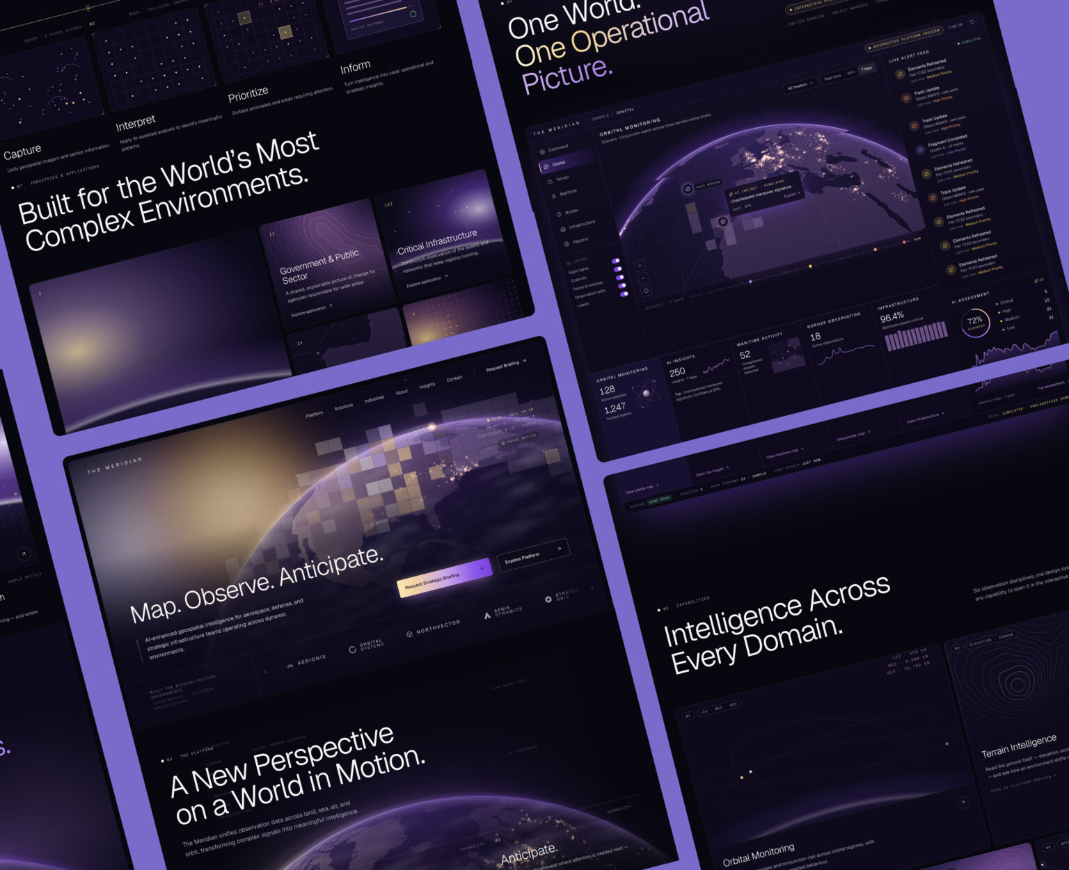
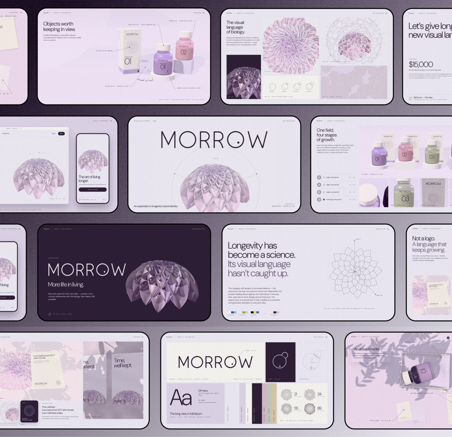
FORMA was developed as an independent creative project, similar to my previous concepts MORROW and Meridian.
It combines a complete visual identity, three-page website, interactive financial dashboards, payment card demonstrations, savings planning tools, and motion design.
Unlike a conventional website template, the project was developed as a connected brand and digital experience.
It demonstrates how branding, product storytelling, and interactive interfaces can work together to simplify complex products.
The concept is intended for entrepreneurs, fintech teams, or established technology companies looking for a developed creative foundation.
FORMA is available for acquisition for $12,000.
The exact assets, source files, and intellectual property transfer would be agreed upon as part of the acquisition.
The website is a working design demonstration, not a production-ready banking platform. Real financial integrations, security infrastructure, and regulatory requirements would need separate development.
Explore the interactive FORMA website
If you’re interested in acquiring FORMA or discussing custom web design services for your own financial product, get in touch.
Related Reading
If you’re exploring how to build a stronger financial or technology brand, these articles go deeper into the strategy and design decisions behind the work:
- How to Build a Banking Website That Actually Feels Trustworthy: How positioning, visual identity, messaging, and credibility signals shape financial websites.
- MORROW: Longevity Brand Identity & Website Design. Another independent concept connecting brand strategy with interactive digital design.
- Agritech Website Design: Turning Complex Innovation Into a Clear Digital System. A look at website architecture and product communication for complex technology businesses.
- Visual Branding: How to Design a Cohesive Brand Identity. Practical principles for maintaining consistency across websites, products, and marketing.
- How a Deep Tech Startup Builds a Brand That Turns Complexity Into Clarity. How to make sophisticated products easier for customers and investors to understand.