Longevity is an interesting industry to design for because the science is incredibly sophisticated, but the way companies communicate it often isn’t.
Some brands look like pharmaceutical manufacturers. Others borrow heavily from luxury skincare, while a growing number have adopted the familiar aesthetic of futuristic technology companies: dark backgrounds, glowing molecules, and enough DNA helices to fill a biology textbook.
There’s nothing inherently wrong with any of these approaches, but they create an interesting branding problem. How does a company operating in ageing science, biological intelligence, and precision supplementation establish its own identity when so much of the category looks and sounds alike?
That was the starting point for MORROW, an independent brand identity and interactive website concept I developed at BBDirector.
The idea was to explore how a longevity company could feel scientifically credible without looking clinical, and desirable to consumers without relying on the usual wellness aesthetic.
The project eventually grew into two connected pieces: a complete brand identity exploration, presented through packaging, advertising, and printed collateral, followed by a functioning interactive website that brings the same visual language to life.
Explore the live MORROW website →
The branding challenge: Making longevity understandable and desirable
Longevity companies face a different communication problem from traditional consumer brands.
When someone buys a skincare product, they often have a relatively immediate expectation of what that product should do. When someone becomes interested in longevity, the conversation is more complicated.
They’re entering an area that involves preventive health, ageing biology, nutritional research, and sometimes highly experimental technologies.
They’re also likely to encounter terms such as cellular senescence, epigenetics, oxidative stress, mitochondrial function, and biological age.
These are legitimate scientific subjects, but knowing how to use the terminology doesn’t necessarily mean a company knows how to communicate with consumers.
From a brand strategy perspective, the challenge is to understand what the audience actually cares about and then build a credible connection between those concerns and what the company can substantiate.
For a longevity brand, that might mean helping people understand what the research says, what remains uncertain, what a particular product is intended to do, and why its approach differs from competing products.
The brand also needs to be recognizable in a market where scientific terminology can make different companies sound surprisingly similar.
For MORROW, I wanted to investigate whether biology itself could provide the foundation for a more original identity.
The creative direction: The Art of Living Longer
The central idea behind MORROW became The Art of Living Longer.
Rather than approaching longevity as a battle against ageing, I wanted to explore the relationship between living organisms, natural growth, and the passage of time.
This opened up an interesting visual territory.
If you look closely at botanical structures, you’ll find intricate patterns that seem almost designed. Plants arrange leaves, petals, and seeds in ways that can be explained through geometry and mathematical relationships.
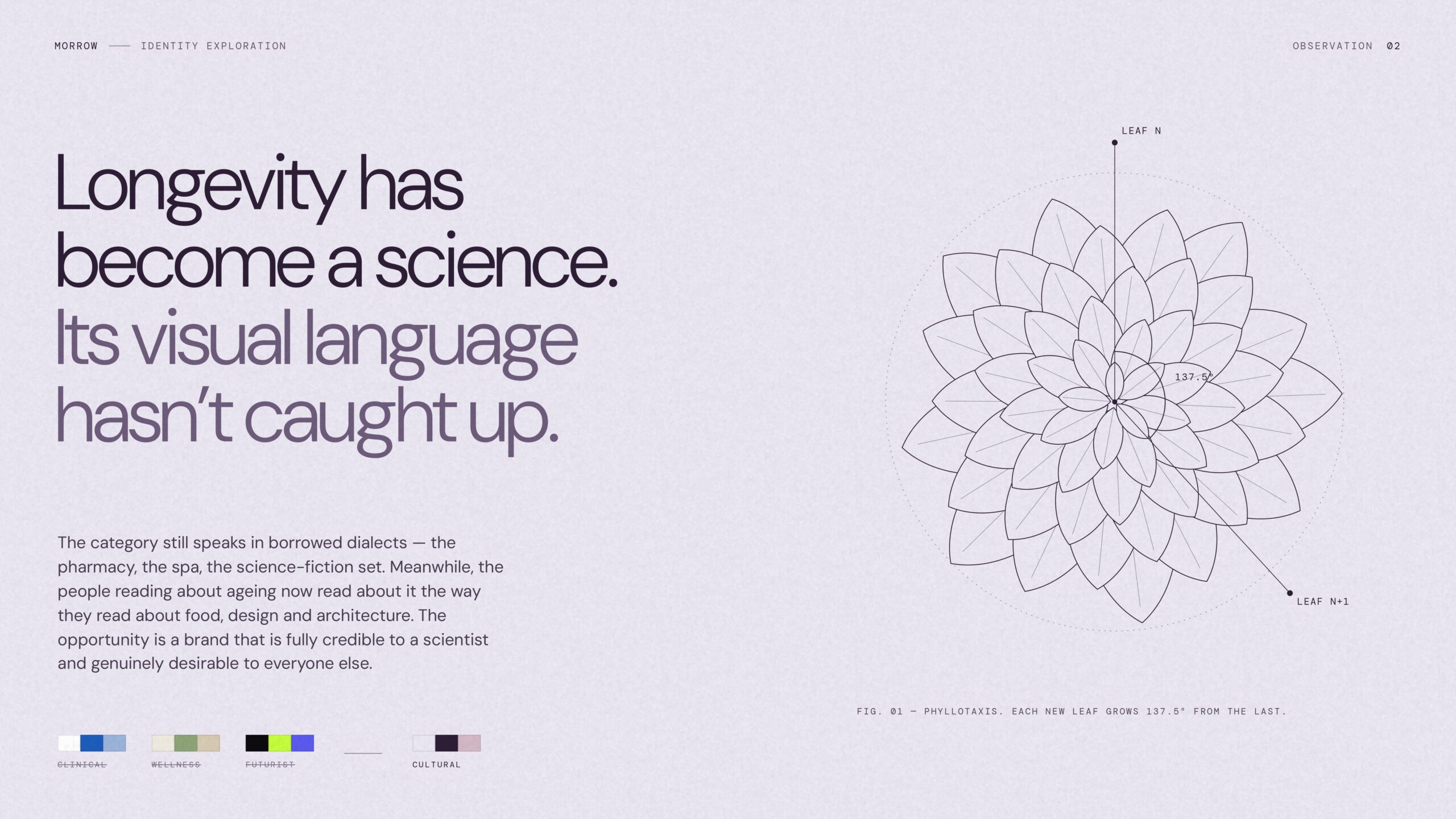
One of those relationships is phyllotaxis, the arrangement of leaves and other botanical structures.
In many plants, successive leaves or seeds are arranged at an angle of approximately 137.5 degrees, commonly called the golden angle. Repeating this angle can produce the spiral patterns associated with sunflowers and other plants.
I found this much more interesting as a branding reference than the usual molecular diagrams or DNA illustrations.
It gave MORROW a connection to real biological structures, along with a visual system that could be developed across different applications.
The visual identity: Scientific precision meets organic form
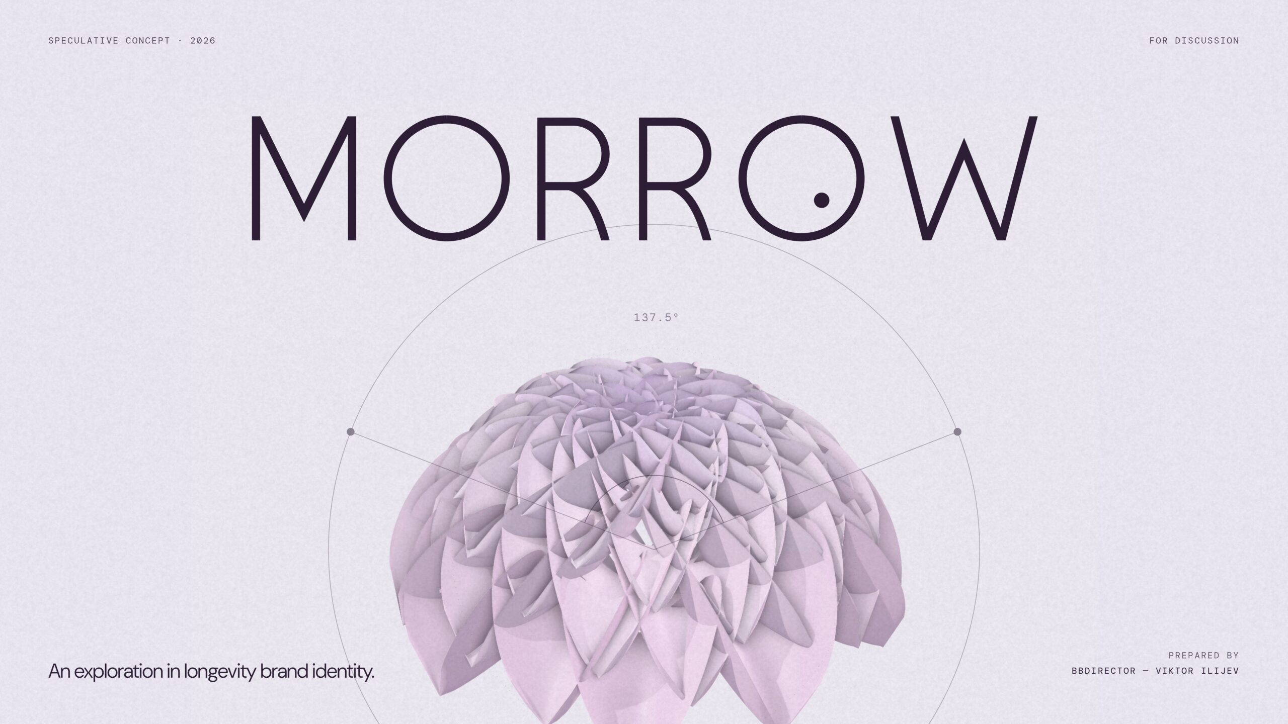
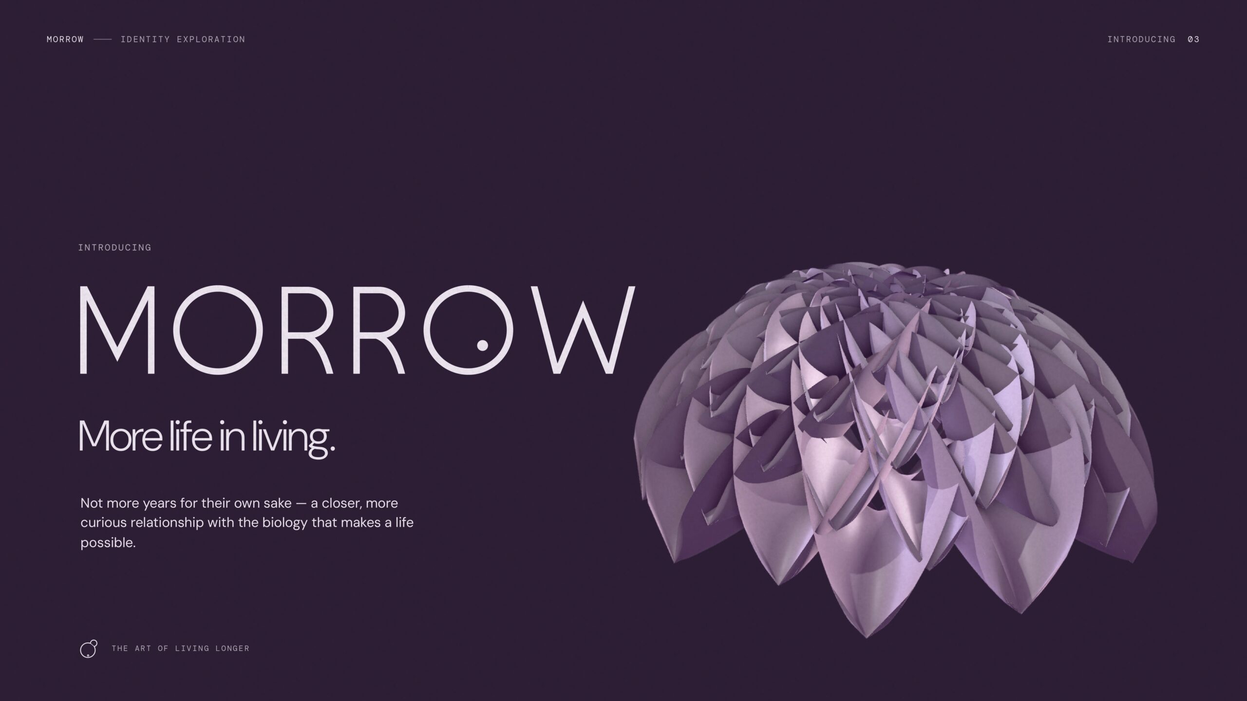
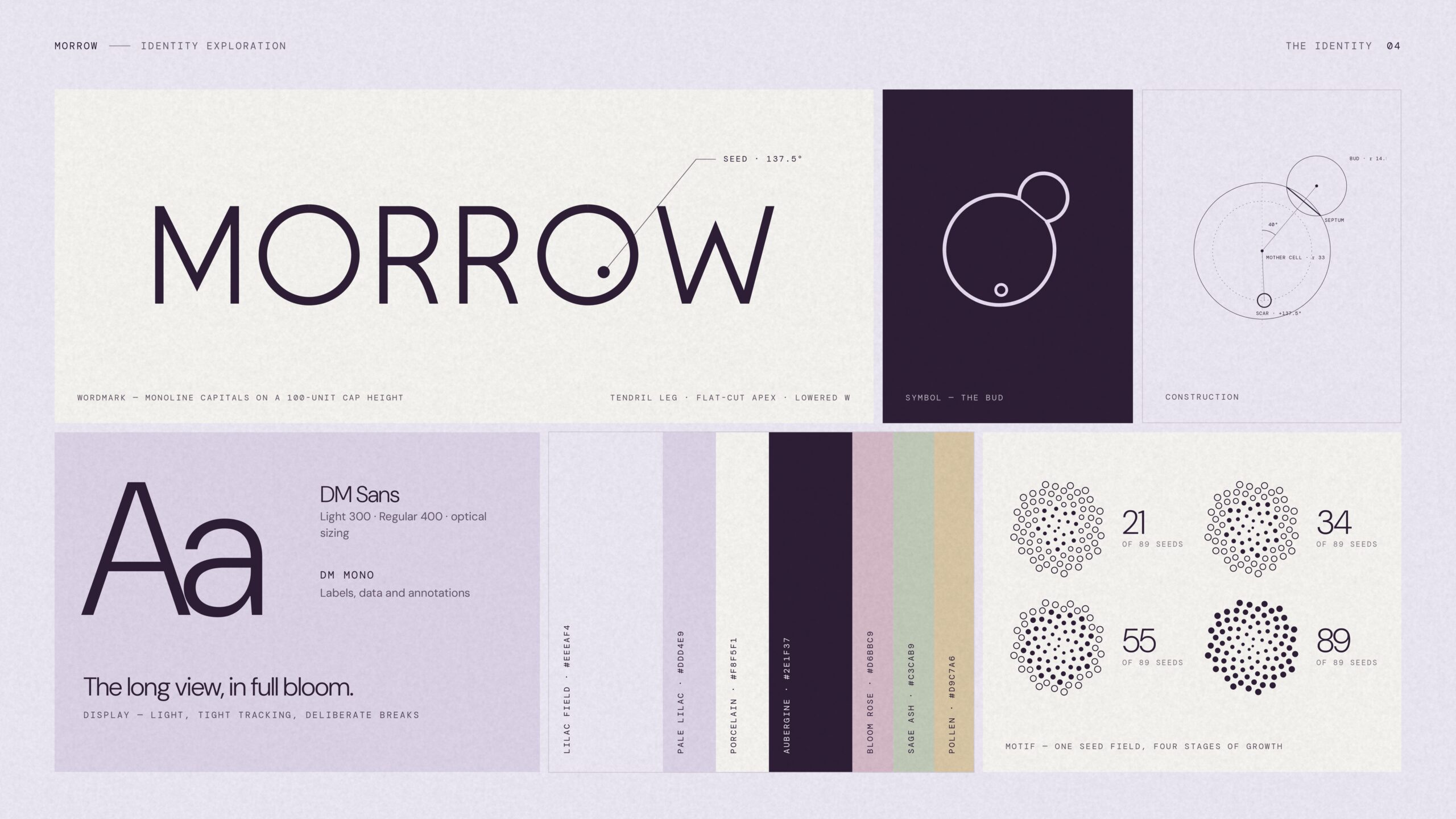
The MORROW identity combines a restrained typographic system with sculptural botanical imagery, precise geometry, and a distinctive colour palette.
The wordmark uses thin, carefully constructed letterforms, supported by DM Sans and DM Mono for the broader typography system.
The palette is built around pale lilac, porcelain, bloom rose, sage, and deep aubergine.
These colours were selected to create something that feels biological and contemporary without relying on traditional healthcare blues or the familiar green-and-white combinations used throughout wellness branding.
The identity also introduces a small bud symbol and a recurring 89-seed pattern inspired by Fibonacci numbers.
What makes the system useful isn’t simply the symbolism. It’s that the geometry can be repeated, rearranged, animated, and adapted to different contexts while remaining recognizable.
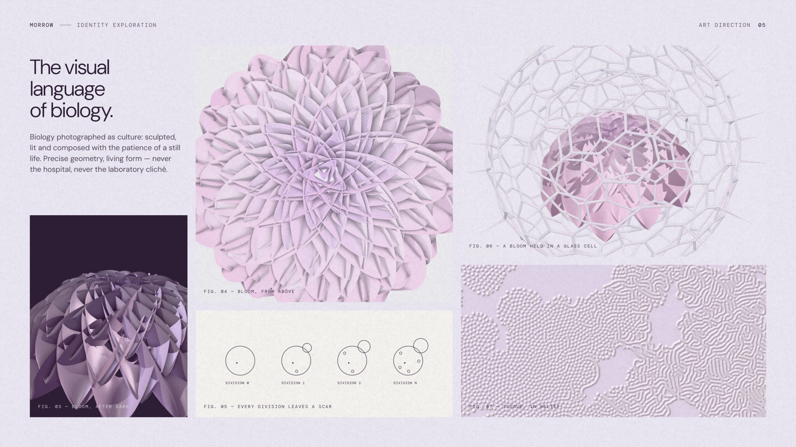
The botanical art direction follows the same thinking. Flowers and organic structures are treated almost like contemporary sculptures, photographed with deliberate lighting and composition.
The result is an identity that can communicate scientific curiosity while maintaining the visual appeal expected of a premium consumer brand.
Supplement packaging design: One identity, four stages of growth
One of the most important tests of a consumer brand identity is whether it works when applied to actual products.
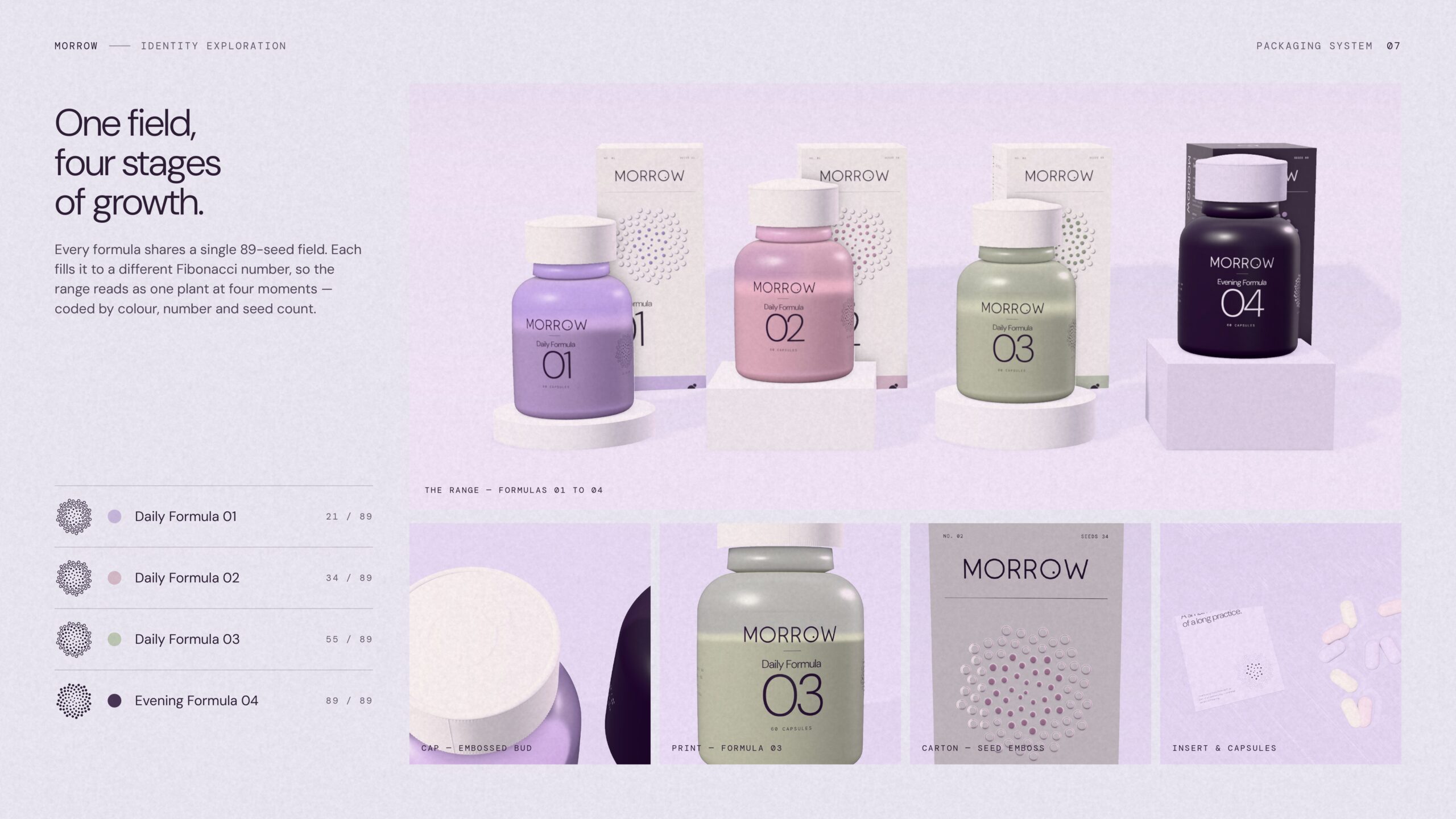
For MORROW, I developed a conceptual family of four supplement formulas.
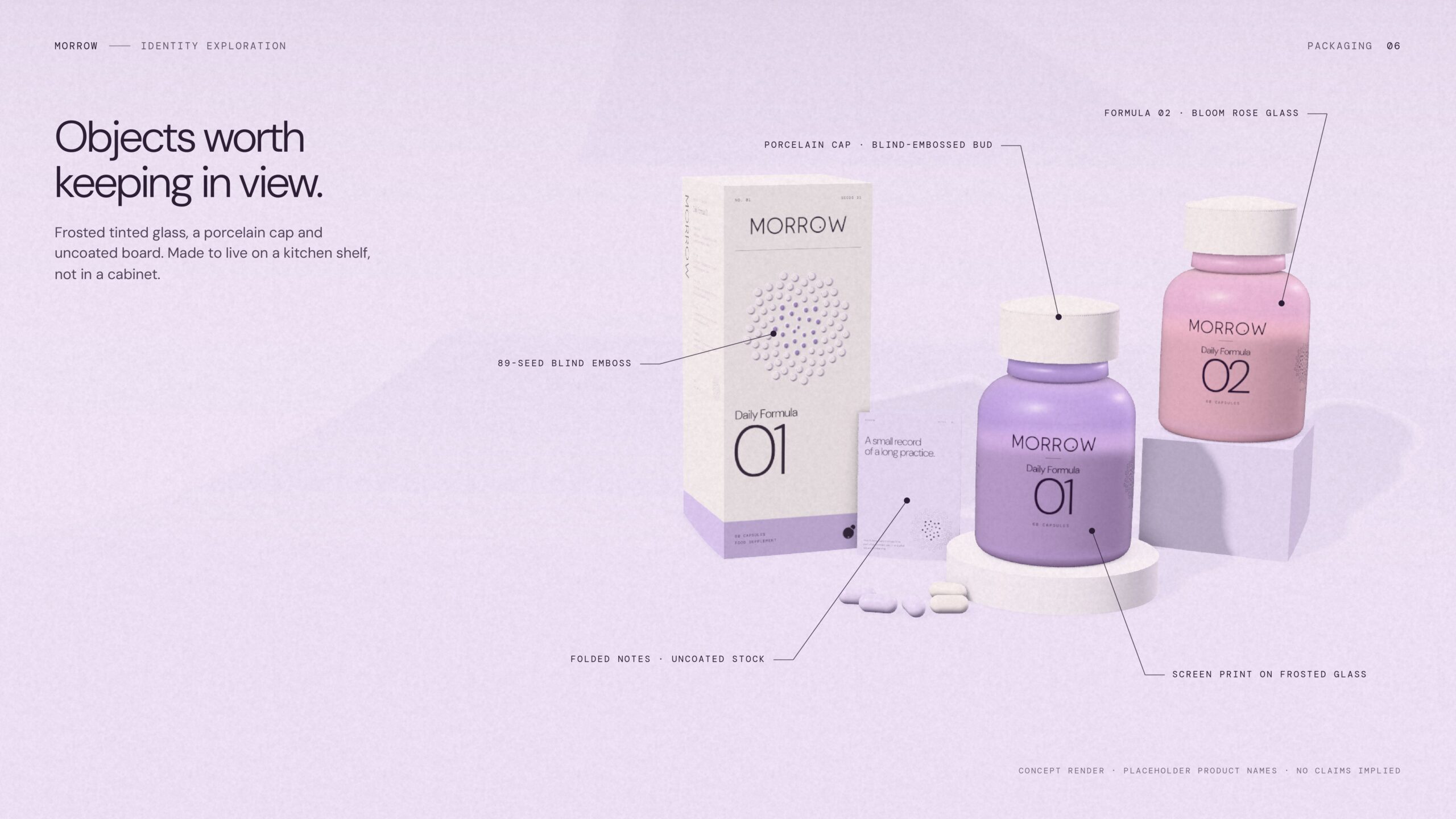
Rather than giving every product an unrelated colour or graphic, the packaging uses the same 89-seed structure at different stages of development:
- Daily Formula 01 — 21 of 89 seeds
- Daily Formula 02 — 34 of 89 seeds
- Daily Formula 03 — 55 of 89 seeds
- Evening Formula 04 — 89 of 89 seeds
Each formula has its own colour treatment while remaining part of the same visual family.
The packaging concepts use frosted tinted glass, porcelain-inspired caps, fine typography, and uncoated printed materials.
I wanted the products to feel like objects people would be comfortable keeping in view, rather than something that has to be hidden away in a cabinet.
From a commercial perspective, the product architecture also demonstrates how the identity could accommodate new formulas without needing to reinvent the packaging system each time.
The products are conceptual, with no defined ingredients or health claims. The exercise is about brand architecture, packaging design, and consumer perception rather than supplement formulation.
Brand presentation: Showing how the identity works in the real world
A logo and colour palette can establish an aesthetic direction, but they don’t necessarily tell you whether the identity will work as a complete consumer brand.
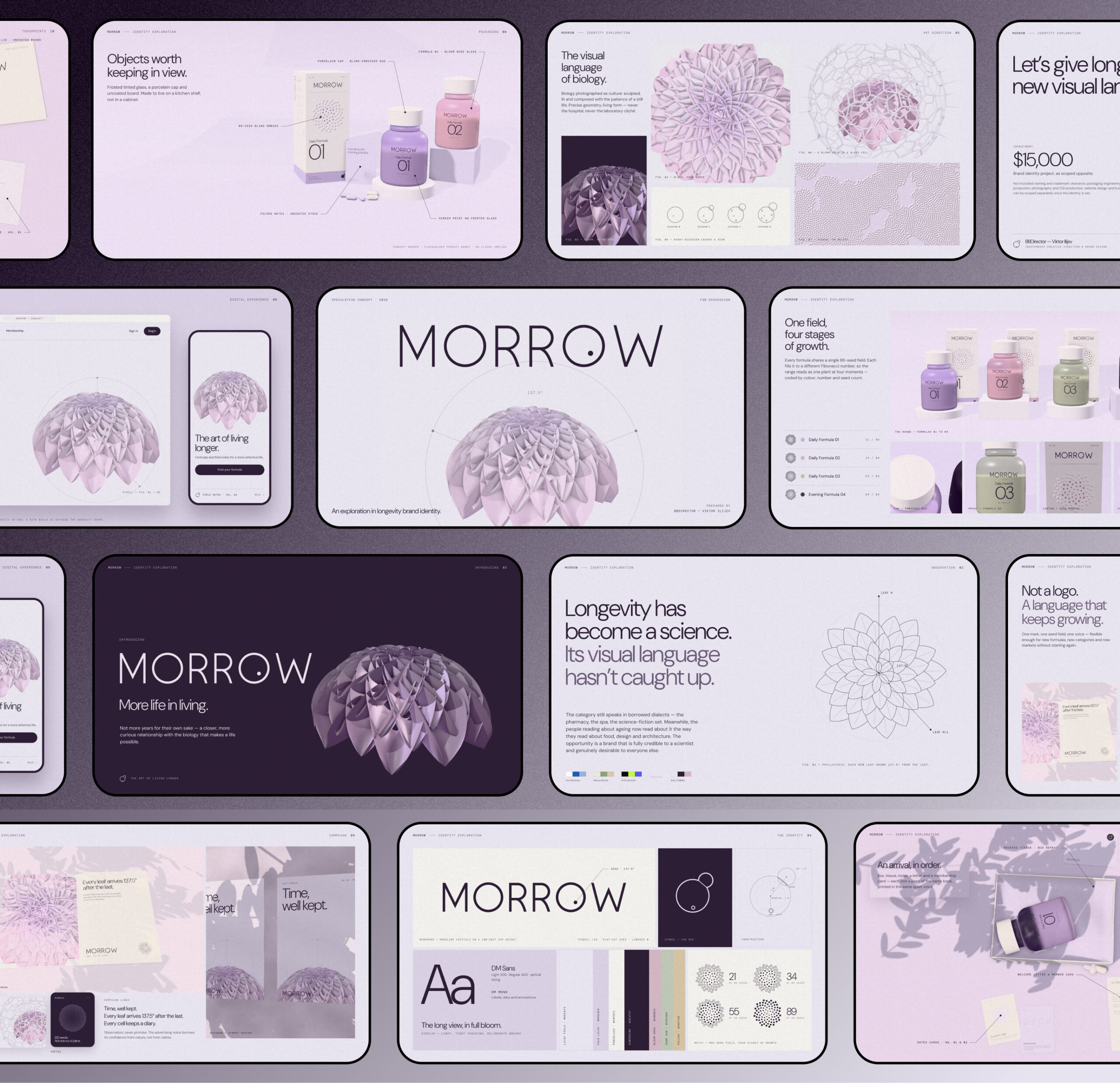
That’s why I developed a 12-slide visual identity presentation showing MORROW across multiple applications.
The presentation explores the thinking behind the identity, its typography and graphic systems, and how those elements translate into physical and digital experiences.
It includes product packaging, advertising campaigns, website concepts, editorial publications, welcome kits, printed correspondence, and membership materials.
The objective was to make the brand feel tangible and commercially plausible rather than simply showing a collection of isolated logo variations.
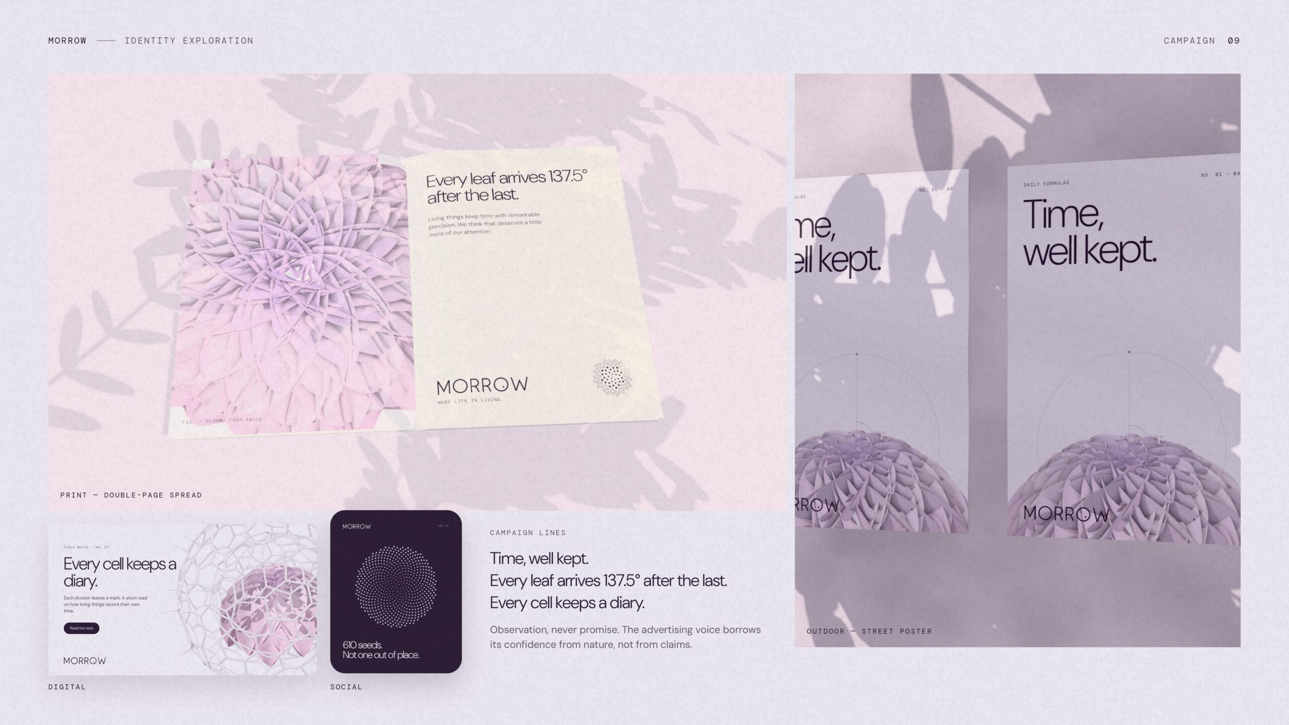
The campaign applications were particularly useful because they helped define how MORROW should communicate.
Lines such as “Time, well kept” and “Every cell keeps a diary” establish a more curious, observational voice without resorting to dramatic promises about reversing ageing.
That distinction is important for companies working in science-driven markets, where the visual identity should support credibility rather than imply evidence that doesn’t exist.
From brand identity to interactive website design
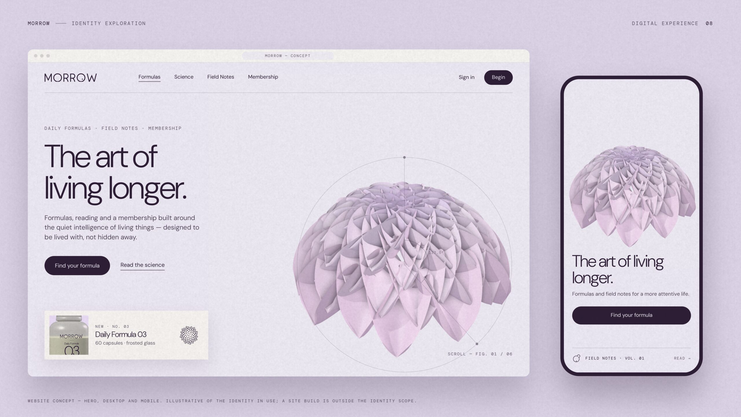
Once the identity was established, I wanted to see how it would behave in an actual digital environment.
This is where a brand concept becomes much more interesting.
A presentation can show beautiful static compositions, but websites introduce movement, interaction, navigation, and information hierarchy. The identity needs to remain consistent while doing considerably more work.
For MORROW, I didn’t want to create another supplement landing page with a large product photograph, three benefit cards, testimonials, and a subscription button.
The website needed to make the underlying ideas interesting to explore.
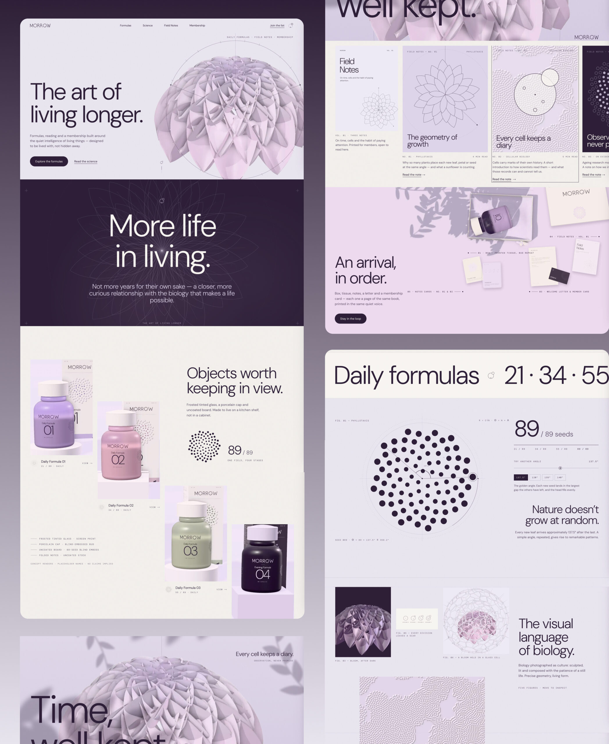
I approached it as an interactive editorial experience that combines product discovery, scientific storytelling, botanical imagery, and carefully controlled motion.
The website uses varied compositions rather than repeating the same section layout throughout. Headlines move between centered, right-aligned, and image-led arrangements, while scientific annotations and botanical details create connections between the different sections.
The idea was to give each part of the website its own visual purpose without making the experience feel fragmented.
Turning biological geometry into an interactive experience
The most interesting part of the website, in my opinion, is the interactive phyllotaxis visualization.
In the brand presentation, the 137.5-degree golden angle appears as a static scientific diagram. On the website, visitors can actually interact with the concept.
The visualization allows users to change the angle between successive seeds and observe how different arrangements emerge.
Visitors can explore the original 137.5-degree pattern or experiment with alternative angles, seeing how the geometry changes.
This is a good example of why interaction should be more than decoration.
Rather than adding animations simply to make the website look sophisticated, I wanted motion to help explain one of the ideas behind the brand identity.
The same thinking extends to the formula gallery, botanical imagery, editorial content, and packaging presentation.
Animations are used to reveal information, emphasize visual relationships, and make different sections more engaging without getting in the way of navigation.
Website storytelling beyond the product catalogue
The website also introduces Field Notes, a conceptual editorial section covering subjects such as botanical geometry, cellular biology, and scientific evidence.
For an actual longevity company, educational content could play an important role in helping consumers understand the science behind a product or technology.
However, the information architecture matters just as much as the writing.
Some visitors want a quick explanation of what a company does. Others want to explore research, understand the methodology, or examine the evidence behind a particular claim.
A well-designed website should allow both audiences to find what they need without forcing everyone through the same level of technical detail.
MORROW explores this through an approachable editorial interface, supported by illustrations and visual explanations.
The membership and welcome-kit concepts extend the same identity into the broader customer experience, demonstrating how digital communications and physical materials could feel connected.
The result: A complete brand and digital experience
MORROW began as an exploration of how longevity branding could move beyond familiar healthcare and wellness aesthetics.
The finished concept brings together brand strategy, logo design, typography, botanical art direction, supplement packaging, campaign design, editorial materials, UI/UX, motion design, and interactive website development.
The brand presentation demonstrates how the identity can work across different physical and marketing applications.
The live website takes that system further by showing how people could interact with the products, scientific concepts, and editorial content in a digital environment.
Both are built around the same design principles, so the website feels like a natural extension of the identity rather than an unrelated interface.
For me, this is the value of developing brand identity and website design together.
A strong identity creates recognition, but it also gives a company a consistent way to communicate. When that thinking carries through the website, packaging, and marketing materials, the business has a much stronger foundation for presenting itself to consumers, partners, and investors.
Of course, MORROW is an independent concept rather than an operating longevity business. Its products, editorial content, and customer experience are illustrative. There are no commercial results or product efficacy claims attached to the project.
What it does demonstrate is how a company in a complex scientific category could develop a distinctive, coherent brand and translate it into a working digital experience.
Explore the live MORROW website
Visit the interactive MORROW website
MORROW is available for acquisition
Both the MORROW brand identity and website concepts are available for acquisition and adaptation.
Brand identity concept — $5,000
Includes the developed visual direction, logo and identity system, typography, colour palette, and concept applications. Final deliverables and licensing terms can be agreed as part of the acquisition.
Website concept — $15,000
Includes the designed and developed interactive website concept, with scope for adaptation to an existing or new business to be agreed separately.
The concepts can be discussed individually or together.
At BBDirector, I work with companies in biotechnology, healthcare, AI, deep tech, and other complex industries to develop brand identities and websites that make sophisticated products easier to understand, trust, and engage with.
If you’re developing a longevity, biotech, or science-driven consumer company and need a distinctive brand identity or website, feel free to reach out.
Viktor Ilijev
Founder, BBDirector
bbdirector.com
[email protected]