

What makes a fintech brand recognizable? And how do you build trust without making another financial company look exactly like the traditional banks it’s trying to compete with?
That’s what I wanted to explore with FORMA.
FORMA is an independent financial technology concept I developed in 2026, built around a simple proposition:
Money, in a better place.
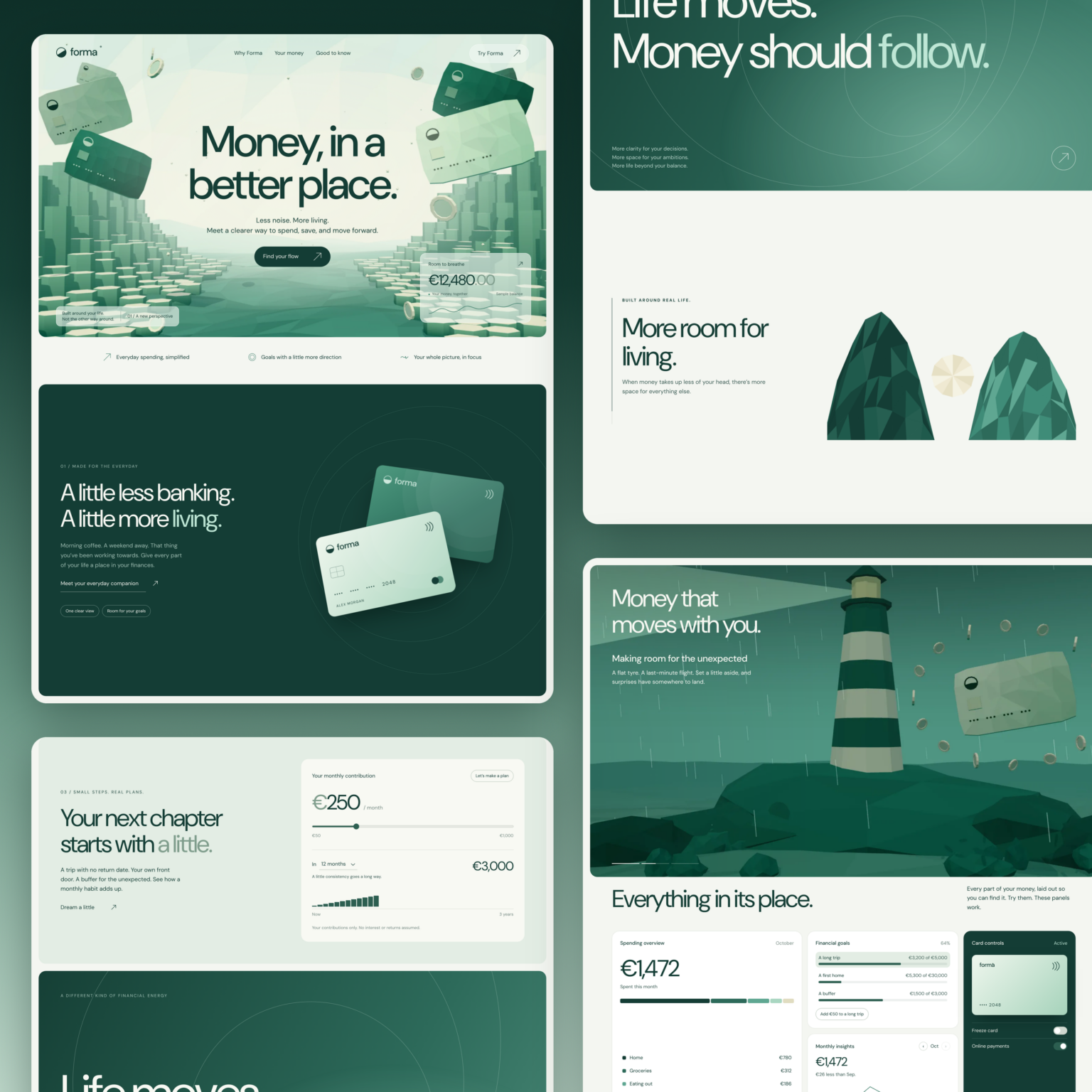
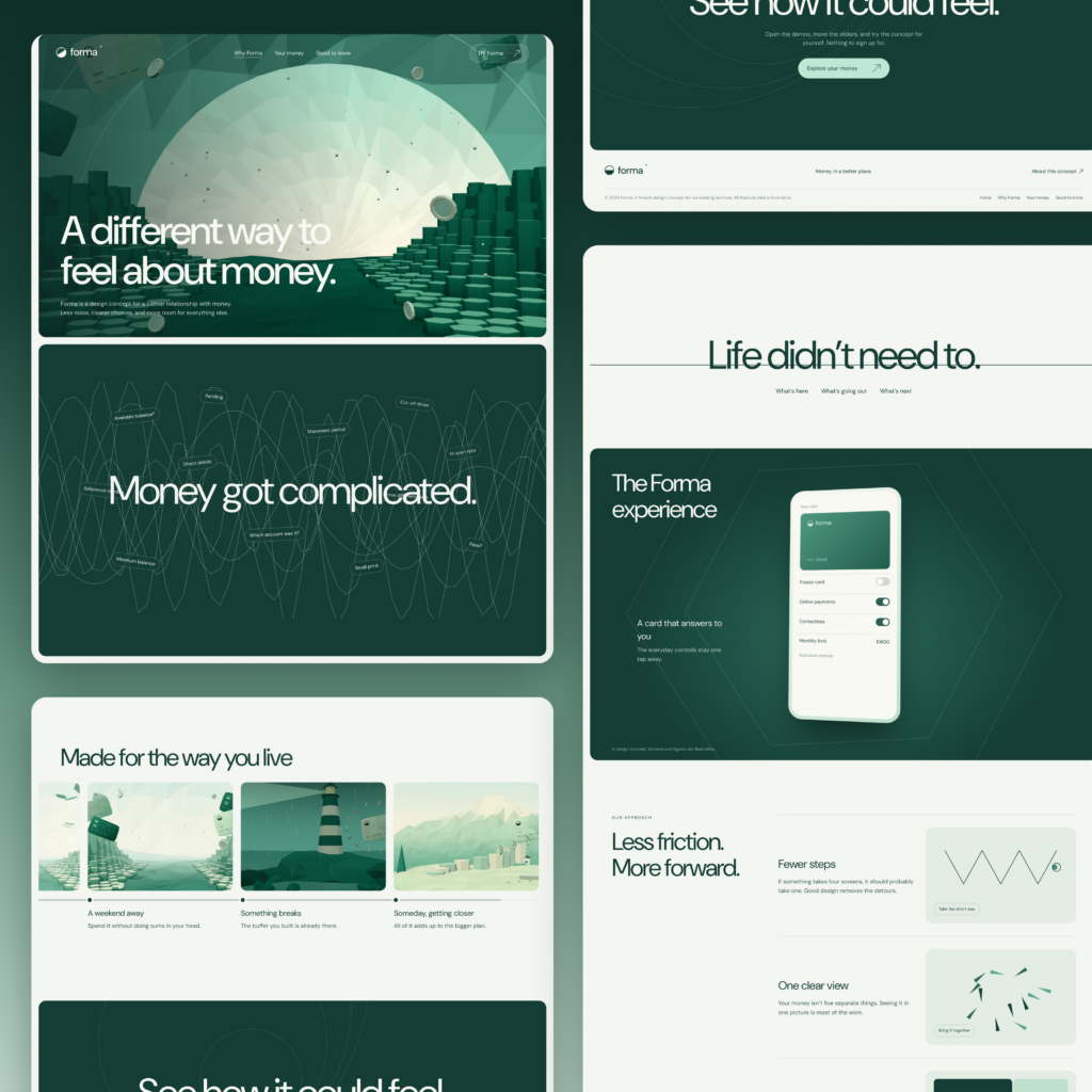
The project started with brand strategy and grew into a complete brand identity, including a geometric logo, custom color palette, typography, low-poly illustrations, marketing applications, payment cards, and an interactive three-page website.
The objective wasn’t to make another fintech brand look modern.
It was to build an identity that could express a clear idea across everything the business might eventually do.
From the logo on a payment card to the user interface of a banking app, each element needed to belong to the same visual world.
Here’s how I approached the project, why I made certain decisions, and what the finished identity demonstrates about effective fintech branding.
The Fintech Branding Challenge: Trust Without Looking Like a Traditional Bank
Financial companies face an interesting branding problem.
They need to appear dependable enough for people to trust them with money, but distinctive enough to avoid looking like every other financial institution.
Traditional banking has established a familiar visual language.
Blue color palettes. Conservative typography. Institutional imagery. Statements about reliability and security.
Those conventions exist for a reason.
But for emerging fintech companies, following the same approach can make differentiation unnecessarily difficult.
Look at challenger banks such as Monzo, Revolut, Starling, and Nubank.
Their brand identities demonstrate that financial products can look and communicate differently from traditional financial institutions.
Monzo’s distinctive card colors, the recognizable Monzo logo, and the more approachable language associated with digital-first banking are useful examples of how a financial brand can create positive associations beyond a conventional bank identity.
That doesn’t mean every fintech startup needs bright colors or playful messaging.
It means the brand should be built around its specific position in the market.
For FORMA, I wanted to explore a different direction.
Not louder. Not more rebellious.
Calmer.
The idea was that a financial product could make people feel more in control without surrounding them with complicated terminology or aggressive promises.
That became the foundation for the brand work.
Brand Strategy: Money, in a Better Place
Before designing the FORMA logo, I established three principles that would guide the brand and product experience.
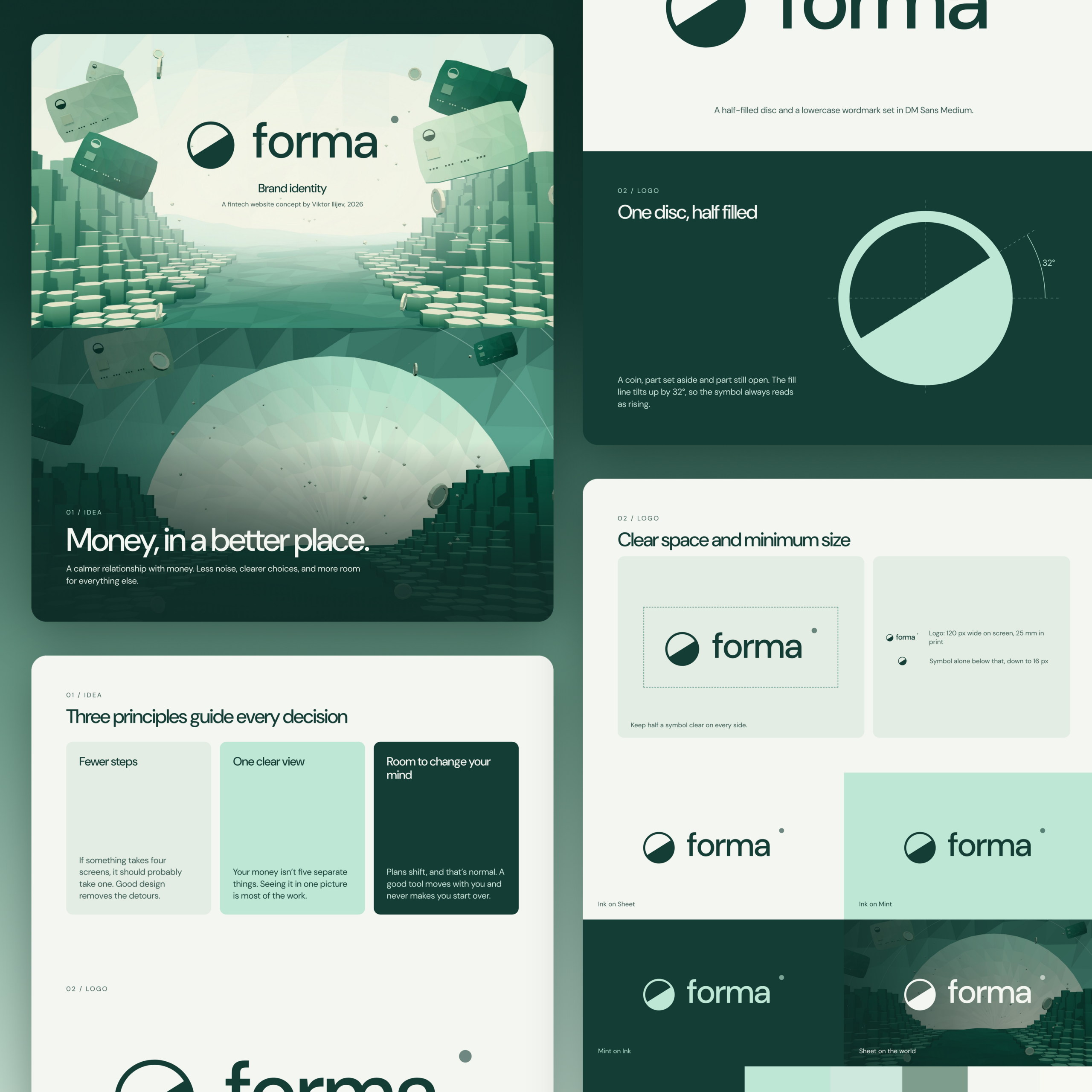
Fewer steps. If something takes four screens, it should probably take one.
One clear view. Spending, saving, and planning should feel connected rather than scattered across different features.
Room to change your mind. Financial goals evolve, and the product should accommodate that.
These principles defined the proposed brand purpose: making everyday financial management feel less complicated.
They also influenced the brand messaging.
Instead of promising to revolutionize finance or disrupt the entire fintech industry, FORMA uses a simpler, more human message:
Money, in a better place.
It’s a statement that can describe both the practical product experience and the feeling the brand intends to create.
A good brand strategy needs that connection.
The visual identity, verbal identity, customer experience, and marketing strategies shouldn’t communicate conflicting ideas.
If the product promises simplicity, the website shouldn’t be difficult to navigate.
If the brand values clarity, the financial interface shouldn’t bury essential information.
And if the brand promises flexibility, the proposed product needs to demonstrate what that flexibility actually means.
Those connections became important as FORMA expanded beyond its initial identity.
The FORMA Logo: One Disc, Half Filled
The logo is built around a simple geometric symbol.
A circular disc divided diagonally, with one half filled and the other left open.
The dividing line rises at 32 degrees.
That small adjustment gives the symbol a sense of upward movement.
The mark has two interpretations.
First, it can be understood as a coin, connecting it to money.
Second, it resembles a rising sun, introducing a feeling of progress and possibility.
I liked that it could communicate both without being a literal illustration of a bank.
The logo doesn’t need a complicated explanation to function.
It’s a recognizable geometric mark that can stand on its own.
The lowercase FORMA wordmark supports the same idea.
Rather than using an imposing institutional identity, I wanted the lettering to feel approachable, confident, and contemporary.
The logo was also designed to function across different scales.
A website header presents different requirements from a payment card, printed stationery, or an application icon.
That’s why the brand guidelines establish logo spacing, clear-space requirements, minimum sizes, and approved color combinations.
A strong brand identity should remain recognizable even when the surrounding design system isn’t visible.
I’ve covered similar considerations in my guide to fintech logo design and recognizable financial identities.
Building the Visual Identity: One Green, Many Lights
Green is already familiar territory in the fintech market.
It’s associated with money, growth, and stability.
But familiarity alone doesn’t make a color distinctive.
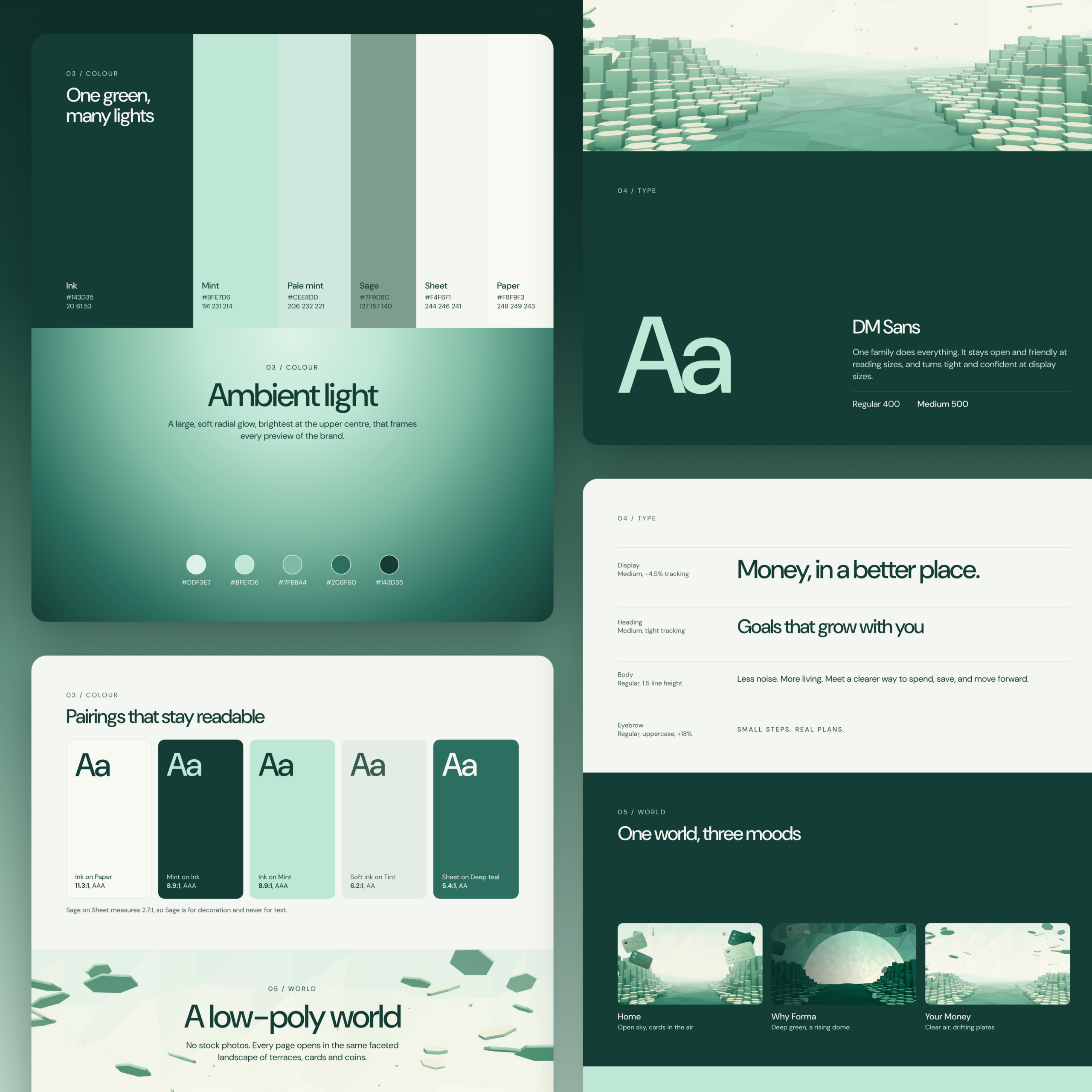
For FORMA, I developed a restrained palette that could support several different visual environments.
The six main colors are:
| Color | HEX |
|---|---|
| Ink | #143D35 |
| Mint | #BFE7D6 |
| Pale Mint | #CEE8DD |
| Sage | #7F9C8C |
| Sheet | #F4F6F1 |
| Paper | #F8F9F3 |
Ink provides the foundation for the identity.
Its deep green tone establishes contrast without relying on pure black.
Mint introduces a lighter, more approachable expression.
Pale Mint and Sage extend the palette into secondary treatments.
Sheet and Paper create warm, almost-white backgrounds that help maintain a calm brand image.
The interesting part is how these colors behave together.
Rather than simply assigning a different color to each application, I wanted the palette to create a recognizable atmosphere.
That’s where the ambient lighting treatment came in.
Ambient Light as a Brand Asset
FORMA uses large, soft radial glows that make the green palette feel illuminated.
The visual treatment is brightest toward the upper center and gradually becomes deeper around the edges.
It creates depth without relying on complicated compositions.
The ambient effect can support website backgrounds, product presentations, campaign graphics, and physical applications.
This is an example of how a visual brand can become recognizable through something other than its logo.
The lighting treatment, colors, and typography work together to establish the brand’s atmosphere.
Color Pairings That Remain Readable
Brand identities also have practical responsibilities.
An attractive color combination isn’t useful if people struggle to read the information placed on it.
The FORMA guidelines demonstrate how Ink, Mint, Sage, and the neutral tones can be combined.
Some pairings are intended for important text and interface content.
Others are more appropriate for decorative applications.
This matters particularly in financial services, where people need to understand balances, spending information, and product controls.
Good brand management starts with defining these rules rather than leaving every new designer to improvise.
Typography: Why One Font Family Was Enough
I selected DM Sans for the FORMA typography system.
Rather than combining multiple typefaces, I wanted one flexible family that could support the entire brand experience.
DM Sans works across large display headlines, medium-sized headings, body copy, and small interface labels.
The visual identity establishes different typographic treatments depending on the context.
Display headlines use tighter tracking.
Supporting headings remain compact.
Body text prioritizes readability.
Small uppercase labels help establish hierarchy across presentations and UI components.
I wanted the tone of voice to remain conversational without making the typography itself excessively playful.
Statements such as Money, in a better place and Goals that grow with you have personality without becoming complicated.
This is important when developing identity systems for technology companies.
A brand may begin with a marketing website but eventually need to support dashboards, product documentation, onboarding screens, transactional interfaces, and social media posts.
The typography has to work across all of them.
Illustrations and Branding: Creating the FORMA World
This is where I wanted to move beyond conventional fintech branding examples.
I didn’t want stock photography of happy people holding smartphones.
Nor did I want another collection of generic gradients and floating interface mockups.
Instead, I developed a custom low-poly visual world.
The environment is built from faceted landscapes, geometric surfaces, floating payment cards, and coins.
It feels almost like a small digital universe.
That gave FORMA a recognizable creative direction beyond its logo and color palette.
More importantly, it created a system that could be adapted across different touchpoints.
One World, Three Moods
The brand presentation introduces three interpretations of the environment.
Home — Open sky, cards in the air.
A brighter landscape representing openness and possibility.
Why Forma — Deep green, a rising dome.
A darker composition with greater contrast and atmosphere.
Your Money — Clear air, drifting plates.
A lighter environment intended to complement the product interface.
Although the compositions change, their geometry and visual language remain consistent.
That’s the advantage of creating a connected system rather than producing unrelated illustrations.
The brand can introduce new environments without losing its identity.
For me, that’s one of the more valuable outcomes of this project.
The low-poly world isn’t just a decorative element.
It’s a recognizable part of the complete brand.
From Brand Assets to Real Applications
A logo on a presentation board doesn’t tell you whether the identity can function across an actual business.
You need to test it in context.
For FORMA, I developed applications across printed materials, packaging, payment cards, advertising, mobile interfaces, and the website.
Stationery and Welcome Kit
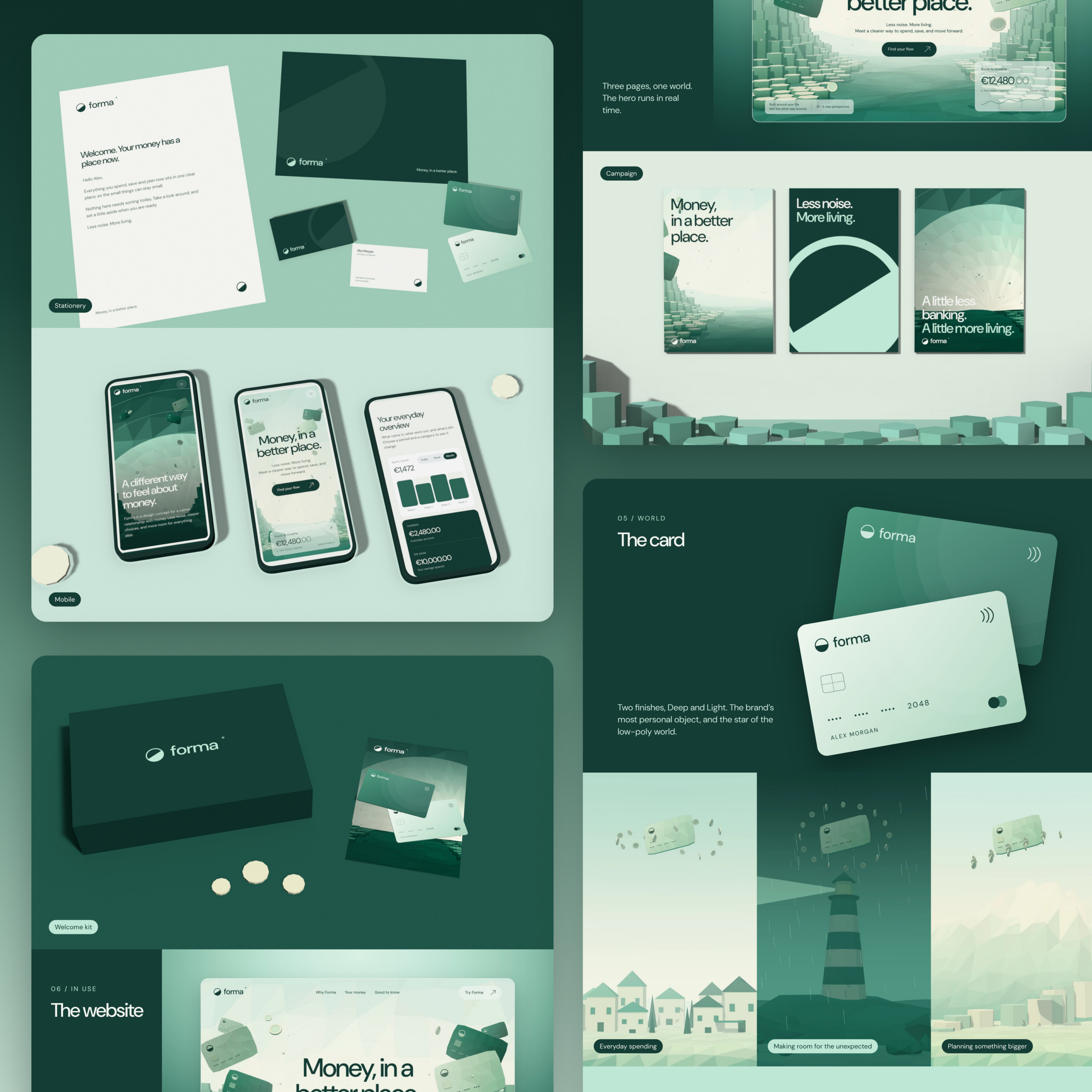
The stationery system includes letterheads, business cards, and supporting printed materials.
These applications rely primarily on the logo, color palette, and typography.
They don’t need every expressive element of the visual system to communicate the brand.
I also developed a conceptual welcome kit combining dark-green packaging with printed materials and payment card applications.
The objective was to test how the identity might feel beyond a screen.
Payment Cards
The FORMA payment cards are available in two visual treatments.
One uses a lighter mint finish.
The other uses a deeper green.
Both retain the same recognizable identity while offering distinct expressions.
I wanted the cards to feel like natural extensions of the financial platform rather than separate merchandise.
This is particularly important for a digital bank or consumer finance product.
The physical card is often one of the few tangible encounters someone has with the brand.
It should feel connected to the experience they already recognize from the website and application.
Campaign Design and Brand Messaging
I developed advertising concepts around short statements:
Money, in a better place.
Less noise. More living.
A little less banking. A little more living.
These messages are deliberately straightforward.
I wanted them to communicate the brand’s emotional direction rather than list product features.
The campaign compositions use the same low-poly environments, colors, and geometric identity.
They demonstrate how the brand could appear across posters, digital campaigns, and social media posts without requiring a completely new art direction for each execution.
For a growing fintech company, those reusable brand assets can help product and marketing teams maintain consistency across different channels.
Connecting the Fintech Brand to Product Design
One of the most important parts of FORMA is that the identity doesn’t stop at the marketing materials.
It continues into the product.
The three-page interactive website uses the same typography, green palette, geometric environment, and messaging.
The payment cards become interactive objects.
The financial dashboard follows the same restrained design principles.
And the savings calculator extends the proposed product experience beyond decorative interface screens.
This is where fintech branding and UX design need to work together.
A brand might promise simplicity on its homepage, but that message loses credibility if the application is difficult to use.
For FORMA, the website and product were developed as connected experiences.
The marketing website can use expressive animation and atmospheric environments.
The financial UI needs more predictable interactions and clearer information.
Both can belong to the same identity without looking identical.
I’ve explored the interactive implementation in my separate FORMA fintech website design case study.
That article examines the dashboard, interactive payment cards, financial planning tools, and website experience in greater detail.
Best Fintech Branding: What Can We Learn From Established Brands?
When evaluating the best fintech branding, I think it’s important to separate recognizable visual execution from actual business performance.
Brands such as Monzo, Nubank, Revolut, and Starling demonstrate different approaches to communicating financial products.
Their brand identities reflect different markets, audiences, and product propositions.
A visual treatment that makes sense for a consumer banking app may not be appropriate for a B2B fintech infrastructure company.
Likewise, a SaaS business selling complex financial software to enterprise customers may need a different approach from a consumer-focused digital bank.
That’s why comparing branding examples purely on appearance is limiting.
The more useful questions are:
Does the brand communicate a specific position?
Does the visual identity support the intended audience?
Can the design system adapt across different applications?
Does the brand and product experience feel connected?
And can the business maintain that consistency as it grows?
Those are the questions I’d ask when evaluating fintech brand projects, whether they come from an independent designer, a fintech branding studio, or a larger branding agency.
An attractive Behance portfolio can demonstrate visual quality.
But the broader brand strategy and execution need to explain why the work makes sense for the company.
Common Fintech Branding Mistakes
There are several recurring problems worth avoiding when creating financial brand identities.
Mistake 1: Designing for the Industry Instead of the Audience
A brand shouldn’t look like a bank simply because the company operates in financial technology.
The relevant audience, product, and business model should shape the visual direction.
The needs of a crypto platform, a consumer banking application, and an enterprise financial SaaS product are not identical.
Mistake 2: Confusing Trust With Conservative Design
A traditional financial appearance may feel familiar, but familiarity isn’t the same as reliability.
Financial brands build trust through accurate information, transparent communication, consistent product behavior, and credible business practices.
Visual design can support reassurance.
It cannot replace evidence.
Mistake 3: Treating the Logo as the Entire Identity
A logo is an important component, but it’s not a complete brand.
The identity needs rules for typography, color, imagery, layout, messaging, and practical applications.
Without those rules, branding efforts can become inconsistent as more people contribute.
Mistake 4: Separating the Website From the Product
A beautiful homepage means little if the in-app experience communicates something entirely different.
The design system should support both the marketing experience and the product.
Mistake 5: Following Trends Without a Clear Position
There are always new trends in fintech branding.
But gradients, 3D illustrations, geometric symbols, and minimalist layouts aren’t strategies by themselves.
They become useful when they reinforce a specific brand purpose.
A brand refresh or rebrand should solve a real communication problem, not simply introduce a more fashionable appearance.
What Makes a Strong Fintech Brand Identity?
After developing FORMA, I’d summarize the most important principles in five points.
1. Start with a recognizable idea.
For FORMA, that idea is making money feel simpler and more manageable.
2. Build a distinctive but practical visual system.
The logo, colors, typography, and imagery need to create recognition while supporting everyday applications.
3. Connect brand messaging to the product.
The company shouldn’t promise simplicity unless its customer experience is designed to support it.
4. Create systems that can scale.
Brand guidelines and reusable components help maintain consistency as more designers, developers, and marketing teams become involved.
5. Test the identity beyond mockups.
Payment cards, printed materials, campaign artwork, website interfaces, and product demonstrations expose weaknesses that might not appear in an isolated logo presentation.
These best practices apply to more than fintechs.
They’re relevant to technology companies, B2B SaaS providers, and other businesses developing complex products.
The specific visual treatment will change, but the need for coherent brand strategy remains.
Why I Develop Complete Brand Identities
I’ve never been particularly interested in delivering a logo and calling it a finished brand.
The more interesting work is understanding what a company needs to communicate and then developing the visual and verbal system to support it.
That involves positioning, message development, visual direction, and the practical applications customers will encounter.
It’s why FORMA includes a complete identity system rather than a logo and a few mockups.
The project tests the brand through real design scenarios.
What does the symbol look like on a card?
How does the visual identity behave in a financial dashboard?
Can the same brand work in a dark advertising campaign and a light application interface?
Does the messaging still make sense when the product becomes interactive?
Those questions help determine whether a visual system is genuinely useful.
I’ve discussed the broader approach in my guide to creating a cohesive brand identity across digital platforms.
The objective is to create a recognizable identity that remains flexible without becoming inconsistent.
FORMA: A Complete Fintech Brand Available for Acquisition
FORMA is an independent financial technology concept developed as a connected brand and digital experience.
The project includes:
- Custom geometric logo and wordmark.
- Fintech brand strategy and core messaging.
- Defined color palette and typography.
- Custom low-poly visual environments.
- Stationery and welcome kit concepts.
- Payment card designs.
- Campaign artwork and promotional applications.
- Three-page interactive website with financial dashboards and planning tools.
The wider project is available for acquisition for $12,000.
The exact assets, source files, customization scope, and intellectual property transfer would be agreed upon as part of the acquisition.
FORMA is a creative concept rather than an operating financial institution. Its financial interfaces use illustrative information, and it doesn’t provide live banking services.
Explore the full interactive FORMA website
You can also explore my pre-built brands available for acquisition or contact me about developing a custom identity for your company.
At BBDirector, I work on brand identity, creative direction, and digital experiences for businesses operating in complex industries.
The goal isn’t to make every company look more expensive.
It’s to make what they do easier to recognize, understand, and remember.
Viktor Ilijev
Founder, BBDirector