You’ve got a bold brand vision, but here’s the catch: people don’t feel it.
And it’s not because your business isn’t brilliant—it’s because your branding doesn’t speak.
The truth? You could have the most innovative product, the most disruptive service—but if your visual identity falls flat, your message gets lost in the noise.
The solution? Design that doesn’t just look good, but psychologically connects.
I’m Viktor, a strategist with 13 years on the front lines of branding and business transformation. I’ve helped companies raise over $500M, build standout campaigns, and craft brand stories that stick. And I’ll tell you this: the colors you use and the typography you choose can make or break your brand perception.
This isn’t just about picking a pretty palette or a modern font—it’s about understanding how design choices influence trust, emotion, recognition, and conversion. In this guide, I’ll break down the psychology of color and typography, show you how the best brands use these tools to command attention, and help you choose the right combinations to make your brand unforgettable.
Ready to turn your brand into something people feel? Let’s dive in.
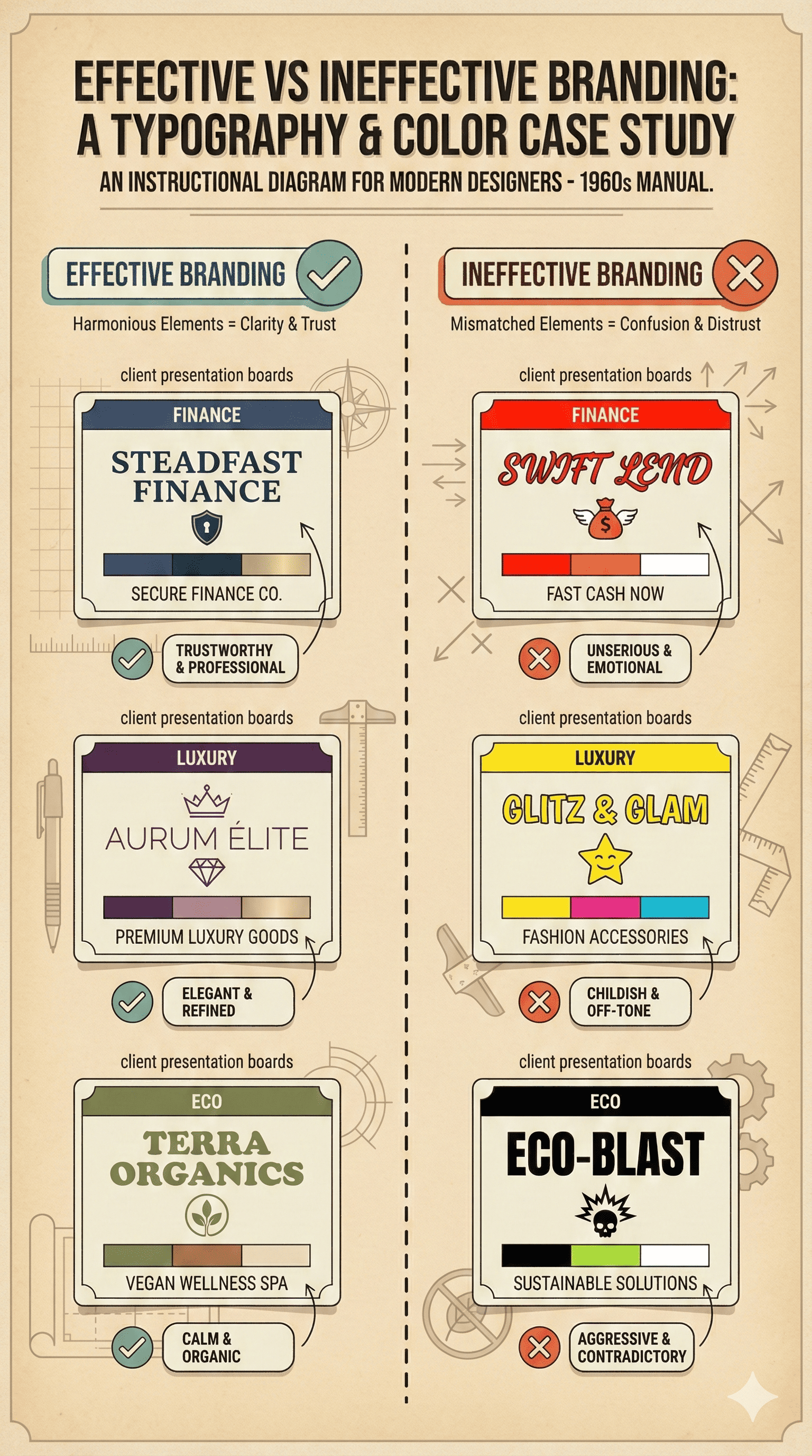
Understanding the Psychology of Color in Branding
Color is visceral. The psychology of color in branding dives into how different hues trigger emotions, influence behavior, and shape perceptions.
In marketing and branding, color is one of the most powerful tools you can use to convey meaning without saying a word.
Whether you’re crafting a brand identity, designing a logo, or building a full-blown brand color palette, understanding how color works psychologically is essential to choosing the right color for your brand. On that note, learn how to master visual brand identity design.
The Science Behind Color Psychology
At its core, color psychology is the study of how certain colors influence human emotion and decision-making. It’s rooted in neuroscience, behavioral science, and cognitive psychology, explaining why consumers see this color or that, and feel a certain way about a brand or product—often without realizing it.
Studies on color show that people make subconscious judgments about products within 90 seconds of initial viewing—and up to 90% of that assessment is based on color alone. This is why color in branding is not a design afterthought; it’s a business-critical decision.
But color psychology isn’t just about emotion—it also taps into learned associations, memory, and even evolutionary cues. For example:
Red is often used to evoke urgency, passion, or appetite.
Blue instills trust, calm, and professionalism—often used by brands in tech, healthcare, and finance.
Green suggests health, eco-consciousness, and growth.
Yellow sparks optimism, youth, and creativity—but can also signal caution.
Black conveys luxury, sophistication, and power.
Purple implies imagination, mystery, and premium value.
These are just surface-level interpretations. Color psychology in marketing is deeply contextual—and the color you choose needs to align with both your industry and your brand personality.
Why Color Matters in Branding and Marketing
Color is one of the fastest ways to build brand recognition—in fact, research shows that using a signature brand color can increase recognition by up to 80%. That’s a massive boost to brand recall, especially in saturated markets where visual differentiation is key.
More than that, color choice directly affects conversion rates, brand loyalty, and even perceived product value. It’s not just about being “pretty”—it’s about being psychologically aligned with your target audience. The right color for your brand can reinforce trust, while the wrong one can create subconscious dissonance that drives people away.
Ask yourself:
Is the color you’re using consistent with your brand story?
Does it align with your positioning in the market (premium vs. affordable, playful vs. serious)?
Are you using color schemes that are cohesive across digital and physical touchpoints?
If not, your brand color psychology could be working against you.
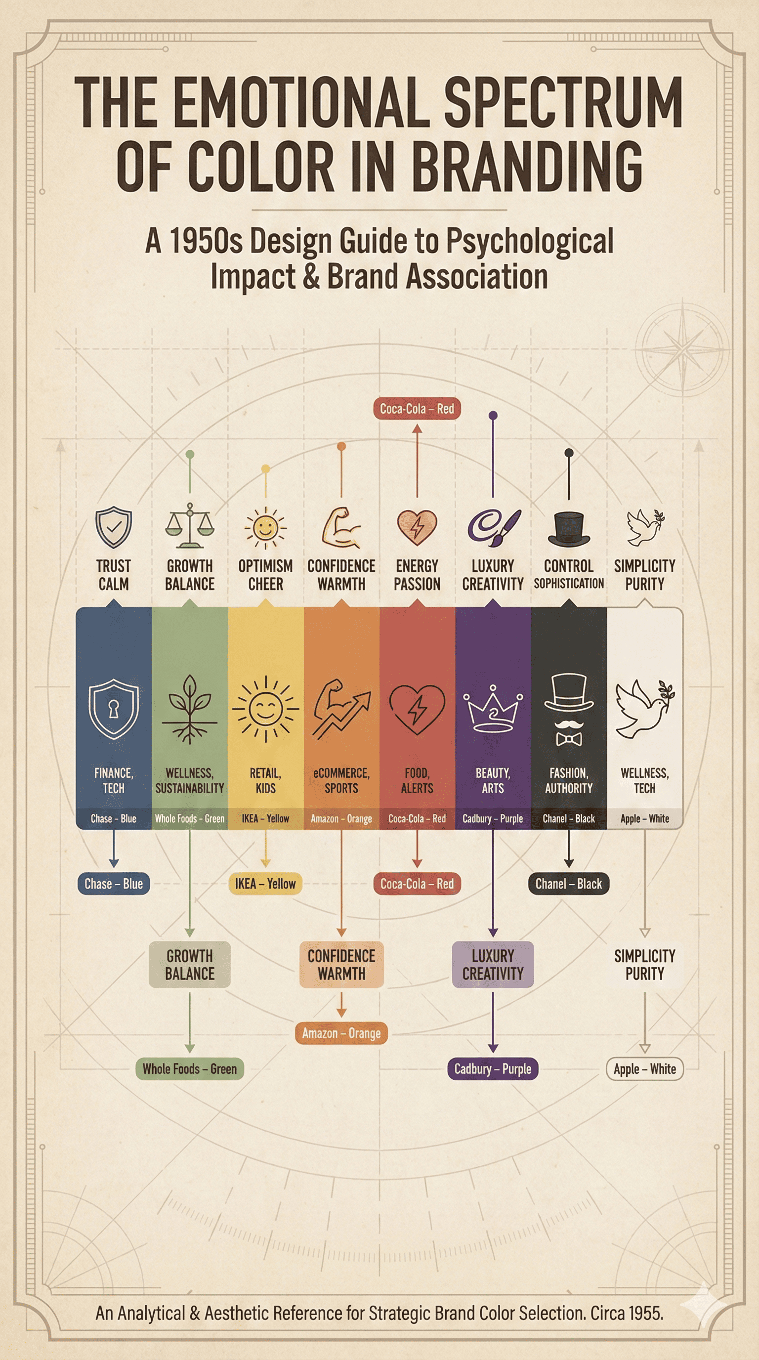
The Emotional and Cognitive Impact of Different Colors
Different colors affect different people in different ways, but there are general emotional patterns we can track in color psychology in branding:
| Color | Emotion / Association | Industries Often Using It |
|---|---|---|
| Red | Passion, energy, urgency | Food, retail, entertainment |
| Blue | Trust, calm, intelligence | Tech, finance, healthcare |
| Yellow | Optimism, youth, warning | Startups, hospitality, signs |
| Green | Growth, eco-friendliness | Wellness, sustainability, finance |
| Black | Luxury, power, elegance | Fashion, automotive, tech |
| Orange | Creativity, friendliness | SaaS, fitness, e-commerce |
| Purple | Imagination, royalty | Beauty, spirituality, innovation |
| Pink | Playfulness, femininity | Beauty, fashion, DTC brands |
| White | Simplicity, purity, minimalism | Tech, healthcare, design |
Understanding color psychology means looking at the emotional triggers and the cognitive expectations that come with certain colors. When someone sees blue on your site or packaging, they expect trustworthiness. If that trust isn’t reinforced by the rest of your branding, you’re creating emotional dissonance. Explore proven emotional branding strategies.
Cultural Context: Why Color Isn’t Universal
While color psychology in marketing is powerful, it’s not universal. Cultural context plays a huge role in how colors are interpreted. For example:
White symbolizes purity in Western cultures but is associated with mourning in parts of Asia.
Red signifies danger in some countries and prosperity in others.
Green may suggest wealth in the U.S., but is taboo in certain South American regions.
This is critical if you’re scaling globally. You need to choose the right colors not just based on emotion, but on cultural meaning—and even within one country, color preferences may vary by region, demographic, or generation.
Using Color Psychology Strategically
If you want to make your brand stand out, follow strategy. Your color palette should reflect your brand identity, support your marketing campaigns, and psychologically prime consumers to trust, remember, and engage with your brand.
Ask:
What do you want your brand to convey?
How do you want people to feel when they see your logo, your site, your ads?
Is your color choice consistent across platforms, from digital to packaging?
When you use color psychology strategically, you don’t just create a “good-looking” brand—you create a memorable, meaningful, and high-converting one.
How Typography Shapes Brand Personality and Trust
Typography delivers your brand’s voice.
Just like the psychology of color in marketing, typography is a powerful branding and marketing tool that influences how your audience perceives your business before they even read the first word.
In fact, font psychology plays a major role in establishing brand identity, conveying emotional tone, building trust, and driving recognition. The typeface you choose is just as important as the brand color you pair it with—and in many cases, even more memorable than a logo.
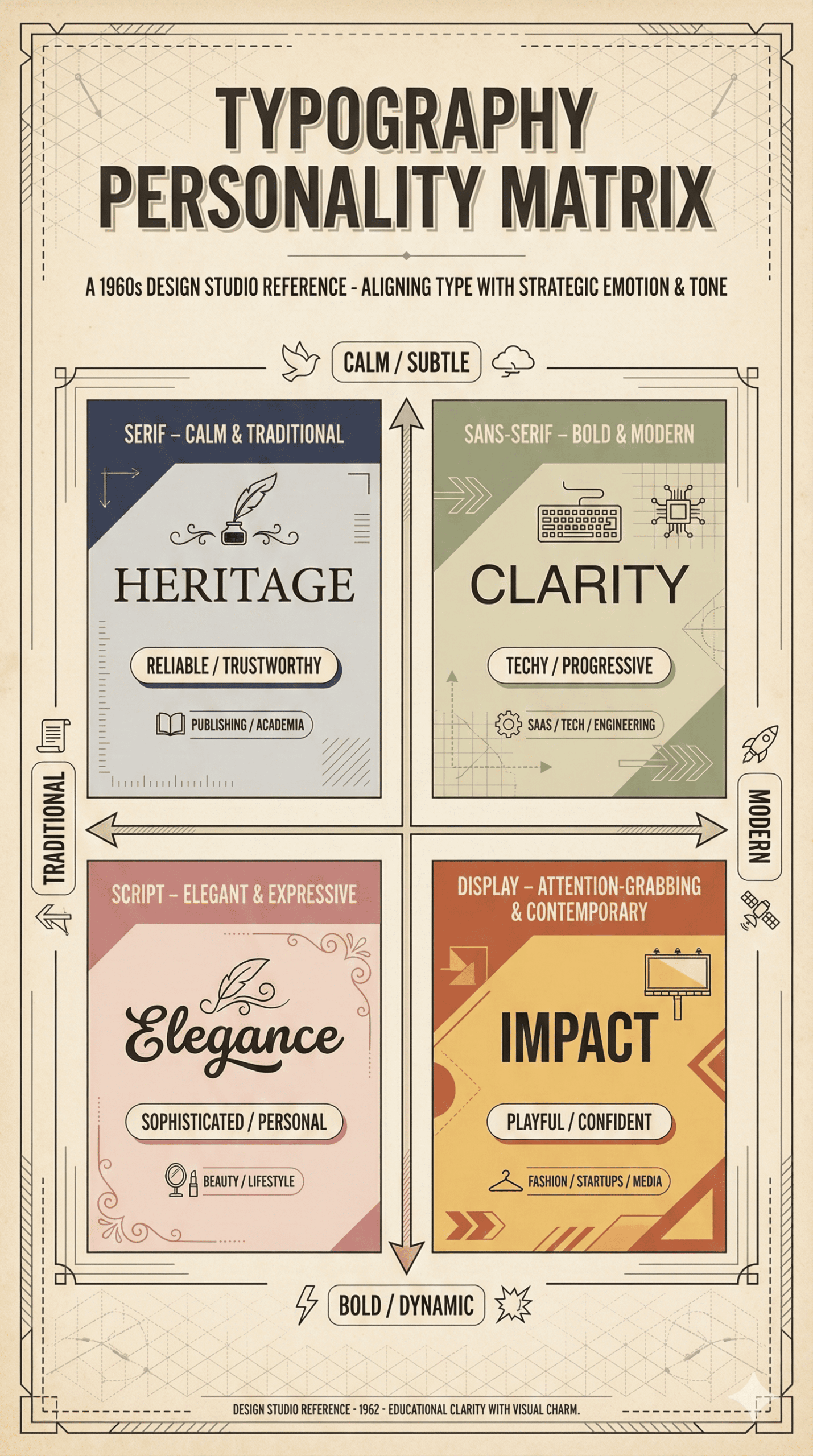
The Semiotics of Typography: Serif, Sans Serif, and Script
Typography carries semiotic weight—each style visually signals meaning, mood, and tone. And understanding the psychology in marketing behind typography helps you design a more coherent and emotionally aligned brand identity.
Here’s a breakdown of the three primary types of typefaces used in branding:
1. Serif Fonts
Serif fonts have decorative “feet” or strokes at the ends of letters. Think: Times New Roman, Baskerville, Merriweather.
Perception: Elegant, trustworthy, established, intellectual.
Best for: Traditional brands, high-end publications, finance, law, and luxury services.
Emotional impact: Stability and heritage—often used by brands looking to convey legacy and credibility.
Example: Vogue’s use of a bold, refined serif evokes timeless sophistication and authority in the world of fashion.
2. Sans Serif Fonts
Sans serifs are clean and minimal—without extra strokes. Think: Helvetica, Montserrat, Lato.
Perception: Modern, neutral, tech-savvy, friendly.
Best for: Startups, tech, SaaS, digital-first companies, wellness and lifestyle brands.
Emotional impact: Clarity, honesty, and accessibility.
Example: Google’s logo, updated in 2015 to a geometric sans serif, reflects simplicity, innovation, and openness.
3. Script Fonts
Script fonts mimic cursive handwriting or calligraphy. Think: Lobster, Pacifico, or custom brush-lettered logos.
Perception: Creative, feminine, artisanal, emotional.
Best for: Beauty, fashion, boutique brands, creative services.
Emotional impact: Expressiveness and intimacy—but legibility must be carefully managed.
Example: Coca-Cola’s custom script is globally iconic—romantic, nostalgic, and deeply emotional.
These typographic choices are more than style—they influence how your brand is perceived, how trust is built, and how quickly your audience connects with your message.
How Typefaces Influence Trust, Tone, and Clarity
Much like color psychology in branding, font psychology plays on subconscious visual cues that affect decision-making.
Here’s how typography shapes perception in three critical areas:
Trust
Typefaces that are clean, readable, and consistent foster trust. Serif fonts suggest credibility and tradition, while sans serif fonts project honesty and innovation. If your typography feels chaotic or mismatched, your audience will subconsciously question your reliability.
Tone
Fonts have voices. Is your brand bold or delicate? Edgy or minimalist? Typography helps set the emotional tone—just like how a color like blue might evoke trust, a bold sans serif might reinforce confidence and modernity.
Clarity
Clear, legible typography helps audiences process your message faster—and that leads to higher engagement, better comprehension, and reduced bounce rates on digital platforms. The wrong font can reduce readability, create confusion, and detract from the brand color psychology you’ve carefully chosen.
Whether it’s in your logo, your website headers, or your product packaging, typography must reinforce—not fight—your brand’s message.
Aligning Typography with Brand Identity
Typography should never be arbitrary. It should be as intentional and strategic as your color choice, your marketing and branding efforts, and your customer experience.
To choose typography that aligns with your brand identity, ask:
What are the core values and personality traits of your brand? (e.g., bold, nurturing, disruptive, elegant)
What emotional response should people have when they see your brand or product?
What typeface emotion aligns with your visual story?
Is your typography style consistent across all channels—website, ads, packaging, social?
Consider how typography supports your color palette too. If you’re using bold, high-saturation colors, pairing them with a thin, minimalist font may reduce visibility and impact. Typography and color should work as a unit—not as competing elements.
Real-World Examples of Typography in Branding
Let’s look at some top brands that have mastered the art of typography in branding:
| Brand | Typography Style | Emotional Cue | Alignment with Identity |
|---|---|---|---|
| Vogue | Serif, tall, dramatic | Luxury, prestige | High fashion, legacy |
| Geometric Sans Serif | Friendly, modern | Accessible, innovative | |
| Spotify | Rounded Sans Serif | Energetic, clean | Youthful, digital-first |
| Tiffany & Co. | Elegant Serif | Sophistication, trust | Heritage luxury |
| Netflix | Bold Sans Serif | Power, authority | Cinematic, commanding |
These examples showcase how brands use typography to create lasting emotional impressions and reinforce visual consistency.
Brand Color Psychology: The Strategic Use of Color in Marketing
In the context of marketing and branding, color acts as an emotional shortcut, triggering perception, behavior, and memory in an instant. That’s where brand color psychology comes in—a powerful framework for using color to reinforce your brand’s message, shape consumer response, and increase recognition.
Whether you’re designing a logo, refining your brand identity, or launching a new product line, the colors you choose are more than design decisions—they’re business decisions.
What Is Brand Color Psychology?
Brand color psychology is the practice of using color intentionally to influence how consumers perceive your brand or product. It’s a core part of color psychology in branding, focused specifically on how certain hues evoke emotions, build associations, and impact purchasing behavior.
Studies show that people make subconscious judgments about a brand within 90 seconds—and up to 90% of that judgment is based on color alone. That makes your brand color palette one of your most important assets, influencing not just aesthetic appeal, but also trust, credibility, and recall.
In short, color is not decoration. Color in branding is strategy.
Color Associations and Emotional Responses
Different colors activate different parts of the brain. Whether it’s the calming effect of blue or the urgency of red, colors influence how people feel, act, and remember.
Here’s an overview of how brand colors impact perception:
| Color | Emotion & Association | Industries Often Using It |
|---|---|---|
| Red | Energy, passion, urgency, excitement | Food, retail, entertainment, sports |
| Blue | Trust, calm, professionalism, security | Finance, tech, healthcare, B2B services |
| Green | Growth, balance, health, sustainability | Wellness, environment, agriculture, finance |
| Yellow | Optimism, creativity, attention | Startups, youth brands, hospitality, casual dining |
| Black | Power, sophistication, luxury, authority | Fashion, automotive, tech, luxury lifestyle |
| Purple | Imagination, royalty, creativity | Beauty, spiritual brands, premium innovation |
| Orange | Friendliness, enthusiasm, adventure | eCommerce, fitness, entertainment, SaaS |
| White | Simplicity, purity, minimalism | Tech, beauty, design, wellness |
These emotional associations aren’t guesses—they’re grounded in decades of psychology in marketing, research on color, and human perception studies. The colors you select help shape how your brand feels in the minds of consumers.
Warm vs. Cool Colors: The Psychology of Temperature
In color psychology in branding, temperature matters.
Warm colors like red, orange, and yellow are stimulating. They create urgency, increase appetite, and spark energy. These are ideal when your brand wants to appear bold, disruptive, or action-oriented.
Cool colors like blue, green, and purple are calming. They signal trust, peace, and professionalism. Cool tones are perfect for brands that want to build credibility, reliability, or a serene brand experience.
When choosing your color palette, consider how the temperature of your brand color aligns with your brand personality. A fintech brand using hot pink may stand out—but might not inspire confidence unless intentionally paired with cooler neutrals.
Choosing the Right Color for Your Brand
Choosing the right color for your brand isn’t about personal preference—it’s about strategic alignment. Ask yourself:
What emotion do you want your audience to feel when they interact with your brand or product?
What are your brand values and how can you translate those into visual cues?
What colors are often used by brands in your space—and how can you stand out while staying relevant?
How do your color choices align with your typography and overall brand identity?
Also, don’t overlook cultural context. The color you choose may have different meanings across global markets. For example, while white implies purity in Western cultures, it can symbolize mourning in parts of Asia. That’s why understanding color psychology requires both emotional insight and cultural fluency.
![]()
![]()
![]()
The Role of Brand Color in Recognition and Retention
The power of color psychology is undeniable when it comes to brand recognition. Think Tiffany blue. Coca-Cola red. McDonald’s yellow. These brands are so deeply tied to their brand colors that they’ve created immediate, instinctual associations.
According to research, consistent use of color in branding can increase recognition by up to 80%. That’s huge in a marketplace flooded with visual noise. If your color choices aren’t consistent, intentional, or strategically aligned, you risk fading into the background—or worse, creating confusion and mistrust.
To truly make your brand stand out, your color system should be:
Cohesive: Used consistently across all touchpoints
Differentiated: Unique enough to stand apart from direct competitors
Emotionally accurate: Aligned with how you want customers to feel
Functional: Accessible for all users (color contrast, legibility, UI/UX friendly)
Color Psychology Chart: Emotional Associations & Brand Examples
| Color | Emotional Association | Common Use Cases | Brand Examples |
|---|---|---|---|
| Red | Urgency, passion, appetite | Retail, F&B, entertainment | Coca-Cola, YouTube, Target |
| Blue | Trust, intelligence, calm | SaaS, banking, health | IBM, Facebook, PayPal |
| Green | Sustainability, wellness | Organic food, finance, eco-products | Whole Foods, Spotify, Nature Valley |
| Yellow | Joy, creativity, caution | Startups, youth brands, retail | McDonald’s, Snapchat, IKEA |
| Black | Luxury, elegance, strength | High-end fashion, tech, automotive | Chanel, Apple, Nike |
| Orange | Friendliness, playfulness | Sports, media, apps, eCommerce | Fanta, Amazon, HubSpot |
| Purple | Wisdom, imagination, premium | Cosmetics, spirituality, luxury goods | Cadbury, Yahoo, Glossier |
| White | Simplicity, clarity, peace | Tech, beauty, design, minimalism | Apple, ASOS, Everlane |
Conclusion: Let Color Work for You, Not Against You
Color is one of the most important tools in marketing, yet one of the most underleveraged. The color you use is not just an aesthetic choice—it’s a strategic decision that affects perception, trust, and conversion.
When you choose the right colors—backed by the principles of color psychology in branding—you bring your brand to life. You amplify your message. You connect with emotion. And you build a visual identity people won’t forget.
In the next section, we’ll explore how to combine typography and color schemes into a cohesive brand system that delivers clarity, impact, and consistency at every touchpoint.
Color in Branding: How It Impacts Recognition and Loyalty
If your brand had no name, no tagline, and no words—could people still recognize it? If the answer isn’t a resounding yes, then it’s time to take a closer look at your color in branding strategy.
Color is one of the most important tools in brand design, not just because it looks good, but because it taps into deep psychological associations, builds emotional connection, and increases long-term brand recognition and loyalty.
Color Recognition: Why It Matters More Than You Think
Visual memory is powerful, and color is the trigger. According to multiple studies on color psychology in marketing, consistent use of color can increase brand recognition by up to 80%. That’s not a marginal improvement—it’s a game-changer.
Why? Because the color you use is often the first impression a customer gets, whether it’s in a logo, packaging, website, or ad. Before they read a word or click a button, they feel the brand—and that feeling is often shaped by color.
Think about:
-
Coca-Cola’s iconic red: It evokes energy, passion, and excitement—mirroring the brand’s bold personality.
-
Tiffany’s signature blue: Sophisticated, serene, and instantly luxurious—so iconic, it’s trademarked.
These brands don’t just use color—they own it. And that ownership is the result of consistent, strategic use of brand colors across every customer touchpoint.
The Role of Consistency in Building Trust
Consistency isn’t just a design best practice—it’s a psychological trust builder. In branding and marketing, the repeated exposure to the same visual identity builds familiarity, which in turn builds confidence.
When brands use color consistently:
-
Customers know what to expect
-
The brand feels more professional and polished
-
There’s an instant sense of continuity between digital, print, and physical presence
Inconsistent use of color—different tones on your website vs. your packaging, or one palette for social media and another for your app—creates a disconnect. And in a world where trust is fragile and competition is fierce, that disconnect can cost you. Here’s how you can leverage social proof in branding effectively.
A strong brand identity requires more than just a beautiful color palette—it demands disciplined application. The colors for your brand should show up the same way across your entire ecosystem: logos, typography, packaging, social content, email headers, UI elements, and beyond.
Color as a Storytelling Tool
Color psychology in branding isn’t just about recognition—it’s about meaning. Every brand tells a story. And color, when used strategically, becomes a visual language that supports that narrative.
Ask yourself:
What story is your brand trying to tell?
What color conveys that story authentically?
How can your color choices support your values and mission?
For example:
A brand centered on sustainability and mindfulness might use green to symbolize balance and nature.
A challenger tech brand focused on disruption might lean into high-contrast black and red to signal boldness and urgency.
A minimalist lifestyle brand could use neutral tones to emphasize calm, clarity, and control.
When done right, color adds emotional layers to your brand story—it becomes a shortcut to everything your business stands for.
Colors Influence Memory, Emotion, and Loyalty
From a cognitive perspective, colors influence not just initial impressions but also long-term brand memory. Over time, consumers come to associate certain colors with certain feelings—and those feelings drive purchase behavior.
This is why choosing colors for your brand is one of the most important decisions in marketing:
It impacts whether people remember your brand
It shapes whether they feel connected to your values
It determines how they talk about and refer your product to others
When color is aligned with your brand and whether you want to evoke energy, peace, sophistication, or innovation, it acts as a powerful marketing tool—and a silent ambassador for your brand in every customer interaction.
Real Brands That Have Mastered Color Consistency
| Brand | Primary Color | Emotion Evoked | Result |
|---|---|---|---|
| Coca-Cola | Red | Passion, excitement | Instant recognition & global loyalty |
| Tiffany & Co. | Blue (Tiffany Blue) | Elegance, exclusivity | Trademarked hue = luxury positioning |
| McDonald’s | Yellow & Red | Happiness, appetite | Universal kid-friendly energy |
| Apple | White, Silver | Simplicity, innovation | Minimalism as modern tech identity |
| Spotify | Green | Youth, creativity, movement | Bold digital-first music persona |
These brands didn’t choose their colors randomly—they used color to create identity, emotion, and trust. They show how effective it is to create a color system that your audience can recognize even without the logo.
Color and Typography in Logo Design
In the hierarchy of visual branding, the logo is your front-line warrior. It’s not just a graphic—it’s a strategic asset, the face of your business, and a visual anchor for your entire brand identity. When done right, it becomes instantly recognizable, emotionally resonant, and symbolically loaded. And at the core of any high-performing logo lies a carefully curated combination of color and typography.
Whether you’re launching a new venture or rebranding an established one, your font choice and brand logo colors directly impact how your brand is perceived, remembered, and trusted.
The Role of Logos in Brand Identity
Your logo is the one piece of your brand that appears everywhere—from your website and social media avatars to business cards, app icons, packaging, signage, and more. It’s the shorthand for your story. The colors you use, the typography you choose, and the shape of the design work together to encode your brand’s tone, values, and positioning.
In fact, research from the University of Loyola shows that color increases brand recognition by up to 80%, and other studies show that typography can significantly influence perceived trustworthiness and professionalism. That’s why color in branding isn’t optional—it’s essential. And the logo is the first and most concentrated expression of that strategy.
How Color and Font Selection Influence Logo Effectiveness
A successful logo is more than just beautiful—it’s strategic. Every design element serves a purpose, especially when it comes to color psychology and typographic emotion.
1. Color:
Color conveys mood, personality, and tone.
Use of color helps visually differentiate your brand in the market.
Certain industries use specific colors to align with customer expectations—blue in finance, green in health, red in food and beverage.
Your logo color palette should reflect your brand color psychology:
Red: urgency, appetite, passion (e.g., Coca-Cola)
Blue: trust, logic, dependability (e.g., IBM)
Green: sustainability, health, calm (e.g., Whole Foods)
Black/White: sophistication, minimalism, timelessness (e.g., Nike)
2. Typography:
Your font choice sets the tone—is your brand friendly or formal? Bold or refined? Modern or nostalgic?
Serif fonts project tradition and credibility.
Sans serif fonts are modern, clean, and tech-forward.
Script or custom type evokes creativity, femininity, or elegance.
When color and typography are aligned, the logo becomes a powerful expression of the brand’s DNA. But when they clash, the result is a mixed message—and in branding, clarity is currency.
Common Logo Design Mistakes to Avoid
To build a strong brand identity, avoid these frequent pitfalls:
Inconsistent color use: Using different shades of your primary logo color across platforms dilutes recognition.
Overcomplicating the logo: Logos should be scalable and simple. Too many effects, shadows, or elements weaken the design.
Unclear typography: Illegible or overly ornate fonts reduce accessibility and professionalism.
Poor contrast: Low color contrast can make your logo unreadable or inaccessible—especially on digital platforms.
Trendy over timeless: Designing for what’s “in” rather than what’s on-brand will shorten your logo’s shelf life.
Your logo should be legible at a glance, recognizable at any size, and functional across multiple color backgrounds and media formats.
Examples of Logos That Use Color Psychology and Typography Masterfully
| Brand | Logo Color(s) | Typography Style | Psychological Effect |
|---|---|---|---|
| Coca-Cola | Red & white | Custom script | Emotional warmth, excitement, tradition |
| Multi-color (blue-led) | Sans serif | Innovation, approachability, trust | |
| Spotify | Green & black | Round sans serif | Fresh, youthful, tech-driven |
| Tiffany & Co. | Tiffany Blue | Elegant serif | Prestige, elegance, exclusivity |
| FedEx | Purple & orange | Bold sans serif | Dependability and speed (with a hidden arrow!) |
| Netflix | Red & black | Condensed sans serif | Cinematic energy, strength, confidence |
Each of these brands demonstrates how color psychology explains emotional tone while typography conveys brand voice. Together, they create a unified and memorable brand expression that lasts across generations.
Logo Design Takeaway: Design with Meaning, Not Just Style
A logo isn’t just a graphic—it’s the most concentrated representation of your brand. When executed with intention, your use of color and typography will:
Create immediate brand recognition
Reinforce trust and professionalism
Visually express your brand’s story, tone, and values
Whether you’re building a minimalist tech startup or a heritage fashion label, your logo should reflect the psychology of color in branding and the semantic weight of typography.
In the next section, we’ll explore how to bring all of these visual elements together into cohesive marketing materials—from landing pages and product packaging to pitch decks and advertising campaigns.
The Role of Color Psychology in Marketing Campaigns
If color is a language, marketing campaigns are the medium through which it speaks to convert. In today’s saturated digital landscape, integrating color psychology into your marketing materials and campaigns isn’t just a creative choice—it’s a conversion strategy. From landing pages and ads to product launches and seasonal promotions, the colors you use can determine whether users scroll past or click through.
Understanding the role of color psychology in marketing campaigns allows you to craft messages that don’t just get seen—but get remembered, felt, and acted upon.
Integrating Color Psychology Into Campaign Design
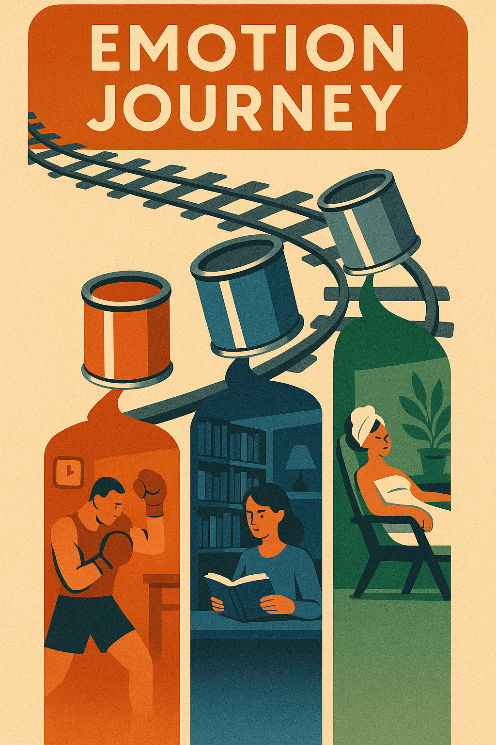
When you use color psychology intentionally, you can guide the viewer’s emotional journey—from initial attraction to final action. But successful integration requires consistency across:
Visual branding (logos, packaging, headers)
Digital content (landing pages, banners, CTAs)
Offline materials (flyers, signage, print ads)
This means your color choices should align not just with your overall brand color palette, but also with the specific emotional goals of the campaign.
For instance:
A new product launch focused on innovation? Use electric blues or bright greens to evoke energy and forward-thinking.
A limited-time sale? Red or orange for urgency and excitement.
A mental wellness initiative? Soft blues, neutrals, or calming greens can foster trust and relaxation.
In short, each campaign should start by asking: What do we want the customer to feel and do? Then reverse-engineer the color combinations to support that outcome.
Using Color to Drive Conversions: CTAs, Landing Pages, and Ads
Color isn’t just visual flair—it drives behavior. In conversion-driven environments like digital ads and landing pages, strategic color use can dramatically improve performance.
Call-To-Action (CTA) Buttons
Your CTA is the focal point of conversion. Use color psychology to make it pop both visually and emotionally.
Red and orange CTAs signal urgency and action—great for flash sales or free trials.
Green buttons feel safe and positive—ideal for wellness, finance, or sustainable brands.
Contrasting colors against background hues help your CTA stand out without overwhelming.
Pro tip: A/B test different CTA button colors to identify which combinations drive the highest conversions—there’s no universal winner.
Landing Pages
Your landing page color scheme should:
Align with your overall brand identity
Use complementary colors to highlight sections
Guide the user’s eye toward action zones (CTAs, lead forms, offers)
Poor color hierarchy leads to confusion and friction, both of which kill conversions. Well-executed color design builds flow, clarity, and emotional momentum.
Display Ads and Social Creatives
In paid campaigns, color is critical to stopping the scroll. The right combination can create curiosity, establish brand recall, or convey instant value.
For retargeting ads, use consistent brand colors to reinforce familiarity.
For cold audience campaigns, test bold and disruptive color treatments to create contrast in busy feeds.
In both cases, the color choice needs to be intentional, not arbitrary.
Seasonal and Situational Color Choices
Great marketing is timely—and so is great use of color.
Different seasons evoke different emotions, and aligning your color palette accordingly can increase relevance and emotional resonance:
Spring: Light greens, pastels, florals → themes of renewal, freshness, beginnings
Summer: Bright yellows, oranges, turquoise → joy, energy, adventure
Fall: Earth tones, amber, deep reds → comfort, nostalgia, richness
Winter: Cool blues, white, silver, jewel tones → sophistication, peace, festivity
Beyond seasons, situational color marketing is also on the rise. Think:
Pride month palettes (rainbows, inclusive colors)
Black Friday campaigns (black, red, gold)
Sustainability pushes (soft greens, neutral palettes)
When your color choice aligns with the emotional climate of the moment, your brand becomes more culturally relevant—and conversion-ready.
Digital vs. Print: Why Medium Matters in Color Execution
One of the most overlooked aspects of color in marketing is how it renders differently across platforms.
Digital
Uses RGB color mode (Red, Green, Blue)
Backlit screens amplify brightness and contrast
Vibrancy can shift between devices (e.g., smartphones vs. desktops)
Uses CMYK color mode (Cyan, Magenta, Yellow, Key/Black)
Printed inks appear flatter and more subdued than screens
Paper type (matte, gloss, textured) affects how color is perceived
This difference matters. A bold, neon CTA that pops online might fall flat on a printed flyer. That’s why you need to test and optimize color palettes separately for digital and physical campaigns—what works in one space won’t always translate.
Also consider accessibility: ensure contrast ratios meet WCAG standards for readability, particularly in digital spaces. Great color combinations not only look good—they’re inclusive and user-friendly.
Color Theory & Design Principles for Brands
Design without strategy is decoration—and color without theory is chaos. To build a cohesive, high-impact brand identity, you need to understand not just what each color means, but how colors interact, balance, and enhance each other. That’s where color theory comes in.
Whether you’re rebranding, launching a startup, or refining your marketing and branding, a strong grasp of the color wheel, color combinations, and harmony principles will ensure you choose the right colors that both look stunning and serve strategic goals.
Let’s break it down.
Introduction to Color Theory: Primary, Secondary & Tertiary Colors
At its foundation, color theory is the structured approach to mixing and combining types of color to create visual harmony.
Primary Colors: Red, Blue, Yellow – The source of all other colors. These cannot be created by mixing other colors.
Secondary Colors: Orange, Green, Purple – Created by mixing two primary colors.
Tertiary Colors: Red-Orange, Blue-Green, etc. – Formed by mixing a primary and a secondary color.
Understanding this structure helps you pick colors that align with your brand’s emotional tone and maintain consistency across your visual identity.
Understanding the Color Wheel and Color Harmony
The color wheel is a visual representation of the color spectrum, and it’s essential for creating balanced brand color palettes. Here’s how to use it strategically:
Analogous Colors
Definition: Colors that sit next to each other on the wheel (e.g., blue, teal, green).
Effect: Create harmony and cohesion. Ideal for wellness, sustainability, or calm brands.
Use Case: Background, accent, and typography tones that blend naturally.
Complementary Colors
Definition: Colors opposite each other on the wheel (e.g., blue and orange, red and green).
Effect: Bold, high-contrast combinations that create visual energy and grab attention.
Use Case: Perfect for call-to-action buttons, ads, or dynamic product packaging.
Triadic Colors
Definition: Three colors evenly spaced around the wheel (e.g., red, yellow, blue).
Effect: Vibrant and balanced—provides diversity without chaos.
Use Case: Complex color schemes that need multiple tones (e.g., branding for apps, SaaS, or multi-tiered services).
Using harmony rules ensures that your brand color palette is not only aesthetically pleasing but also emotionally aligned and psychologically effective.
Building a Cohesive Brand Color Palette
Your brand color palette should do three things:
Convey emotion using color psychology
Maintain consistency across digital and print platforms
Support function (contrast, readability, accessibility)
Here’s a simplified framework to get started:
| Palette Role | Purpose | Example |
|---|---|---|
| Primary Color | Dominant brand identity color | Coca-Cola red, Spotify green |
| Secondary Color | Adds visual diversity, complements primary | Orange with blue, teal with navy |
| Accent Color(s) | Highlights, calls to action, UX buttons | High contrast options like yellow, red |
| Neutral/Base Color | Backgrounds, body copy, containers | White, grey, charcoal, sand |
Using a limited number of colors (typically 3–5) ensures your identity remains visually recognizable and strategically consistent across channels.
Color Contrast, Accessibility, and Usability
Designing for beauty is not enough—your brand also needs to be usable and inclusive.
Here’s why color contrast matters:
Low contrast reduces readability, especially for people with visual impairments.
Poor contrast between background and text or CTAs leads to lower engagement and higher bounce rates.
Accessibility guidelines (WCAG 2.1) specify minimum contrast ratios for text and interface elements.
🛠 Tools to test color contrast:
WebAIM Contrast Checker
Stark Plugin (Figma/Sketch)
ColorSafe.co for accessible color palette design
Make sure your color system works for everyone, not just those with perfect vision or ideal screen settings. Color psychology explains how color affects perception—but color usability ensures your message gets delivered effectively.
Why Design Principles Matter in Branding and Marketing
Great marketing and branding isn’t random—it’s deliberate, refined, and rooted in strategy. By applying color theory, you’re not just picking “pretty” colors. You’re building a system that:
Reinforces emotional intent
Improves brand recall
Enhances UX/UI experience
Strengthens trust across touchpoints
Ensures your brand color psychology remains clear and consistent
Whether you’re selecting a color for a new logo, creating campaign visuals, or designing a product interface, this foundation will help you maintain harmony, accessibility, and conversion power.
Choosing the Right Colors and Fonts for Your Brand
Your brand’s visual identity isn’t just about style—it’s a psychological system that triggers perception, emotion, and action. The colors and fonts you choose are your first impression, your voice, and your emotional handshake with the audience. When aligned with your brand values and positioning, they can elevate your business, influence behavior, and build trust at scale.
But how do you actually choose the right colors and fonts for your brand? Here’s a proven, strategic process to help you blend color psychology, font psychology, and competitive analysis into a cohesive, emotionally intelligent visual identity.
Step 1: Define Your Brand Personality and Core Values
Before diving into palettes or typography, start with clarity on who your brand is.
Ask:
What do we stand for?
What are our tone, values, and personality traits?
How do we want our audience to feel when they interact with us?
Are you bold and rebellious? Calm and nurturing? Sophisticated and minimalist?
This psychological groundwork is what drives every color choice and typeface selection. Remember: color psychology in branding is about aligning emotion with identity.
Example:
A luxury skincare brand that values purity and elegance might lean toward clean serif typography and a muted neutral or soft white-blue color palette. A Gen Z fashion startup with a bold voice? Expect vivid colors, experimental layouts, and playful sans serif fonts.
Step 2: Research Your Industry and Direct Competitors
You want to stand out, but also signal familiarity. That’s the balance between differentiation and relevance.
Audit your niche:
What brand colors and fonts are commonly used in your space?
What emotional tones do they convey?
How can you avoid duplication while staying recognizable?
Understanding color psychology in marketing means knowing not just what your brand wants to say, but what the audience expects from brands like yours.
Tip: Use this step to map both your direct competitors and aspirational brands—even in other verticals. Often, the best ideas are borrowed from unexpected places.
Step 3: Create Mood Boards and Style Tiles
Bring your visual research to life through mood boards—collections of images, colors, typography, and layouts that feel “on-brand.” This is where color psychology influences start becoming visual and strategic.
Use platforms like Pinterest, Milanote, or Figma to create mood boards.
Identify color schemes that feel aligned with your brand’s tone.
Pair colors with typeface styles (serif, sans serif, script) and note the emotional response.
This is your sandbox. Let your creativity flow—but stay rooted in the emotional clarity defined in Step 1.
Step 4: Test for Emotional Alignment
Once you’ve shortlisted a few potential color/font combinations, test how they make people feel—especially your intended audience.
Conduct A/B testing on social graphics, ads, landing pages, or product mockups.
Ask: Does this color palette feel trustworthy, exciting, premium, friendly?
Does the font choice match the tone of your copy and messaging?
This stage is critical. Often, brands fall in love with a look that feels cool, but if it doesn’t emotionally align with your brand story, it becomes noise instead of signal.
Remember: It’s the color and typography together that create the emotional footprint of your brand.
Step 5: Use Psychology to Refine Visual Identity
Now it’s time to apply insights from color psychology and font psychology to fine-tune your choices.
Here’s a basic framework:
| Color Emotion | Use Case |
|---|---|
| Red (energy, urgency) | Sales, limited offers, retail activations |
| Blue (trust, calm) | SaaS, healthcare, B2B, finance |
| Green (growth, health) | Sustainability, wellness, fintech |
| Yellow (optimism) | Youth brands, creative services, eCommerce |
| Black (luxury, power) | Fashion, premium DTC, automotive |
And for typography:
| Font Style | Perception |
|---|---|
| Serif | Trustworthy, established, editorial |
| Sans Serif | Modern, clean, digital-first |
| Script/Custom | Creative, emotional, expressive |
Ensure your final selections are both strategically sound and emotionally congruent with your brand values.
Step 6: Use Tools to Select and Test Your Colors and Fonts
Let’s bring data into the process. Here are some tools to help choose the right colors and select typography with purpose:
Color Tools
Coolors (color scheme generator)
Adobe Color (color wheel, harmony rules, accessibility contrast checker)
Khroma (AI-powered color inspiration)
Color Hunt (trending color palettes)
Font Tools
Fontpair.co (suggests harmonious Google Font pairings)
Typewolf (inspiration and real-world typography examples)
Google Fonts (free, high-performance web typography)
WhatFont (browser plugin to identify fonts on the web)
Don’t forget to test your selections across platforms and formats—desktop, mobile, print, social, and product packaging. A color that looks strong on a screen may lose power in print. A typeface that’s elegant on desktop might lose clarity on mobile.
Case Studies: Brands That Mastered Color & Typography
The world’s most iconic brands don’t just get noticed—they get remembered. And often, it’s not because of what they say, but how they visually speak. Through intentional use of color psychology and typographic strategy, these brands have carved unforgettable identities in the minds of millions.
In this section, we’ll break down four global brands—Spotify, Chanel, McDonald’s, and Airbnb—to show how each uses color and typography in branding and marketing to build recognition, emotion, and loyalty. If you’re wondering how to choose the right colors and typefaces for your own brand, these real-world examples will give you a masterclass in strategy.
Spotify: Green Energy Meets Digital Fluidity
Color: A bold, slightly neon green on a dark background
Typography: A round, modern sans serif (Spotify Circular)
Why it works: Spotify’s color palette was a bold move in the tech space, where blue dominates (think Facebook, LinkedIn, Twitter). Their choice of green not only broke industry convention, but also aligned with color psychology principles:
Green conveys growth, freshness, and energy—perfect for a brand built on discovery and movement.
Paired with black, the contrast creates a modern, digital-first aesthetic.
Their custom font—Circular—is round, balanced, and friendly, mirroring the fluid experience of music streaming. This seamless pairing of brand color and typography builds a distinct visual signature that’s instantly recognizable across devices and touchpoints.
Psychological Effect: The green evokes momentum and creativity, while the typography suggests inclusivity and flow—exactly what Spotify wants you to feel when using their app.
Chanel: Timeless Elegance in Black and White
Color: Pure black and white
Typography: Custom all-caps serif (inspired by “Couture Bold”)
Why it works: Chanel doesn’t use color to stand out—it uses it to elevate. In the luxury world, less is more, and black and white deliver timeless sophistication, symbolizing exclusivity, formality, and power.
The typography is classic yet commanding: an elegant serif that speaks to heritage, precision, and high fashion. This is a masterclass in color psychology in branding—the message is that Chanel doesn’t follow trends; it defines them.
Psychological Effect: The stark contrast of black and white signals authority and class, while the serif typeface reinforces legacy, craftsmanship, and trust.
McDonald’s: Appetite, Speed, and Joy
Color: Red and yellow
Typography: Rounded sans serif (McLawsuit, Speedee-inspired)
Why it works: McDonald’s is the poster child for color psychology in marketing. Their use of red and yellow is anything but accidental:
Red triggers appetite and urgency (it’s often used in fast food for this reason).
Yellow conveys happiness, warmth, and friendliness—perfect for families and children.
Their typography has evolved into a bold, rounded sans serif that reflects ease, speed, and accessibility. Combined, these visual choices have become iconic across billions of customers and countries.
Psychological Effect: The colors stimulate quick decision-making and create emotional warmth. The typography enhances clarity and approachability.
Airbnb: Coral Comfort and Rounded Friendliness
Color: Coral pink (a unique blend of red and orange)
Typography: Custom sans serif with soft, rounded edges (Airbnb Cereal)
Why it works: Airbnb’s rebrand in 2014 was a pivot from techy cool to emotional connection. Their coral color was chosen for its blend of energy (from red) and friendliness (from orange), while still feeling warm, inclusive, and human.
Their custom typeface—Airbnb Cereal—is soft and geometric, designed to be both modern and emotionally comforting. The rounded shapes reflect a global community that feels safe and welcoming.
Psychological Effect: Coral suggests warmth, empathy, and uniqueness. The typography feels playful yet professional—striking the perfect balance for a brand that blends hospitality with innovation.
Key Takeaways: What These Brands Teach Us About Strategy
| Brand | Primary Color Psychology | Typography Emotion | Marketing Strategy Impact |
|---|---|---|---|
| Spotify | Growth, innovation, freshness | Fluid, friendly | Stands out in tech, appeals to modern listeners |
| Chanel | Luxury, timelessness, authority | Elegant, classic | Signals exclusivity, builds high-end emotional loyalty |
| McDonald’s | Appetite, urgency, joy | Bold, simple, fast | Drives quick conversions and global accessibility |
| Airbnb | Empathy, energy, warmth | Welcoming, modern | Builds community trust and emotional resonance globally |
These top brands didn’t just pick random colors or fonts—they used deep psychology in marketing to shape perception, craft emotion, and scale loyalty. Their identities are built on systems that consistently use color and typography to deliver on brand promises.
Common Mistakes and How to Avoid Them
Even the most well-intentioned branding efforts can falter when color psychology and typography are misused. A beautiful visual identity means nothing if it sends the wrong signals, undermines accessibility, or fails to resonate across platforms.
Let’s break down the most common mistakes brands make when choosing colors for branding, selecting fonts, or implementing visual identity systems—and how to fix them before they cost you trust, conversions, or long-term recognition.
Mistake 1: Overusing Trendy Colors or Fonts
What’s hot on design blogs today may be visual clutter tomorrow. One of the most common errors in marketing and branding is prioritizing trendiness over strategy.
Neon gradients, bold corals, ultra-minimal type—these trends cycle fast.
While they may look modern, they often lack emotional alignment with your brand identity.
Worse, they can make your brand look derivative instead of distinctive.
Why it matters:
Your color choice and font selection must be timeless enough to scale with your brand and grounded enough in psychology of color to convey lasting meaning.
How to fix it:
Start with your brand personality and values, not the latest color report.
Use color psychology in branding to guide your decisions—e.g., use blue to evoke trust, not because “everyone else is using it.”
Treat trends as inspiration, not instruction.
Mistake 2: Ignoring Accessibility and Contrast
A brand that looks beautiful but isn’t usable fails its audience. Many designers fall in love with muted tones, soft contrasts, or light typography—but forget that readability and inclusivity come first.
Low contrast can make content illegible for users with visual impairments or even in different lighting conditions.
Thin or script fonts might look elegant but can be hard to read on smaller screens or fast-scrolling environments.
Why it matters:
Accessibility isn’t just a technical checkbox—it’s brand ethics. The colors you use and how they interact impact your user experience and overall brand perception.
How to fix it:
Follow WCAG 2.1 guidelines for color contrast (minimum 4.5:1 for body text).
Use tools like WebAIM or Stark to test contrast ratios.
Choose fonts that are legible across weights and sizes.
Make sure your color schemes function well across both digital and print.
Mistake 3: Poor Alignment with Brand Personality
A font might be beautiful. A color might be bold. But if they don’t reflect who your brand is, they’re working against you—not for you.
Example misfires:
A wellness brand using harsh reds (which can signal danger or urgency).
A law firm with playful, bubbly typography (which may diminish authority).
A luxury brand using overly casual fonts (which may reduce perceived value).
Why it matters:
The way your brand is perceived is shaped by subconscious associations. If your font and color combinations send mixed signals, it causes cognitive dissonance and reduces trust.
How to fix it:
Use brand archetypes and personality mapping to guide visual decisions.
Align font and brand color psychology with the emotional response you want.
Ask: “Does this look and feel like our brand promise?”
Mistake 4: Inconsistent Application Across Platforms
Visual inconsistency is a brand killer. It makes you look disjointed, amateur, and unreliable. Whether it’s misaligned color usage or shifting typography across touchpoints, inconsistency confuses customers and erodes trust.
Examples:
A different shade of green on your website vs. packaging.
Inconsistent font styles between your Instagram graphics and sales decks.
Uncoordinated design choices by multiple teams or freelancers.
Why it matters:
Consistency drives brand recognition, which leads to loyalty. Without it, your brand fades into the background—or worse, looks unprofessional.
How to fix it:
Create a brand style guide that includes:
Exact brand color hex/RGB/CMYK codes
Typography hierarchy and usage examples
Logo usage rules across backgrounds and formats
Use tools like Frontify, Canva Brand Kit, or Figma libraries to maintain visual standards.
Train all teams to adhere to your brand guidelines across content, marketing, sales, and product.
Color Psychology and Branding Trends in 2025
As branding continues to evolve in a hyper-digital, emotionally intelligent, and sustainability-driven world, the way we use color and design visual systems is shifting fast. The brands leading the charge aren’t just applying color psychology reactively—they’re predicting where it’s headed and adapting to changing consumer expectations in real-time.
In 2025, expect to see color psychology in branding take center stage in everything from marketing campaigns to UI/UX, packaging, and environmental design. Below are the key trends shaping the future of brand color, typography, and visual identity—and how your business can stay ahead of the curve.
1. Predictions for Emerging Color Trends
The next generation of brand colors is being shaped by global sentiment, technological change, and cultural mood shifts. As consumers seek more meaningful and mindful connections, brands are shifting from bold, attention-grabbing hues to emotionally intelligent, nuanced palettes.
Emerging color trends for 2025:
Muted Earth Tones: Think terracotta, olive, sand, and clay. These tones support brand stories tied to sustainability, authenticity, and calm.
Digital Pastels: Soft, tech-adaptive hues like periwinkle, lavender, and mint green that evoke a sense of future-meets-nostalgia—perfect for wellness, fintech, and AI startups.
Metallic Neutrals: Subtle silvers, brushed golds, and techy greys are becoming go-tos for luxury tech and premium lifestyle brands.
Hyper-Accents: While base palettes are calming, bold accent colors (electric blue, crimson red, vibrant coral) are being used sparingly for CTAs and moments of focus—playing directly into color psychology in marketing.
Brands that choose the right colors based on audience emotion, industry context, and future relevance will stand out while still building meaningful, lasting recognition.
2. Rise of Neo-Minimalist Typography
As part of the broader visual evolution in modern branding, we’re seeing a strong move toward neo-minimalist typography—a style that blends precision, personality, and accessibility.
Neo-minimalist trends to watch:
Custom Variable Fonts: Flexible, responsive typography that adapts across screen sizes and devices while maintaining clarity and voice.
Mono-width Fonts: Inspired by coding and developer aesthetics, monospaced fonts are emerging in fintech and data-heavy industries for their sense of structure and clarity.
Ultra-legible Geometric Sans Serifs: Especially for DTC, healthcare, and lifestyle brands—clarity is trust.
Typography as Brand Identity: Many top brands are investing in custom typefaces as core IP, embedding brand personality into every word displayed.
Psychology in marketing demands typography that isn’t just beautiful—but usable, accessible, and emotionally on-brand. Expect to see more brands treating type as both a functional UI asset and a storytelling tool.
3. The AI Revolution in Brand Design
AI is no longer an experimental tool in branding—it’s becoming an essential part of the creative process. In 2025, AI-powered brand design tools are helping companies test, generate, and optimize color palettes, typography pairings, and even layout logic based on behavioral psychology and live data.
Expect:
AI-driven brand audits to test emotional consistency across assets.
Predictive color analysis tools that suggest palettes based on target audience psychographics.
Real-time UX testing of CTA colors, font hierarchies, and accessibility compliance.
This doesn’t mean humans are out of the loop—it means strategic designers will work with AI to refine brand visuals faster and with greater behavioral insight. And with color psychology in marketing being algorithmically testable, we’ll see data-backed design move from niche to norm.
4. The Sustainability Shift: Greens, Neutrals, and Earth-First Design
As sustainability shifts from niche value to brand expectation, the psychology of color is adapting accordingly. Consumers now associate certain hues with environmental values, authenticity, and ethical responsibility.
Color trends shaped by sustainability:
Greens: From leafy to mossy to olive, green is the go-to for signaling eco-consciousness, wellness, and clean growth.
Warm Neutrals: Browns, beiges, and soft sands are grounding, organic, and rooted in simplicity—used in everything from beauty to packaging.
Off-Whites & Stone Tones: Minimalist and calming, ideal for clean-label brands that want to convey transparency and trust.
But using a color associated with sustainability isn’t enough—you have to back it with authentic values and behavior. Consumers are increasingly fluent in brand color psychology and quick to call out greenwashing.
Tip: Use these colors not just to “signal” but to reinforce sustainable narratives in your brand story, marketing materials, and even in your packaging and sourcing strategy.
Conclusion: Make Your Brand Speak Through Design
In branding, design isn’t just about looking good—it’s about feeling right. Throughout this guide, we’ve explored how color psychology and typography are not merely stylistic choices but strategic tools that shape how your brand is perceived, how it makes people feel, and whether it moves them to act.
From the color you use in your logo to the typeface on your landing page, every visual choice contributes to a larger story—your brand identity. These elements work together to express your values, differentiate you in the market, and build the kind of emotional resonance that fosters loyalty.
We’ve seen how top brands use color psychology in branding to trigger trust, energy, excitement, or calm. We’ve explored how fonts can silently convey sophistication or simplicity. And we’ve examined how even small color choices can influence marketing and branding performance across platforms, campaigns, and user experiences.
The takeaway?
Design with intention. Don’t just pick colors or fonts—choose them strategically based on your brand’s emotional DNA, your audience’s expectations, and the psychological impact you want to create.
A thoughtful visual identity doesn’t just help people recognize your brand—it helps them connect with it, remember it, and advocate for it. That’s the difference between being seen and being chosen.
Ready to Bring Your Brand to Life?
If you’re building—or rebuilding—a brand that needs to be more than just “pretty,” you’re in the right place. I help founders, startups, and seasoned companies create brand identities that perform—powered by psychology, precision, and positioning.
Let’s talk about how to craft a brand that speaks with purpose, stands out with clarity, and scales with confidence.
Whether you’re defining your brand color palette, refining your typography, or building a full visual system, I can help you choose the right colors, shapes, and signals to make your brand unforgettable.
Your brand deserves more than good design. It deserves strategy.
Let’s make it happen.