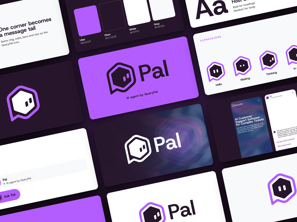


I still find it slightly ridiculous how much of this identity was already there. QueryPal needed a name and a face for its AI sales agent. The name was sitting inside QueryPal. Most of the face was sitting inside its existing icon. My job was to notice what could work, explore it properly, and stop before I buried it under extra design.
The result is Pal. This chatbot branding project covered naming, the brand icon, visual expressions, colour and typography, with applications showing how the identity fits into the website chat experience. A small identity with enough structure to use beyond one attractive mockup.
The brief: give the sales agent its own identity
The agent needed to belong to QueryPal while being recognisable as the thing visitors could talk to. Those are two different requirements. Reusing the company logo without any change would keep the connection, but it would do less to distinguish the agent. Building an entirely unrelated mascot would create the opposite problem.
I wanted a visitor to see the connection without needing it explained. That became the useful constraint for the project: how little could change while still giving the agent a clear identity of its own?
For me, chatbot branding starts with that relationship. The name, avatar, colours and interface should help someone understand who is speaking and which company stands behind the conversation. The visual identity sets expectations before the first answer appears.
Naming: the agent was already in the name
QueryPal became Pal.
There is a temptation with naming to assume the more distant the reference, the more intelligent the solution. You can end up explaining ancient mythology to somebody who only wanted to ask about a software integration.
Here, the shorter name retained a direct connection to QueryPal and gave us a familiar word for an approachable agent. It was easy to put beside the icon, easy to say, and useful in interface copy. “Ask Pal” is a complete invitation in two words.
The supporting line, “AI agent by QueryPal,” does another job. It tells the visitor what Pal is and who it belongs to. The friendly name and the factual description can sit together without either having to do all the work.
Logo design: one corner becomes a conversation
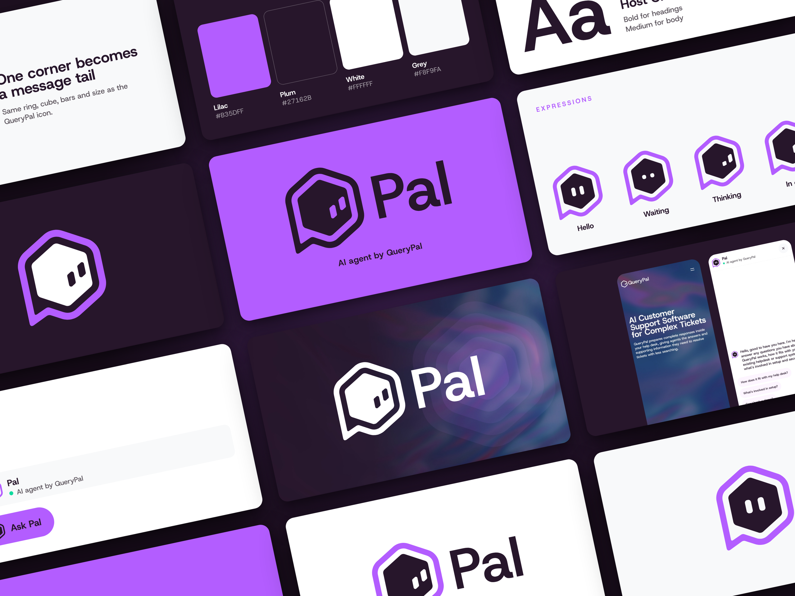
The case study shows three directions: a two-tone treatment, a speech-corner treatment and a more direct face. The speech corner was the strongest fit because it made a small, meaningful change to the existing shape.
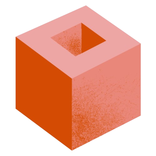
The ring, cube and two bars stayed recognisable. One corner of the outer shape became a message tail. That was enough to introduce the idea of conversation while preserving the family resemblance.
This is the part I like most. You can point to the change and explain it in a sentence. There is no need to invent a twelve-part story about what every curve represents. The company mark becomes something you can talk to.
It is also a useful example of extending an existing brand identity. Before drawing a new symbol, look at what the parent brand already gives you: shapes, proportions, naming, colour and familiar details. Some of those elements may carry more value than a new illustration ever could.
We tried a smile. The eyes were enough.
The exploration included adding a mouth. It made Pal feel more like an emoji, which pulled attention away from the character of the original mark.
The two bars already offered enough expression. Changing their arrangement gave us a visual vocabulary without adding more facial features. The finished system includes Hello, Waiting, Thinking and In chat states. The outer icon stays consistent while the bars do the expressive work.
That constraint matters. If every state changes the whole face, the identity can start drifting. Keeping most of the shape fixed lets the expressions feel like the same agent. It also gives anyone extending the system a clear rule: work with the two bars first.
A visual identity built from colour and typography
The palette combines lilac, plum, white and a light grey. Lilac gives the icon and interface accents a clear presence; plum provides the darker field used across the presentation. White and light grey create quieter areas for text and the chat interface.
The specified colours are lilac #B35DFF, plum #27162B, white #FFFFFF and grey #F8F9FA. Host Grotesk is used with bold headings and medium body text.
These are practical ingredients. A usable visual identity needs more than an isolated logo file. The team needs a consistent way to set a heading, place the mark on different backgrounds, introduce the agent and show an interaction state. The mockup brings those pieces together so the relationship is visible.
Chatbot design: the identity inside the interface
The application views show Pal in the chat header, beside messages and on the “Ask Pal” launcher. These placements are useful checks because the icon has to make sense at the scale of a working interface.
A brand board gives you room. A chat header does not. The fewer details competing inside the icon, the easier it is to preserve its character in those smaller placements. That is a design rationale, rather than a claim that this project has already improved engagement or sales.
The work shown here is the delivered identity and its application mockups. The expression sequence demonstrates the intended visual system; it should not be read as proof that every animated state is already connected to the live agent.
Brand personality has to continue into the conversation
The graphic system is one part of the customer experience. The assistant’s tone of voice and behaviour need the same consistency. A friendly visual introduction followed by a vague or pushy reply would send mixed signals. That is something to review with the team responsible for customer interactions as the agent develops.
For AI agents and other chatbots, a practical handoff should show the designer’s visual rules alongside the approved introduction and example responses. It gives the people building the experience a shared reference instead of leaving them to guess from a logo.
What I would take from this chatbot branding project
Start with the existing brand before assuming you need a separate universe for the bot. Give the name a useful role in the interface. Make the agent’s relationship to the company explicit. Keep the icon recognisable across expressions. Then check the design where people will actually encounter it.
The wider principle also applies to deep tech brand strategy: decide what someone needs to understand, then make the design carry that meaning.
Pal worked as a design because the decisions supported each other. The name came from QueryPal. The icon came from QueryPal. The speech corner explained the interaction. The two bars supplied the character.
I could have added more. I’m glad I didn’t.
If you’re building an AI product and need the naming, identity and website to make sense together, see my brand and digital design work.