

A good restaurant site has a fairly straightforward job. Show me the food, tell me what it costs, tell me where I can get it, and don’t make me fight with a PDF menu on my phone.
Yet after looking through enough food website templates, it’s surprising how often the basics are buried under beautiful but completely interchangeable layouts. You swap the logo, change the hero image, and suddenly the Italian place has become a burger joint. Even the same little leaf icon survives the transition.
I wanted to try something different with Burger Boys, a fictional plant-based smash burger restaurant in Amsterdam. I built the brand world and an interactive website as a self-initiated design project. The idea was to make the food look irresistible and let people explore the menu in ways that actually fit the brand.
You can browse the Burger Boys website yourself. The site works as an interactive concept, but the restaurant and its depicted location are fictional, the food and interior photos are AI-generated, and the ordering flow is a demo. No real food orders or payments are processed.
The idea behind the Burger Boys design
If you looked at a typical plant-based restaurant a few years ago, you could almost predict the color palette. Sage green, beige, some leaves, perhaps a perfectly clean wooden spoon. Nothing wrong with those choices, but they don’t tell you whether the burger is any good.
For Burger Boys, I wanted to lead with appetite. The first thing a hungry customer should see is the burger. The plant-based story comes right behind it.
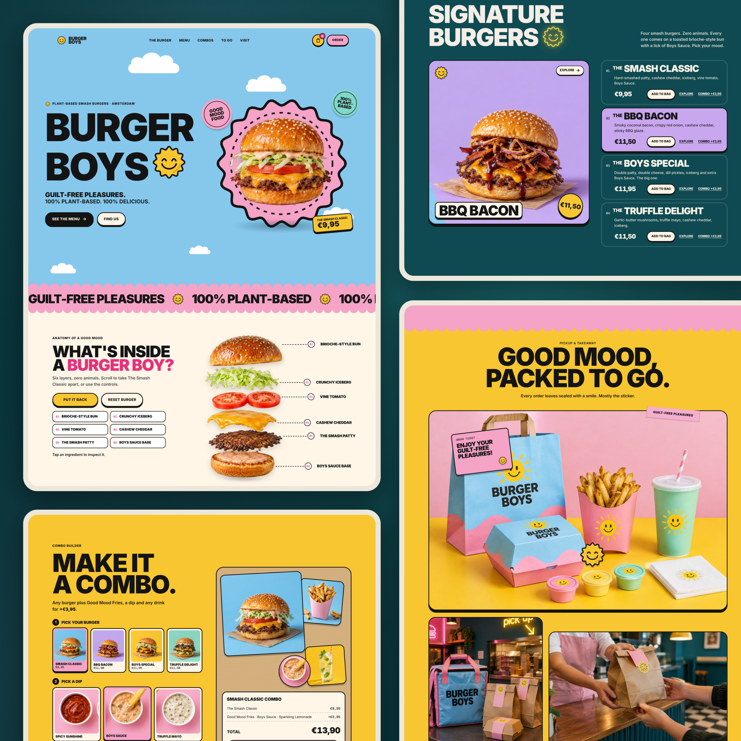
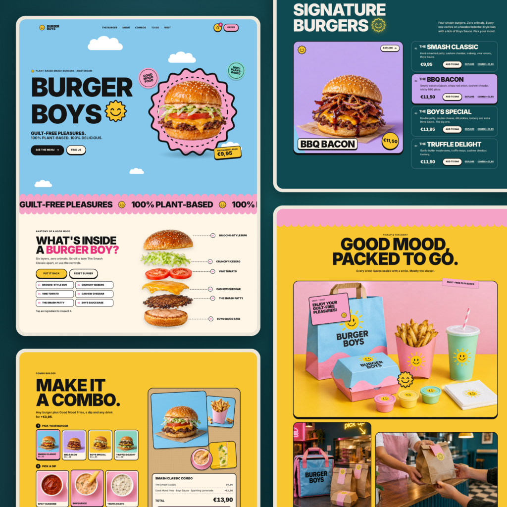
That decision informed the entire website design: oversized black type, a smiling sun mascot, sky blue, pink, sunshine yellow and mint, with photography close enough to see the sauce. The slogan “Guilt-free pleasures” became the personality of the place. It belongs on a takeaway bag just as naturally as it does on a web page.
The physical world mattered, too. I developed concept imagery for a storefront, counter, interior, cups, burger boxes, fries packaging and uniforms. These are not photographs of an existing kitchen or location. They are art direction for a restaurant that exists as a creative project.
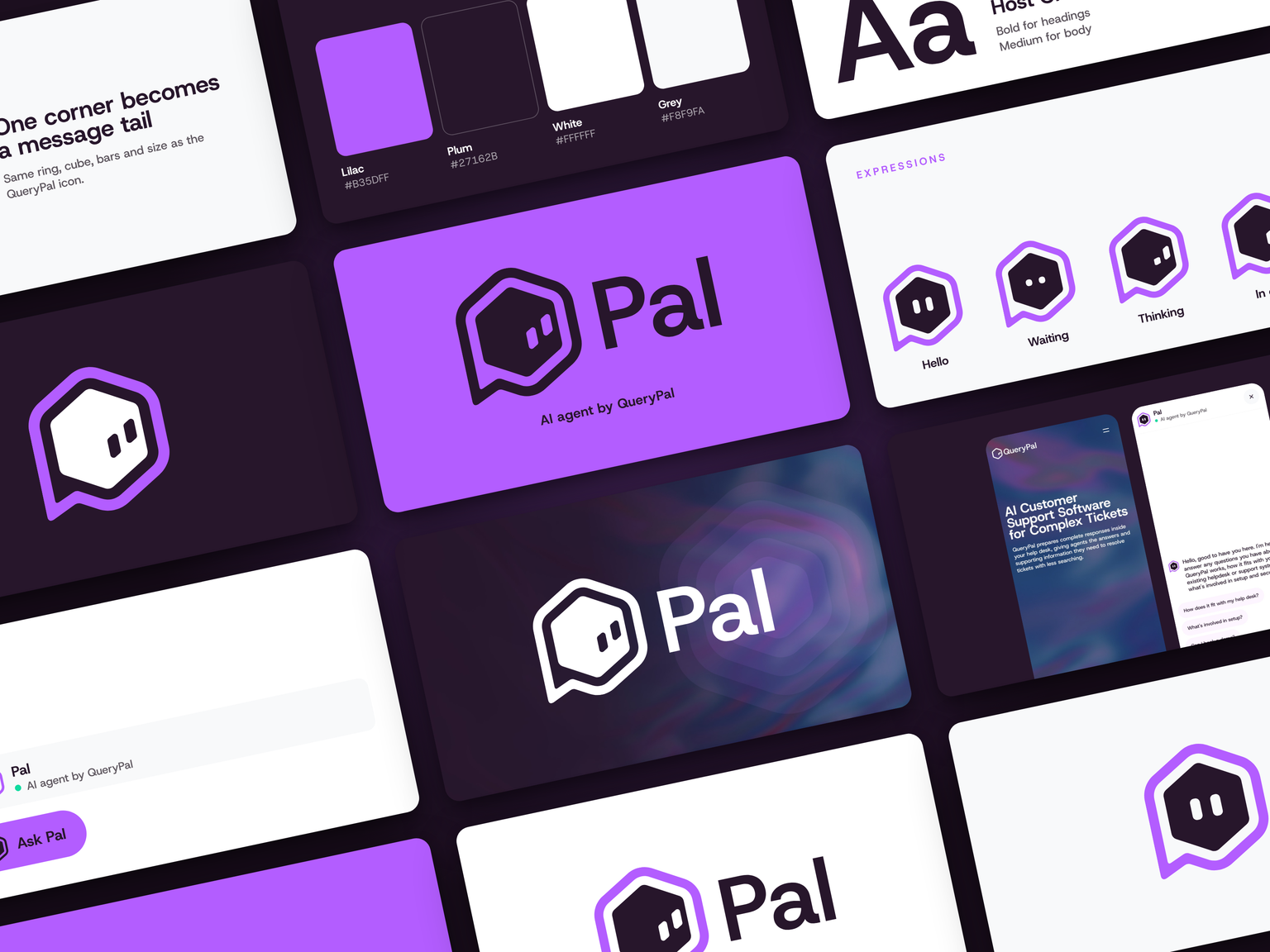
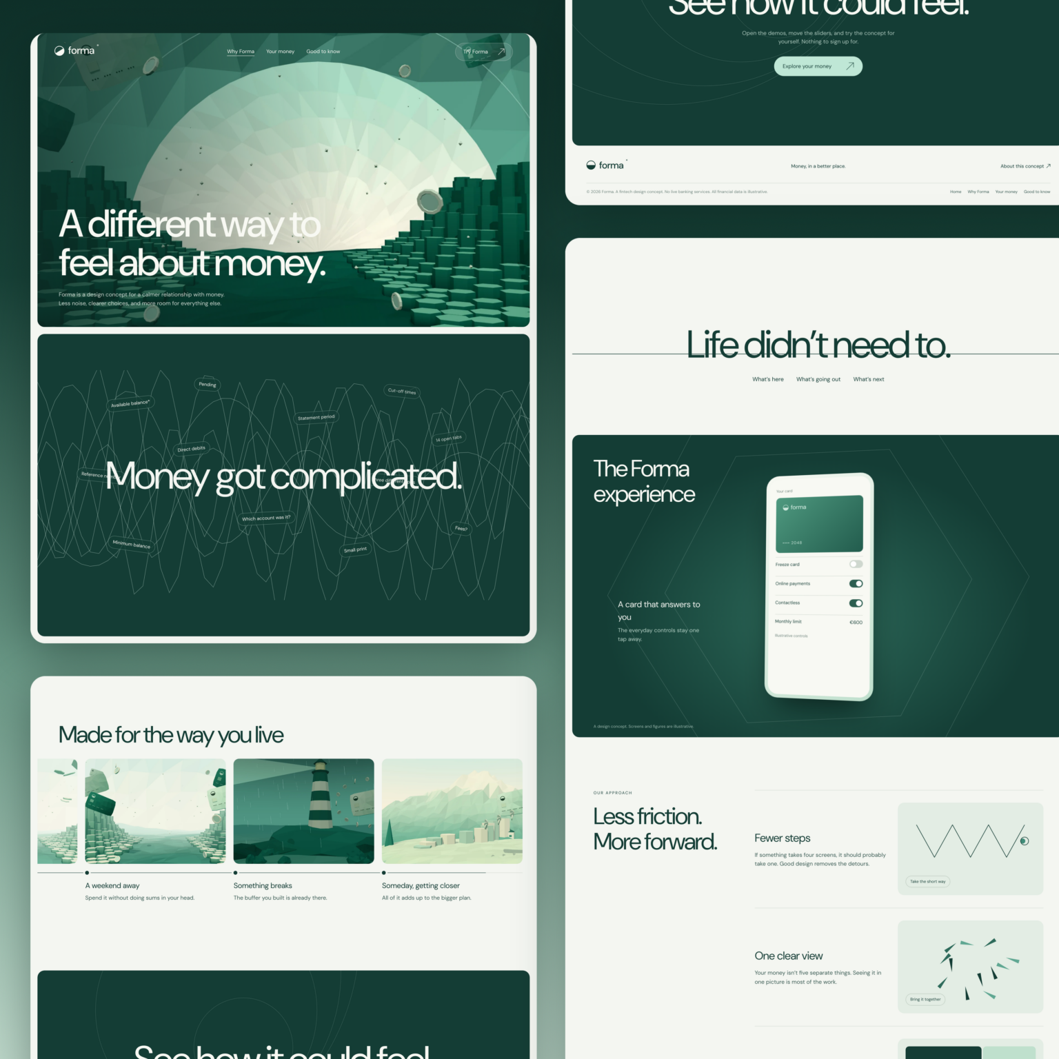
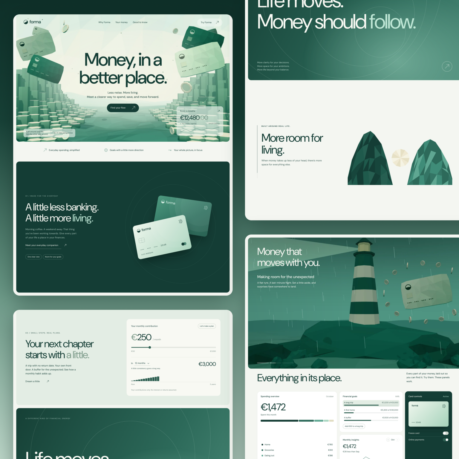
This is similar to how I approached the FORMA fintech website concept. Different industries, obviously, but the principle is the same: the visual identity has to survive beyond the first hero section. A brand should have enough character to work across actual touchpoints.
Food website design starts with the food
Photography isn’t decoration in this category. It’s a large part of the product information.
When somebody visits a fast food website, they’re trying to judge taste from a screen. A photograph cannot deliver the smell of a freshly toasted bun, but it can show texture, portion size, the amount of sauce and the difference between one dish and another.
That’s why I used large, high-quality, mouthwatering concept images throughout the page. The photo style is consistent: warm products, clean backgrounds, dramatic but believable lighting and enough detail to make the product visible on a smaller device. The visual language is vibrant, and the colorful backgrounds deliberately echo the restaurant packaging.
For a real client I’d never replace photographs of the actual dishes or location with images of things customers couldn’t buy or visit. Stock imagery can help with early inspiration, and AI-generated visuals can help develop a direction, but real restaurant photography should reflect the actual kitchen, portion sizes and atmosphere. A strong image may get someone hungry; an inaccurate one earns you an angry review.
<!– Insert genuine Burger Boys screenshot here: hero and 4 menu cards. Caption: Four burger products in one consistent photographic and digital system. –>
The dishes should be easy to navigate before it gets clever
Burger Boys has four signature burgers: The Smash Classic, The BBQ Bacon, The Boys Special and The Truffle Delight. Visitors can also explore sides, drinks and dips, including Good Mood Fries, Spicy Sunshine, Boys Sauce and Truffle Mayo.
Each menu card has a clear name, description and price, with an option to explore the burger or add it to the demo bag. The selection isn’t hidden inside a downloadable file or locked behind a complicated animation. It’s there to browse.
The interactive details are an extra layer. A customer who wants a quick price can get it immediately. Someone who’s curious about the ingredients can spend longer.
This is a basic but overlooked point in restaurant web design: the most enthusiastic person in the room may want to explore everything. The hungry person on a lunch break probably doesn’t.
The burger anatomy: one interaction that earns its place
The centrepiece of the site is a section called “What’s inside a Burger Boy?” It takes the Smash Classic apart into six layers: a brioche-style bun, iceberg lettuce, tomato, cashew cheddar, the plant-based smash patty and Boys Sauce.
Visitors can trigger the expansion, inspect an ingredient and reset the burger. The animation gives a mundane piece of ingredient information a little personality, while the controls leave visitors in charge.
You can see the burger anatomy interaction on the live concept.
This is where I think interactive website design becomes interesting. It doesn’t need to resemble a video game to be useful. Sometimes a small interaction makes a product easier to understand or more enjoyable to examine.
The motion has to remain functional, of course. A slow animation that stops someone from reading the ingredients would defeat its own purpose. The site includes animation controls and a reduced-motion mode.
<!– Insert two genuine Burger Boys screenshots here: burger assembled and expanded, or a live animation video. –>
From browsing food to building a combo
The second interactive feature is the combo builder. Visitors select a burger, then a dip and a drink; the page displays the components and updates the illustrated total. There is a bag interface as well.
This is still a demo, not an online ordering system. The page makes that clear instead of pretending a transaction was completed. There is no payment processing, delivery integration or live restaurant POS behind it.
For an operating business, the next step would be the unglamorous work: connecting real menu data, marking unavailable items, handling taxes and modifiers, setting pickup or delivery rules, validating orders and making sure the kitchen gets the right ticket. That matters more than how satisfying the Add button feels.
The broader idea is to make ordering intuitive before adding personality. If an interaction helps customers decide, it’s useful. If it delays the meal, save it for a portfolio animation.
How the visual identity carries the website
The palette was deliberately simple: blue, pink, yellow and mint, anchored by heavy black typography. I used repeated scalloped shapes, stickers, the smiling sun and strong product framing so the site feels related to the bags, cups and packaging.
A restaurant identity doesn’t exist alone. People meet the brand on Instagram, see a delivery bag in the street, maybe spot the storefront while walking past, then open their options on their phone. Those encounters should feel like the same business.
On AGFUTURA’s brand identity and website system, I explored the same problem from the opposite direction: how to connect a more complex B2B business across physical and digital touchpoints. Burger Boys is simpler, louder and covered in sauce, but a consistent system still matters.
Website templates: useful foundation, limited personality
There’s no shame in starting with a template. For a small business with a limited budget, a WordPress theme or Elementor website template may be the sensible route. A good template already gives you responsive sections for a menu, opening hours, reservation requests and contact details. That gets the functional part moving.
I wouldn’t recommend developing a custom interactive experience for every café, coffee shop or neighborhood kitchen. Some businesses need an easy-to-navigate, reliable site more than a bespoke animation. A well-maintained WordPress site with Elementor Pro and, where appropriate, WooCommerce can be a reasonable option if the team is prepared to manage plugins, payments, fulfillment and updates. A template alone doesn’t supply a working restaurant operation.
For anyone looking through food website templates for design inspiration, I’d judge them on what happens after the pretty screenshot: Can the owner update the dishes and prices? Can users find location details? Can someone book a table if reservations are offered? Does it look great and still load promptly on mobile? Do its customization options allow the business to look like itself?
Burger Boys sits at the other end of that spectrum: a custom creative demonstration. The useful lesson is not “every restaurant needs custom code.” It’s knowing where a unique design adds value and where a familiar interface is perfectly fine.
What a functional restaurant site should have
Before getting carried away with motion graphics, here’s the practical checklist I’d use for a client project:
- Menu and prices: Real dishes, accurate descriptions, ingredients and relevant allergen information.
- Location and hours: Correct address, a usable map, opening times, parking or pickup instructions when useful.
- Mobile experience: Responsive images, readable fonts, clear navigation and buttons that work with a thumb.
- Ordering or reservations: A real system if the restaurant offers them, with working checkout and confirmation. If not, a clear phone or contact option.
- Performance: Optimized images, predictable load behavior and accessible motion controls.
- Trust: Real customer information, real kitchen or venue photography, and obvious contact details.
- Discovery: Sensible page titles, useful on-page content, local search details and a maintained Google Business Profile.
A graphic designer may enjoy the animated sun. A customer wants to know whether the kitchen is still open. A good digital experience should accommodate both.
If you’re looking for a more technical walkthrough of building a concept with AI, I’ve written a separate guide on how to build a fast food restaurant website with AI on Direktorium.
Why I built Burger Boys
I work across branding, digital design and creative development, often for businesses whose products are considerably harder to explain than a cheeseburger. Burger Boys was a chance to take that same thinking somewhere less serious and see how far a consistent identity could travel.
The result is a complete, responsive site concept with a distinctive visual language, large product imagery, interactive burger exploration, a configurable demo combo and a branded takeaway world.
There are no restaurant sales figures, conversion claims or actual diner reviews to report. This is a fictional concept designed to demonstrate an approach, and you can judge the experience by trying it yourself.
Explore the Burger Boys website
If you run a restaurant or hospitality brand and want to talk through the website, menu experience or visual identity, get in touch with BBDirector.
FAQ: Designing a restaurant site
What should a food website include?
A clear menu, current prices, genuine food imagery, location and hours, contact details, and an obvious way to order or reserve when those services exist. The layout should work well on a phone.
Is Burger Boys a restaurant website template I can download?
No. It’s a custom interactive concept, not a downloadable WordPress theme, Elementor template or template library item. The example is useful for inspiration, but the design isn’t offered here as a ready-made restaurant website template.
Can I create a restaurant site with Elementor?
Yes. Elementor is one way to create a WordPress site for a restaurant. The important decision is whether you also need menu management, table bookings, direct ordering, delivery rules or other integrations. Those require suitable tools and ongoing maintenance, not just a page editor.
Can the Burger Boys site take actual orders?
No. It includes a working demonstration of menu selections and an order bag, with explicit notices that nothing is purchased or charged.
How does a restaurant brand become interactive online?
By choosing interactions that match customer questions. For Burger Boys, that means an ingredient breakdown and a combo builder. Another restaurant might benefit more from an intuitive reservation calendar, kitchen story, or location map.